I’m finally caught up to present day regarding sorting variants!!! It only took 6 months, haha. I had intended to finish this in August, but as I mentioned in the Part 3 post, I didn’t have the small boxes. I ordered 15 and that actually wasn’t enough, so the week after I started this, I was waiting on another 35 boxes. They all arrived in perfect timing and I got it all done.
This is from when I started on September 2nd.
I went from 71 boxes last time to end on 99 boxes this time!
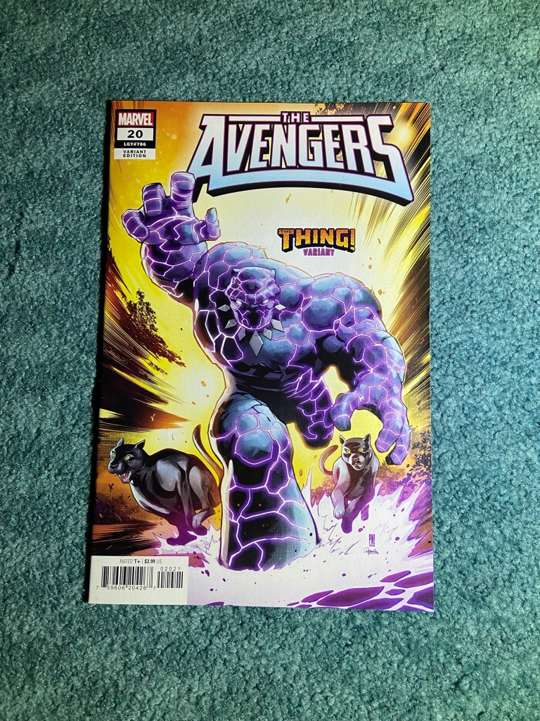
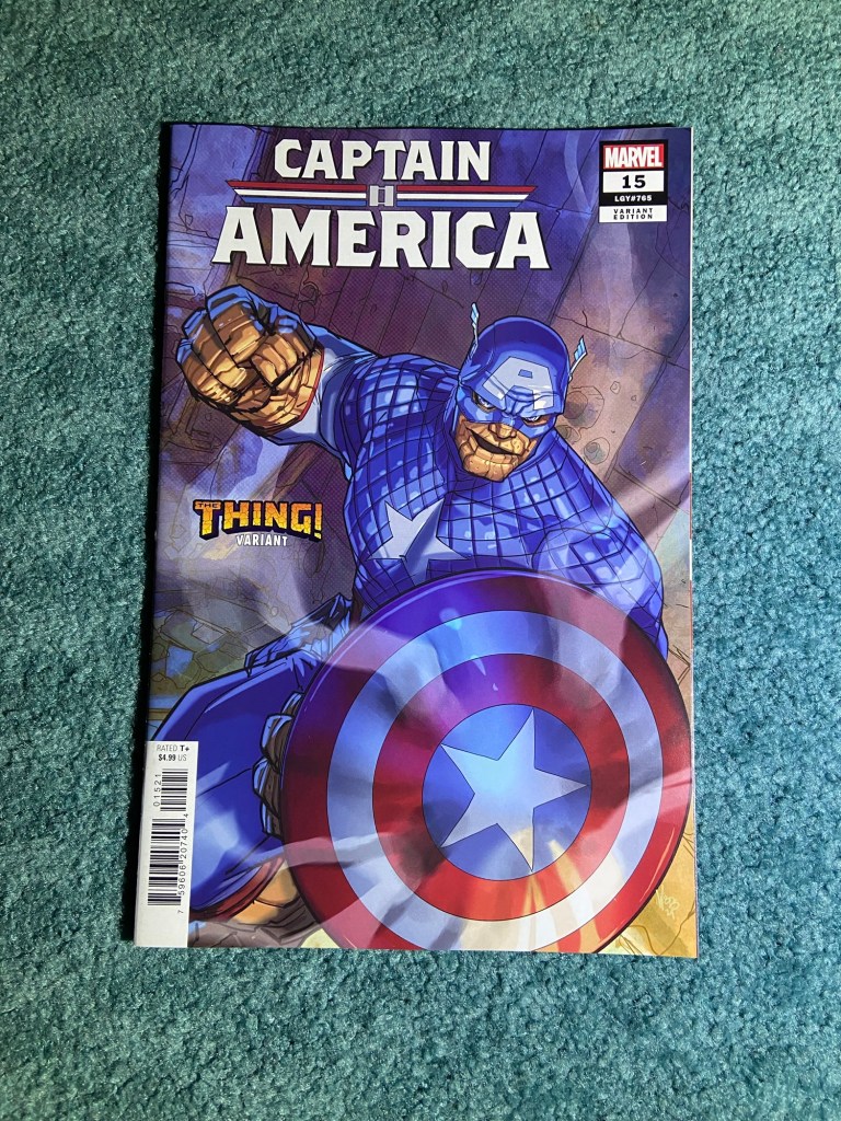
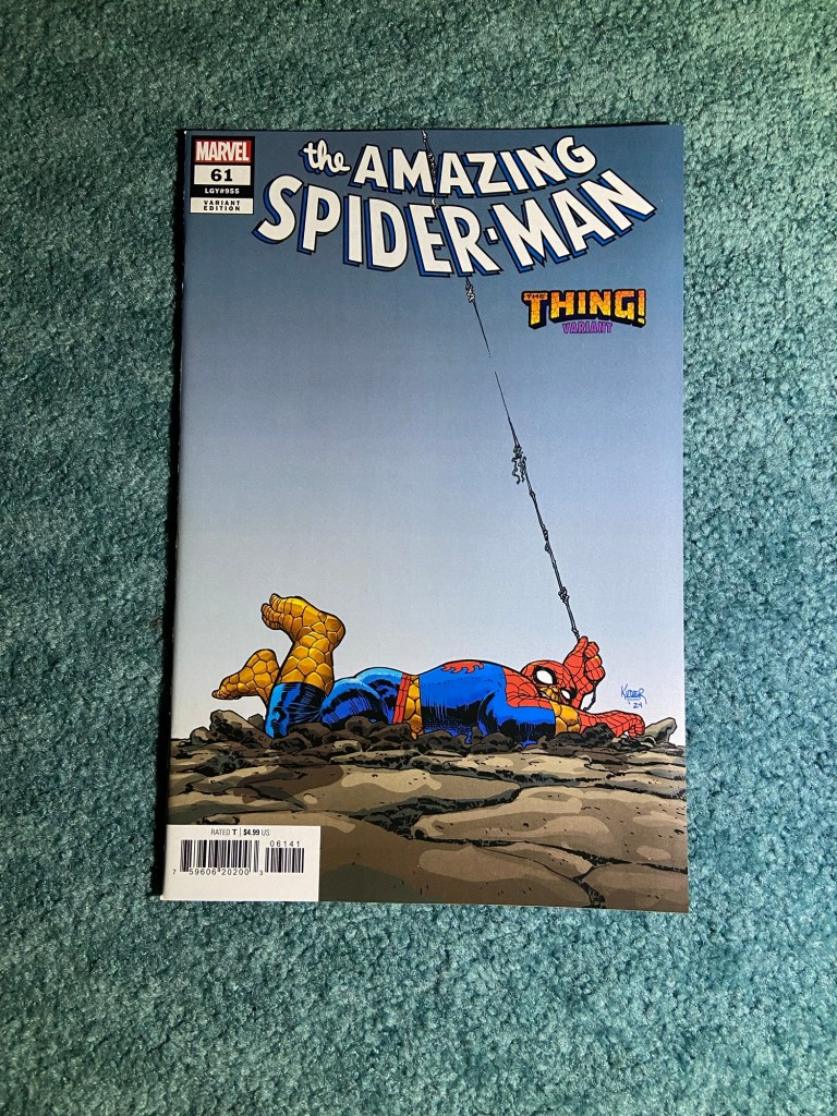
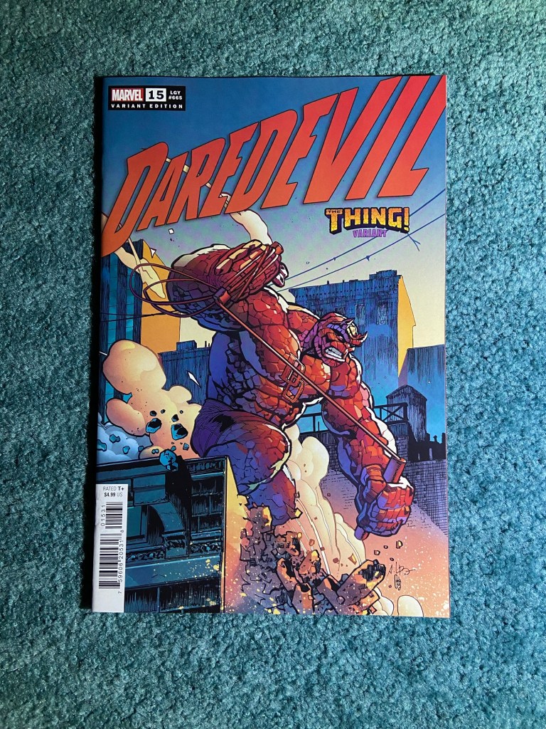
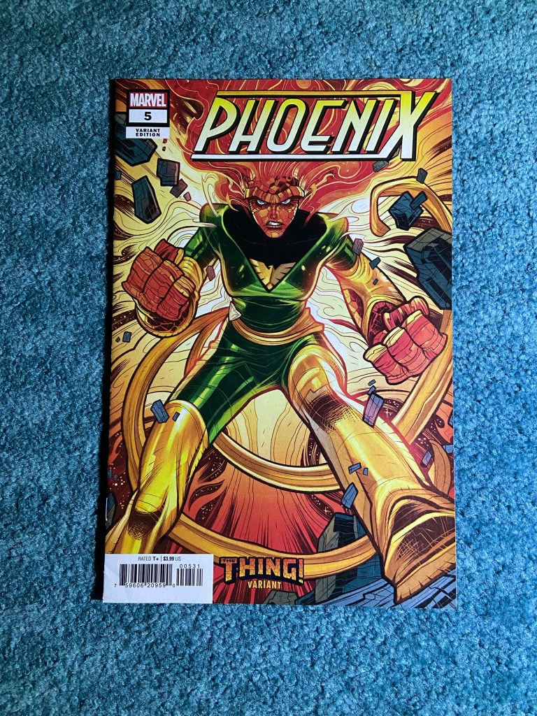
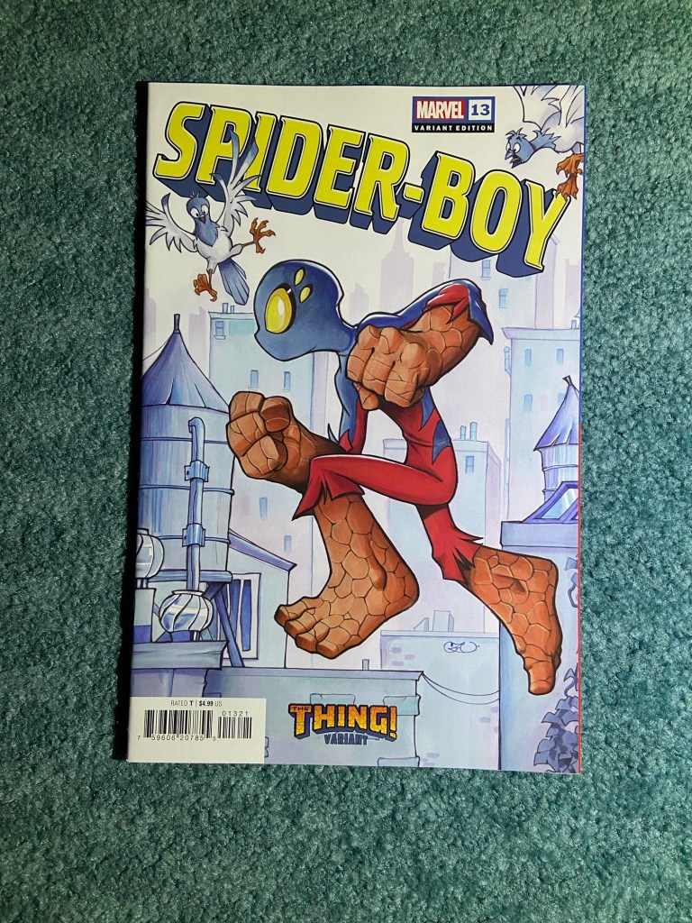
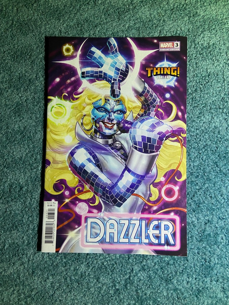
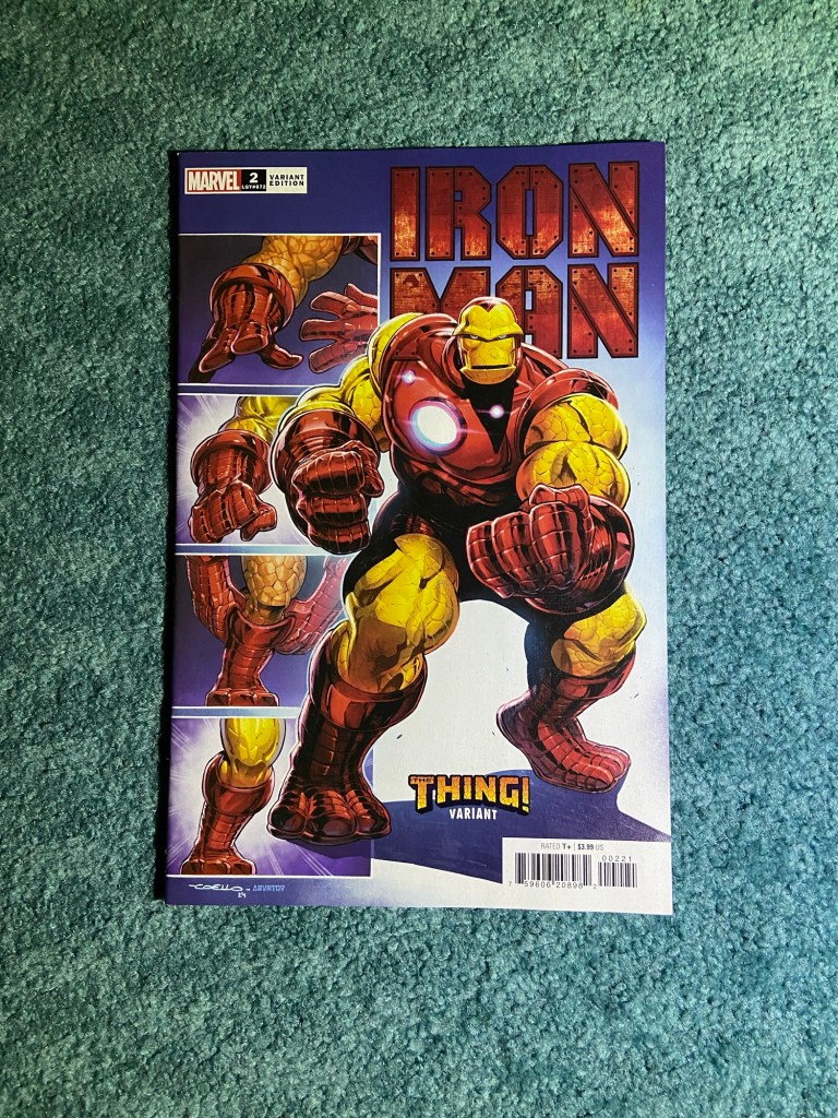
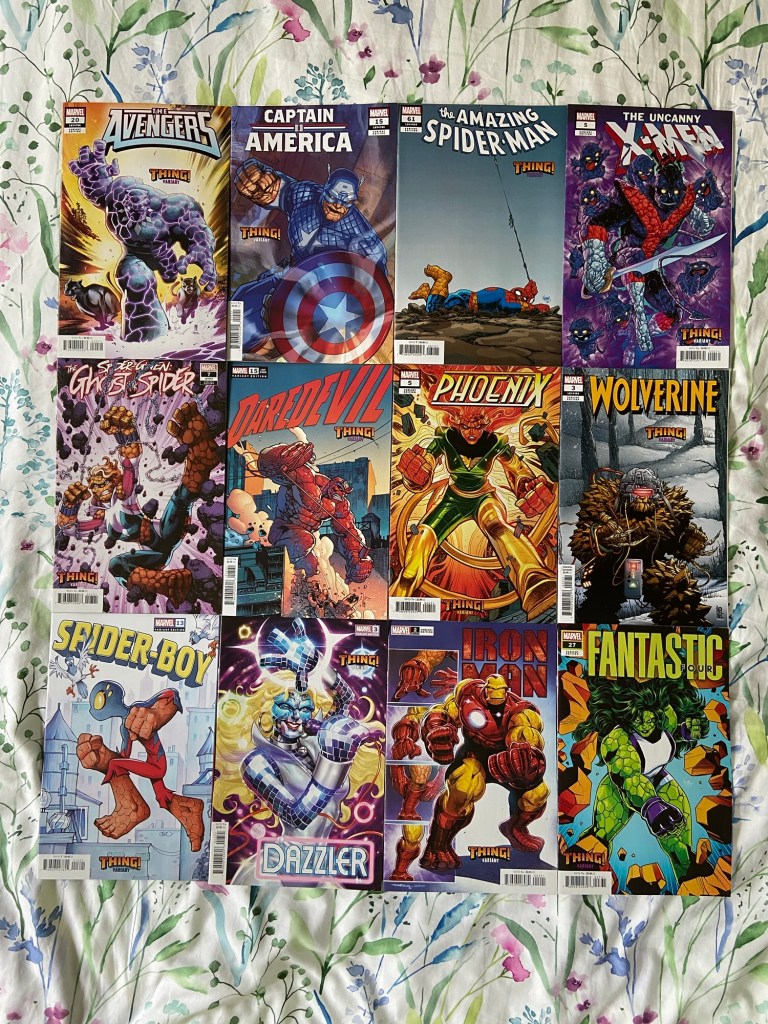
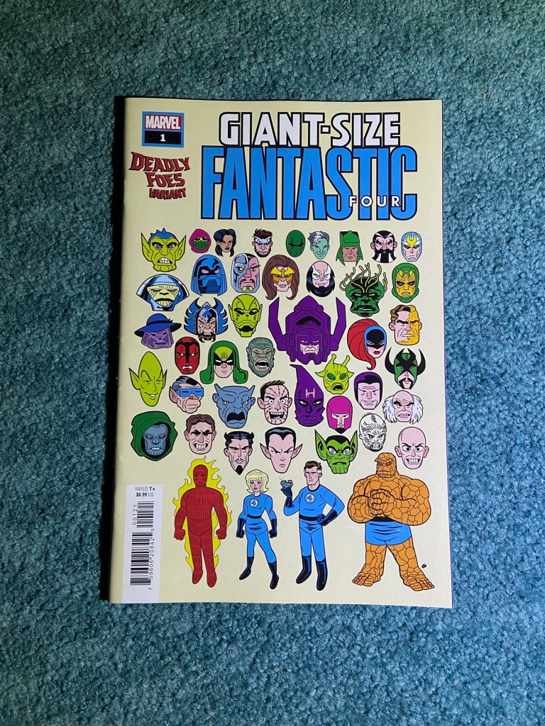
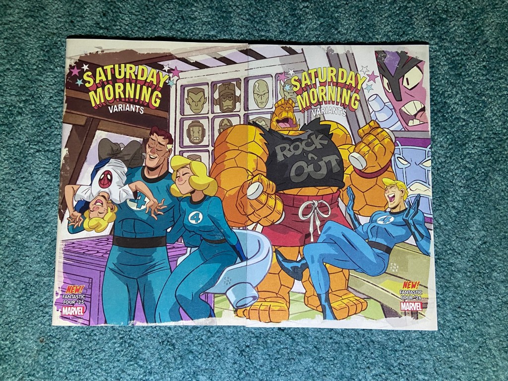
This was a fun and creative set! I liked that it wasn’t Ben Grimm being different heroes, but each hero having his Thing powers.
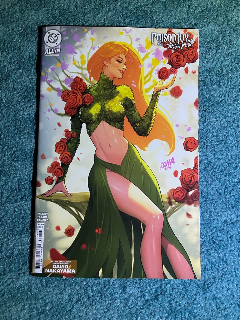
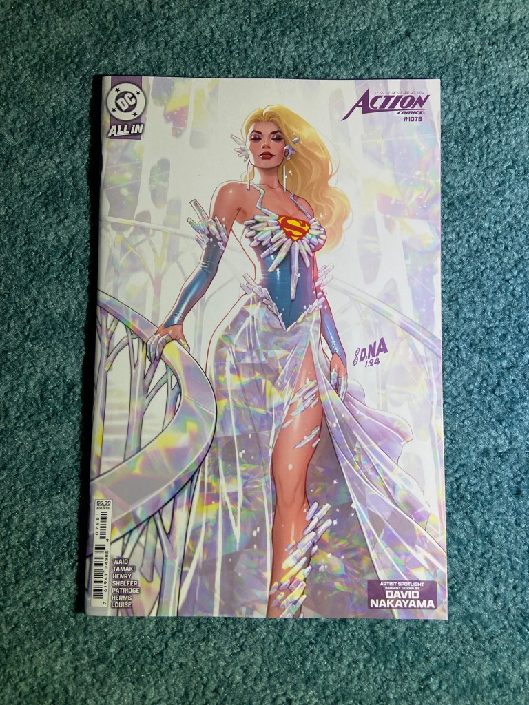
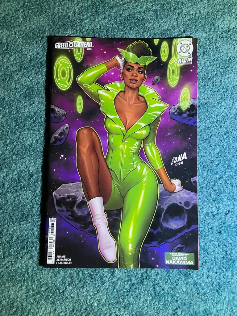
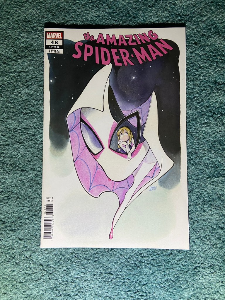
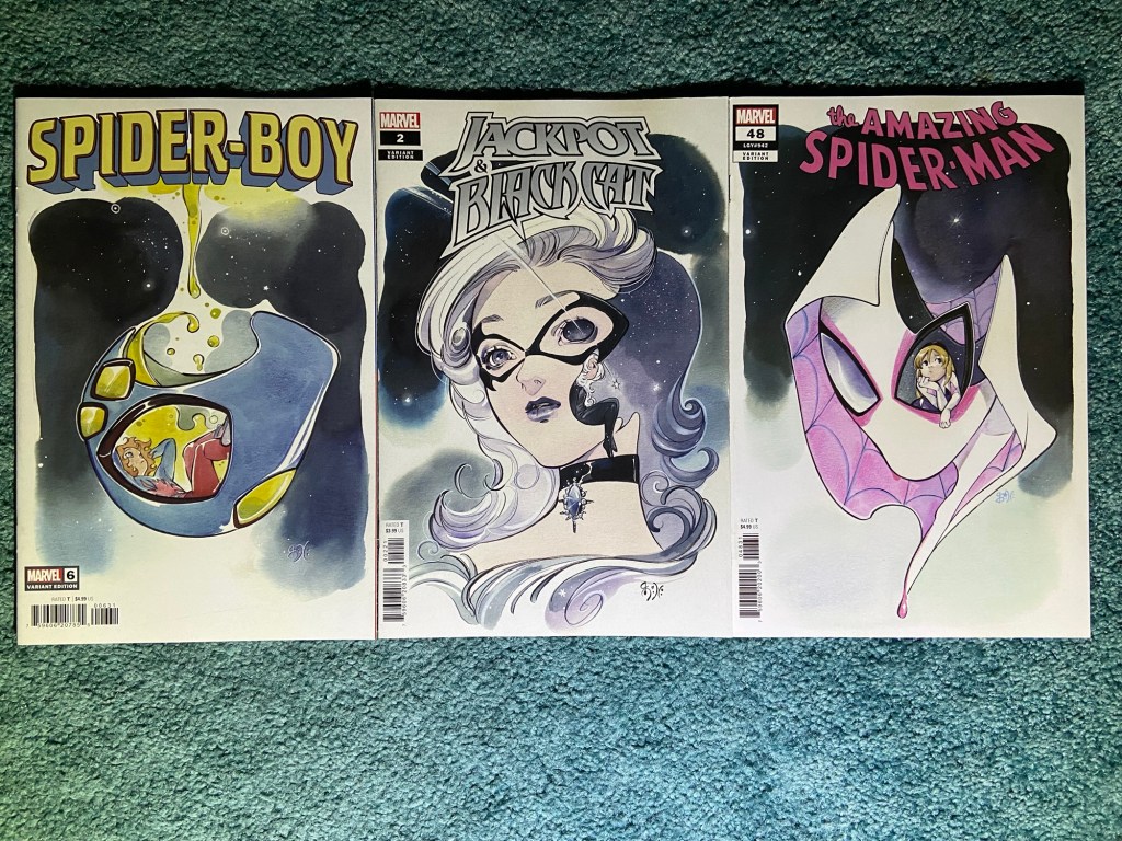
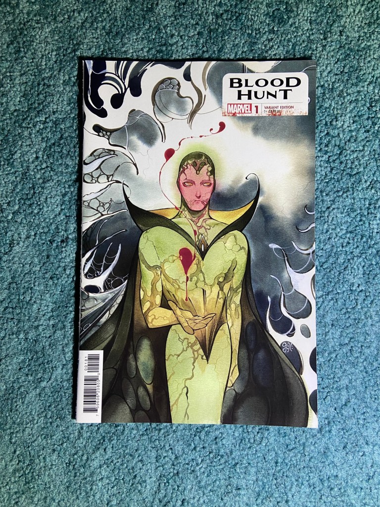
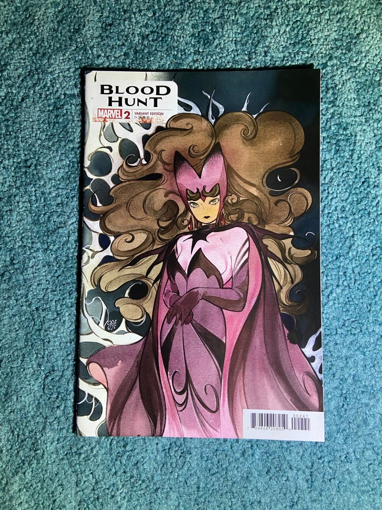
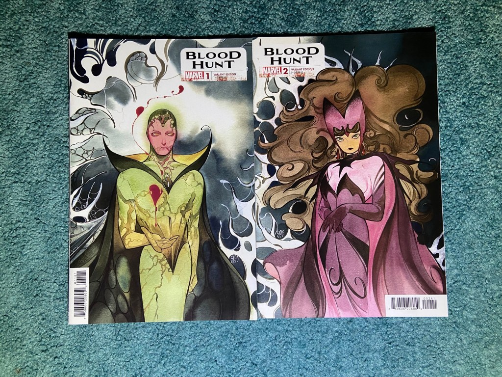
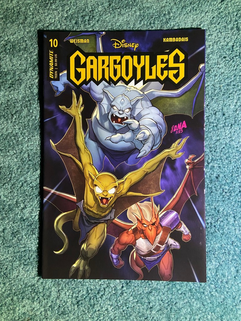
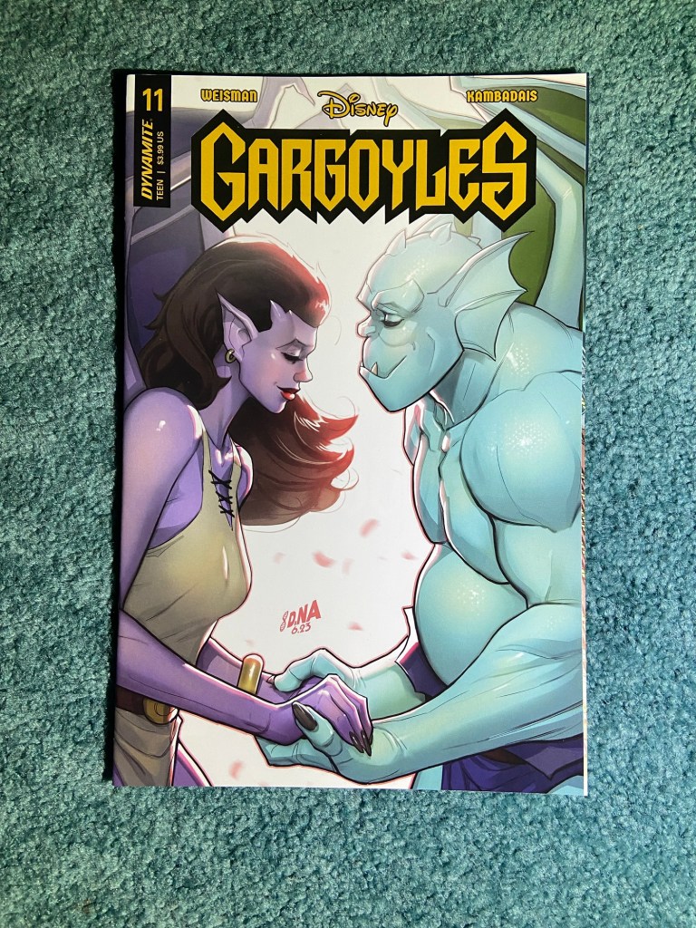
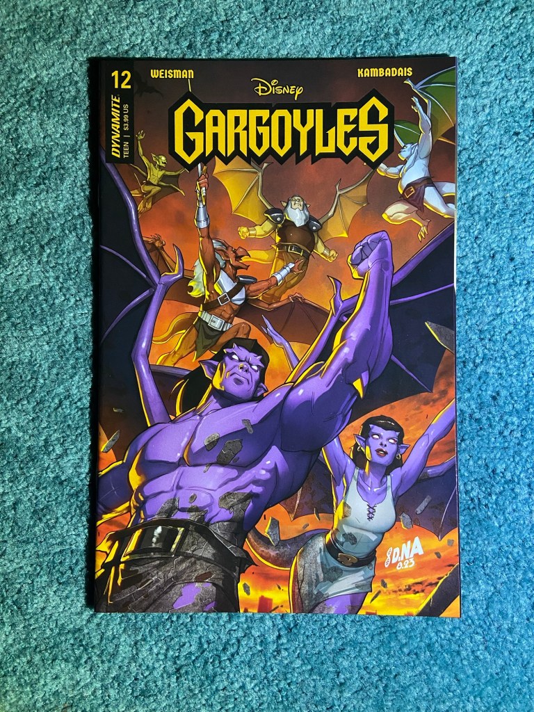
And here are David Nakayama’s Artist Spotlight covers! They’re amazing!!
Finally seeing them all together in-person is wonderful!
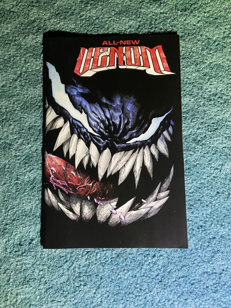
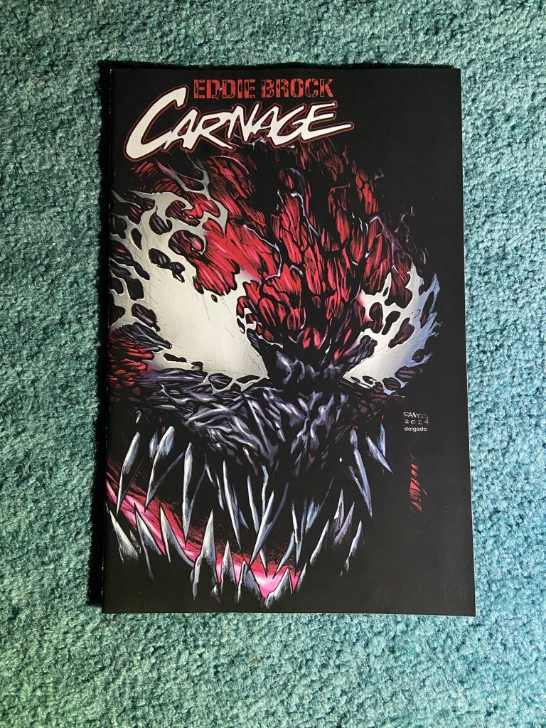
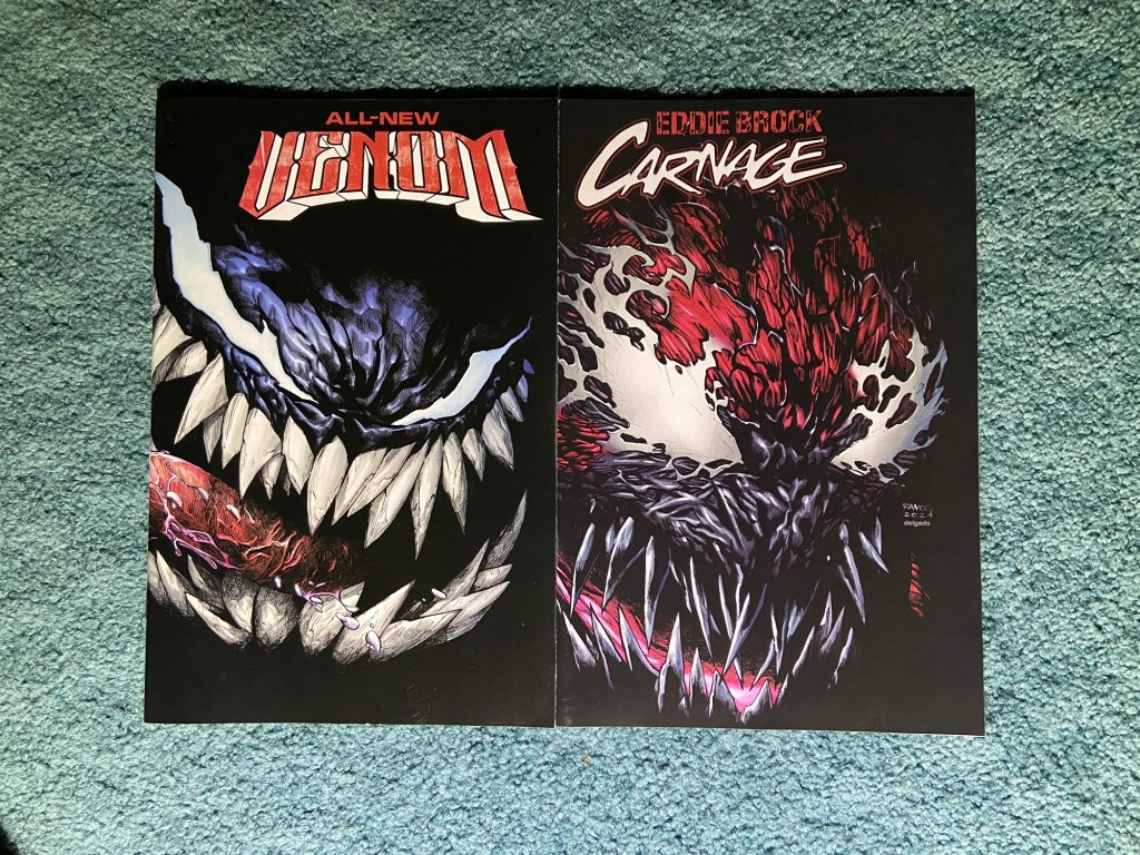
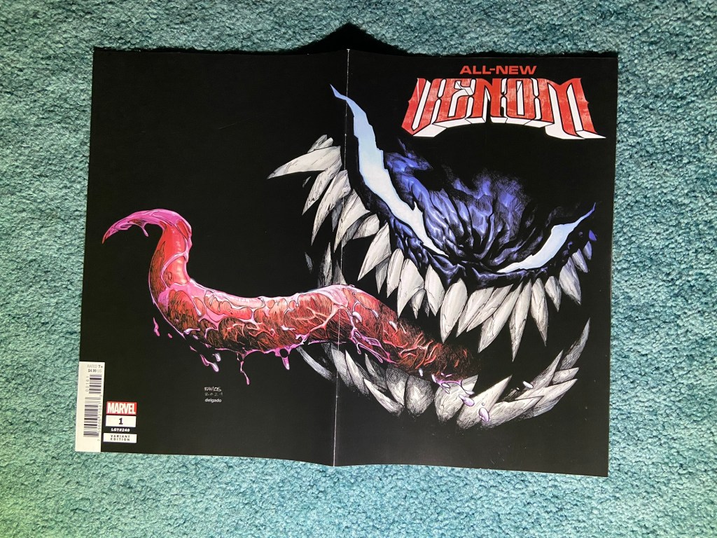
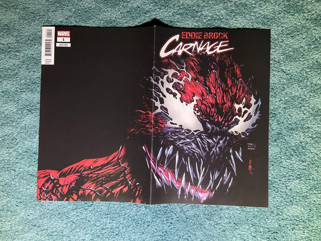
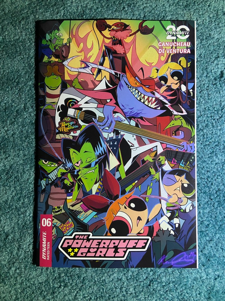
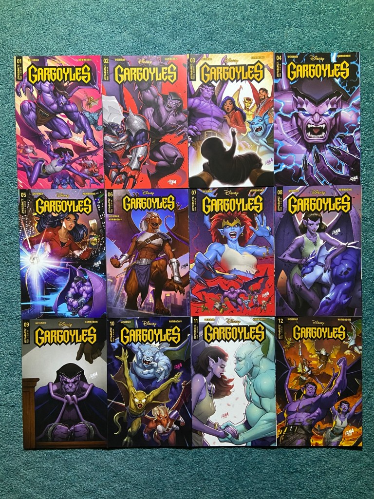
These funtastic wraparound covers are by the wonderful Humberto Ramos! Who, I now can say that I’ve met! See my second SDCC post from the last day.
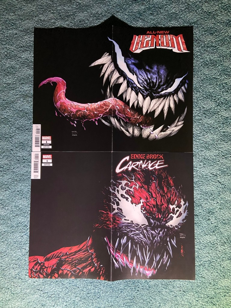
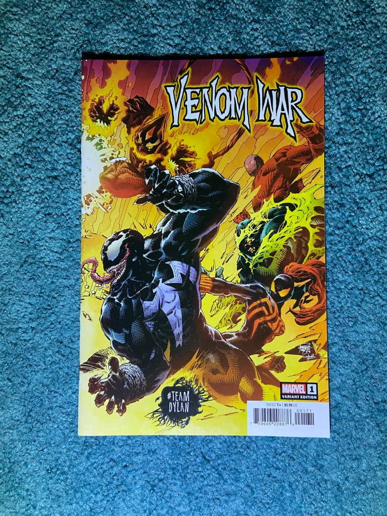
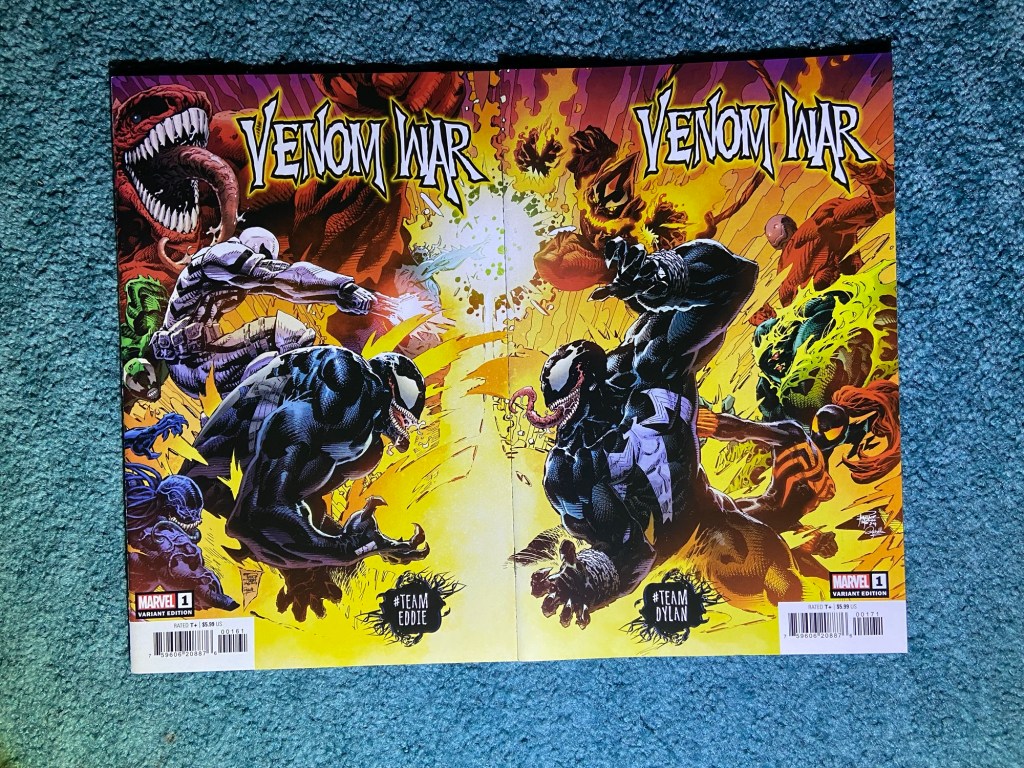
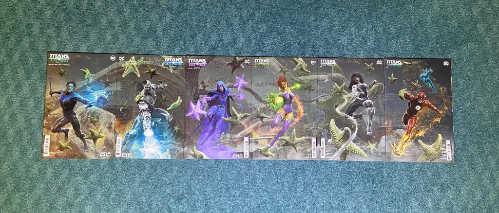
Love how these look next to each other! I’d love to see more covers with the other symbiotes!
These are by n artist whom I followed online first and then saw art of as he got noticed. Jake Bartok did his own Star Wars art online for years and at some point he was noticed and hired to do these covers as-well-as some official High Republic concept art.
It’s great to see his worn on actual comics!
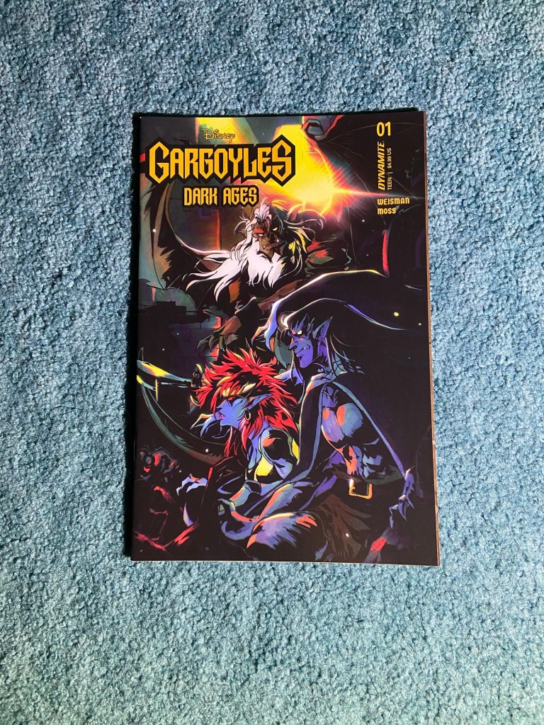
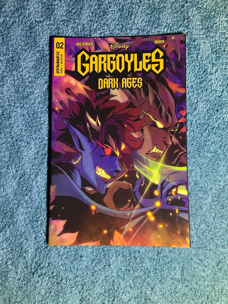
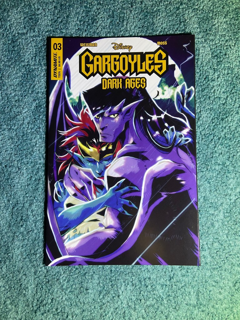
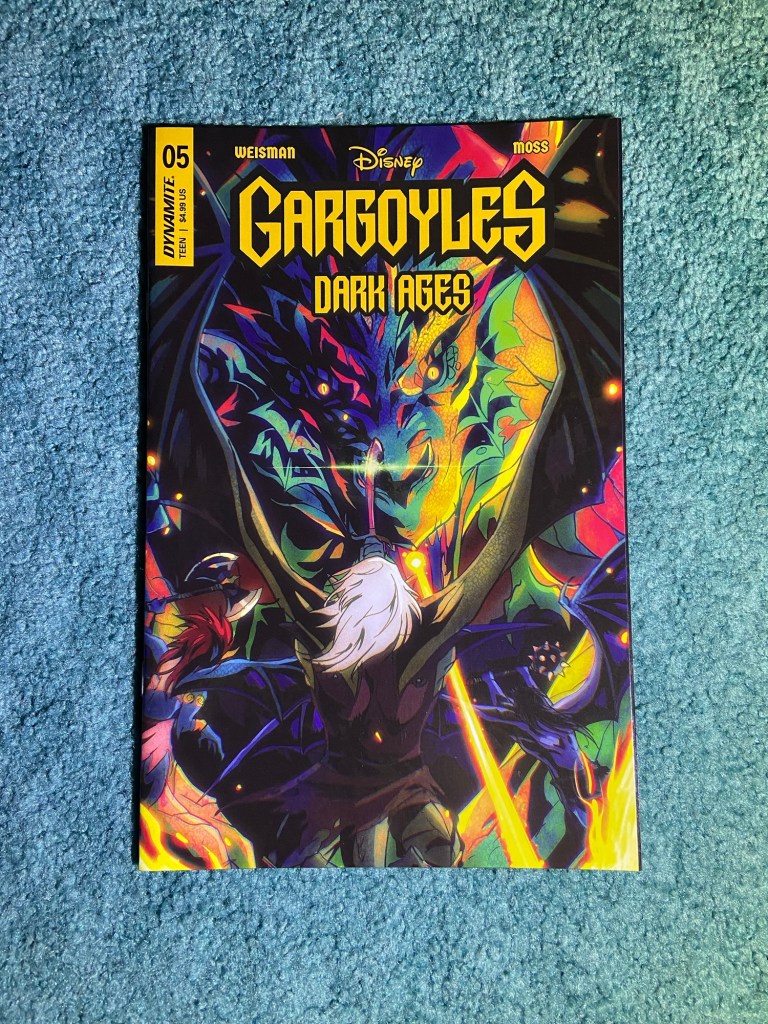
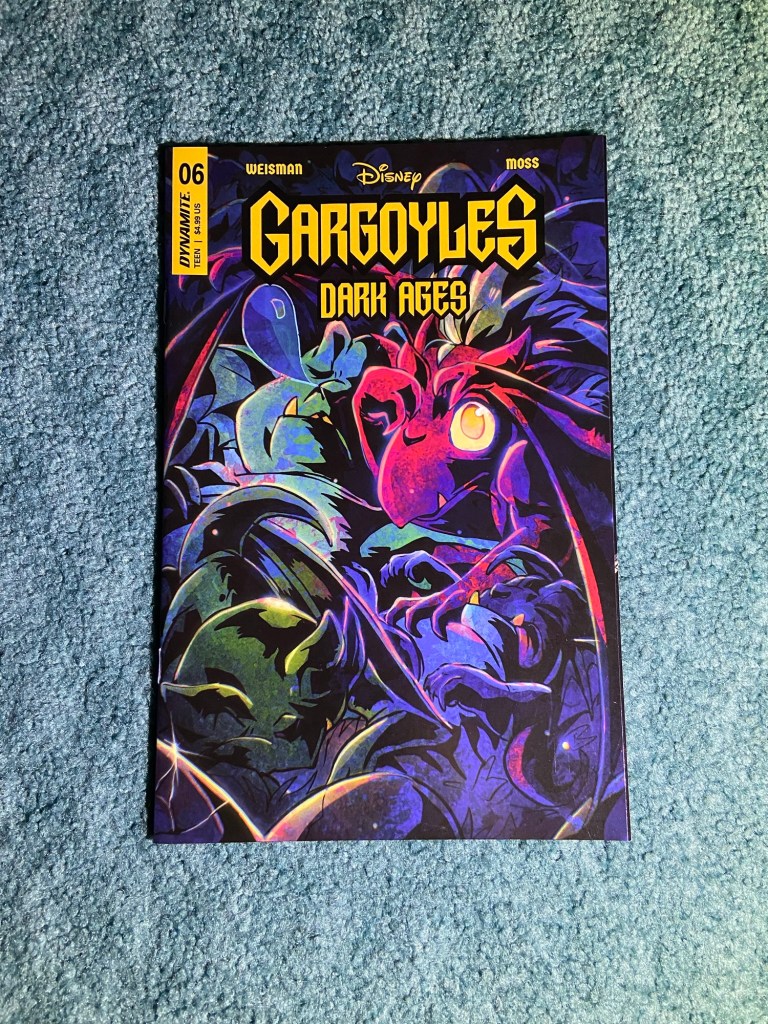
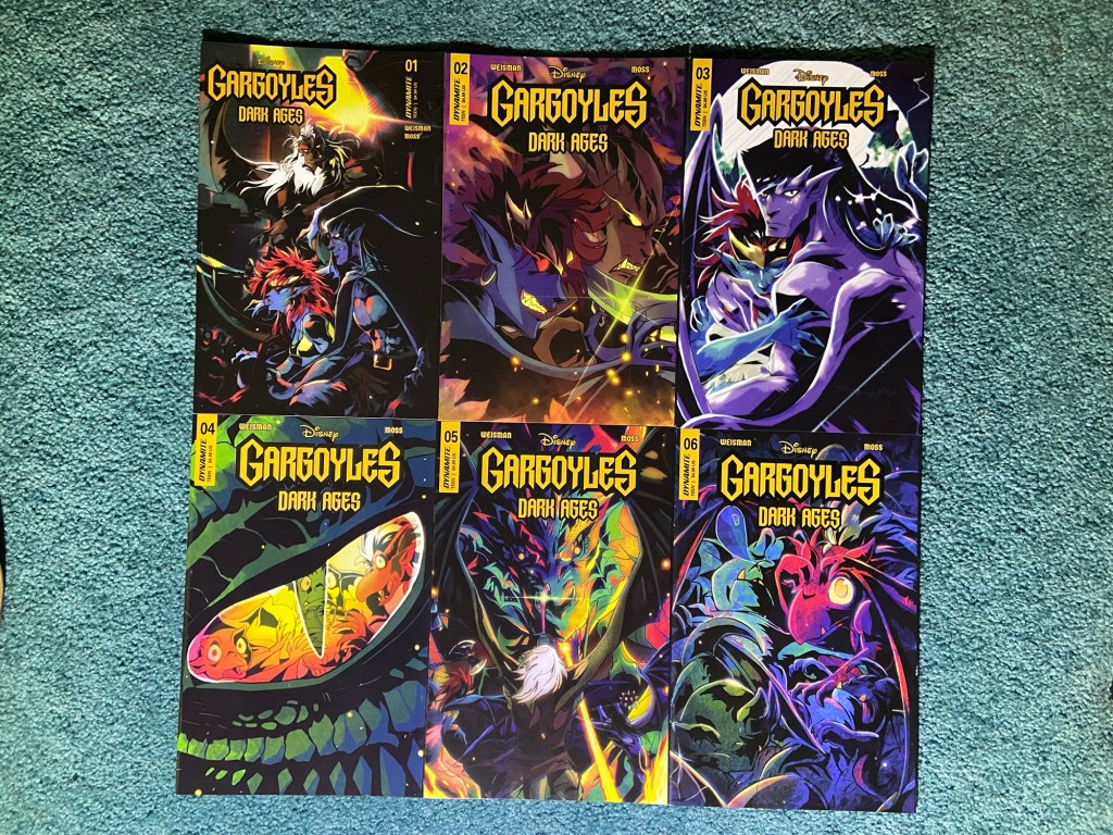
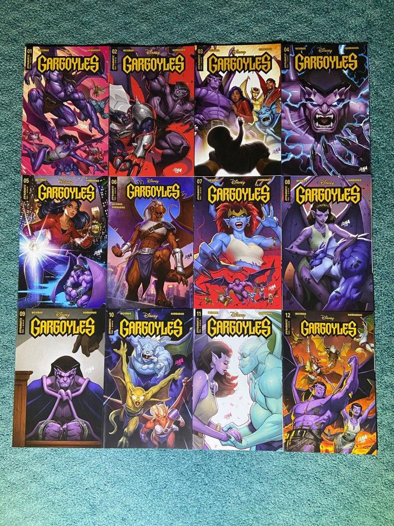
Another cool set by local-to-DC Kenya Danino!! I love seeing her pop up on comics too! She’s also an artist I followed online first. Her first set was Gargoyles: Dark Ages.
I like how they’re all so different.
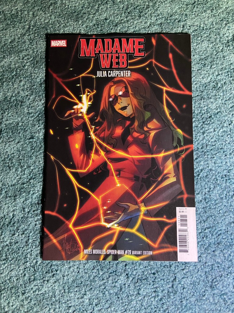
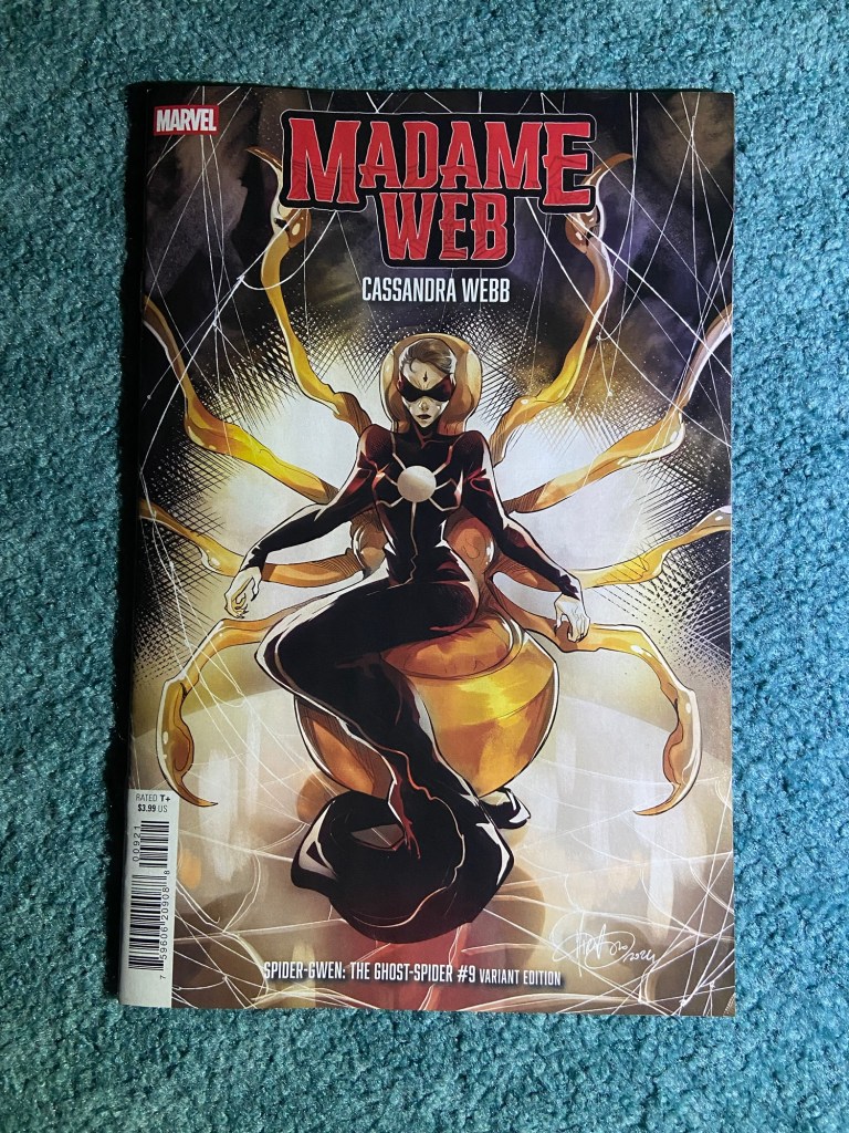
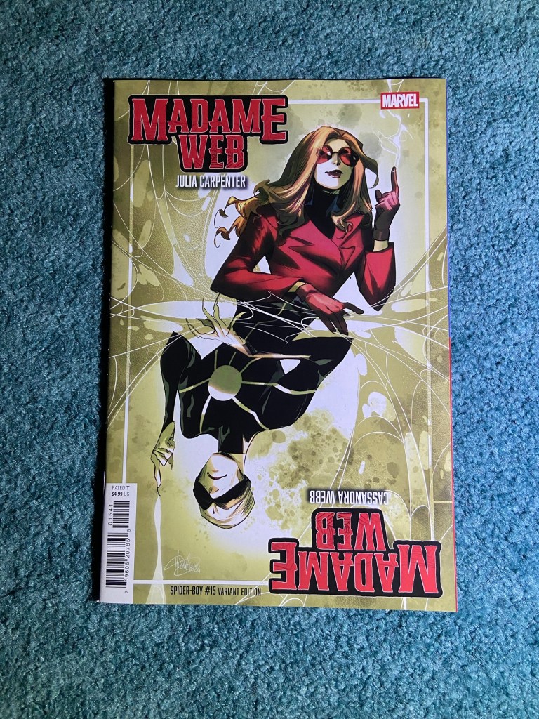
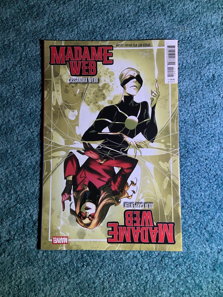
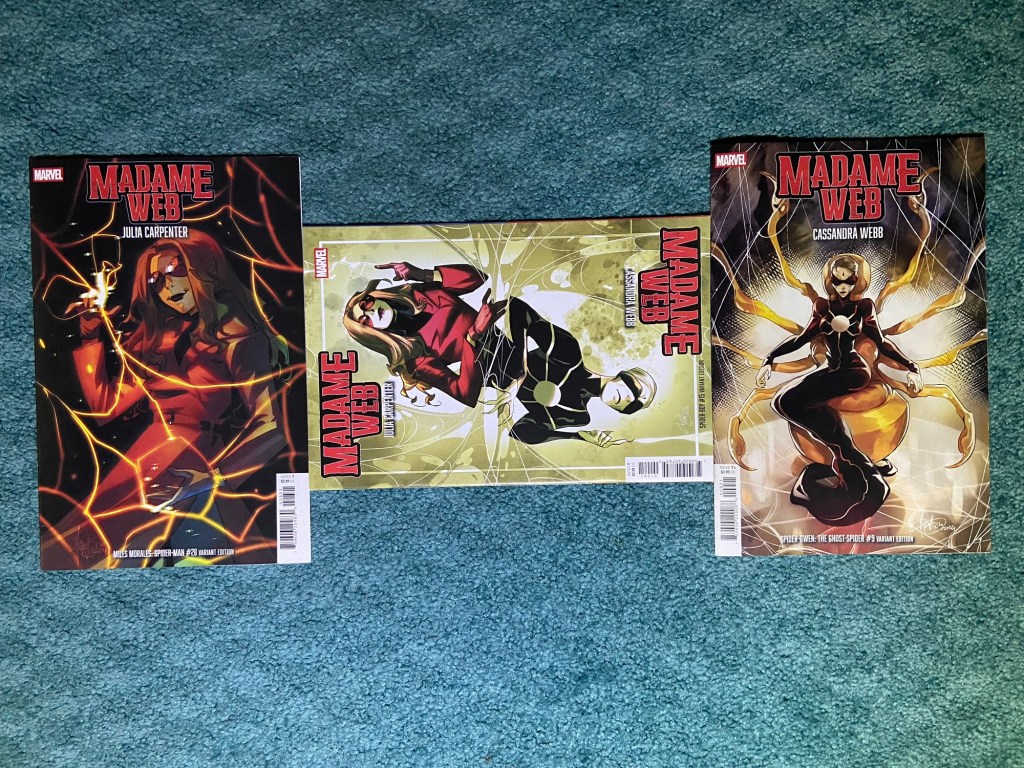
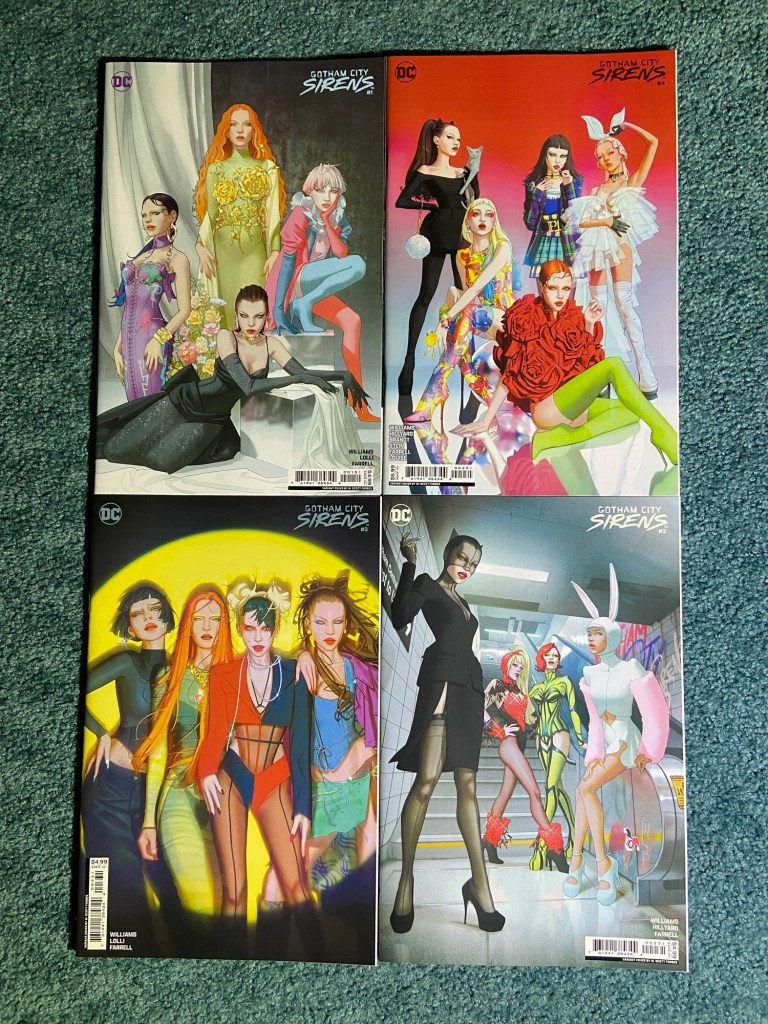
Last but not least for this set of posts, Mirka Andolfo’s set of Madame Webb variants featuring both Madame Webs!
I have to say, I love these covers more than the movie, haha. For those many thoughts, see my movie post for that movie. I felt like ending on a fun note and arranging these in a vague spider shape.
It’s been a crazy two weeks dealing with all the delays from the small flood. I’m glad to have actually finished this!! I would have already started sorting the last 6 boxes (24 weeks) of variants, but as I said in the first post, I don’t have any more of those small boxes yet. I did order some, so hopefully they arrive in good time and aren’t damaged or something. I hope to have finally caught up with complete variant cover posts within the month. Fingers crossed!
The added covers of this post were from sets that I had one or two covers left to add from after June’s sorting. So they were among the first to be completed this time.
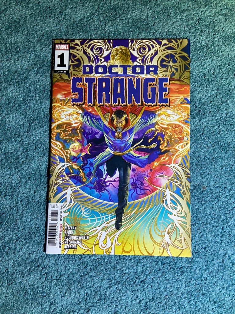
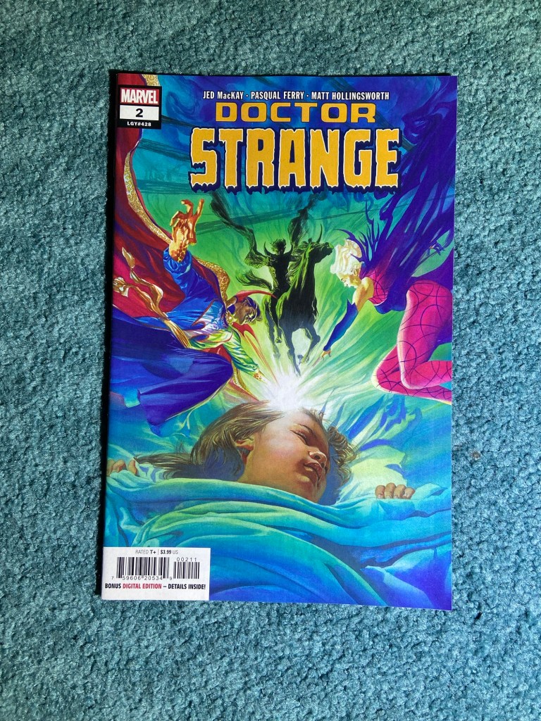
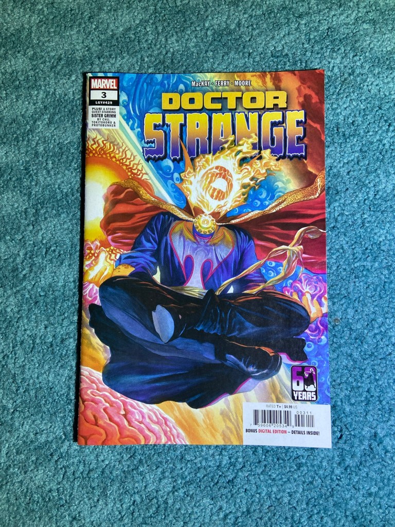
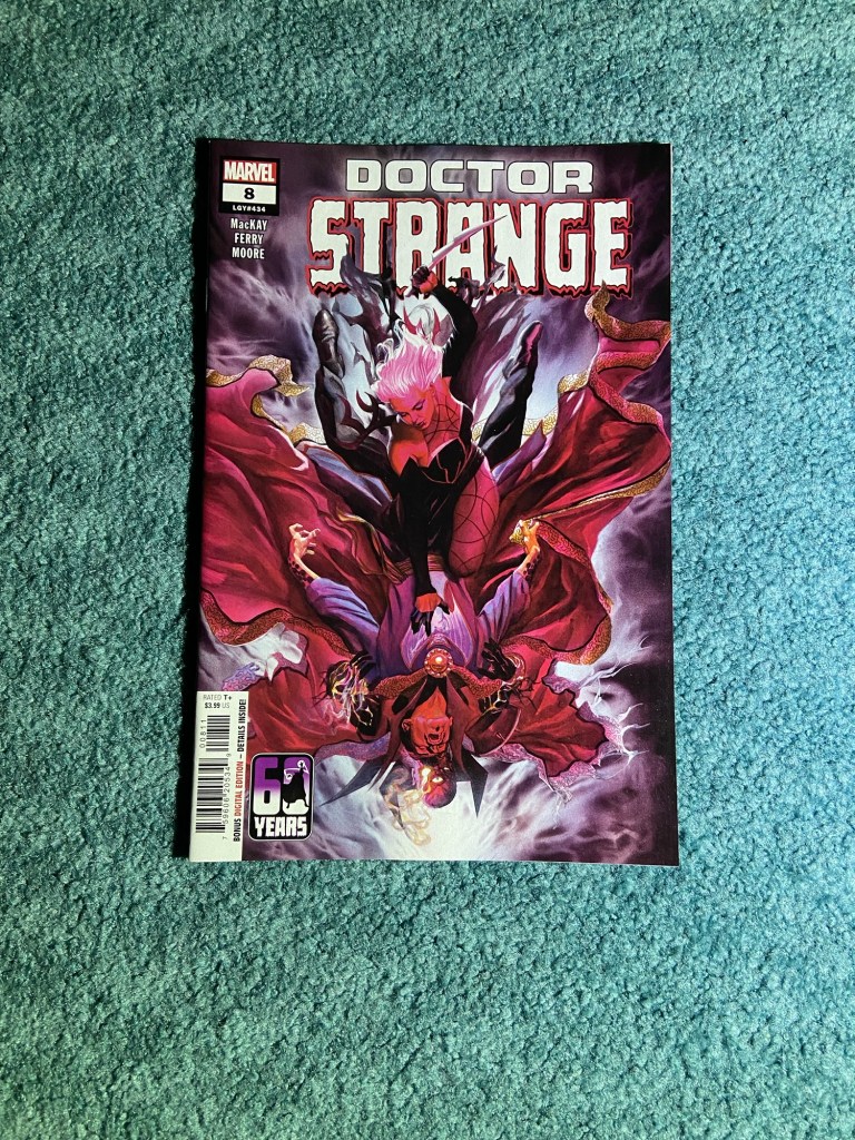
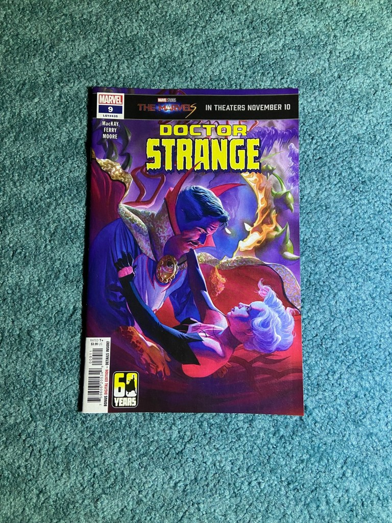
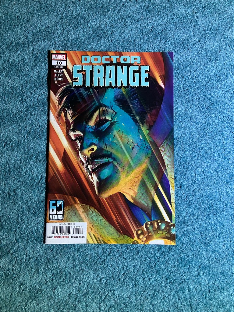
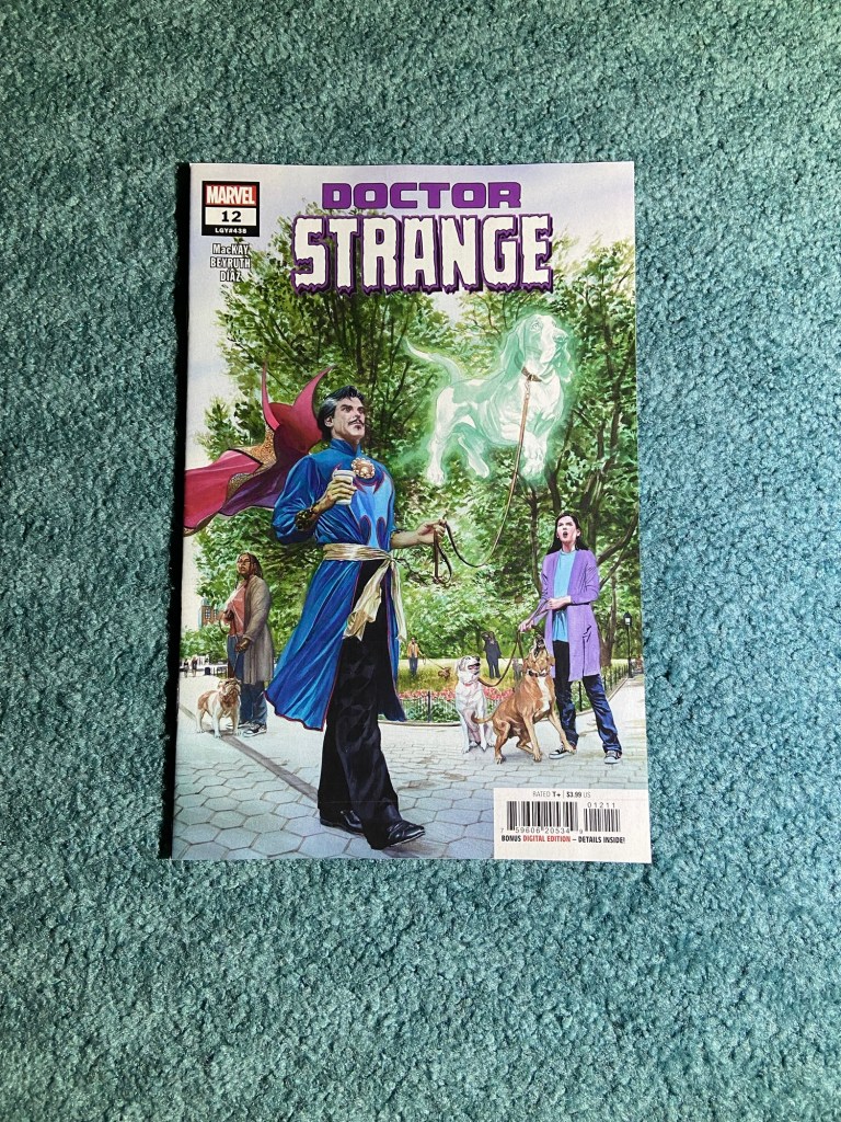
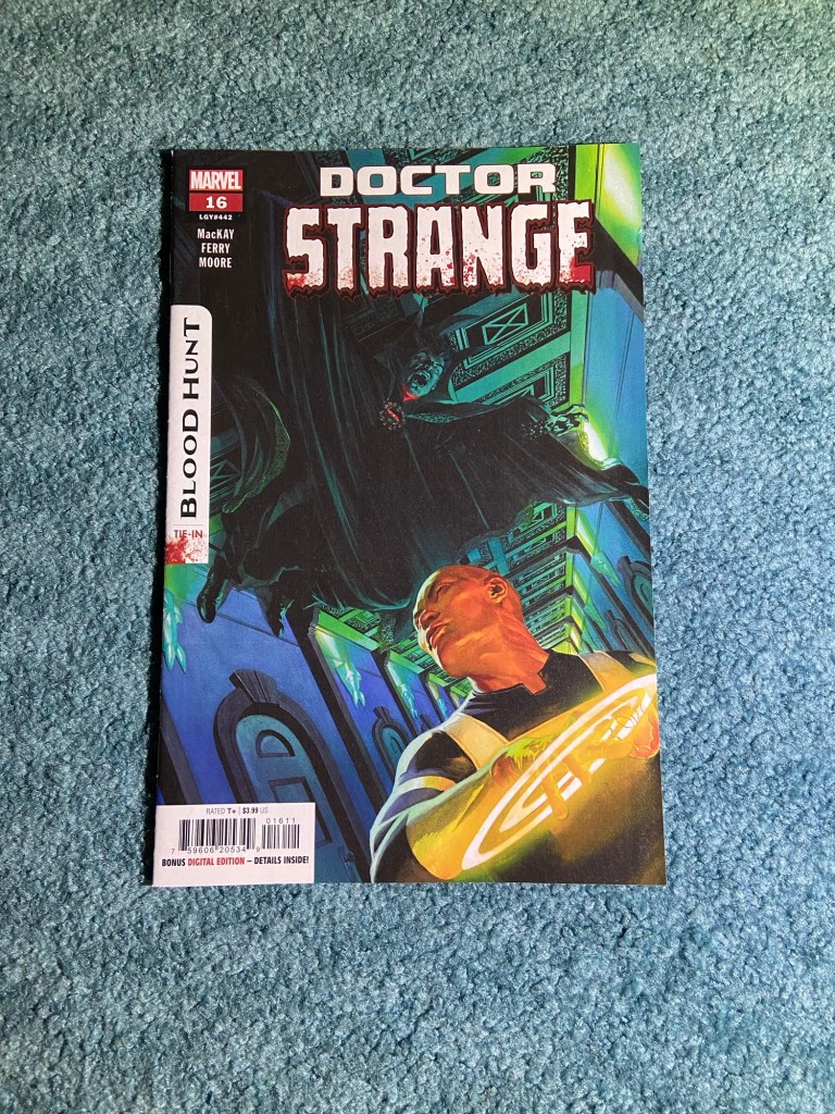
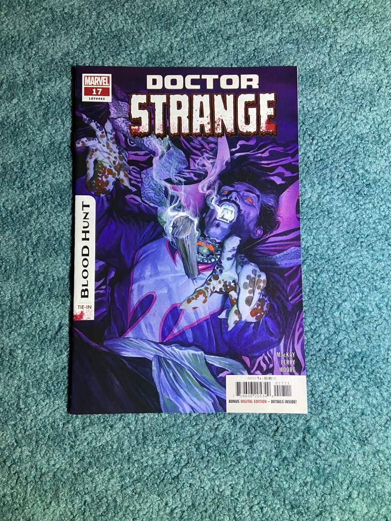
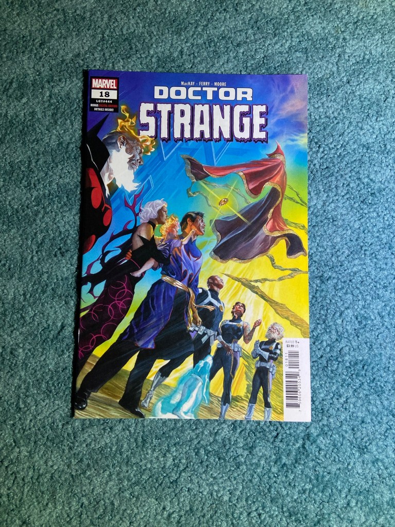
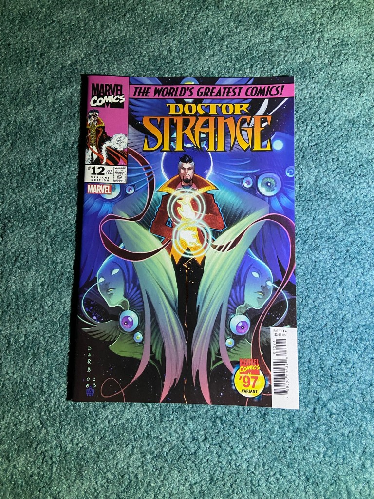
Alex Ross! He did an amazing job on this run of Doctor Strange. Every cover was spectacular!
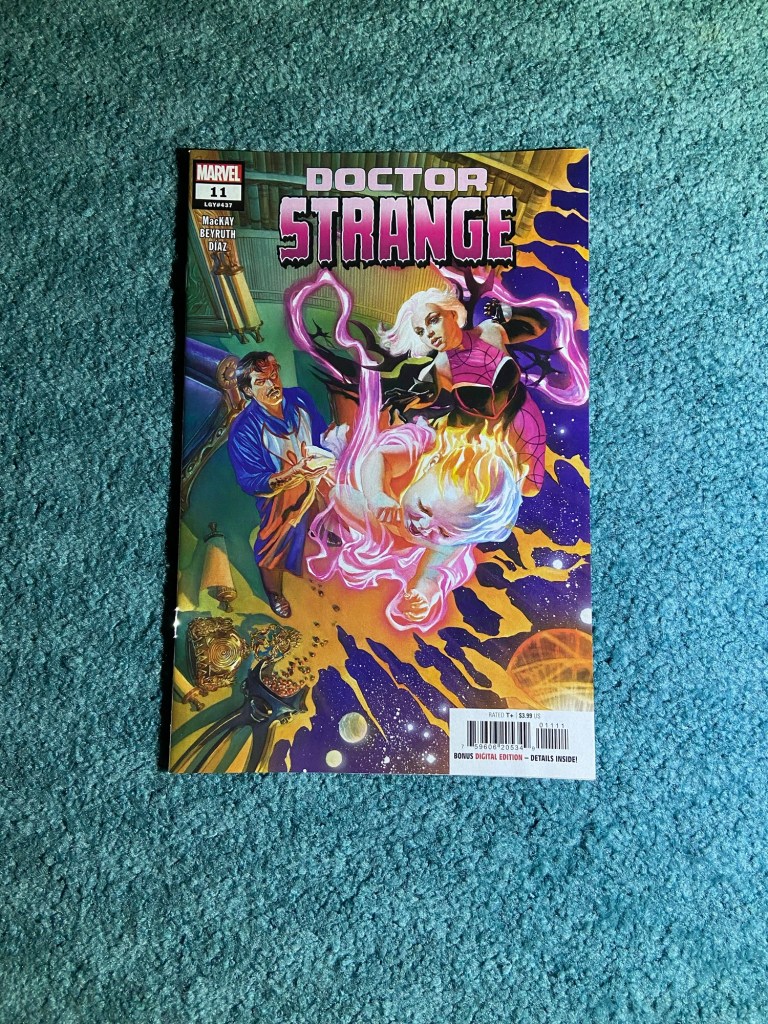
For this set last time, I was just missing another copy of the first issue. 18 covers that looked like paintings. They look amazing side-by-side!
For this set last time, I was just missing a copy of the first issue’s variant. These are a book cover themed set by Declan Shalvey!
They look wonderful together!
These Negative Space variants are by Alessandro Ranaldi! These were a fun throwback!
I do love how they look together, though I would have liked perhaps Hades and also Pain & Panic to have the last two covers respectively. But perhaps if we get another run of this there will be more of these variants.
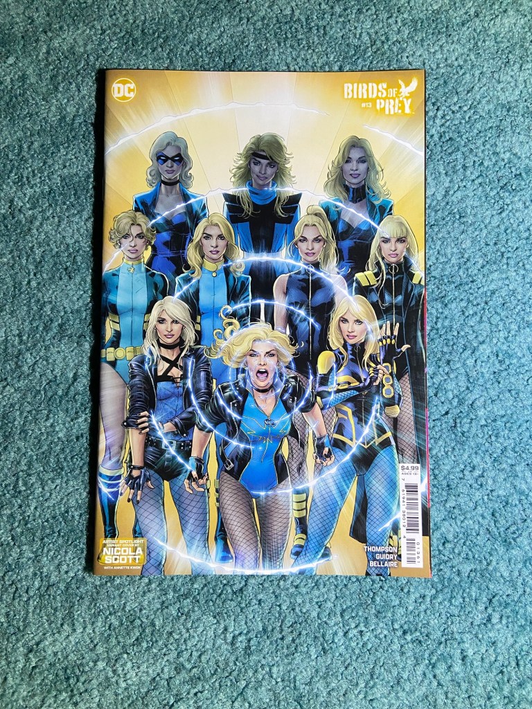
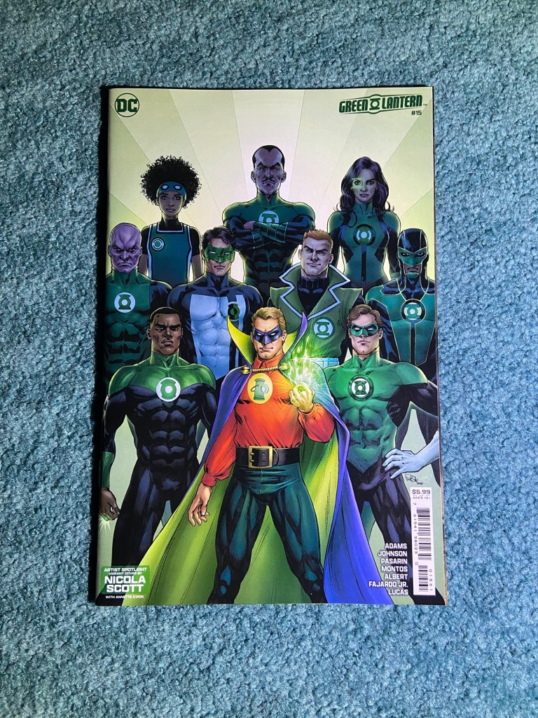
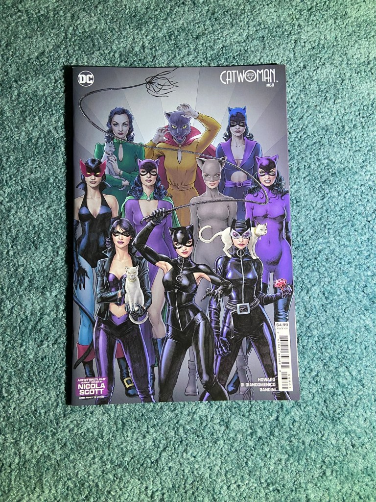
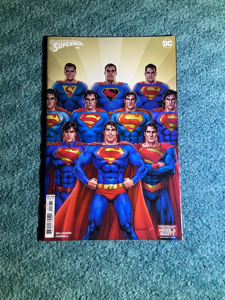
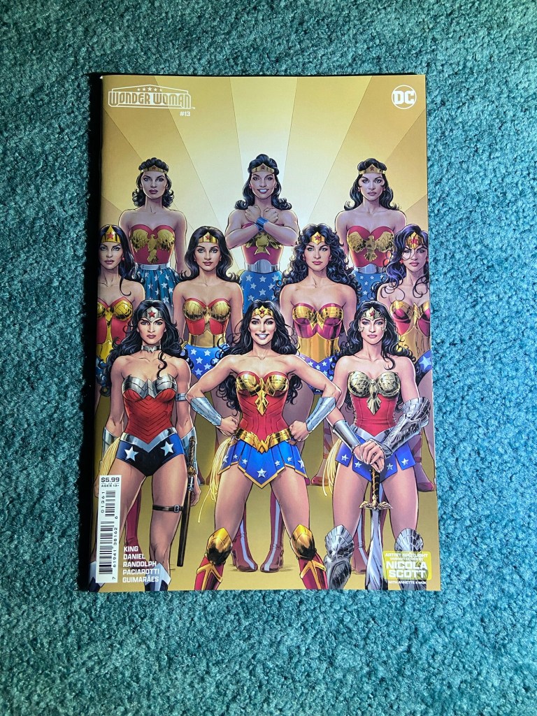
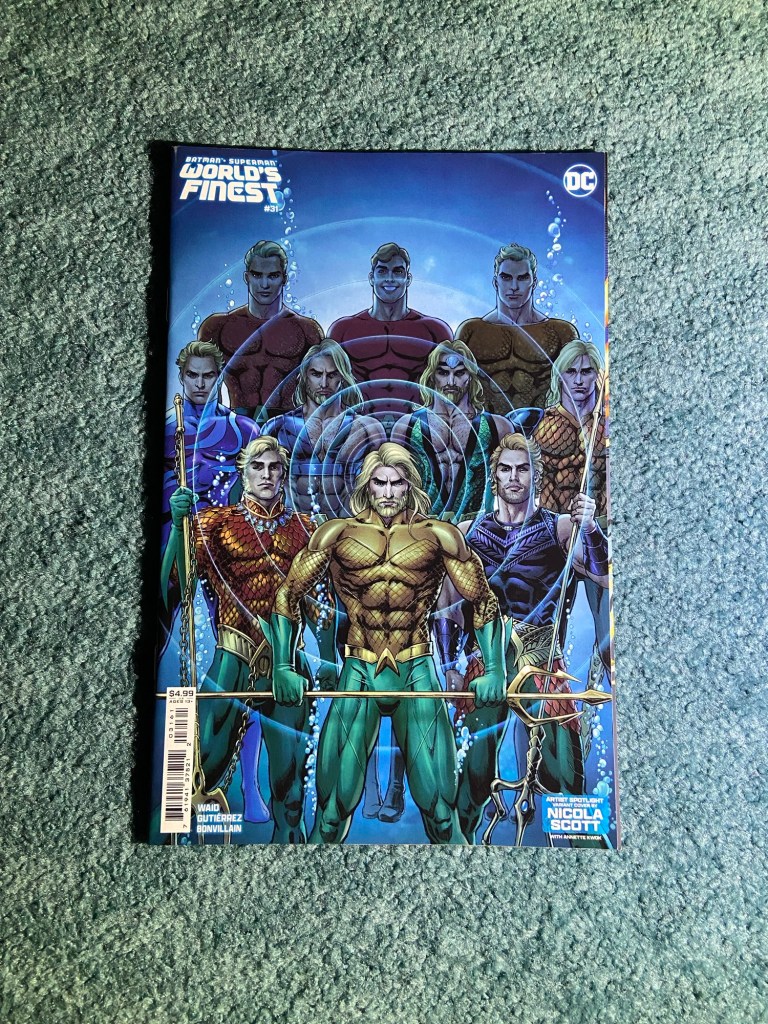
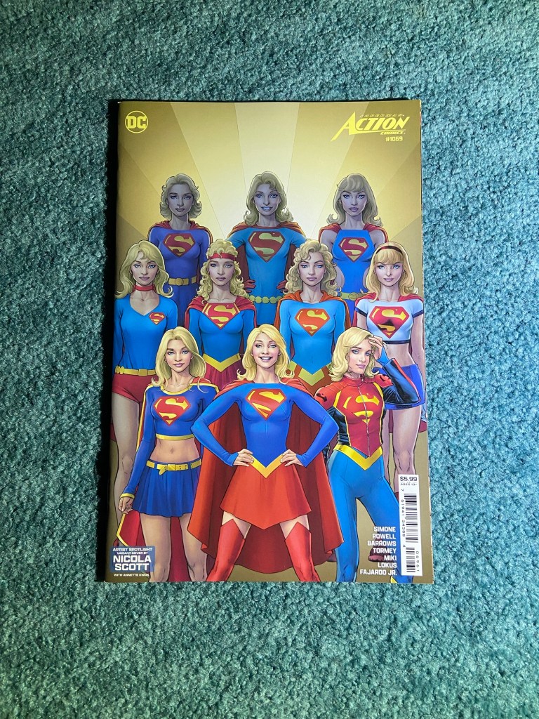
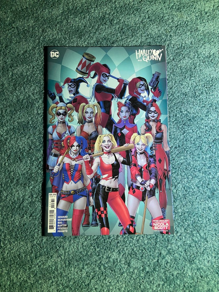
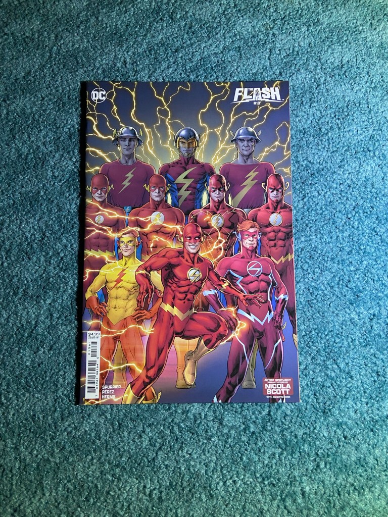
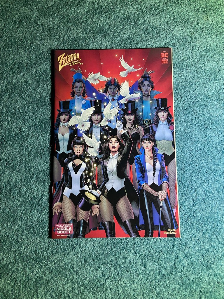
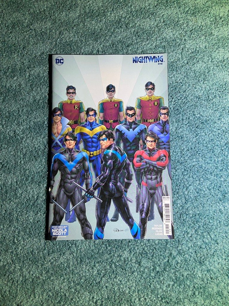
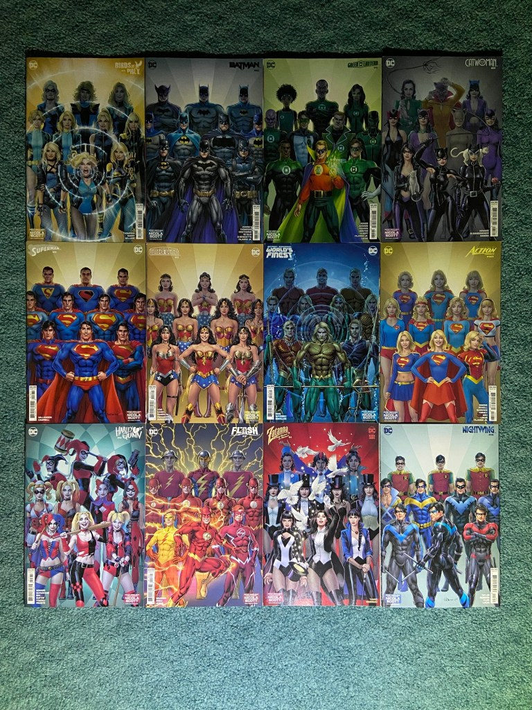
These are the amazing Nicola Scott and Annette Kwok’s costume themed variants!! I love how much detail is in all the costumes throughout the years.
These remind me of Dauterman’s costume covers. You know how I love those too! I certainly should have brought all these to the other room for more light, but it was darker outside by the time I took these photos.
This post will include mostly similarly-themed variants.
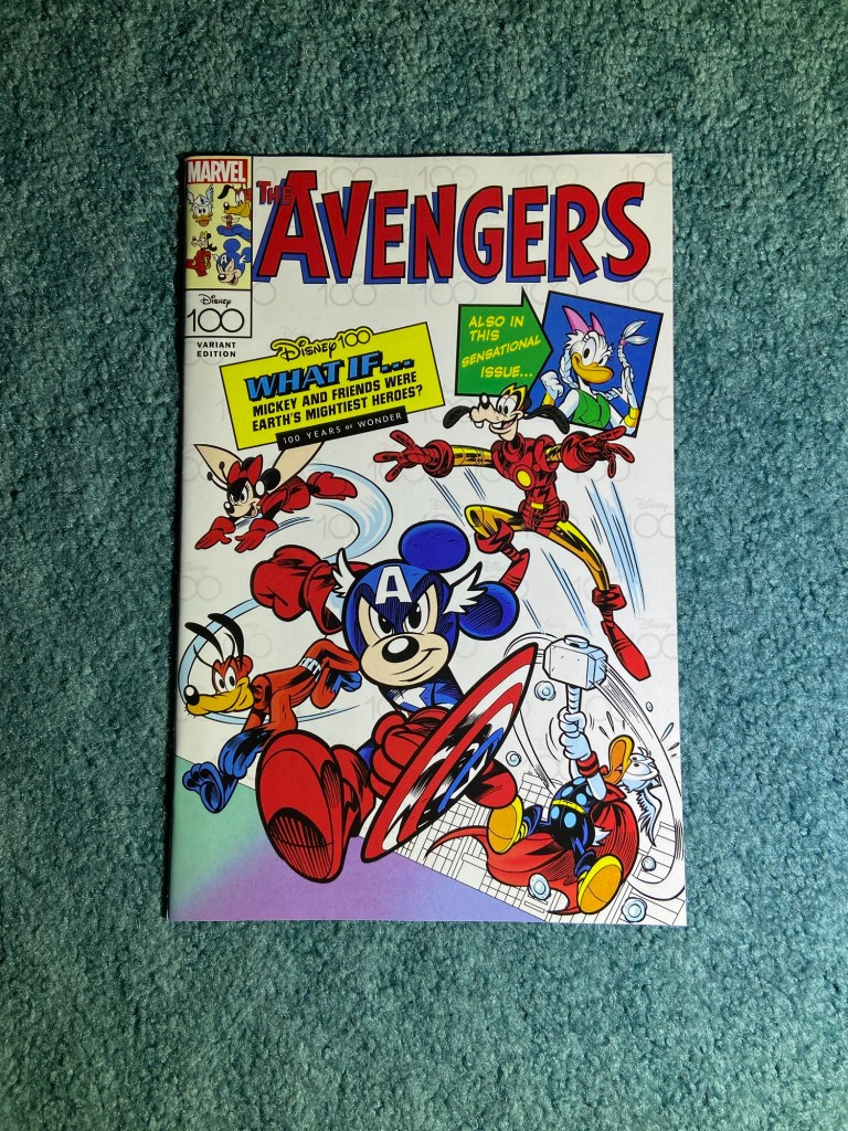
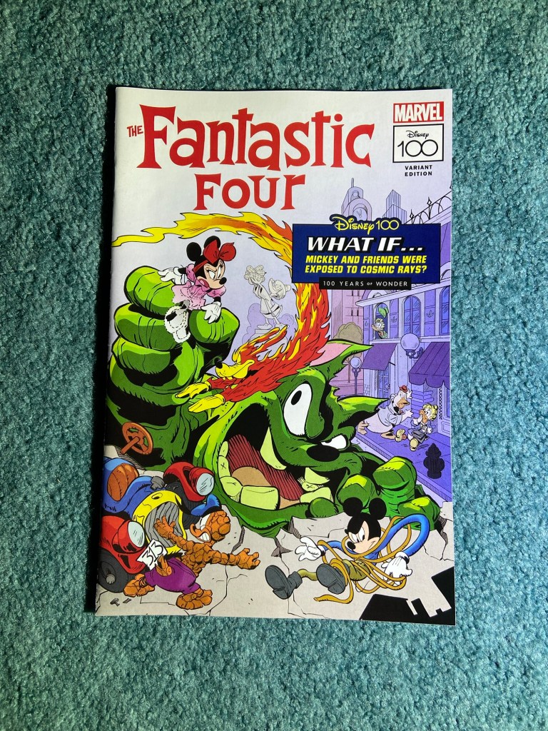
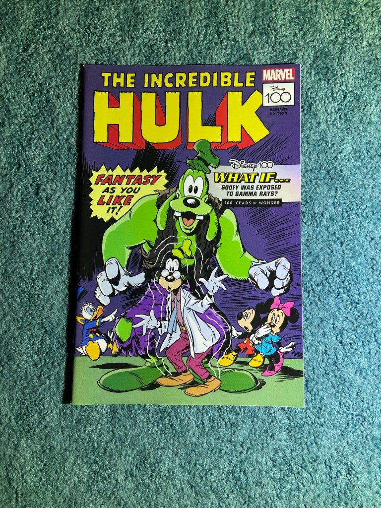
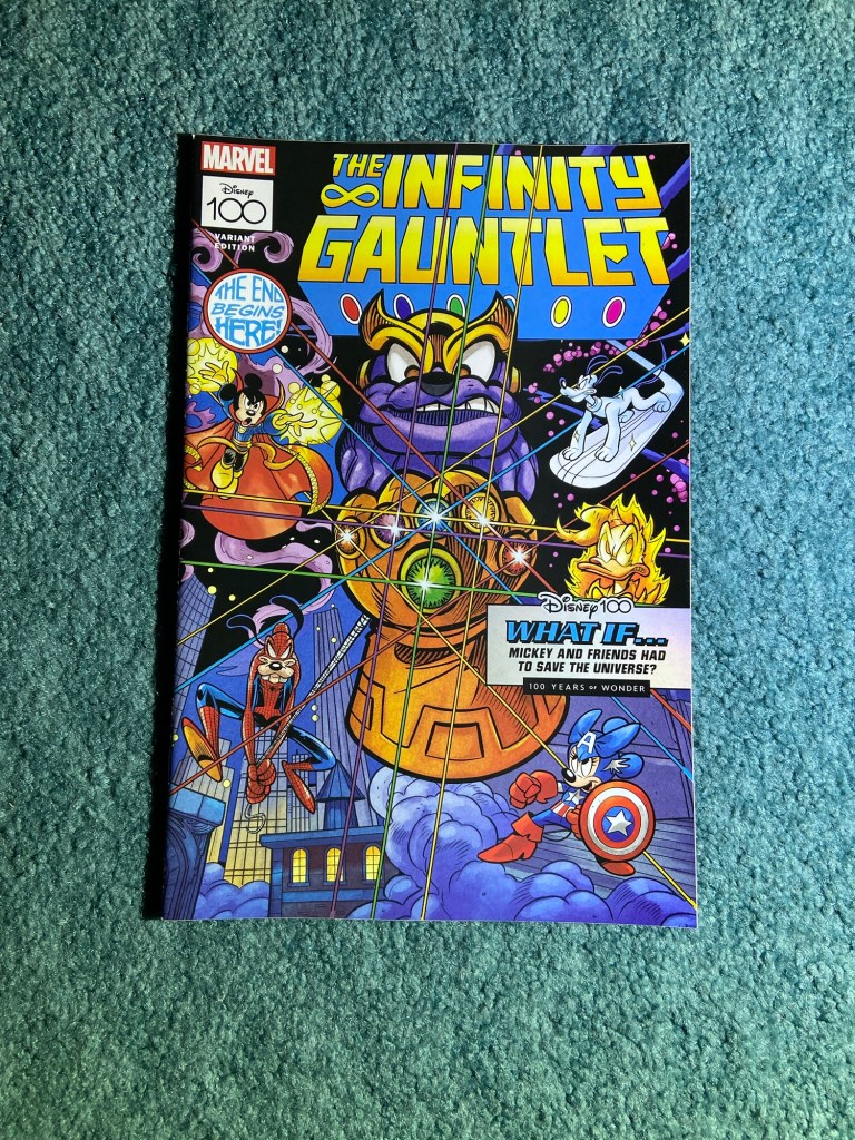
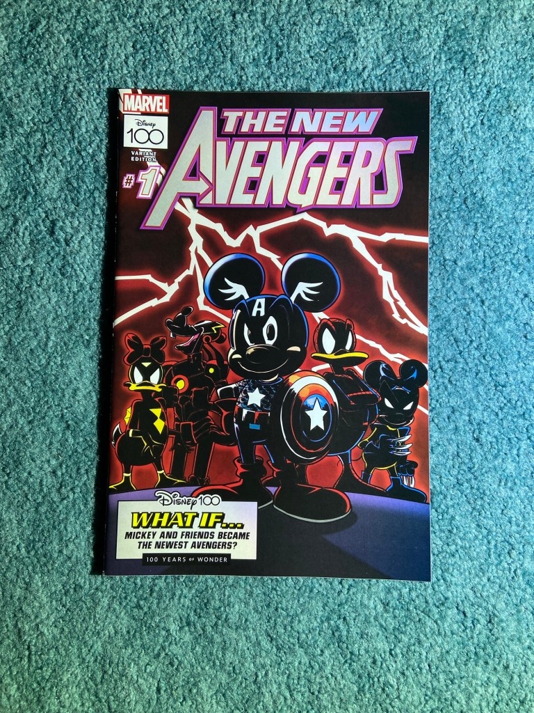
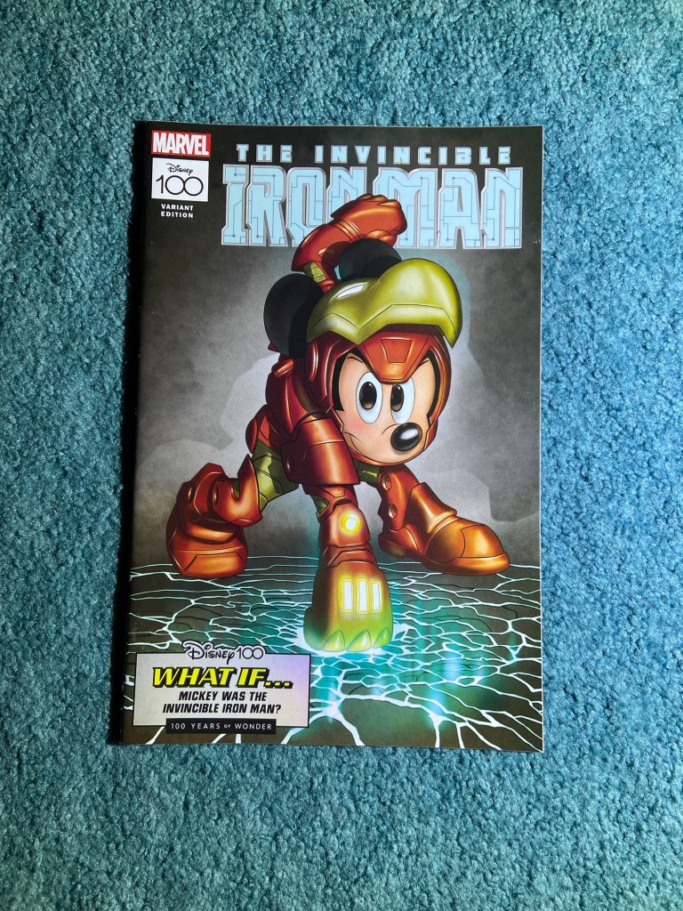
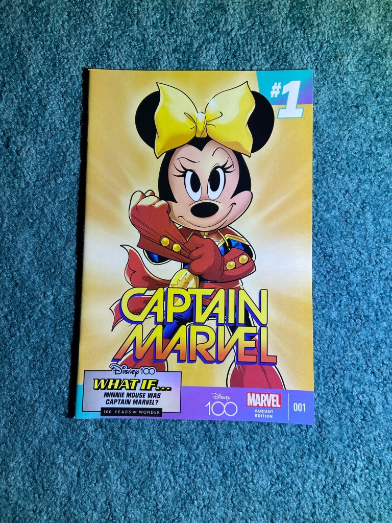
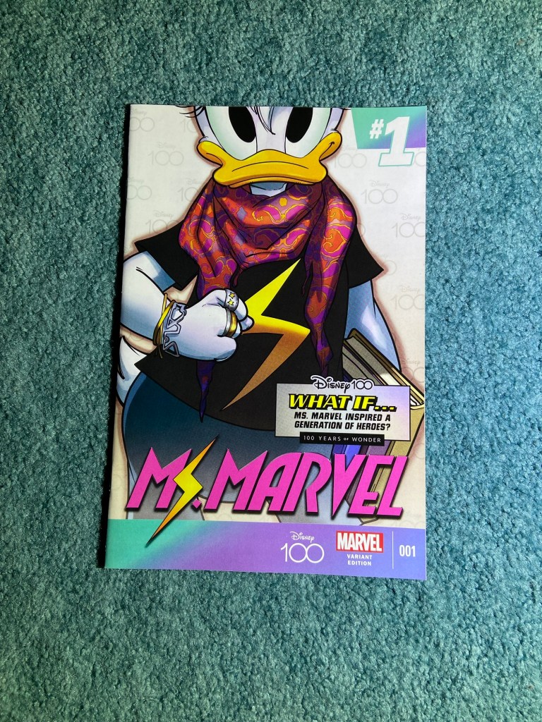
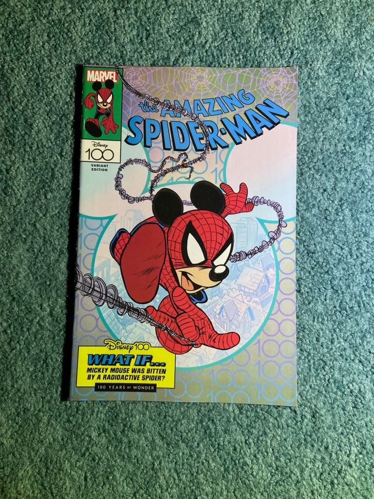
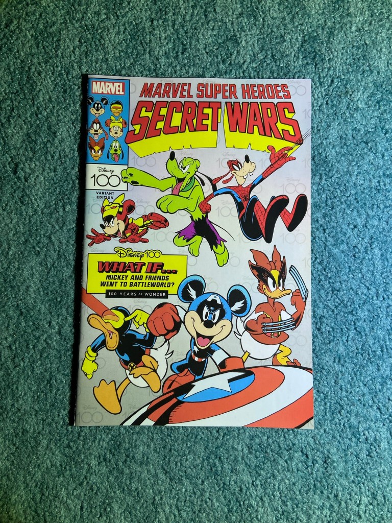
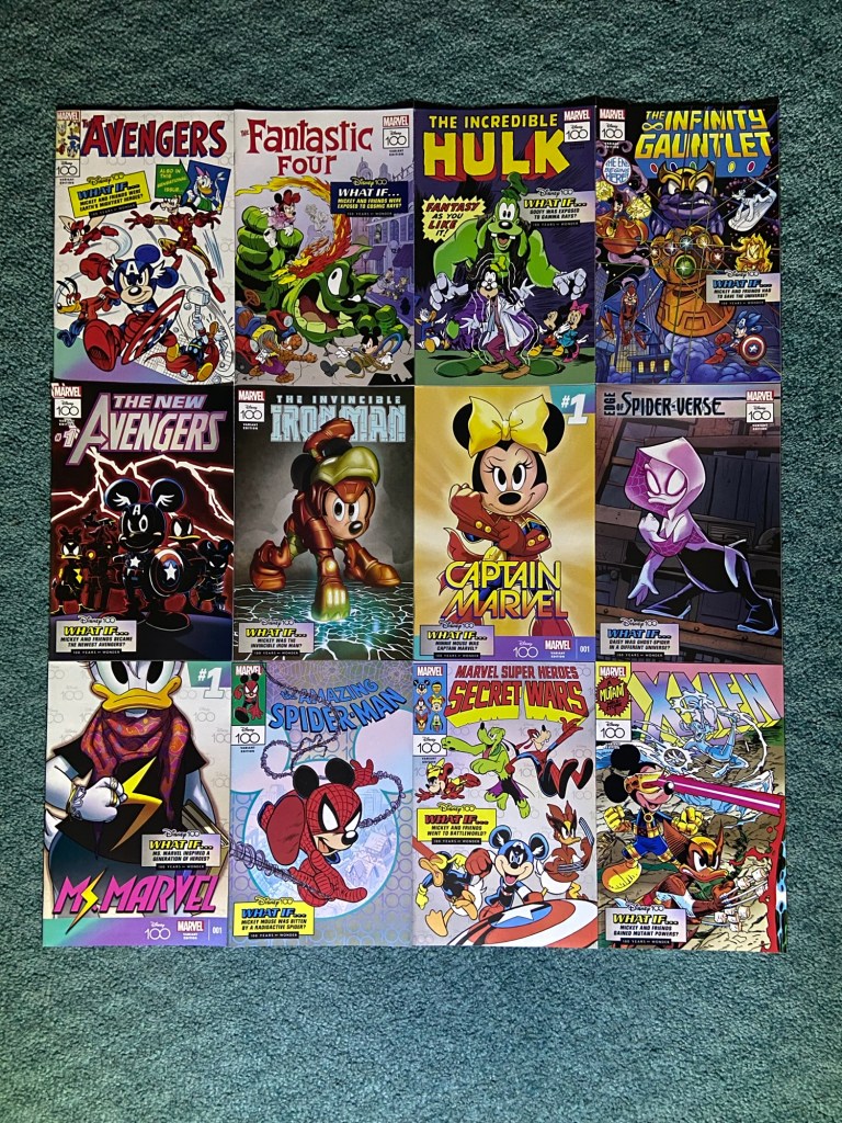
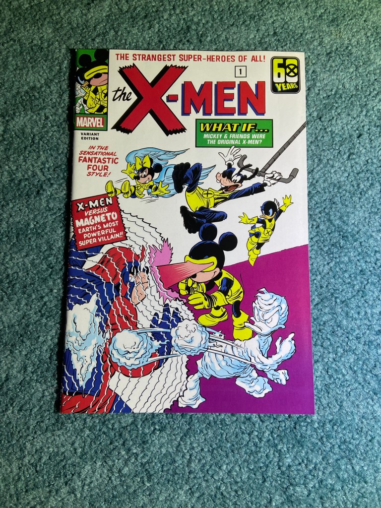
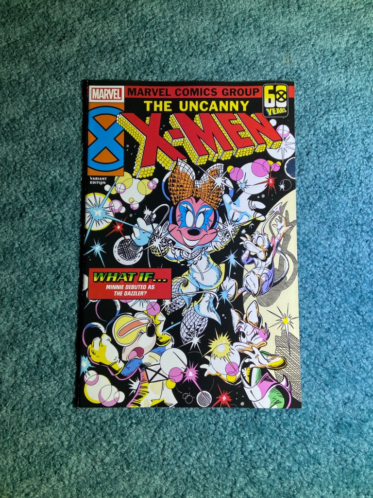
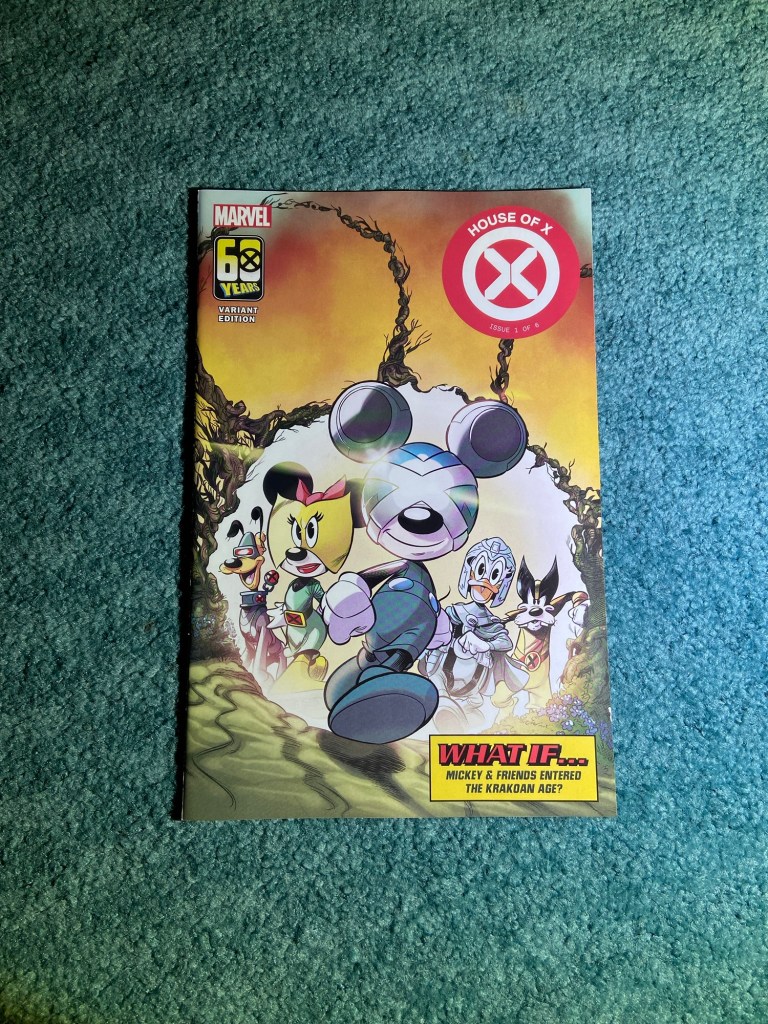
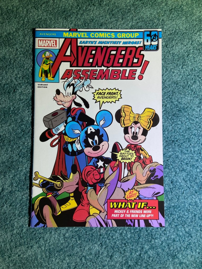
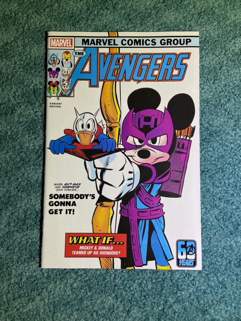
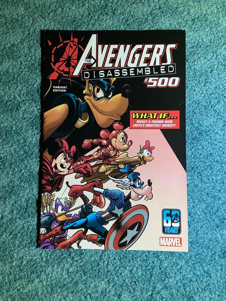
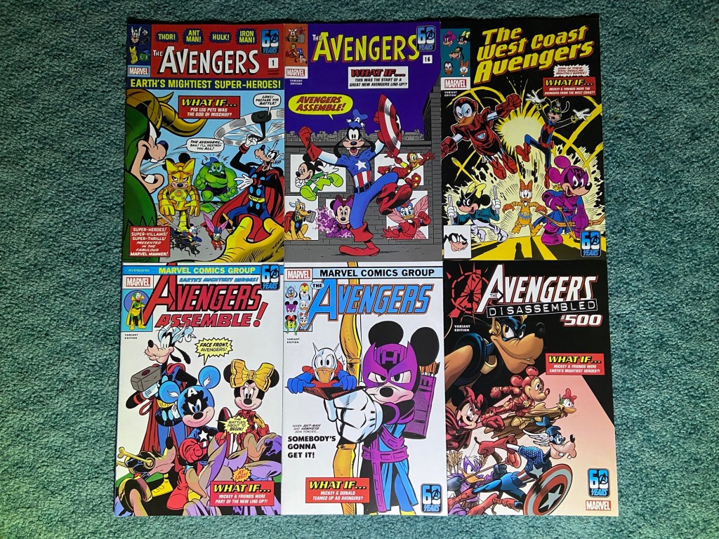
2023 was Disney’s Centennial! And thus, we got the Disney 100 Marvel What If mashup covers! These were so fun to get! They all depicted homages to famous covers from Marvel’s history using Disney’s Mickey and his friends. These were all either Lorenzo Pastrovicchio or Giada Pastrovicchio variants for Amazing Spider-Man.
I could go through all the covers being paid homage to, but I won’t because I feel like most comic fans would know which covers these are representing. They do all look great together.
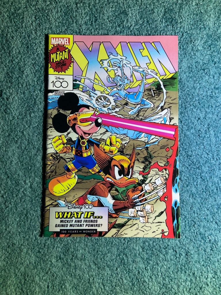
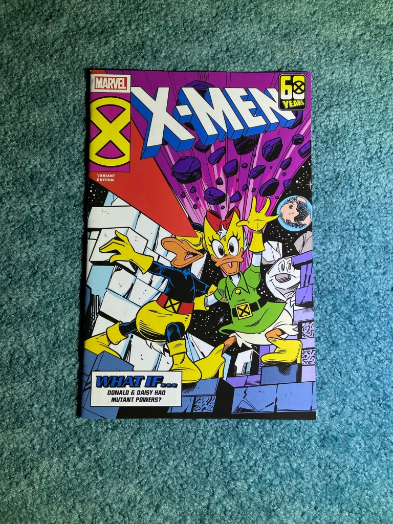
And in 2024, it was X-Men’s 60th Anniversary! So they continued the crossover cover theme through specific X-Men covers. Still variants for Amazing Spider-Man.
Another great set!
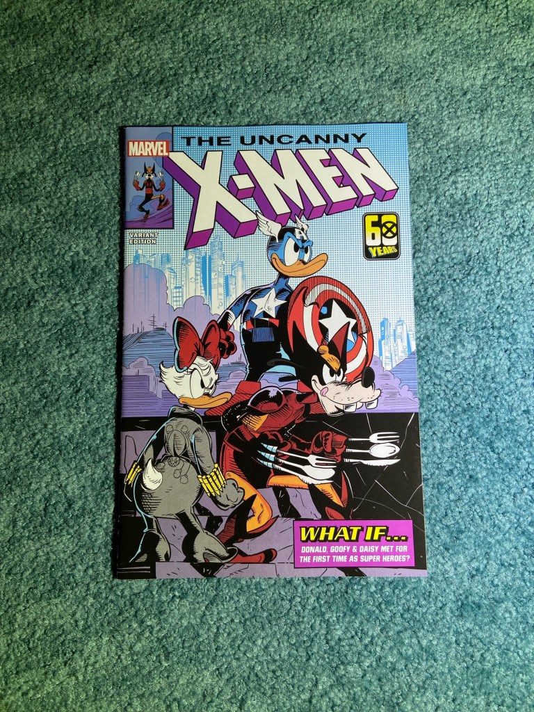
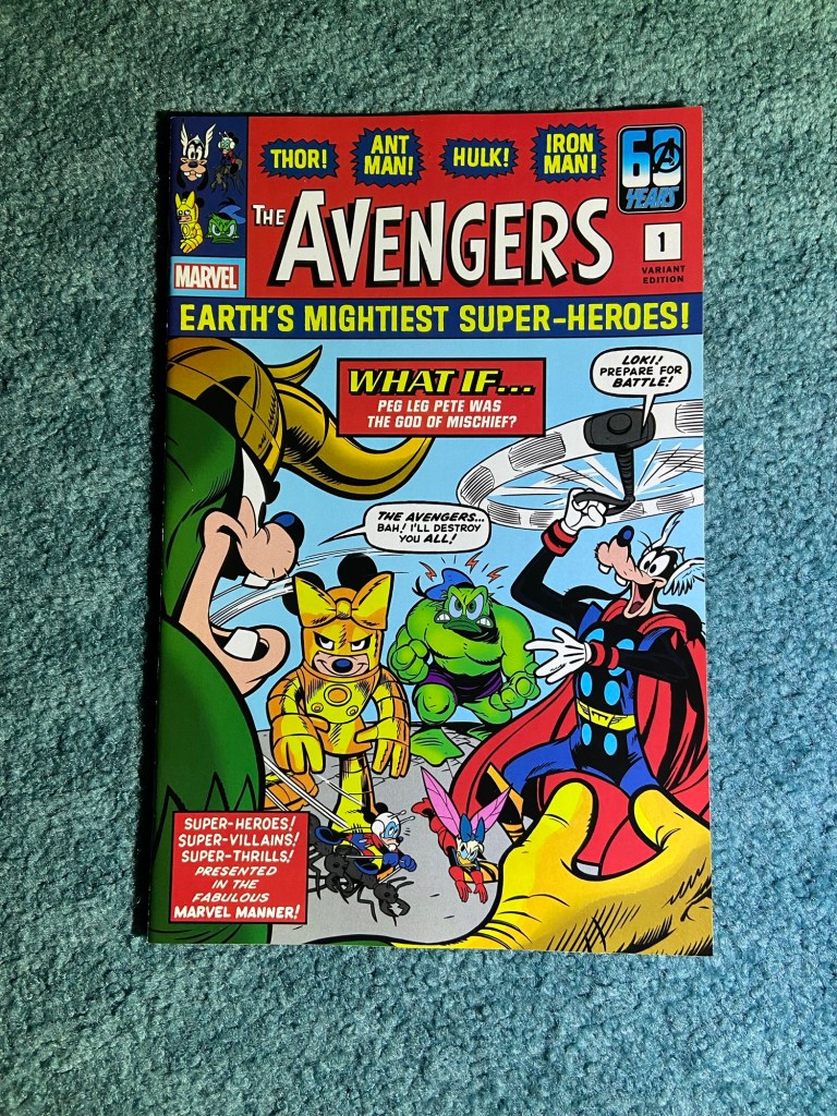
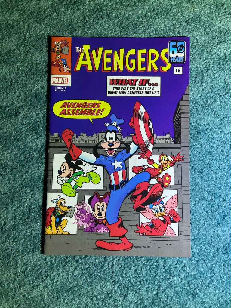
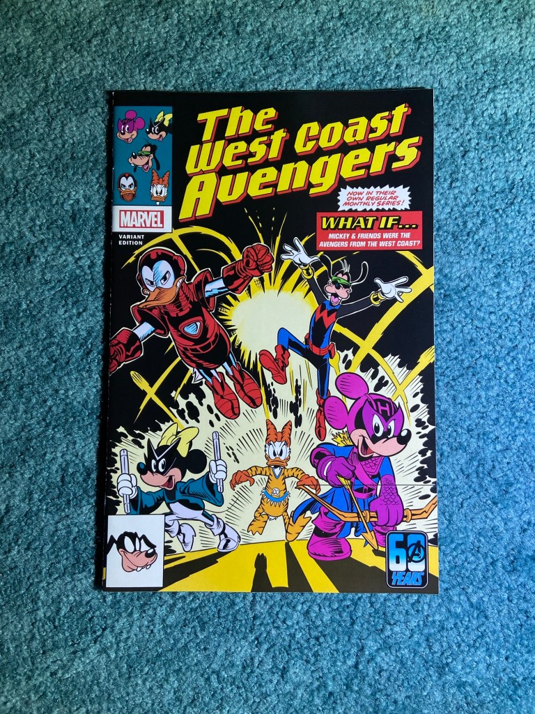
And guess what? It was also The Avengers 60th Anniversary in 2024. So, most of the alternating covers for the previously mentioned Amazing Spider-Man variants were these covers.
And of course these were homage covers for various classic Avengers comics.
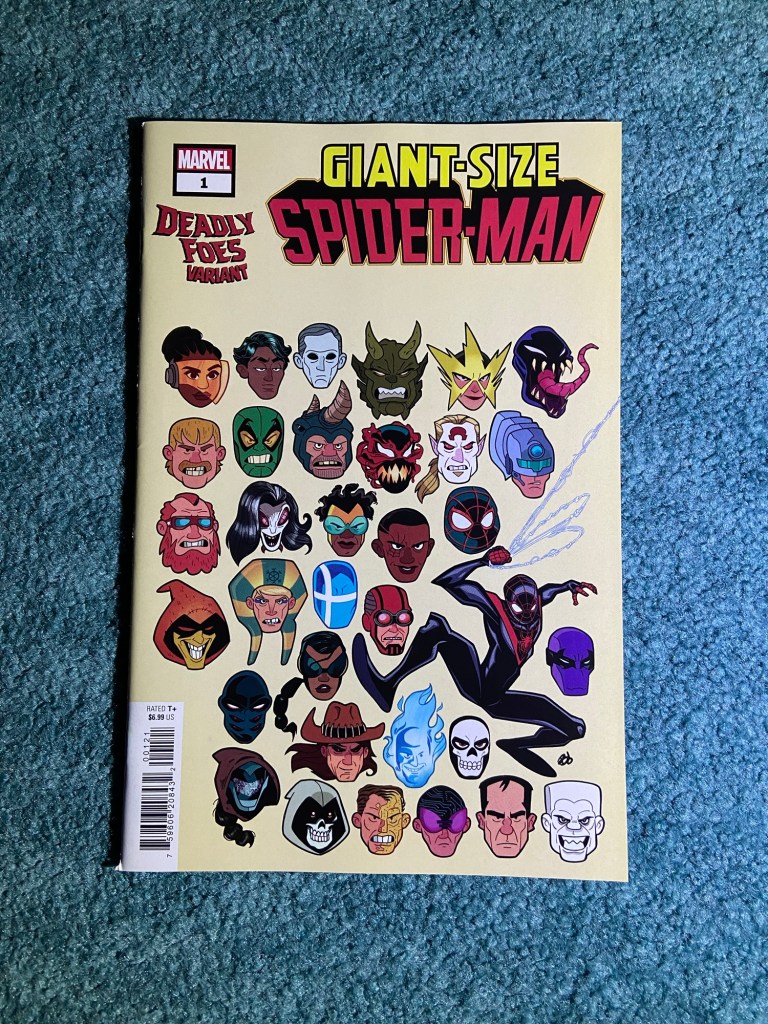
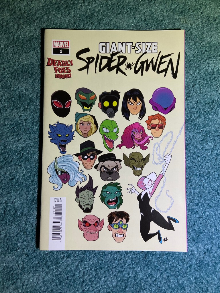
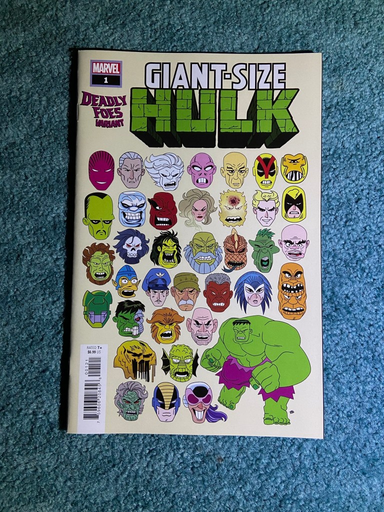
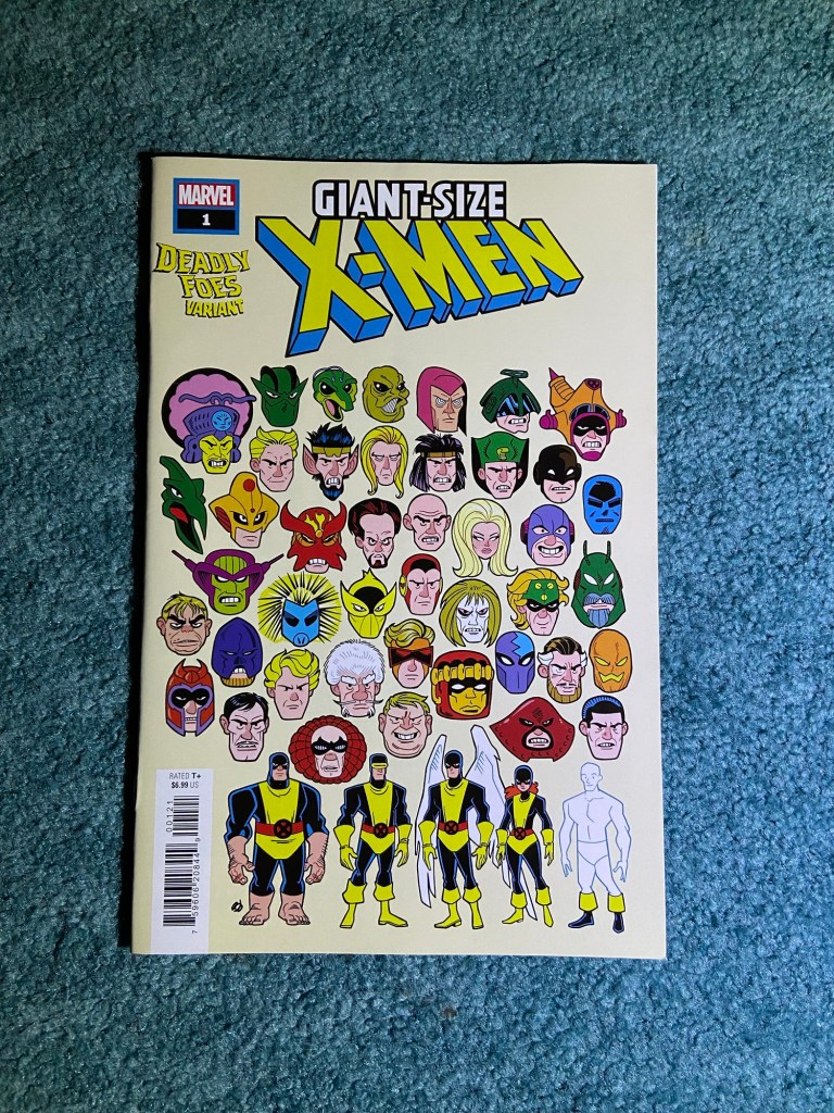
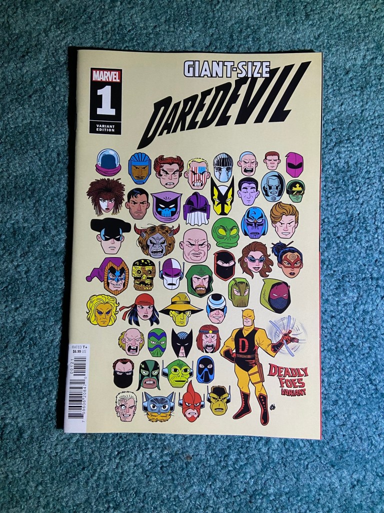
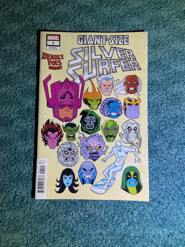
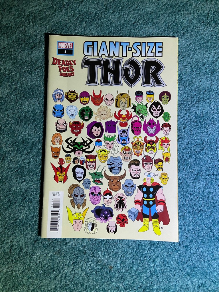
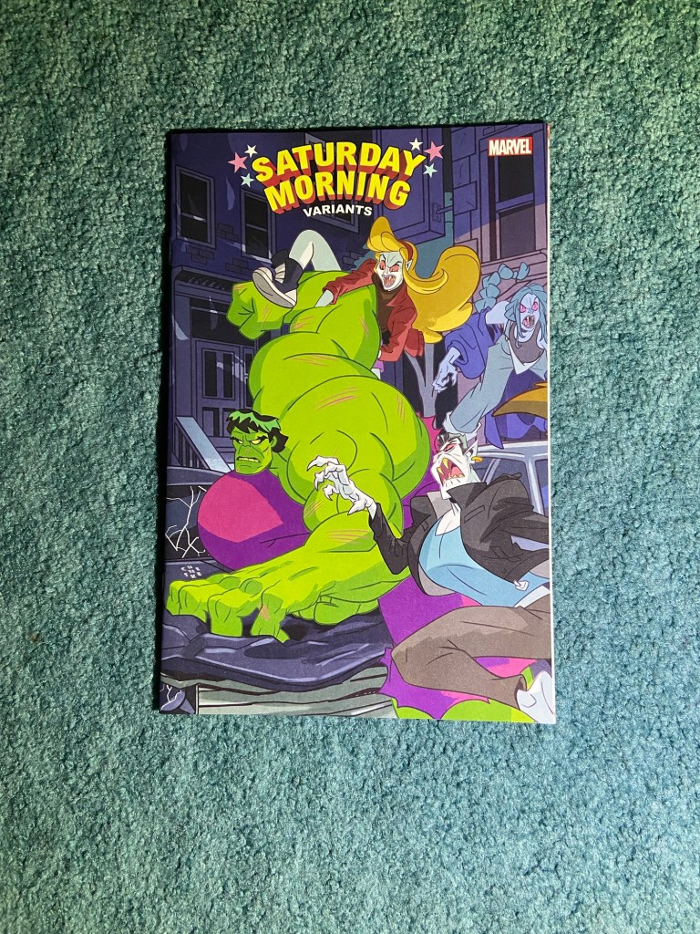
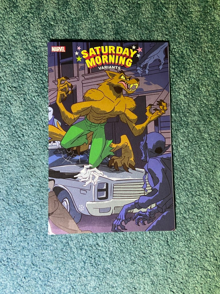
This next sets’ covers were in the art style of animation. These all showed the villains of each particular hero. The wonderful Dave Bardin did all these.
Now, I’m not 100% sure that these are all the covers because when I tried looking a list up, I didn’t find any lists nor did I find any full sets on sale anywhere. So, if next variant sorting time, I find another, I’ll add it and do another photo. These all look great!
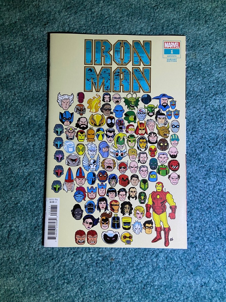
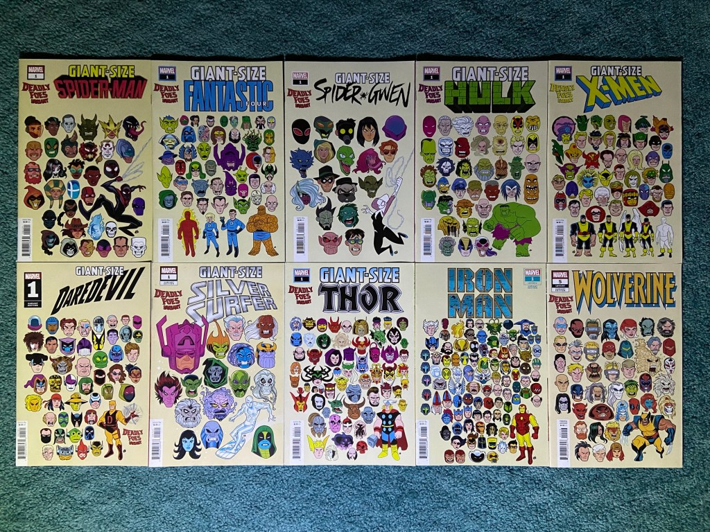
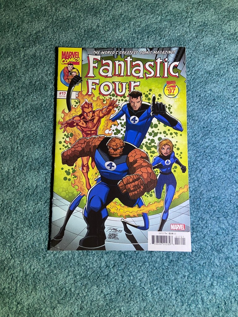
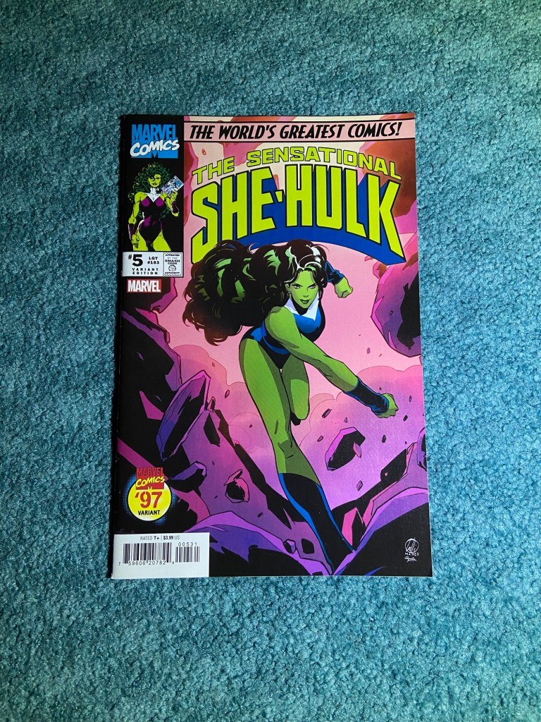
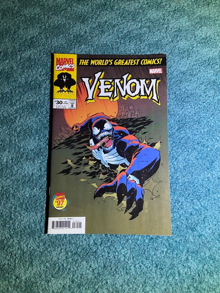
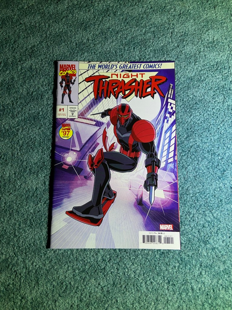
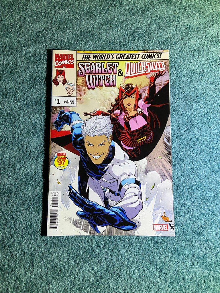
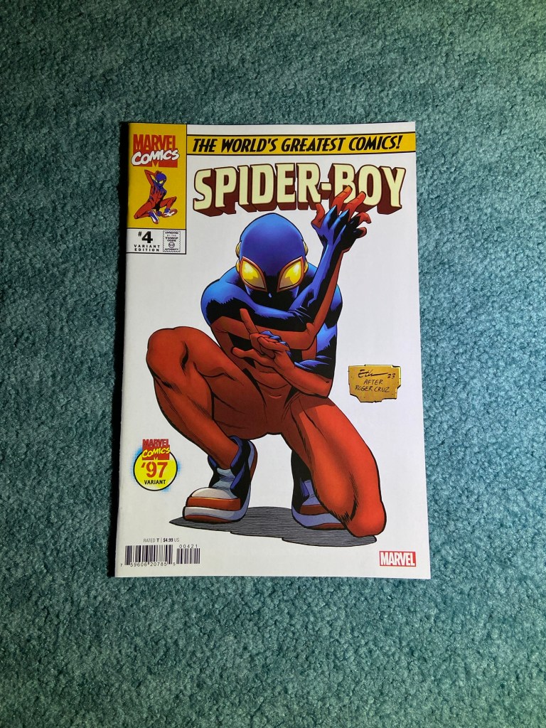
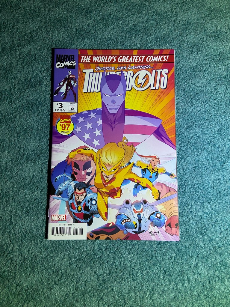
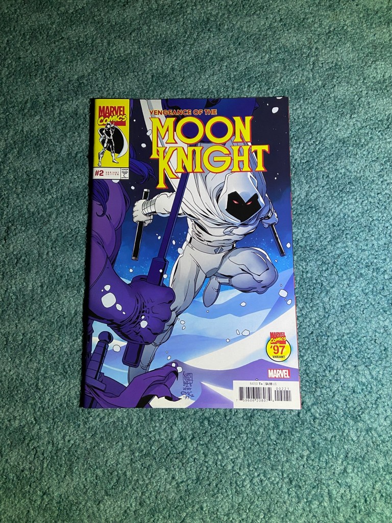
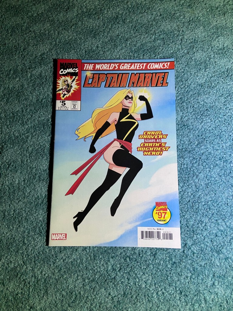
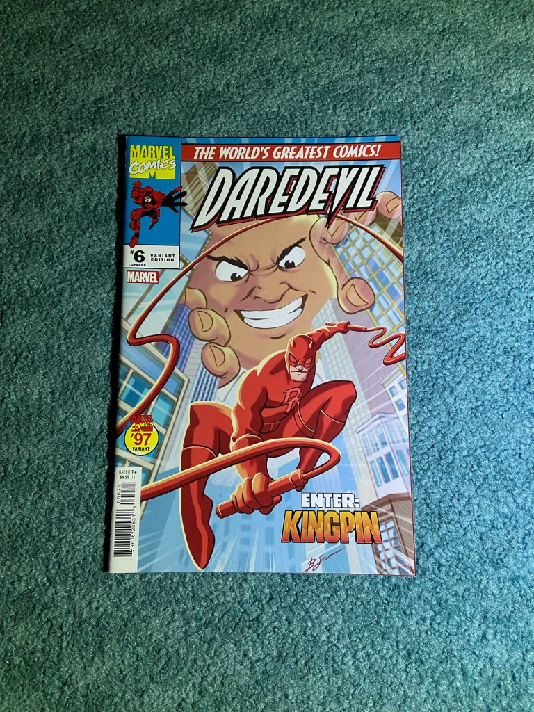
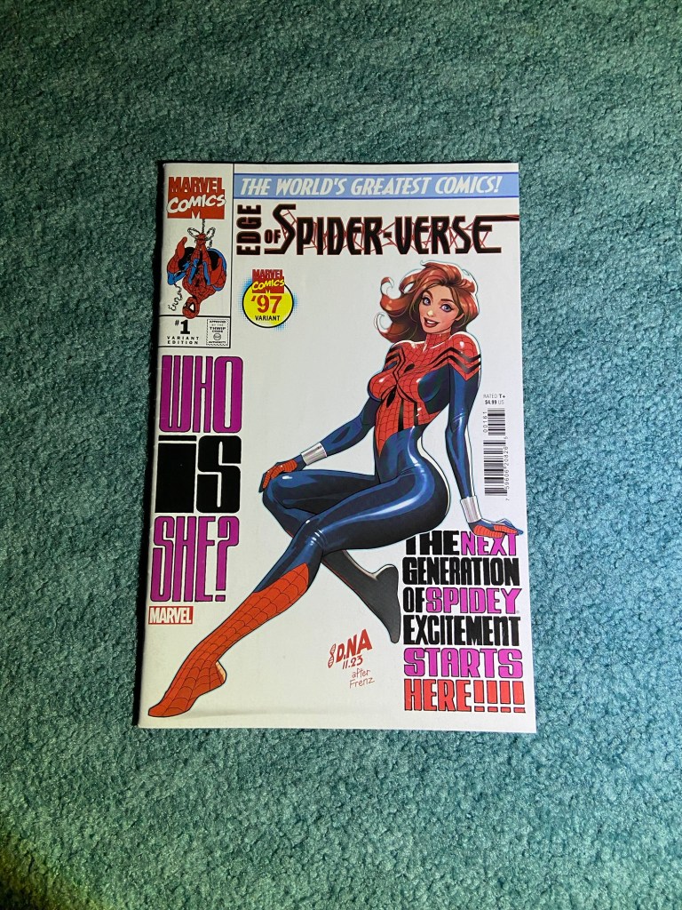
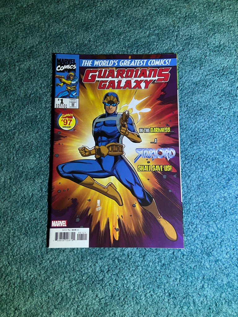
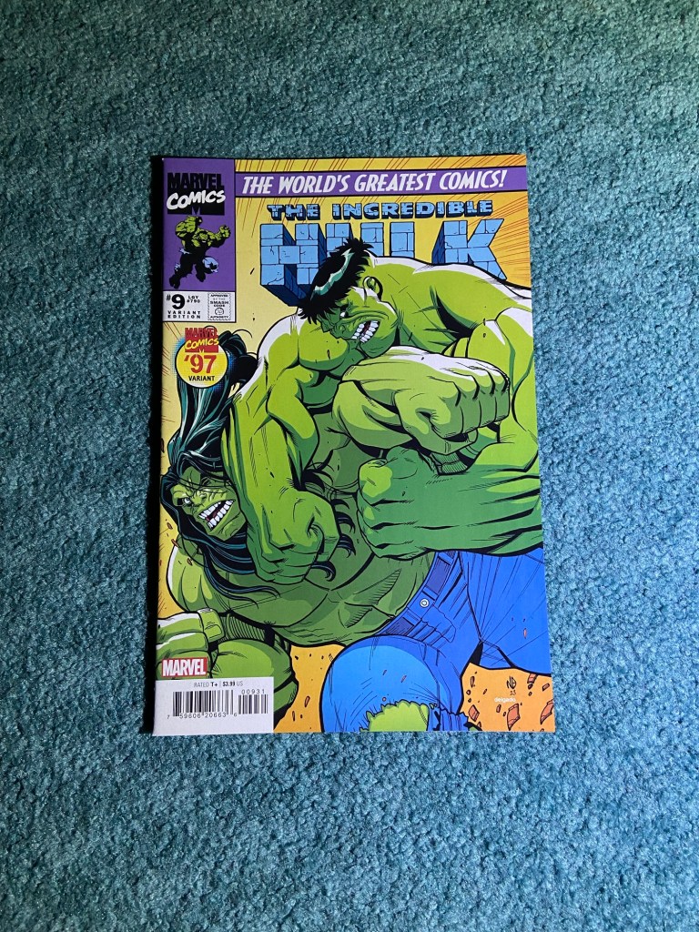
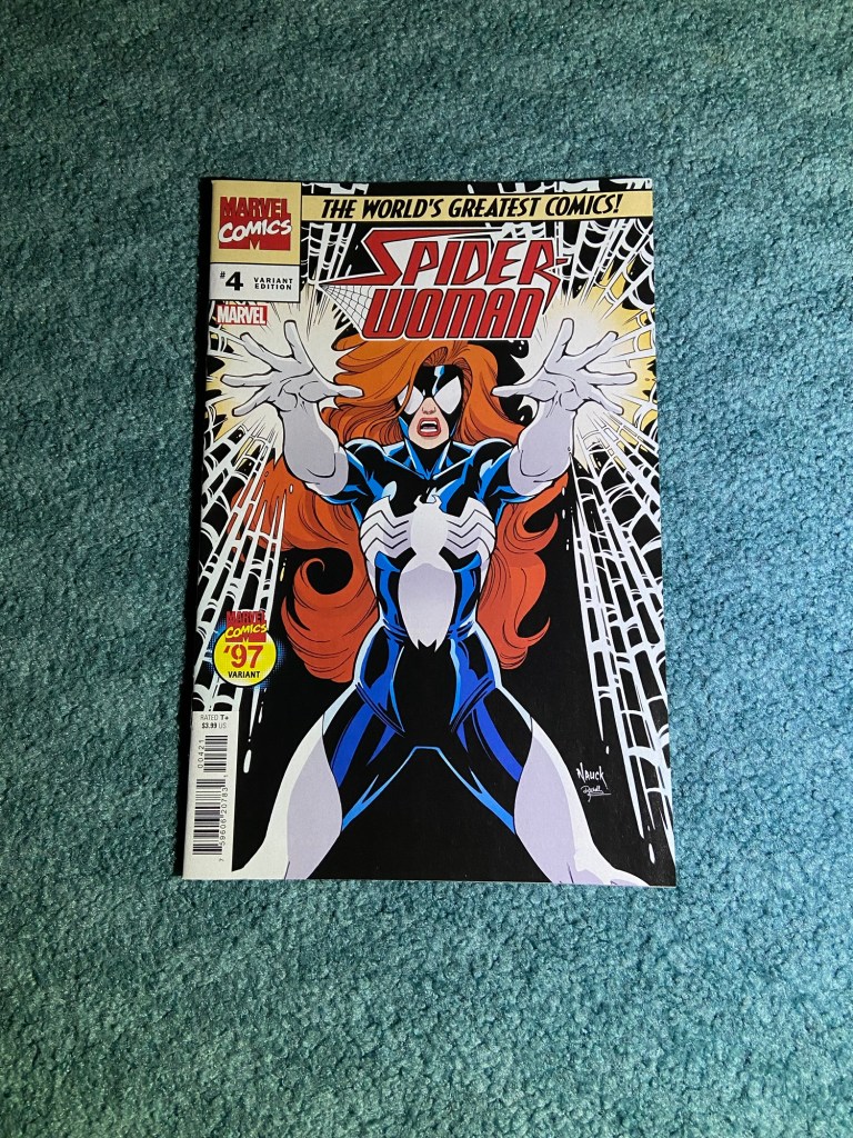
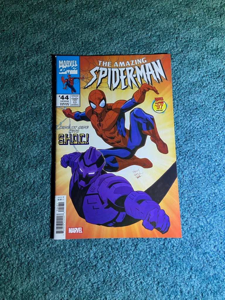
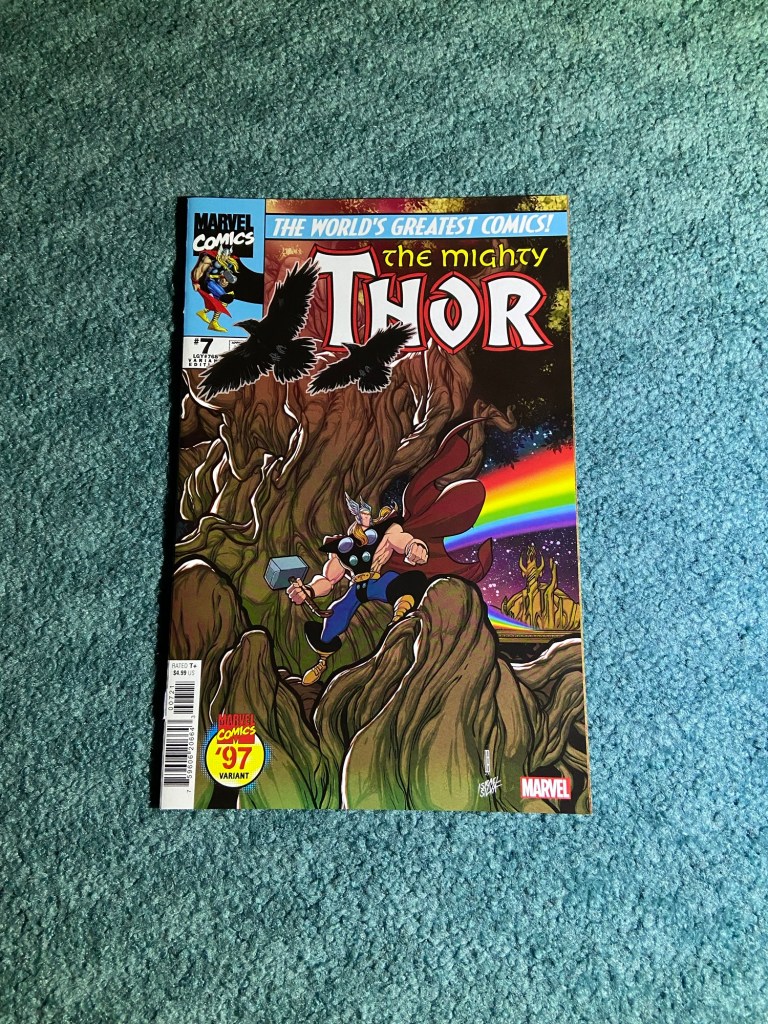
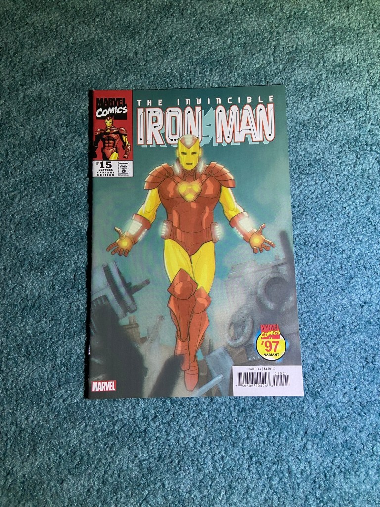
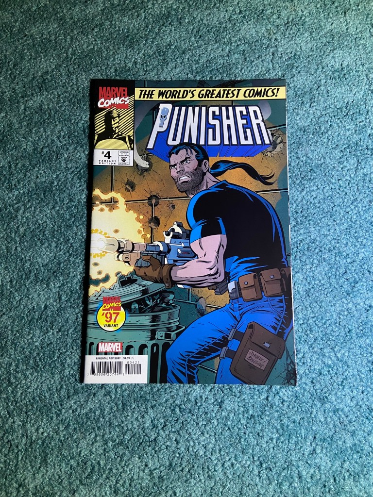
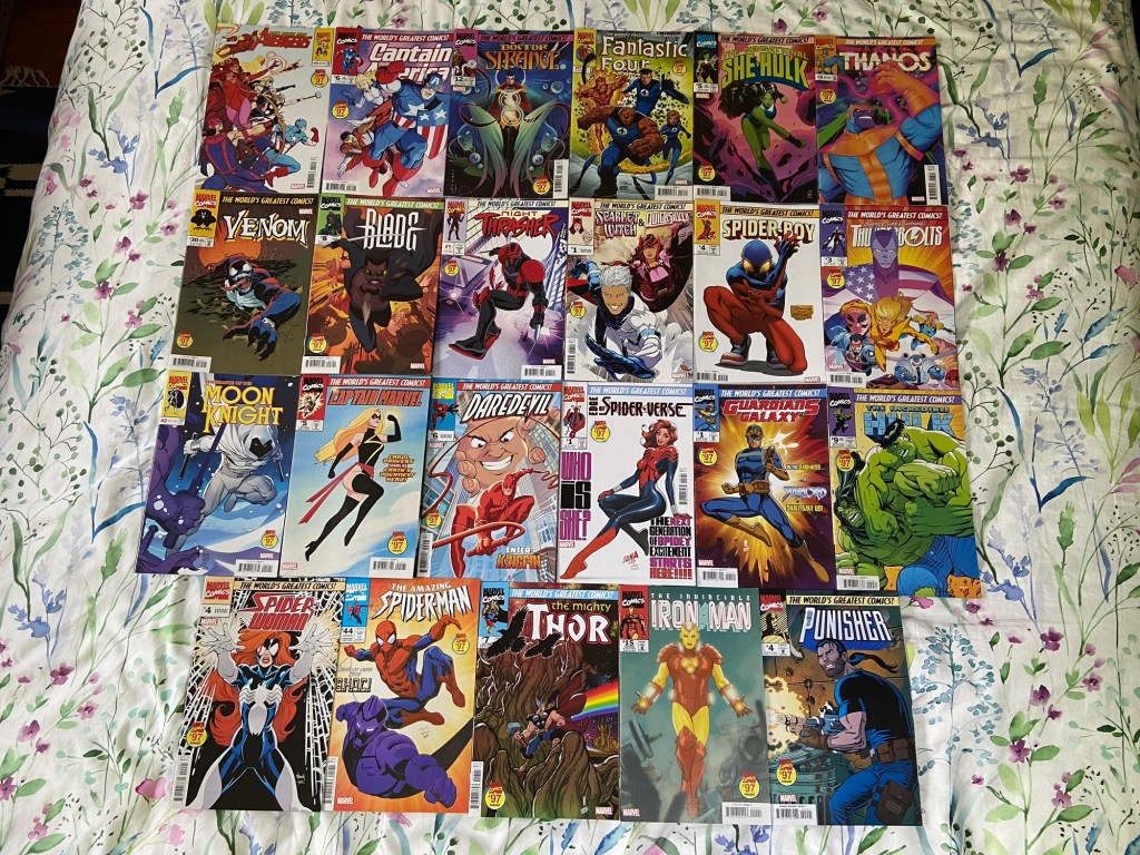
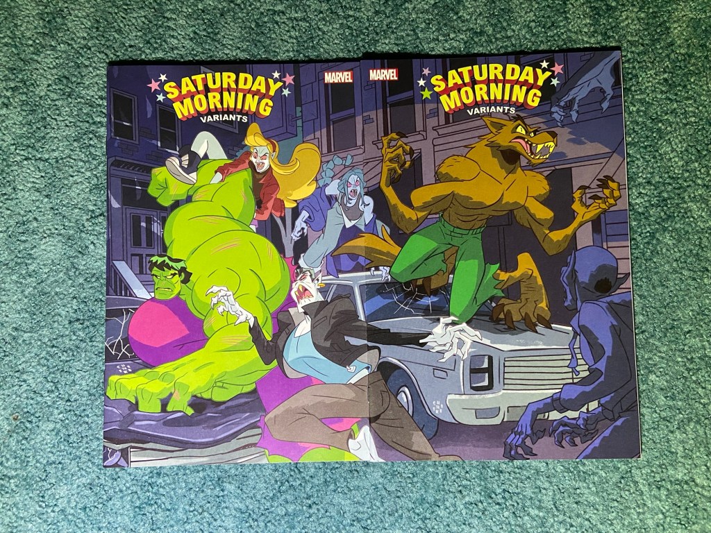
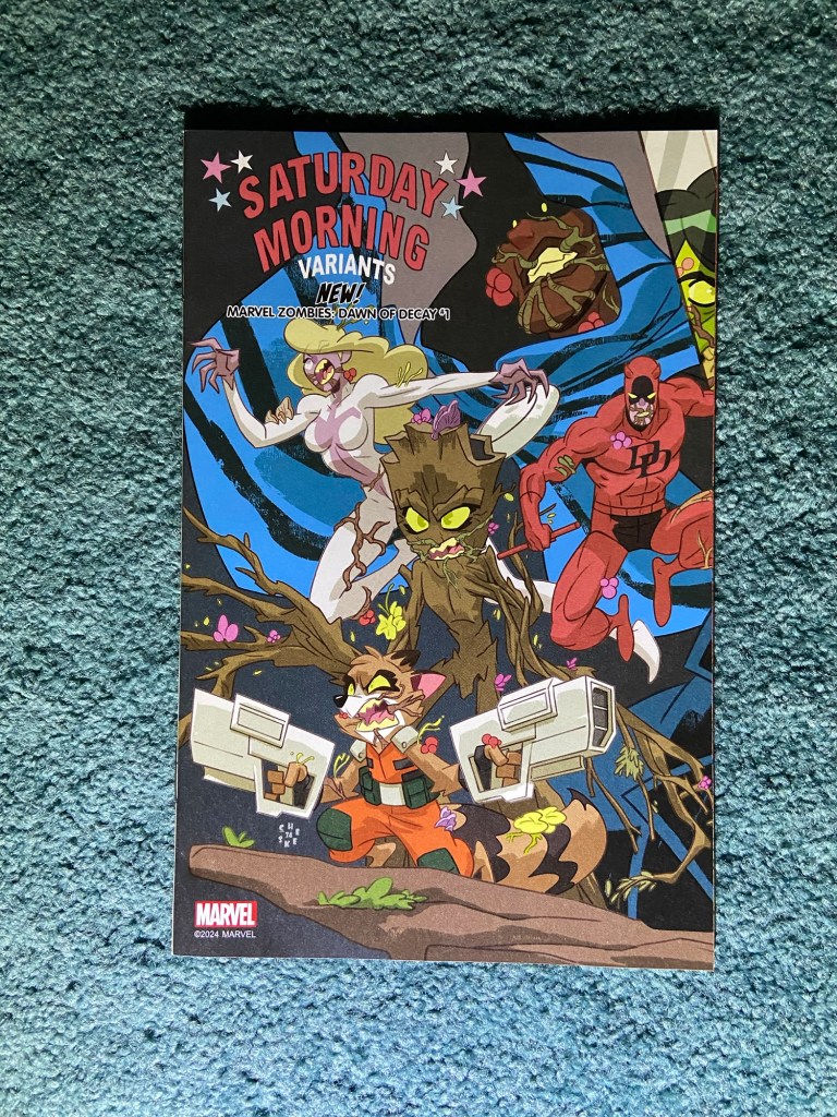
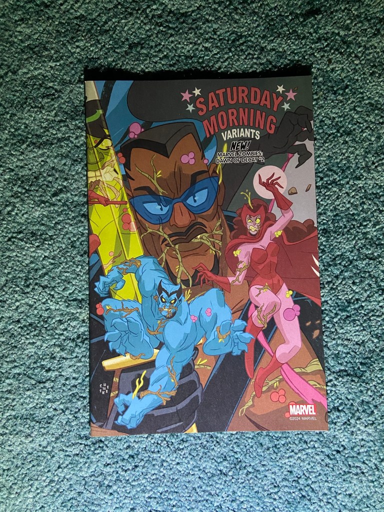
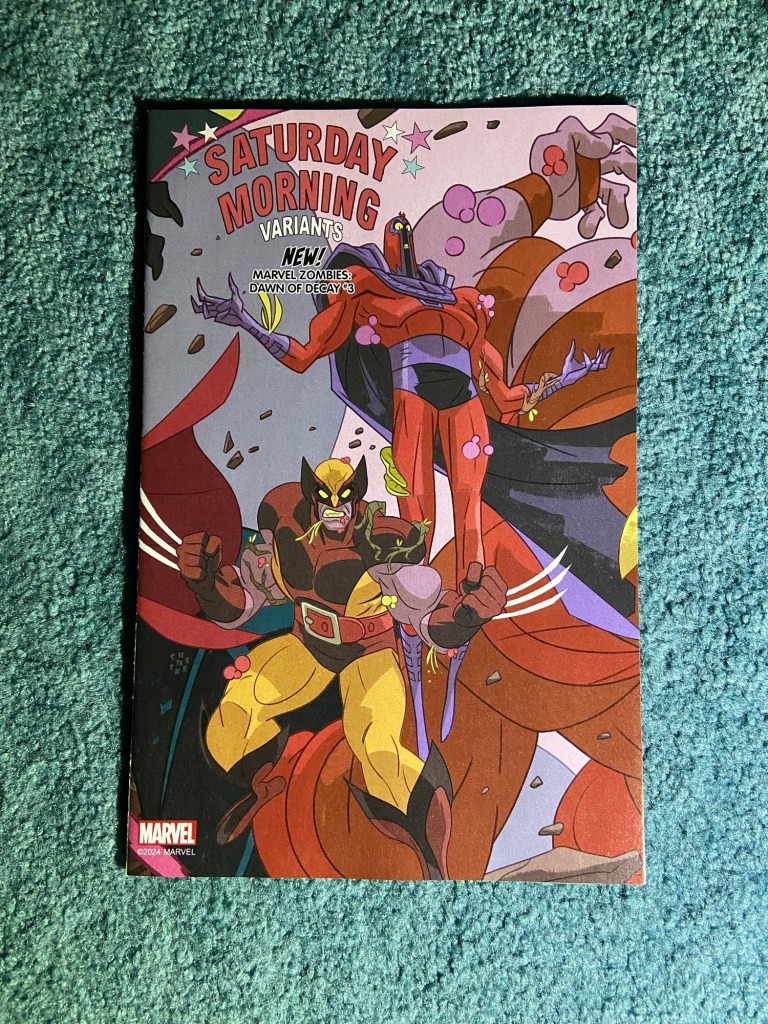
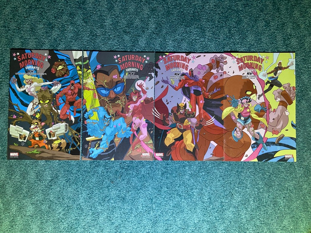
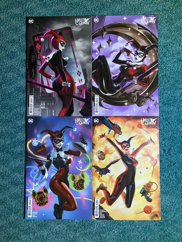
23 covers! This is the Marvel ‘97 cartoon themed set by various artists. For each photo of them I’ve added the artist in the caption.
Jamie McKelviePete WoodsKaren S. Darboe and Jesus AburtovRon Lim and Israel SilvaMatteo Lolli and Rachelle RosenbergDoalyMike Henderson and Nolan WoodardLeinil Francis Yu and Rachelle RosenbergLuciano Vecchio Paulo SiqueiraEthan Young Scott GodlewskiGiuseppe Camuncoli and Alex SinclairAnnie WuBenjamin SuDavid NakayamaPaco Medina and Israel SilvaNick Bradshaw and Edgar DelgadoTodd Nauck and Rachelle RosenbergCarlos Gómez and Rachelle RosenbergDavid Baldeón and Israel SilvaPhil NotoDan Jurgens, Brett Breeding and Rachelle Rosenberg
Such a fun set! I love the all the styles while still fitting into the 90’s cartoon theme.
This will be 4 posts for these complete sets. the first three posts are all of sets that I’d mostly collected during the sorting back in June and I needed 1-3 more covers to finish. The last post will be sets that are new.
These two first sets were ones where I thought I had all the covers of the set, but I was either wrong or just forgot about.
This Momoko set you’ll recognize from a previous collection post. For this set, this Peter Parker cover came out months after the other issues. So it’s not a set within a title, but it’s obviously the same style. They all look so good!! I’d love to see more Spider-characters in this design style.
The same story with this J. Scott Campbell cover! I thought it was a four-issue set, but nope, it’s five…though, I hope I’m not forgetting another one. Well, we’ll see next time.
And of course, they all look amazing together.
Jenny Frison! I’ve been waiting to see this set together for three years! And it did not fail to astonish. This also made me excited to eventually get to a huge box of so many variants from when I first started collecting since that has a bunch more covers from Frison as-well-as a few others of my favorites. That was before I’d used the small boxes, so they were all in a huge box. One day during the early pandemic i sat down and sorted out all the variants that I wanted in their own place and the just cool cover variants. So I have that huge box with a bunch more to be sorted. But I wanted to catch up with present day variants before I tackle that box.
Look at this set!! I purposefully had the light above since the covers at the top wanted more light. And I just didn’t want to do another photos with the light coming from below. I love Jenny Frison’s art!!
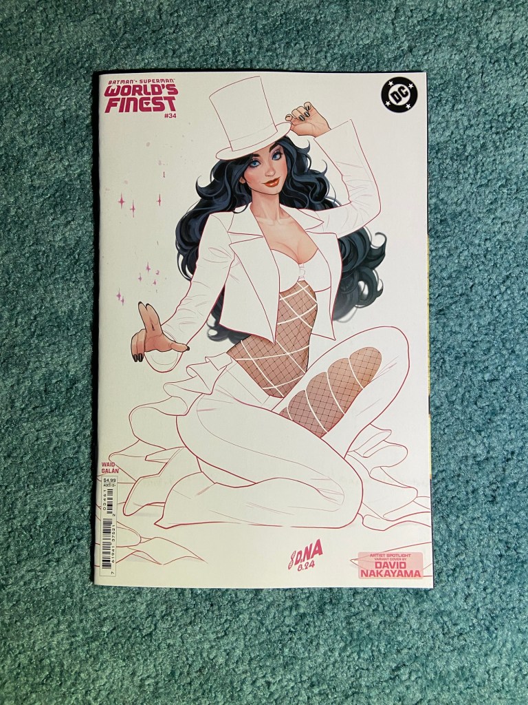
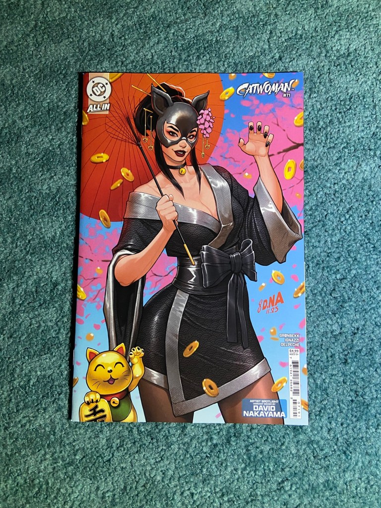
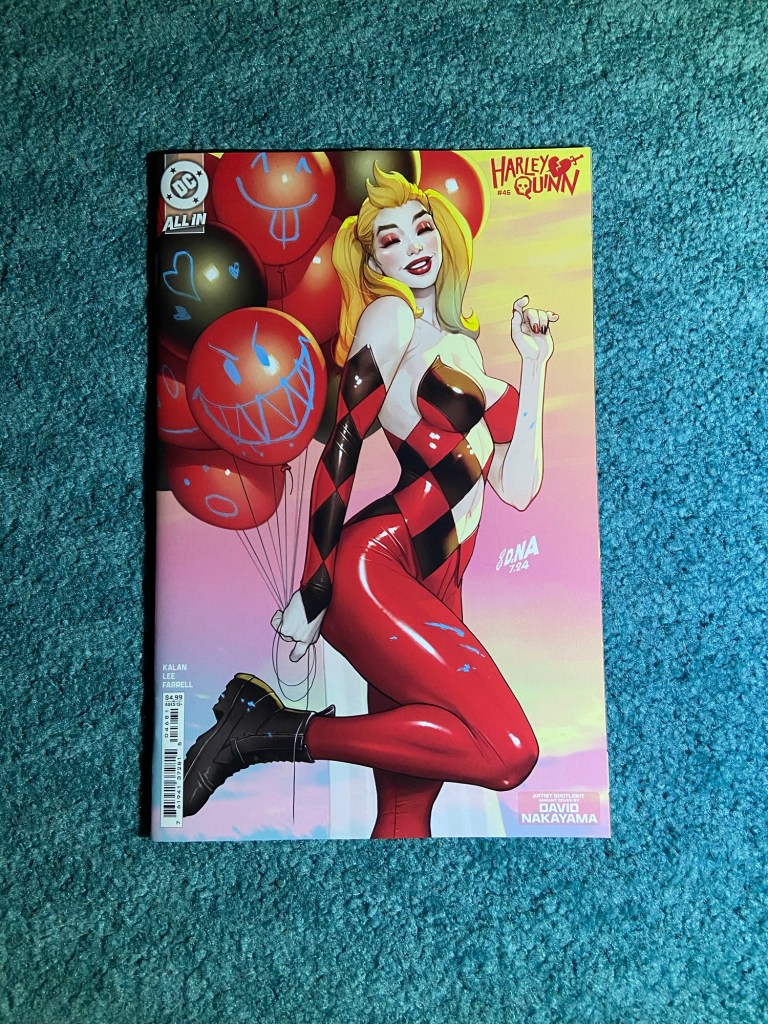
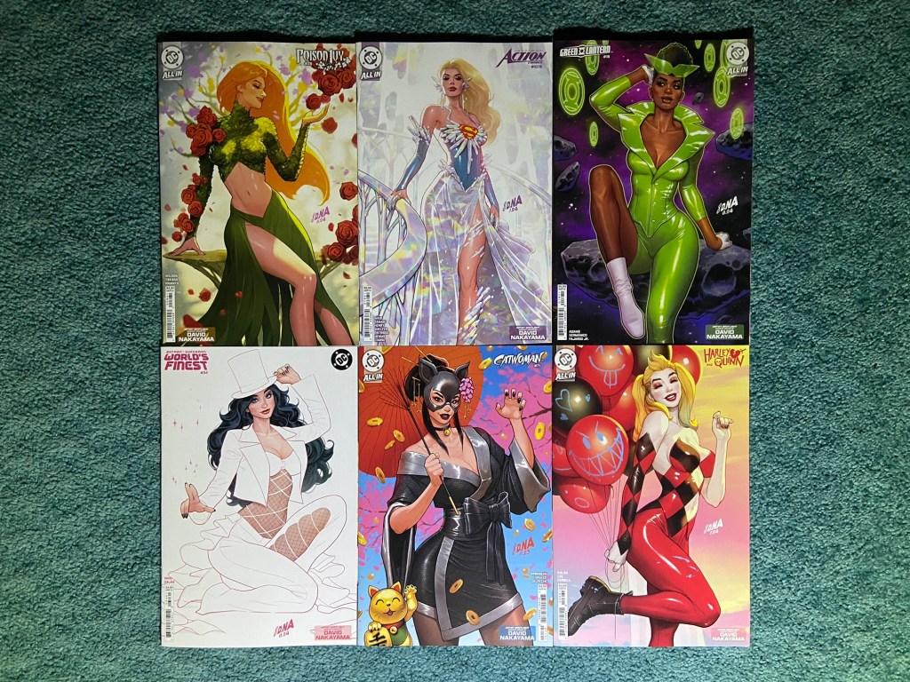
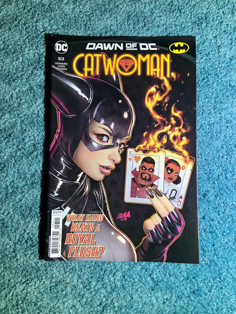
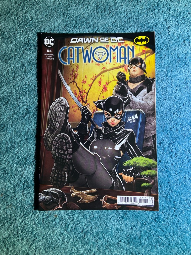
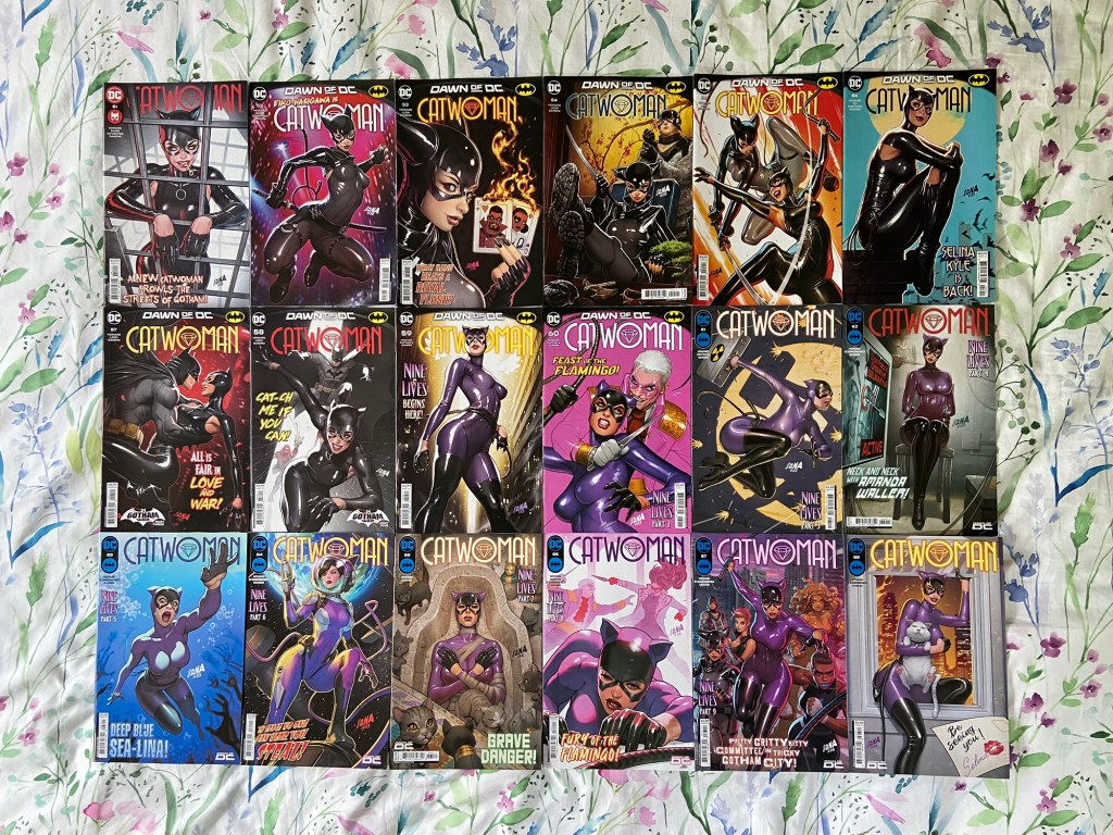
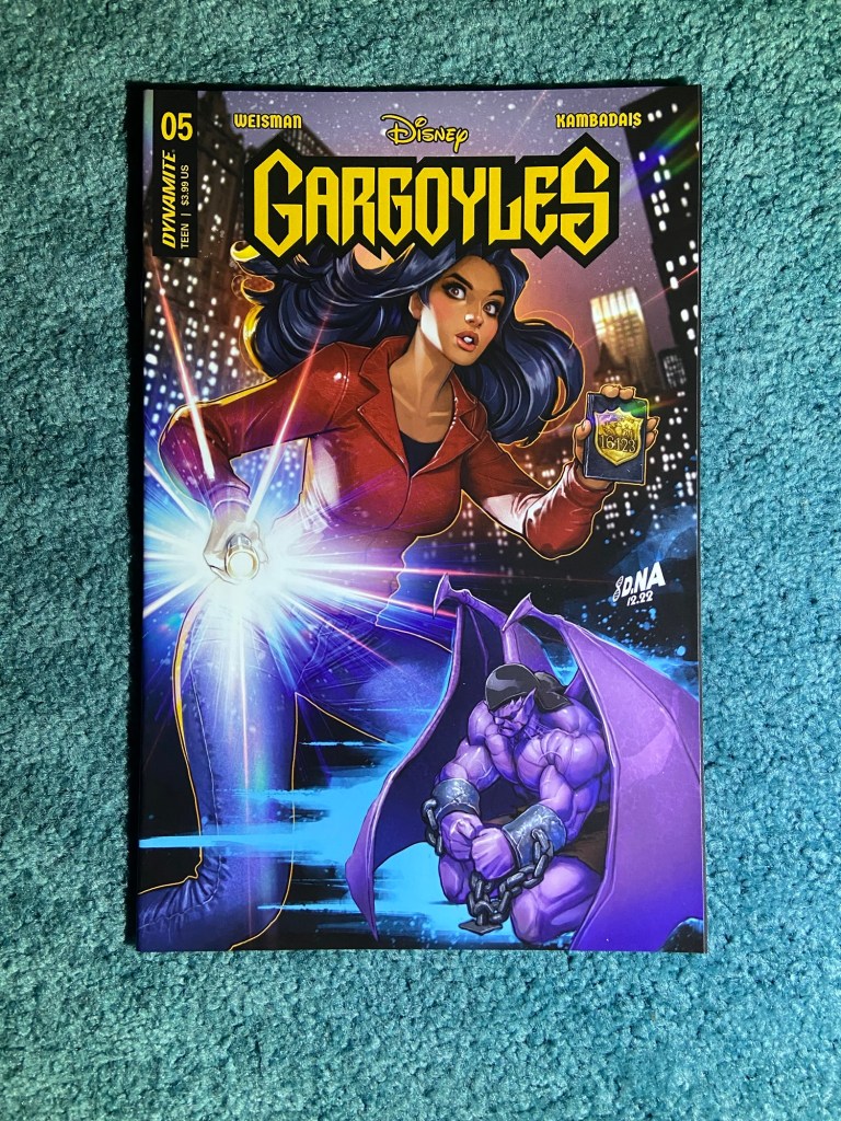
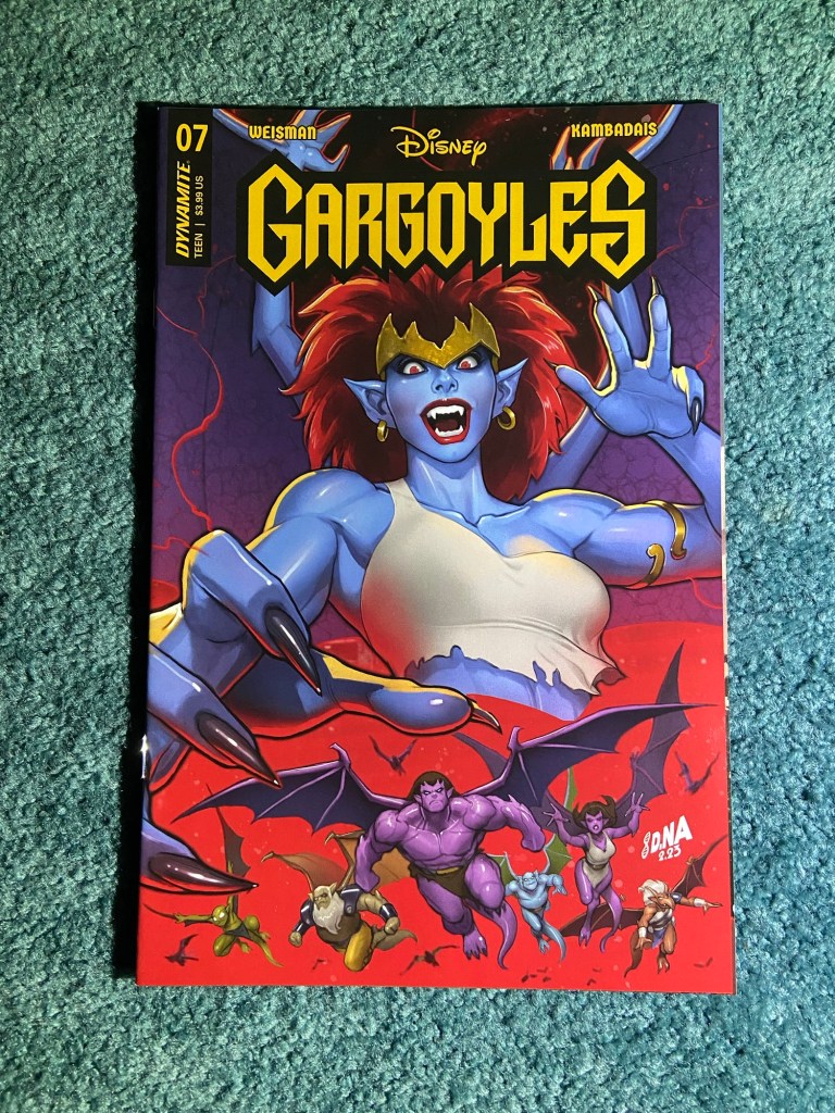
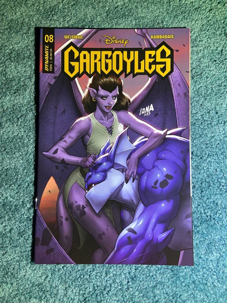
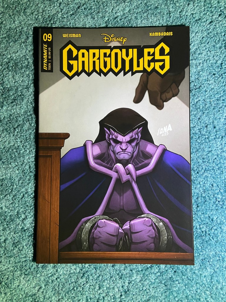
The rest of the sets for this post are all Nakayama covers!
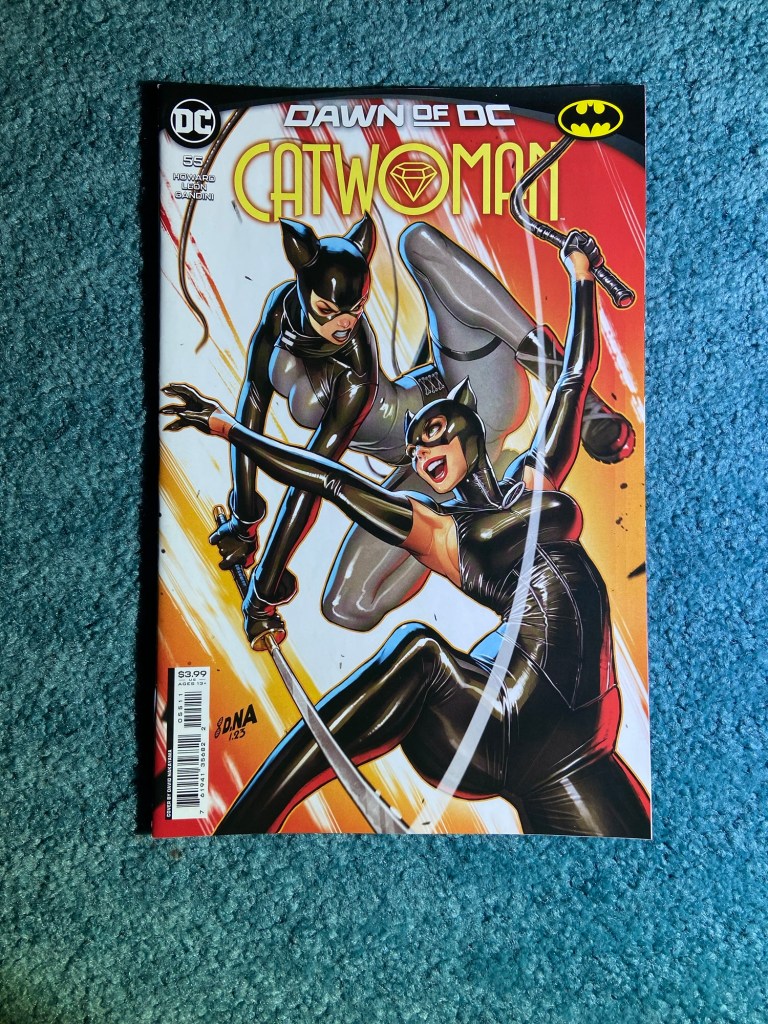
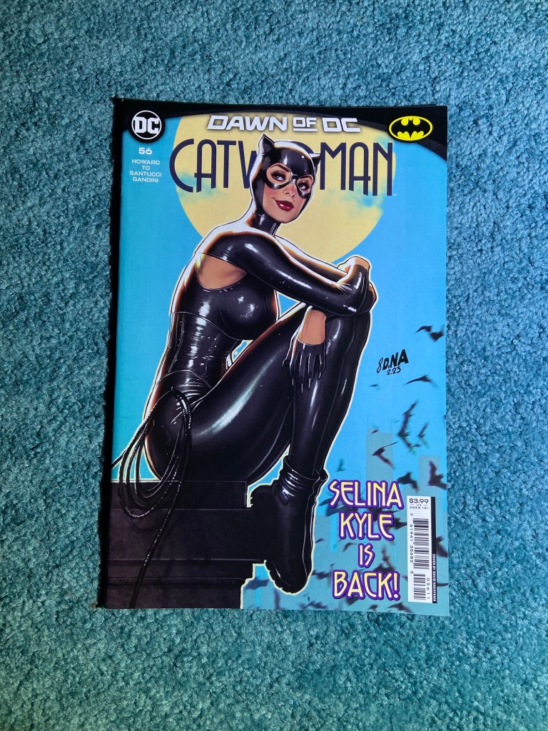
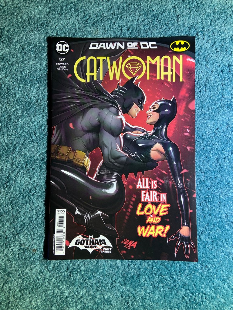
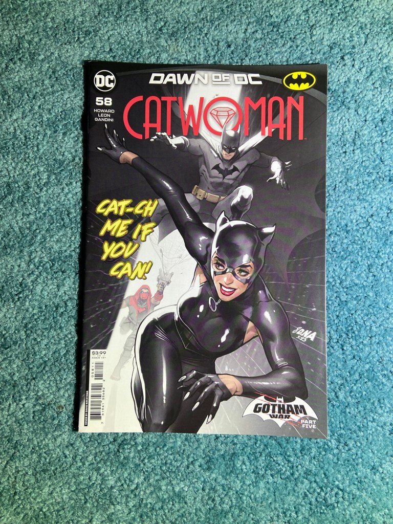
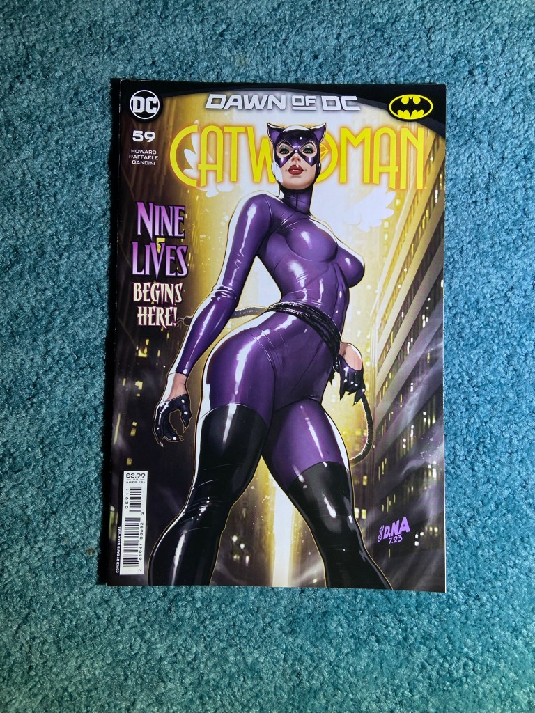
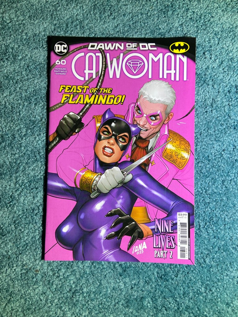
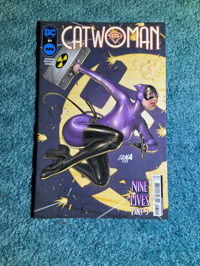
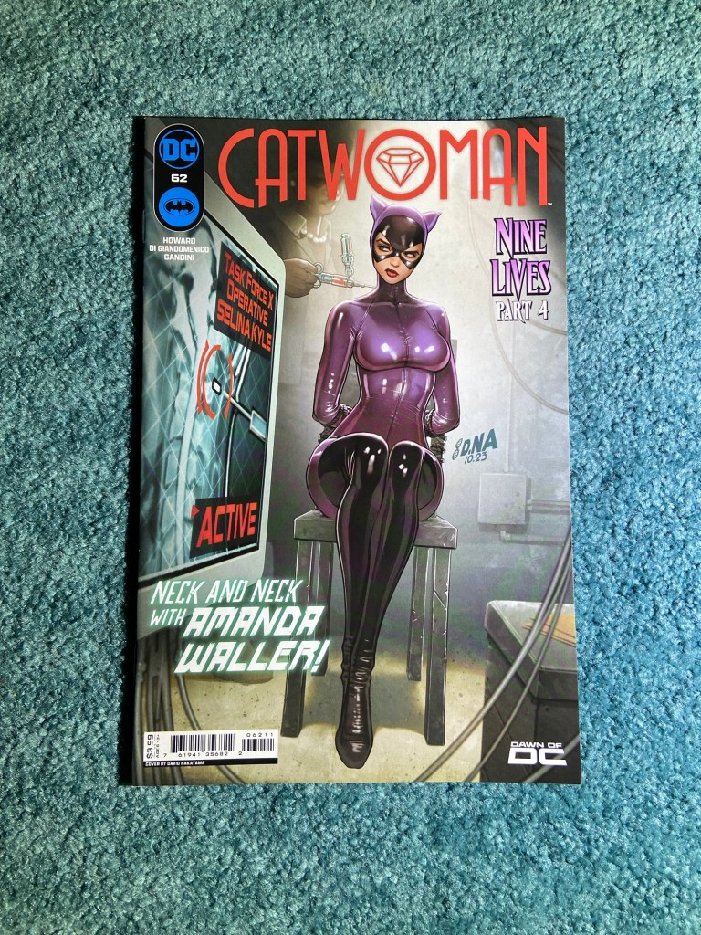
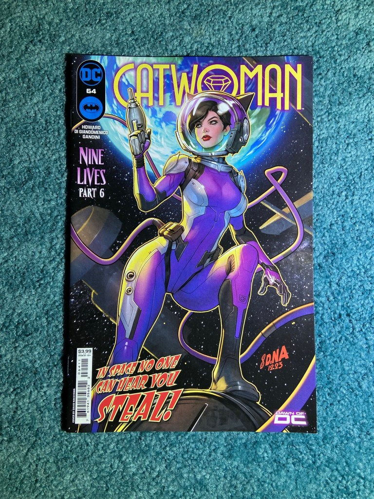
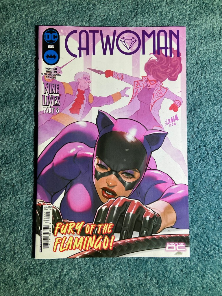
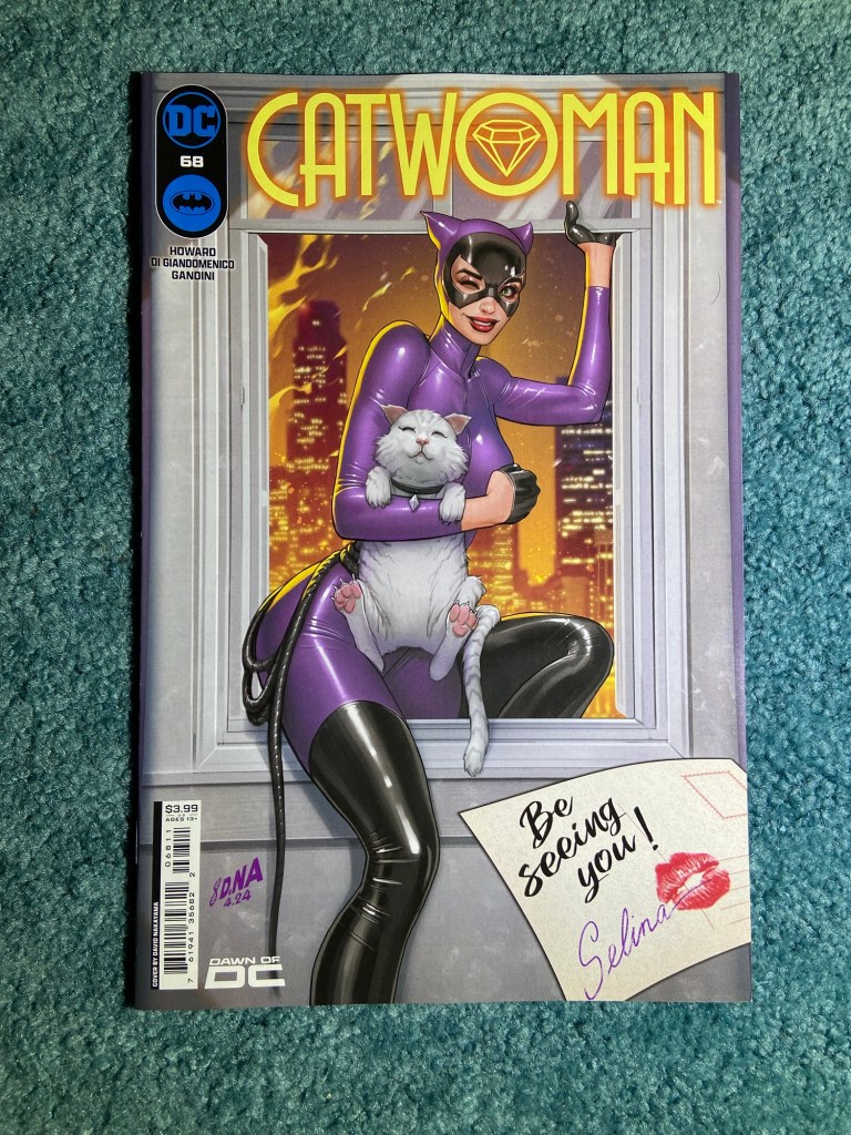
This was his cover run of Catwoman from 51-68 with him being the main cover artist.
They all have such different tones from each other! Such a great set!
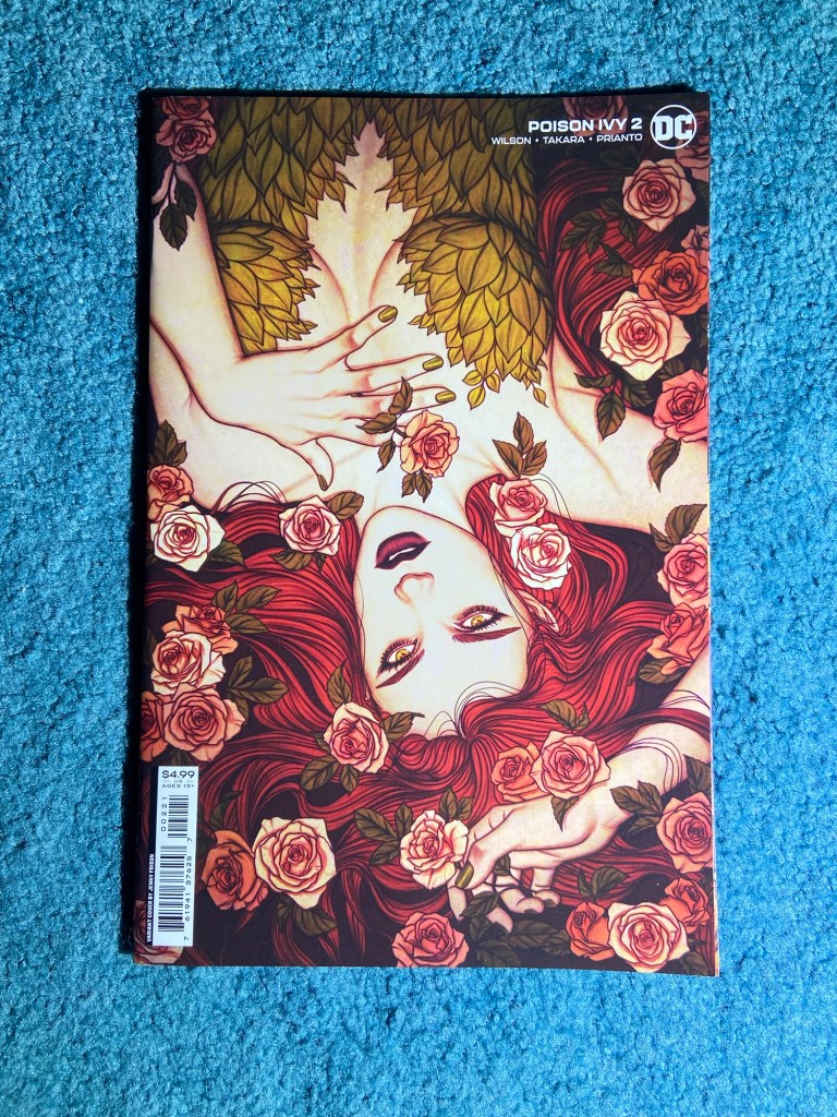
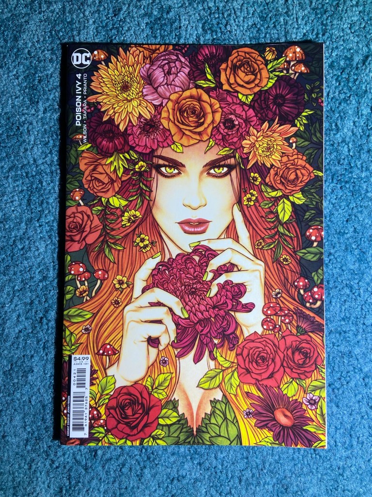
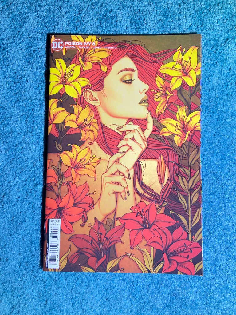
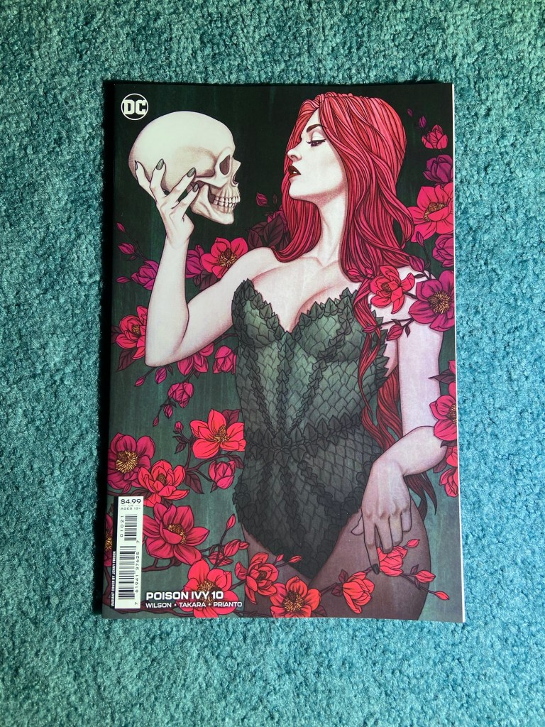
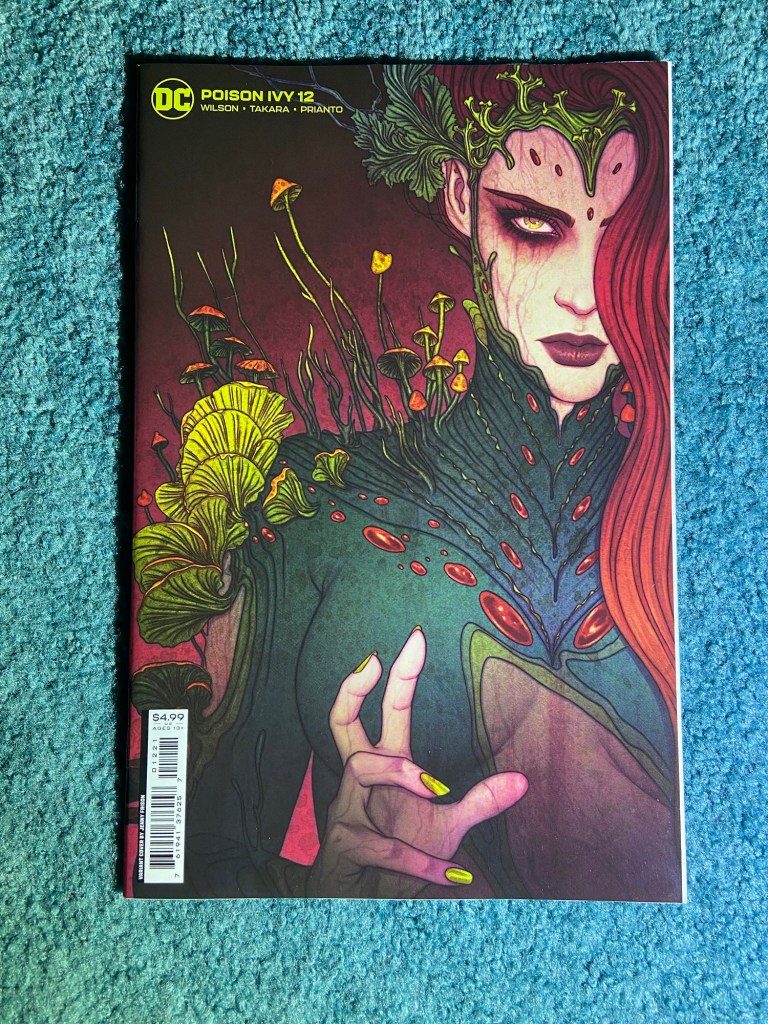
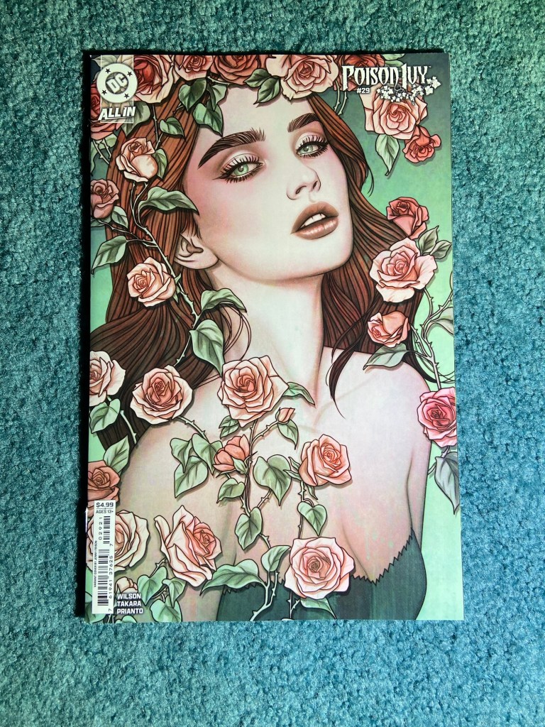
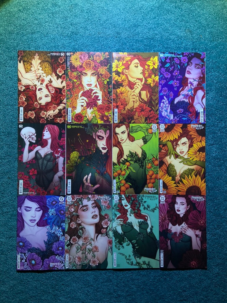
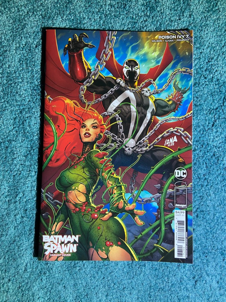
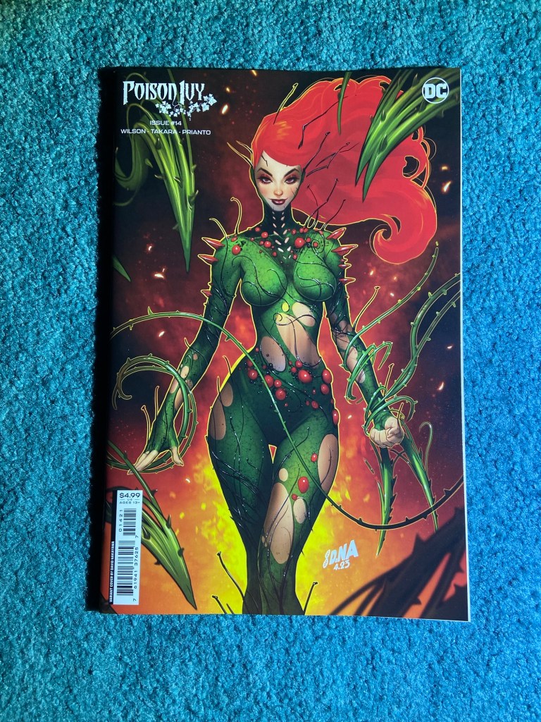
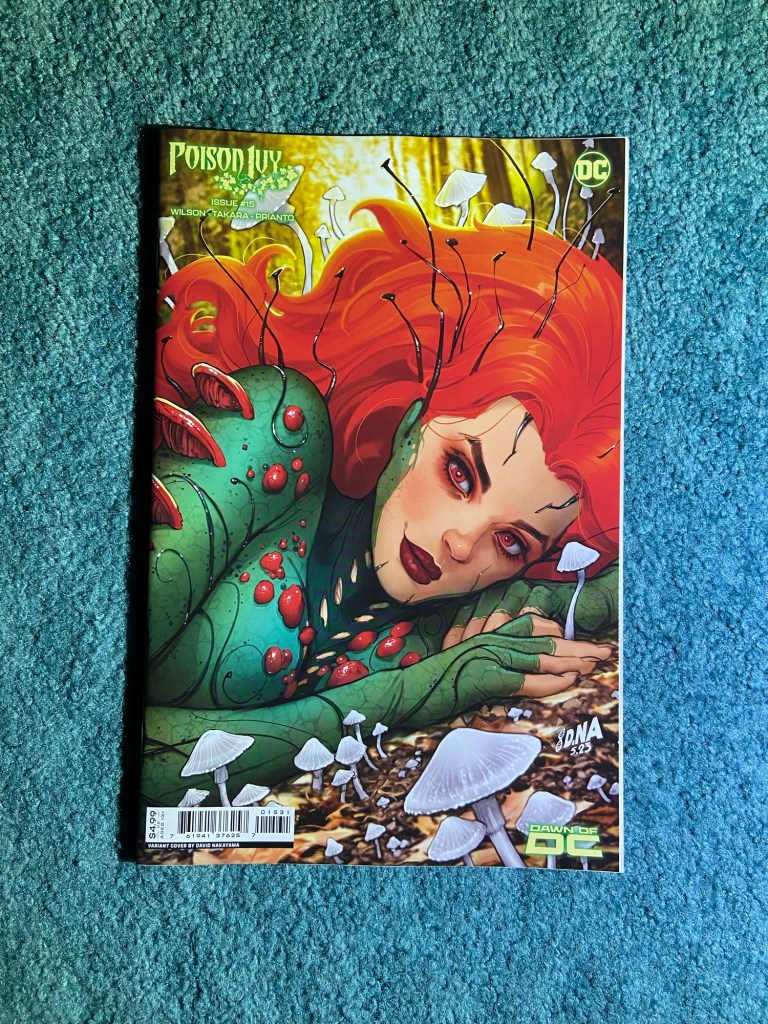
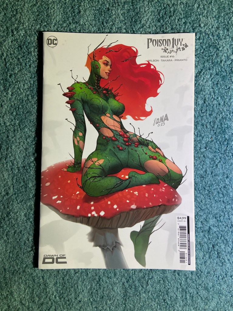
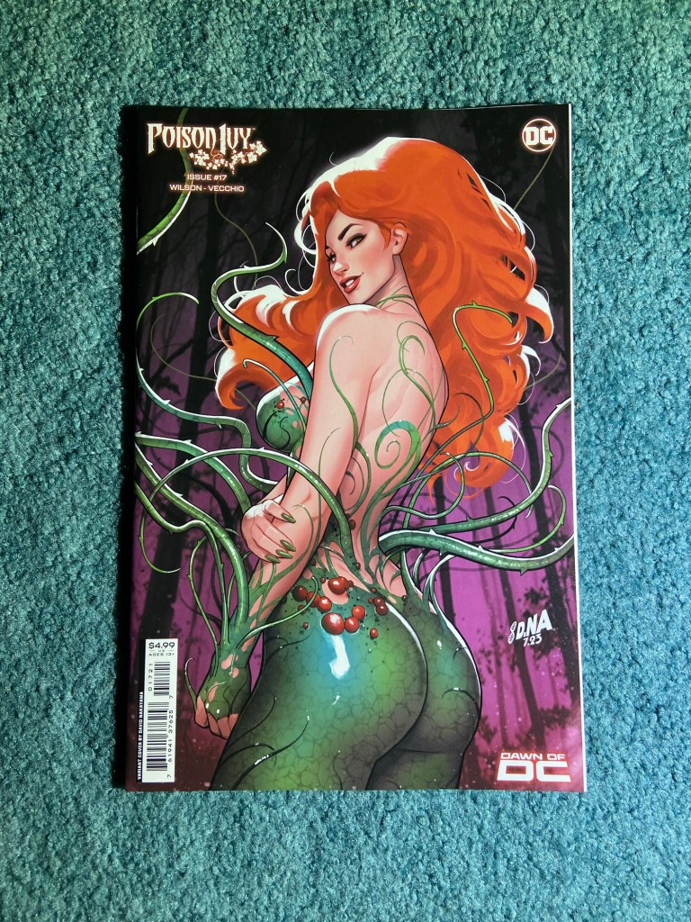
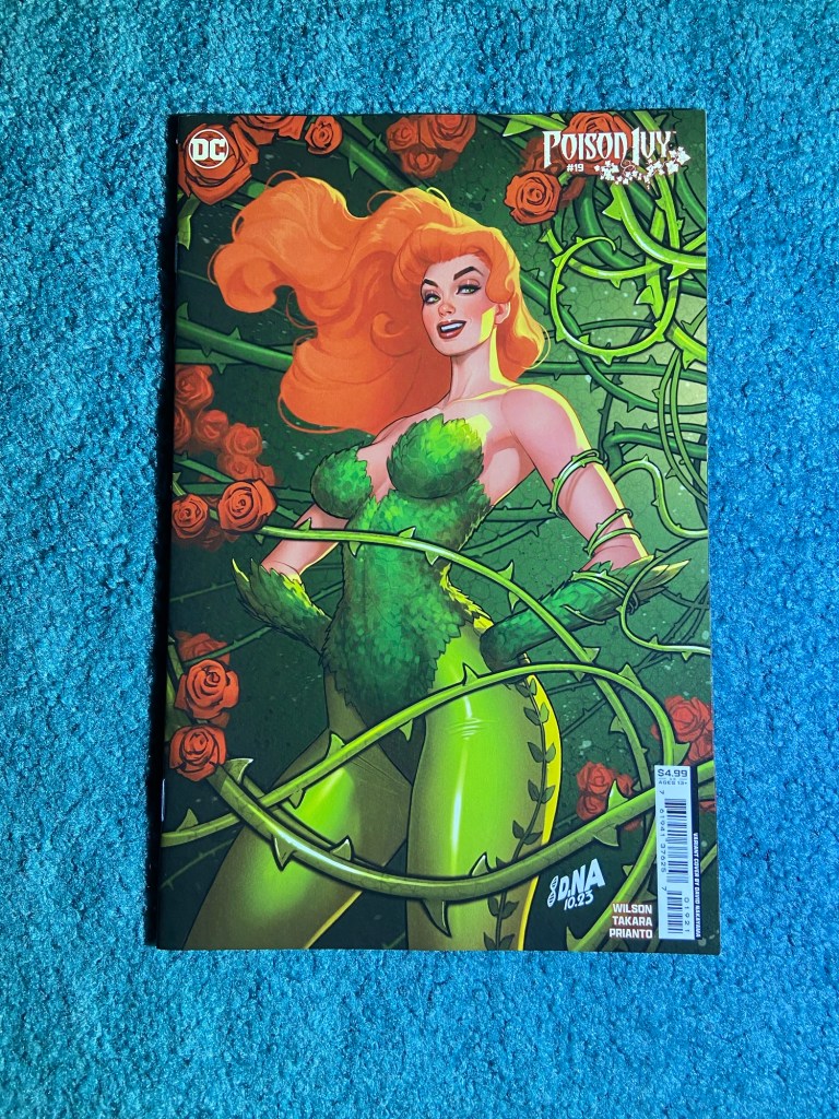
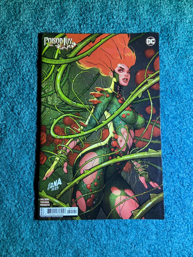
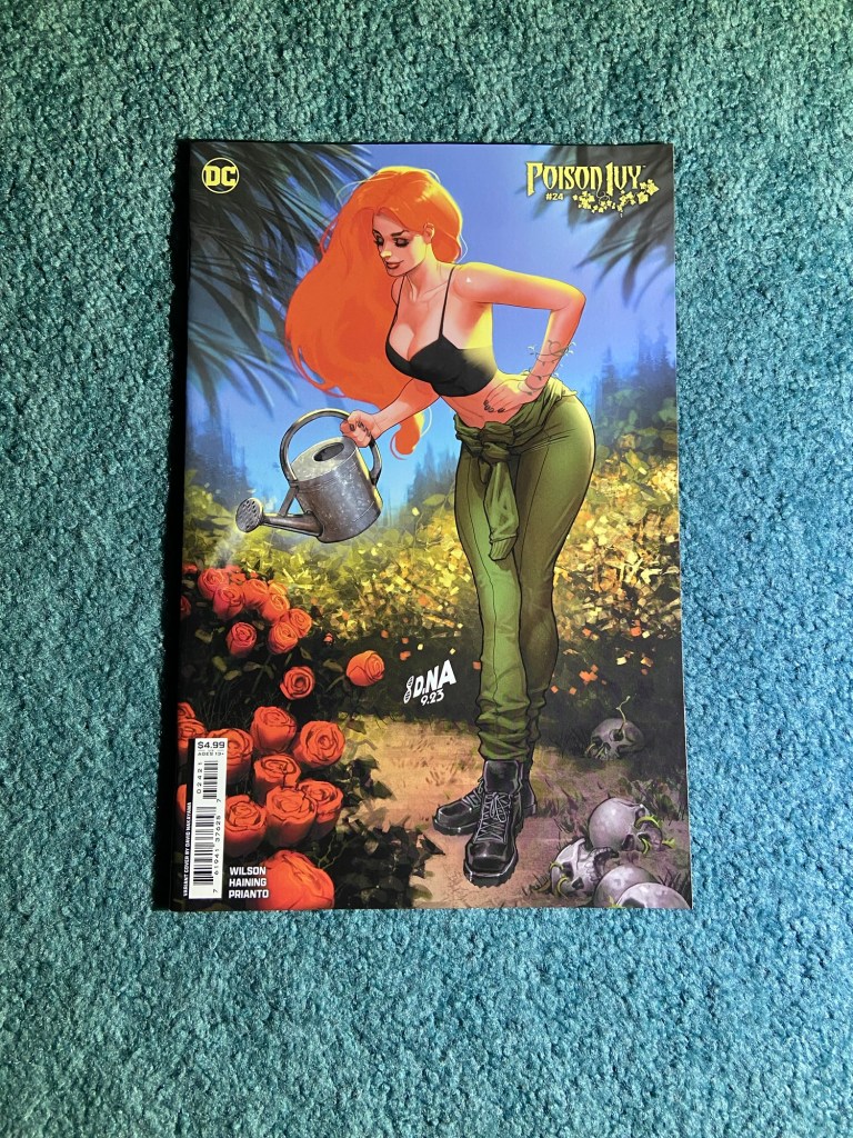
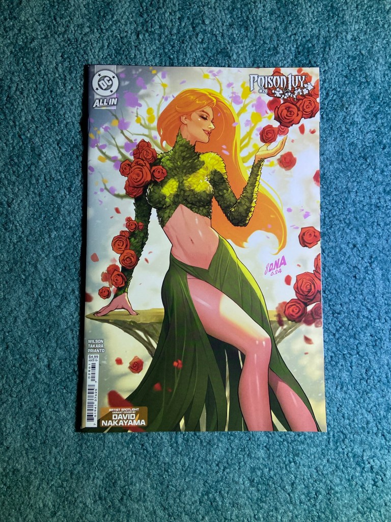
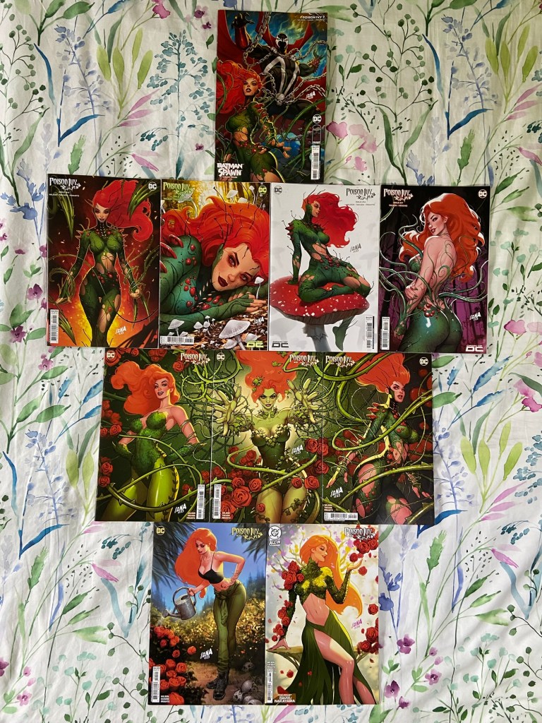
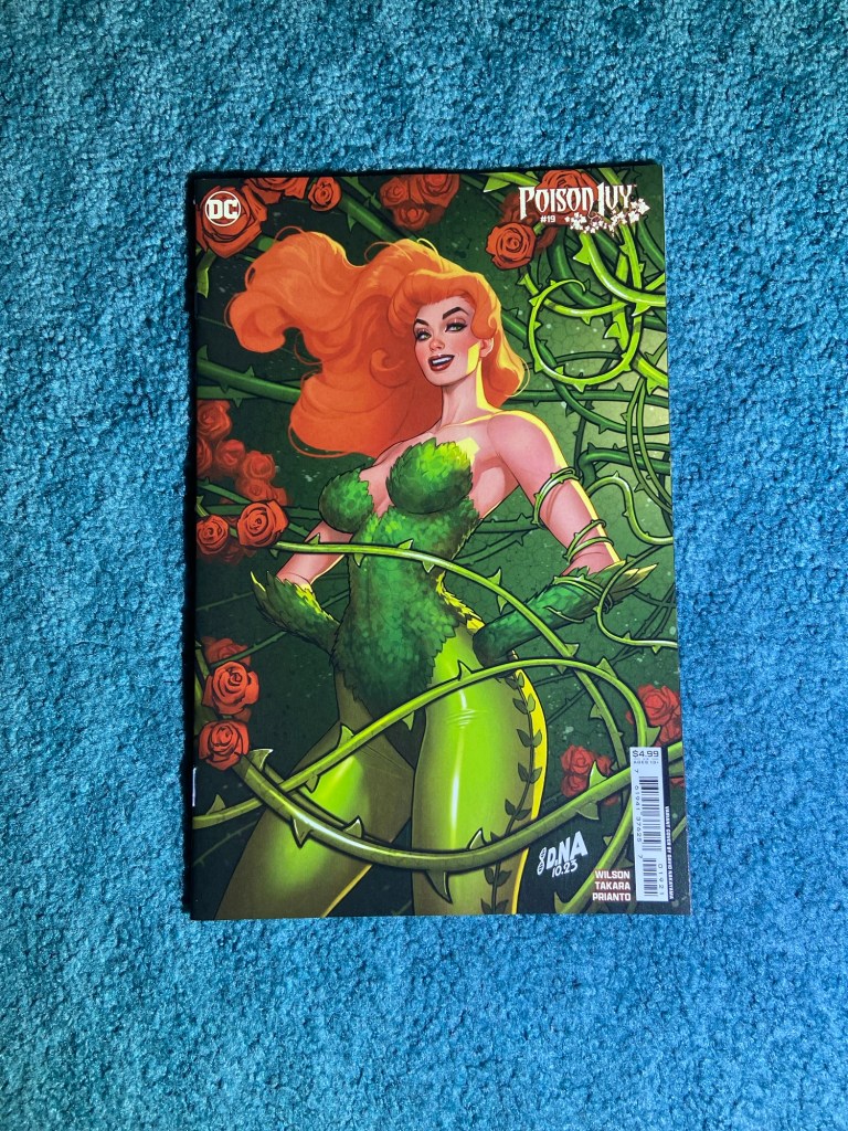
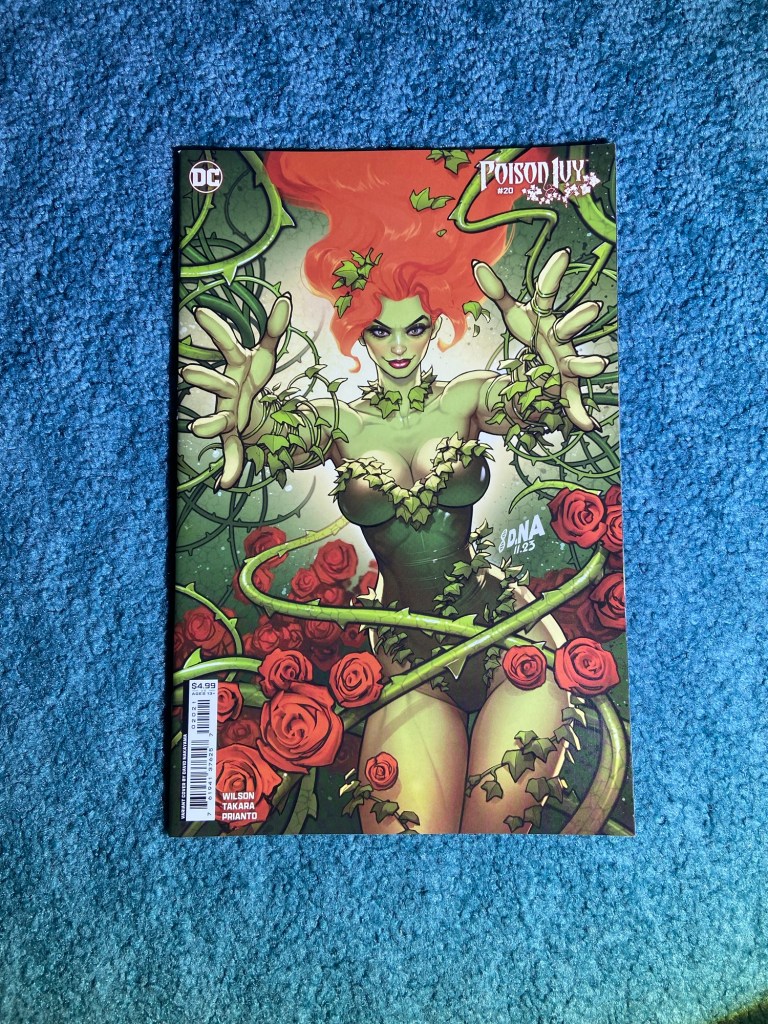
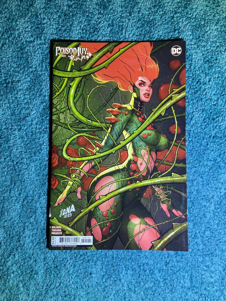
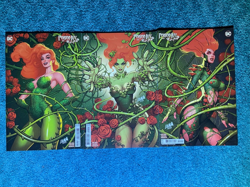
And then of course we have David’s Poison Ivy main (mostly) cover set! I love the greens and oranges! I included that connecting set image again even though I had it in the previous posts from June.
I arranged these specifically. The top one was Nakayama’s first cover for this run, though it was a variant, with Spawn! And then over a dozen issues later, he was brought in to do the main covers! That was 8 issues of his amazing art! Three of which were of course that brilliant connecting cover art. Then one last main cover for this run. And finally, he was chosen for an Artist Spotlight set of six variants for different titles. Those will all be together in a layer post.
I’m going to pause writing these so I can watch the first episode of Peacemaker season 2! Then I’ll come back to get the last couple posts done.
As usual, connecting variants first! And this will probably be 3 posts like last time but it may be more, I’m not sure yet.
These sets were similar to June’s sets, not as bad but still none that really connected as they should. Most of the faults were overlaps or misalignments.
There are a lot of these two-issue sets from Sean Galloway this time! I thought these would be all sets when they first appeared, but there are a lot that are on their own. So, I probably will have to make a post with all the ones I’ve not taken photos of and also have one like that for the Windowshades covers.
These are fun covers. There was a bit of misalignment and obviously the colors are not matched up at all. But I still like this image of Marvel’s First Family having fun while some villain is trying to get their attention.
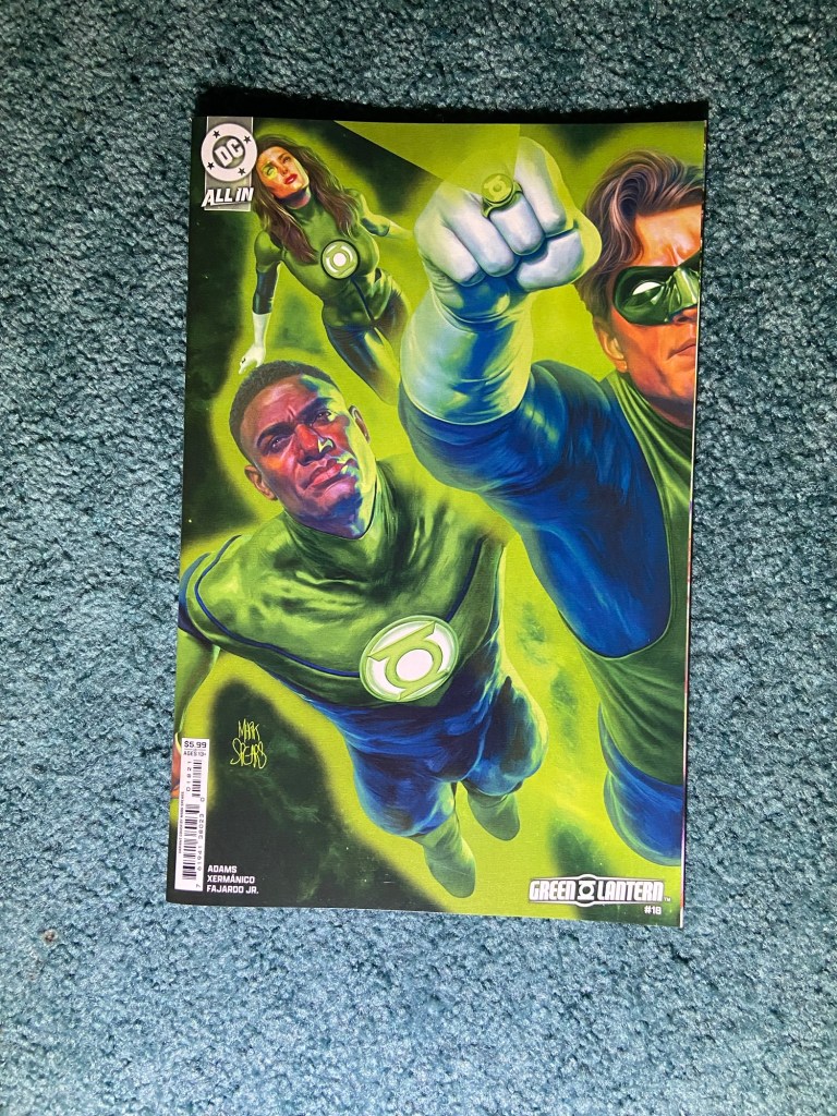
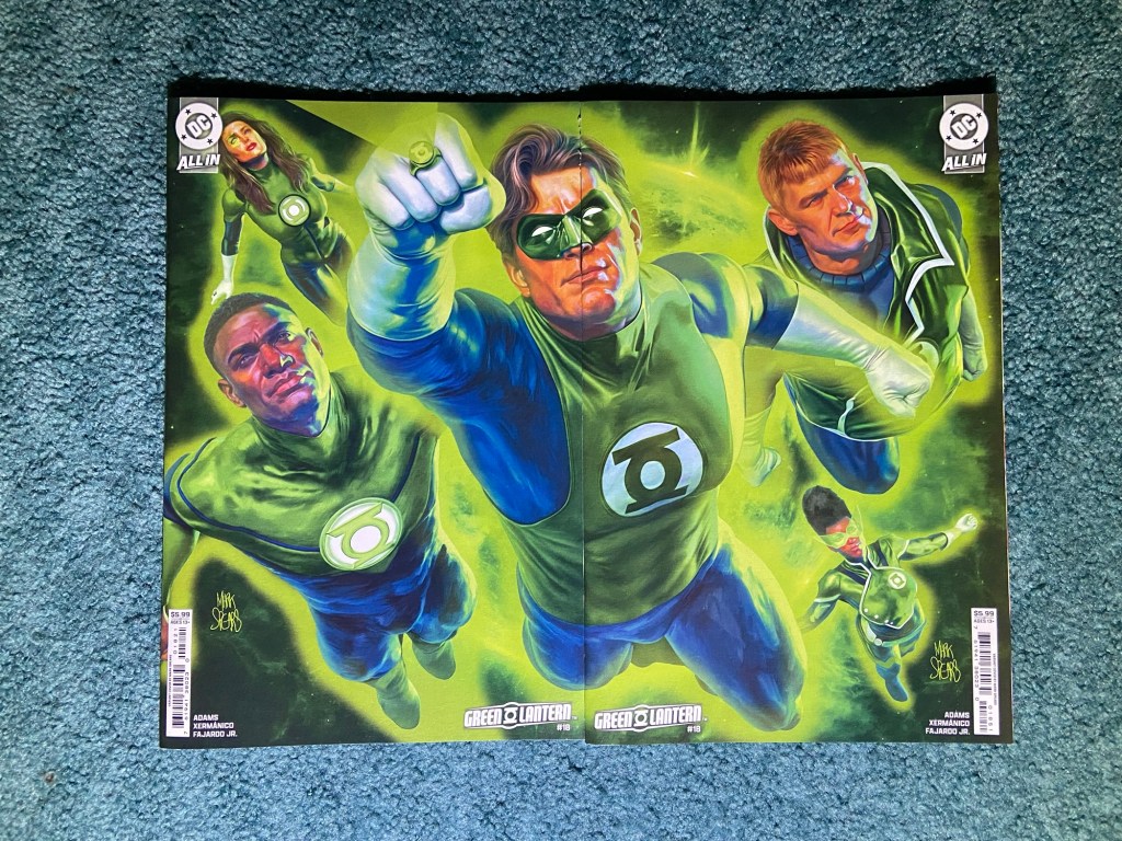
I love Mark Spears’ covers! Probably for similar reasons to why we all love Alex Ross’s art. The realism is so well-done! I would love something like this from him but with as many Lanterns on it as he could fit. Perhaps one set for each Lantern ring or one with all of them.
This one was I think a little bit of an overlap. Though only by a sliver of page. A lot of the overlaps were really just the card cover not reaching the edge of the rest of the book so there’s that sliver of pages on the right side. As I’ve said before, you’d think they would have figured out all these connecting cover problems by now, in 2025.
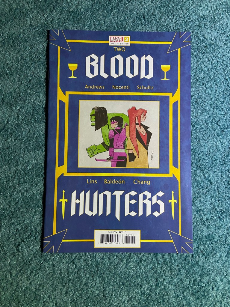
Here’s another Galloway set! this was during the Blood Hunt event.
This was both misaligned and overlapped. But still a fun and busy cover!
A 12-issue connecting cover grid!! This was an interesting set indeed. I do love the line-work and the colors! Bravo to John Timms!
This set had some parts overlapping and other parts misaligned. So I did my best to make sure that the vertical connections worked. Now, I will say that for a connecting set, usually there’s one background connecting image and then the characters are mostly in the foreground, and this whole image seemed all over the place. When I first saw the set in the previews, I wasn’t 100% sure I was even looking at a connecting set.
Having said all that, I do love that this image feels like it’s storyboard for a big comicbook movie event! There’s so much going on that you want to look at every inch of it to find something you hadn’t noticed before. And as I said, the art itself is amazing! There are two photos because I wanted to get the light on both ends but with the angles I had to work with, I couldn’t make it work. Hence, after this, sets with 12 or more, had photos take elsewhere.
Here’s a Galloway set of 4!
Such a fun set! If only there wasn’t a gap between those first two issues, not the color matches between covers being non-existent, nor the overlap issues. But other than the problems, the image itself is so great! A lot going on and all the characters are front-and-center!
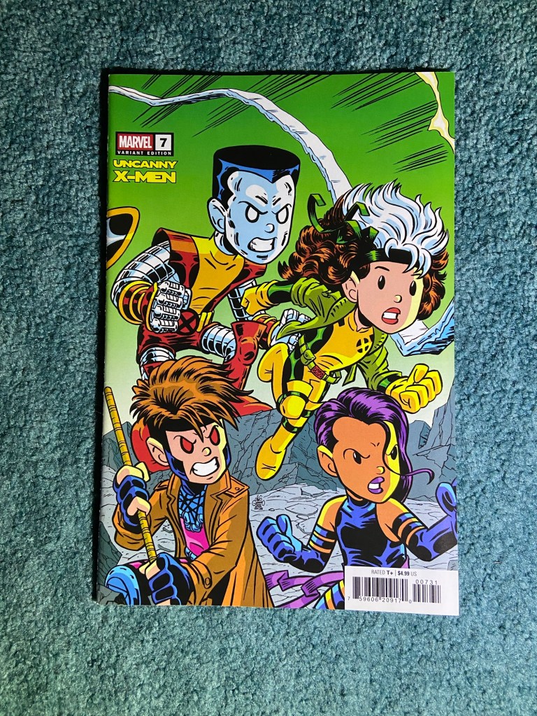
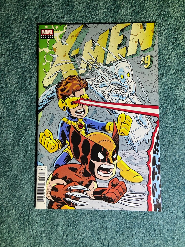
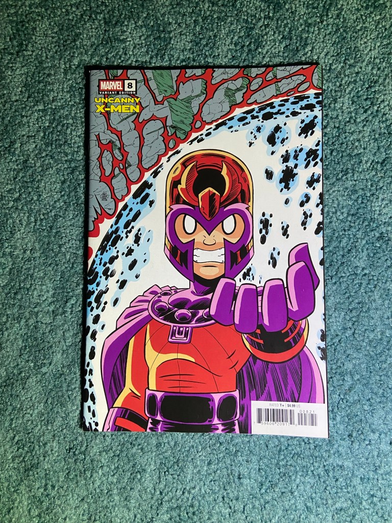
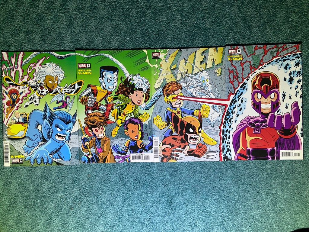
This artist is a name and art that I recognized from a recent connecting cover set. Chris Giarrusso did a great job with this homage set to that classic X-Men Jim Lee cover!
This is another set that I really wanted to connect well! This one was both misalignments and overlaps. Though those last two issues look really good next to each other. It’s still such a fantastic image!
More Mark Spears! This time with the Super-Family!
Such a great image! This one was an overlap. I’ll have to think about where to put these within my set boxes. The family looks great! And the villains look great too!
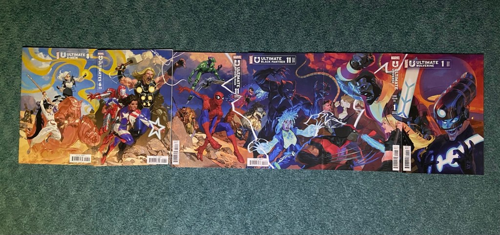
This next set is by Josemaria Casanovas. Since Peach Momoko’s Ultimate X-Men run started, I’ve been wondering what those characters would look like in normal Ultimates art styles, since Momoko’s style is so unique. Seeing all these characters in one image was great!
The first and third through sixth issues all had the overlap problem. But the second issue somehow was printed and cut at a slight angle? Very odd indeed. But the whole image does look pretty great.
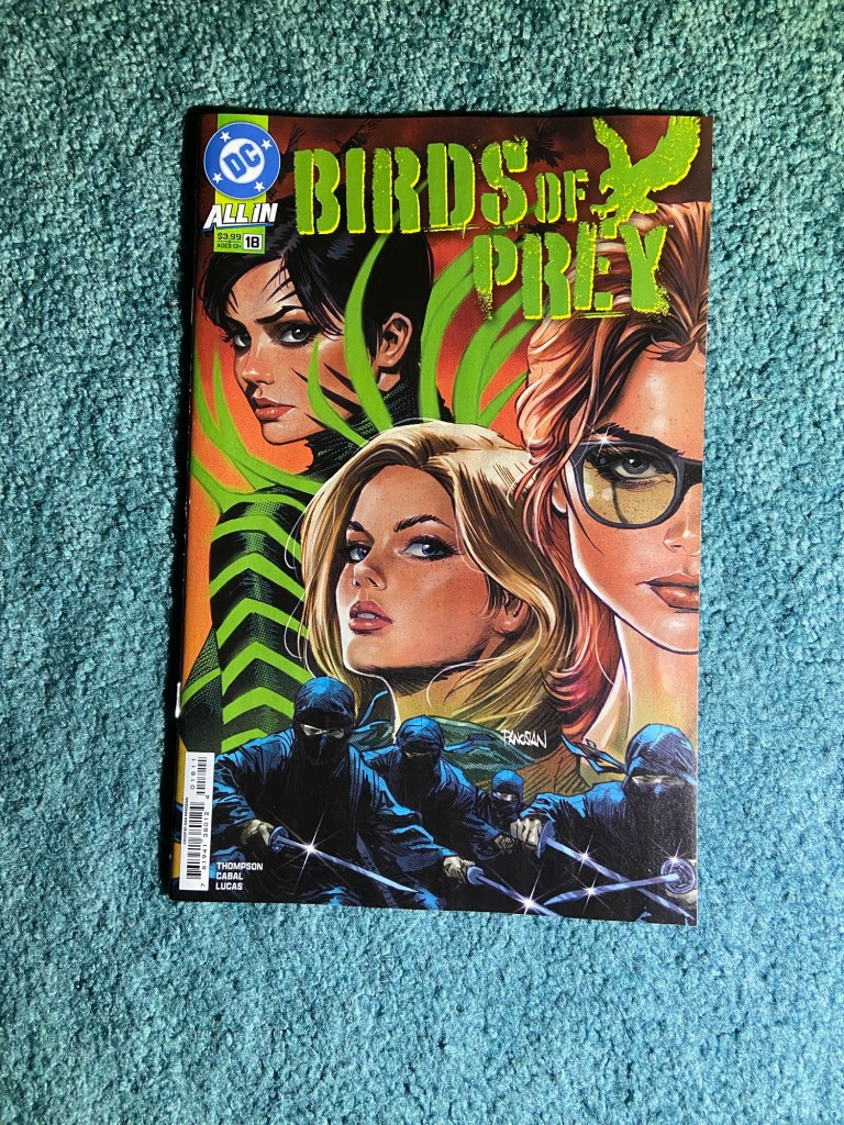
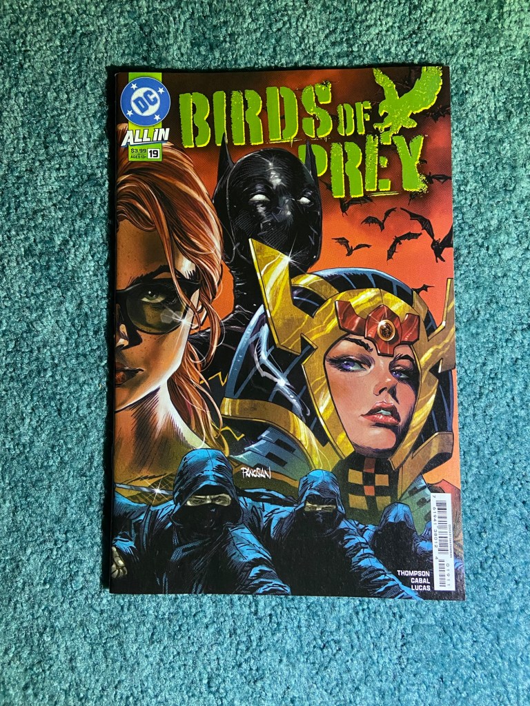
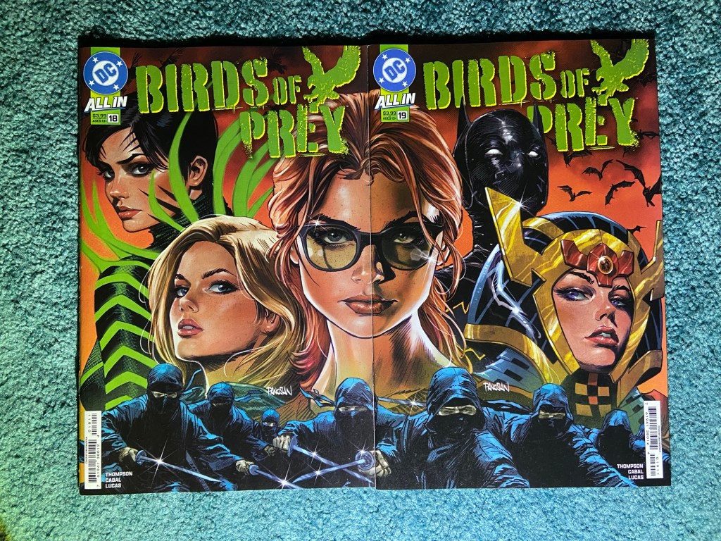
These are both the main covers for these issues by Dan Panosian. I really like this image!
This was an overlap via the sliver of page. But other than that, everything else looks great!
And that’s the end of the connecting covers for this sorting. Well, I will have a couple more in the next couple parts of the complete sets posts, but I felt they better suited those posts, or also, I’d already covered them.
Another two months since the last Complete Collections posts! This time things were a bit more complicated and took much longer because of two things. One was that a small part of the basement flooded on the morning that I was going to start doing this. So, that took 3 days way from my schedule. And the second thing is that I ran out of the small boxes I use for this. And since the comic distribution company that used them essentially went under, the boxes weren’t being made anymore. So I had to use the ones that I had as efficiently as possible. And it did work out very well for most of the sorting. I still have half a short-box of comics I have to put in boxes and I have found a place to order them from, so I’m waiting their delivery to finish up completely. But I finished taking photos yesterday.
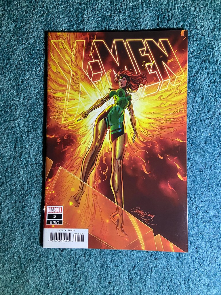
From 66 boxes to 71! Not much during the initial sorting because I ended up not needing a lot since many of the incomplete boxes got a lot of comics moved to the complete boxes. This was me sorting 24 weeks of variants from last year!
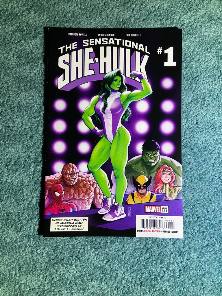
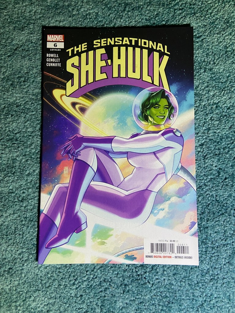
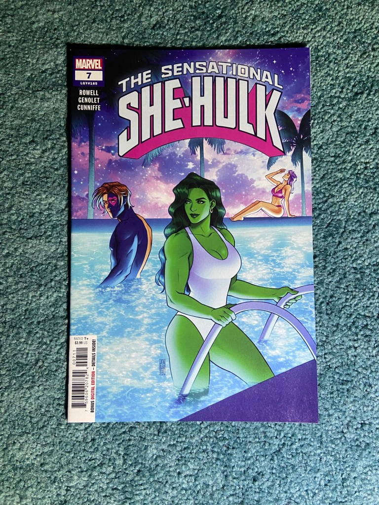
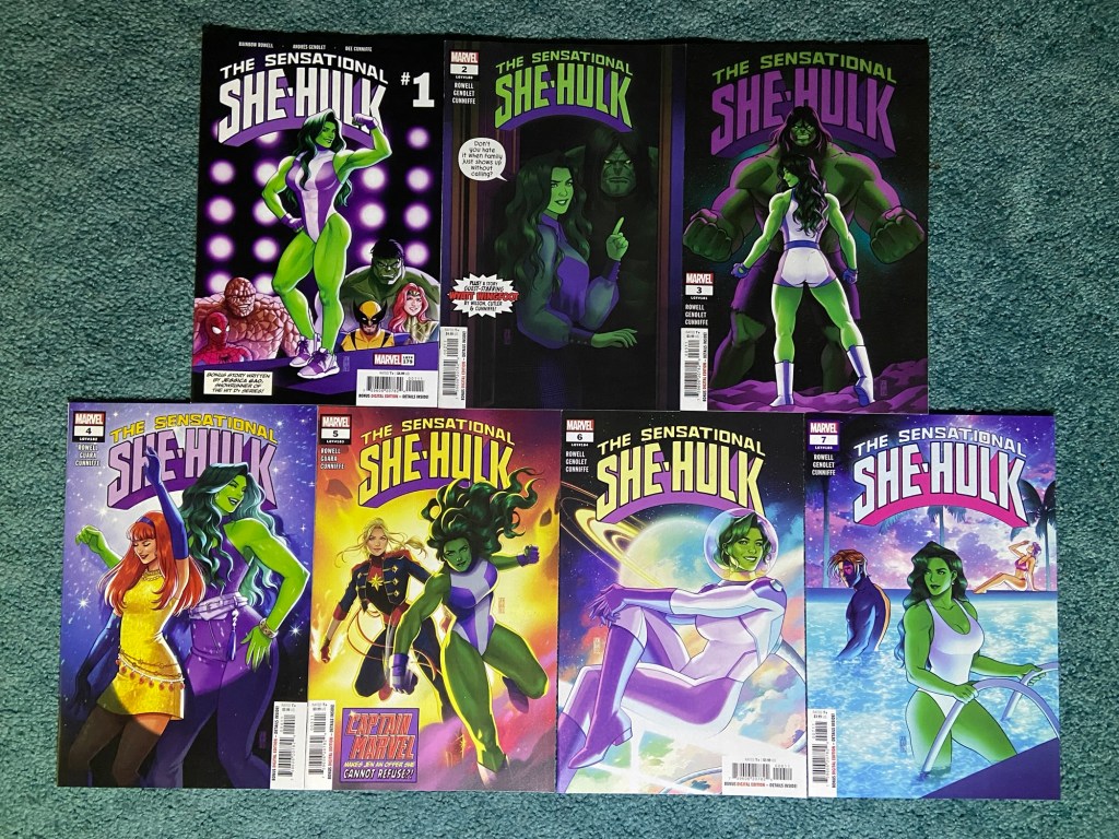
This is Jen Bartel’s next set of She-Hulk’s next run following that previous one. This run was far too short! I was sad that in got cancelled. But these covers are so fun and different than Jen’s previous She-Hulk cover set.
Peach Momoko has such an innovative artistic mind. she has a couple distinct styles from herself and then she dropped this which was another different style!
Now, I think these are a set of three. I tried searching to see if there were more covers of this design of hers, but I found nothing. If there are any more from 2024, someone let me know!
Leirix did such a good job on these fun covers!
I think these are the only J. Scott Campbell covers that I’ve bought from the store. I got a pack of some others at some point but haven’t taken photos. But I really like these.
This set looks so good together! There are virgin variants of these designs, but I like the X-Men logos in the background.
That’s it for now! I’ve not planned when to do the next bunch of these. But, doing this I think 2-3 more times and I should be caught up with all variants and should be able to keep up to date with variant photos. But we’ll see.
I will be starting with the connecting covers sets again.
So, unlike last time, the connecting covers weren’t as bad with the connecting aspect of the covers. Having said that, none except one set actually connected without needing to overlap, line up misaligned covers or having a space of missing art.
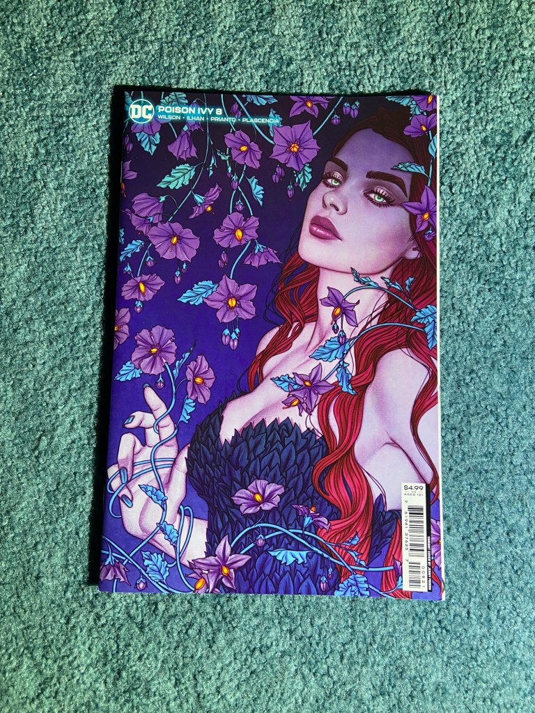
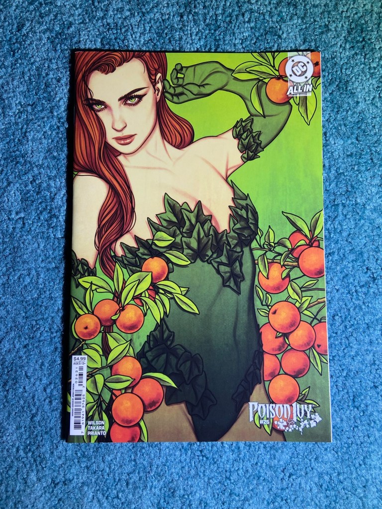
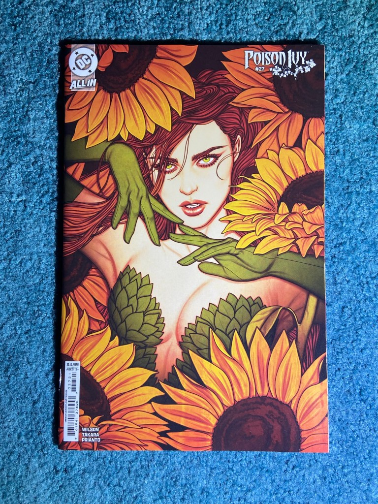
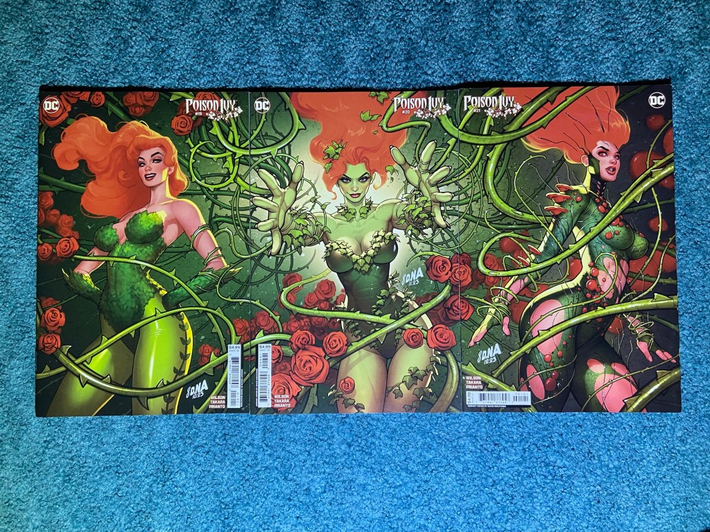
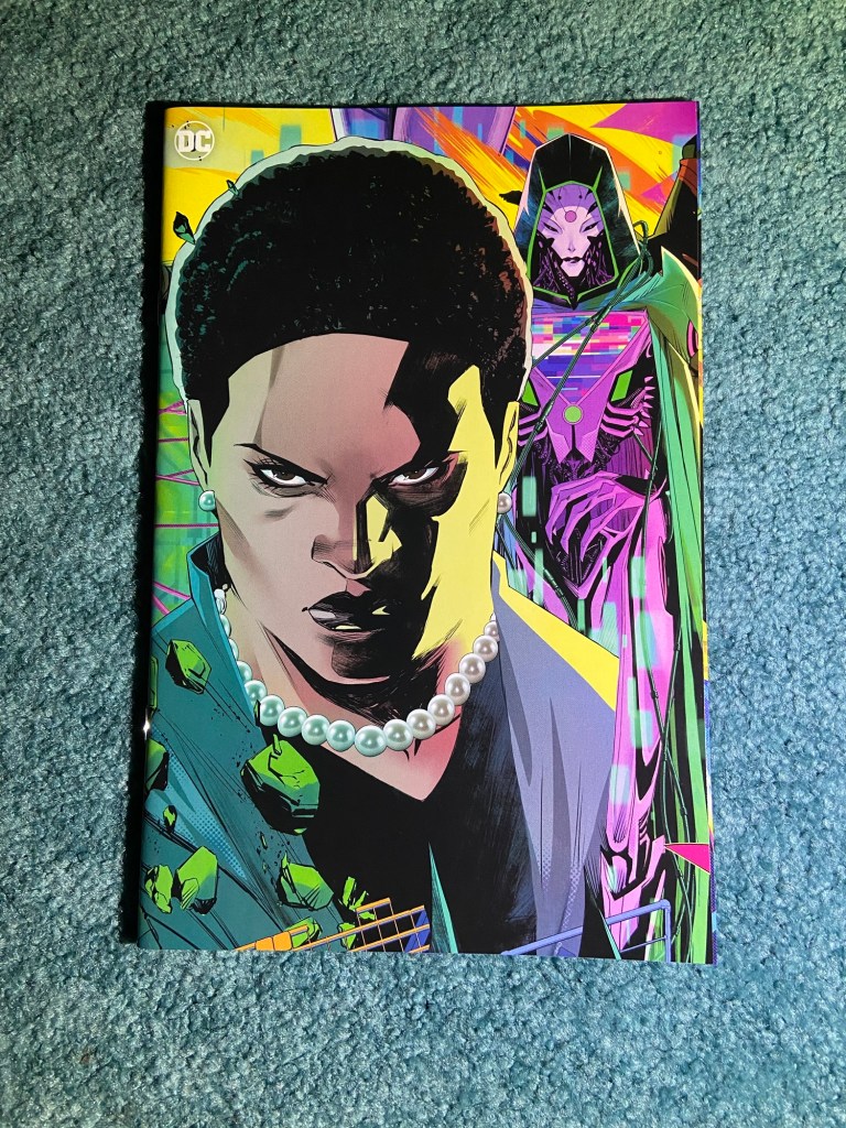
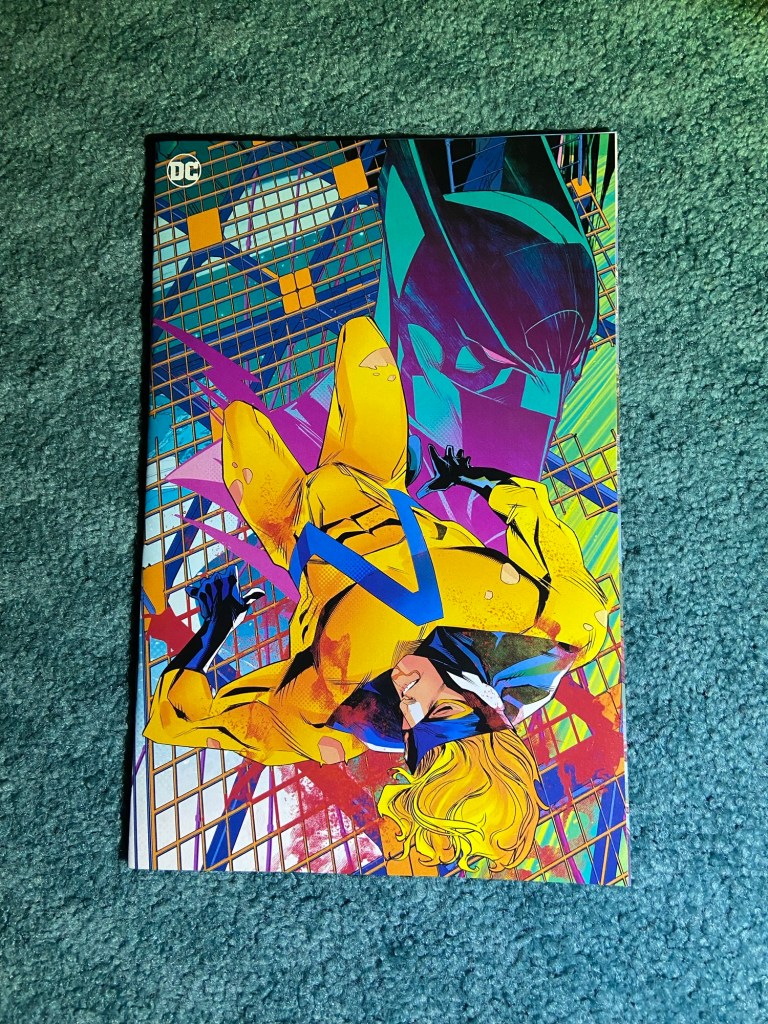
These are the Nakayama trio from his cover run of the current Poison Ivy run.
I had to overlap with these covers. They almost made it! But they look so good together! I love his sense of legacy with the Ivy’s from different eras.
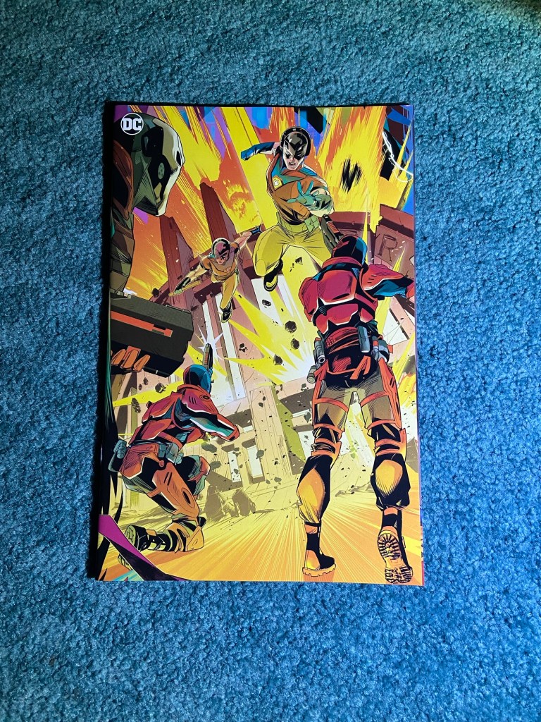
This is a very dynamic connecting cover with Apocalypse and Annihilation at war with each other with the others in the background.
This also overlapped, though, again it works well.
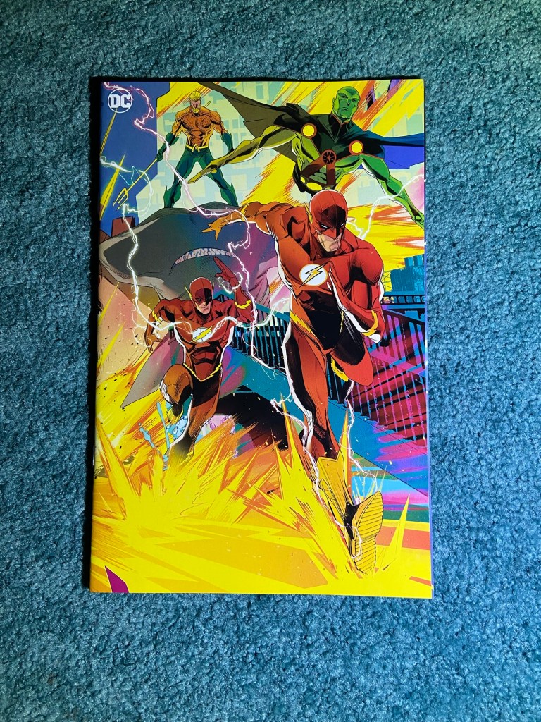
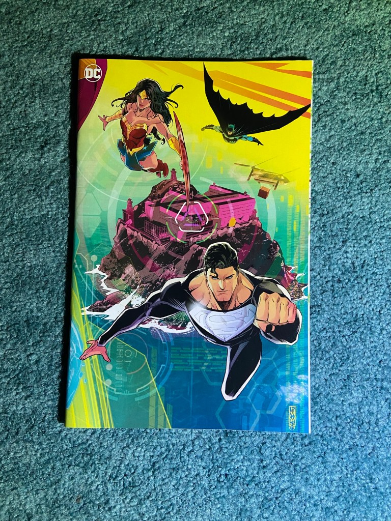
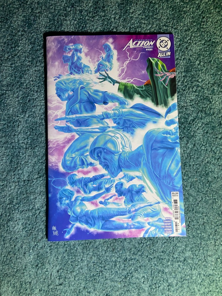
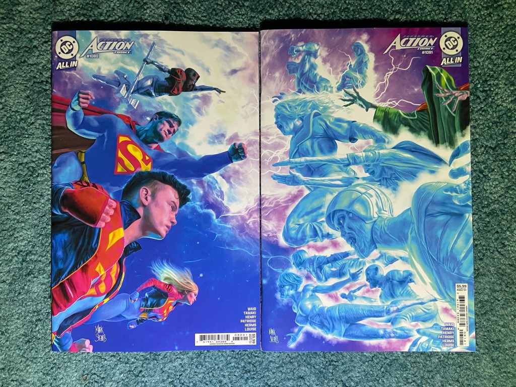
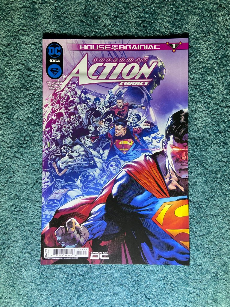
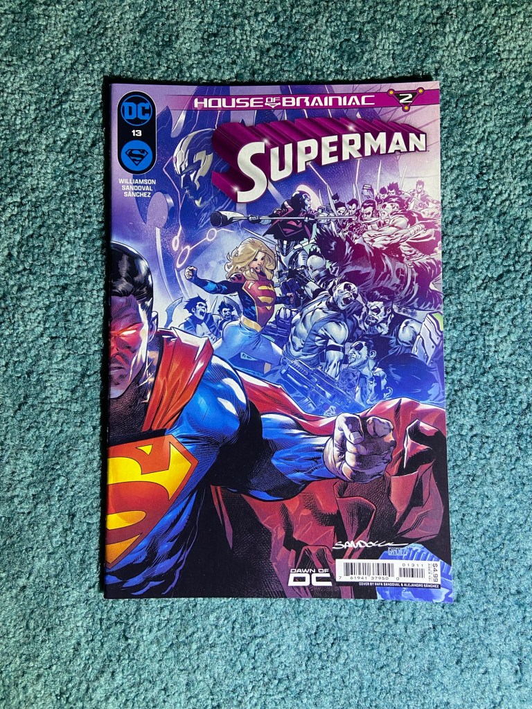
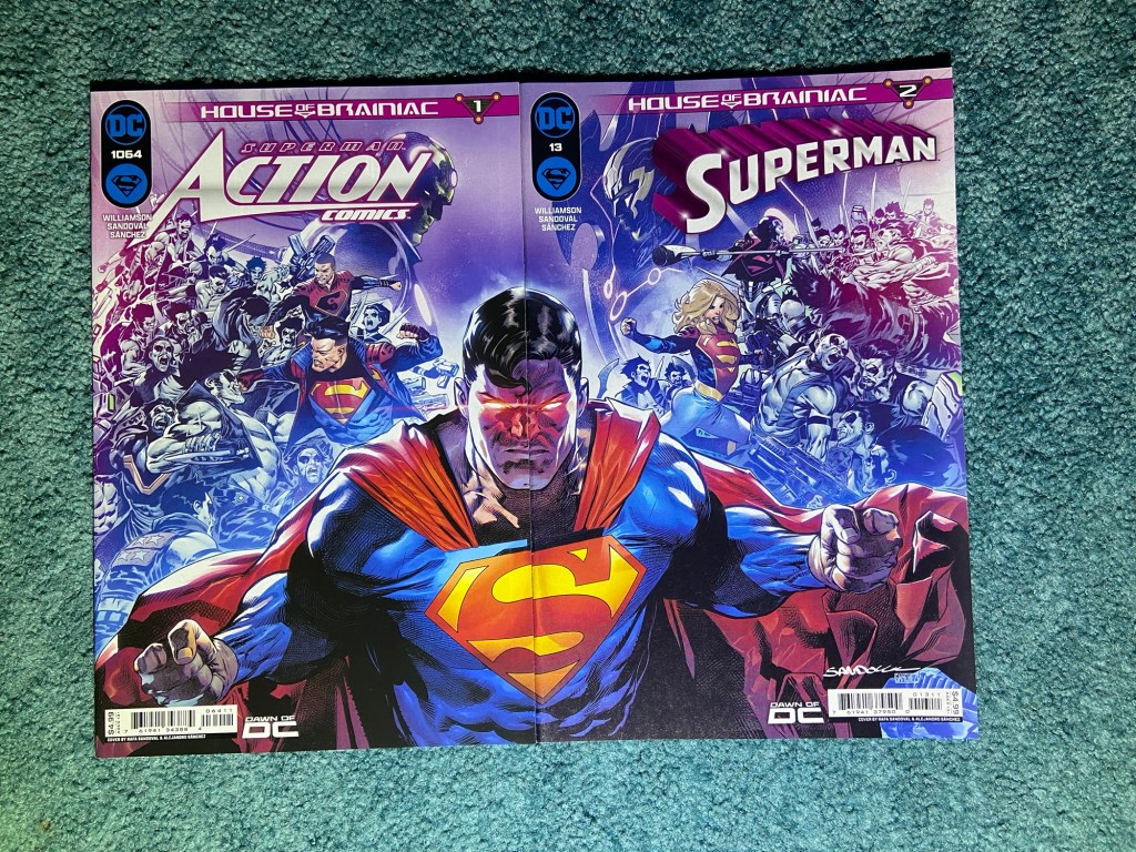
Such a cool cover set. Warring sides and Clark at the center.
This was a misaligned set. I lined up the image focused on the Superman hair curl because if I didn’t, it just looked weird with the curl cut up.
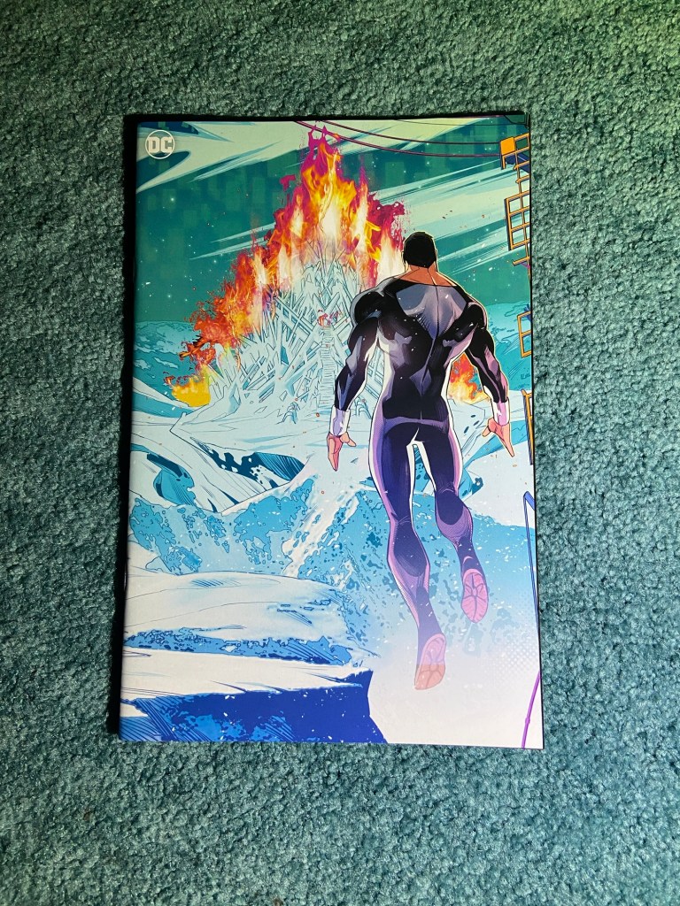
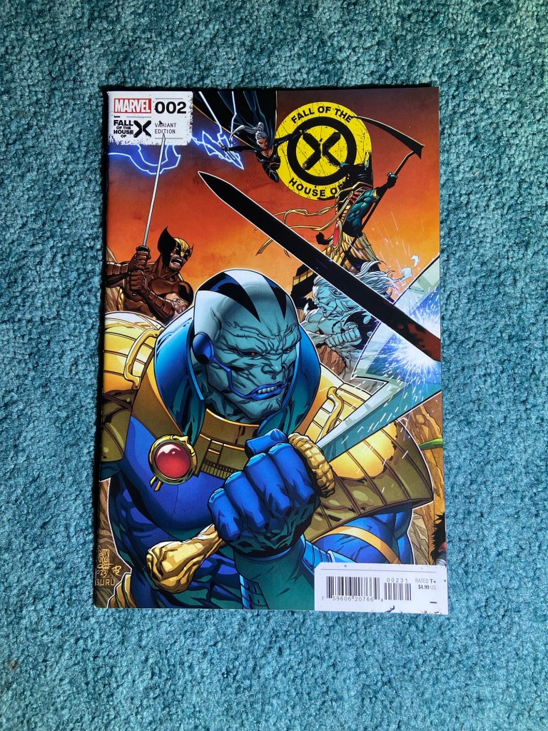
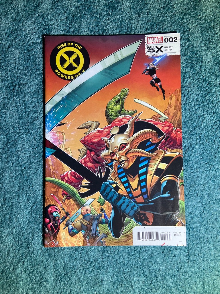
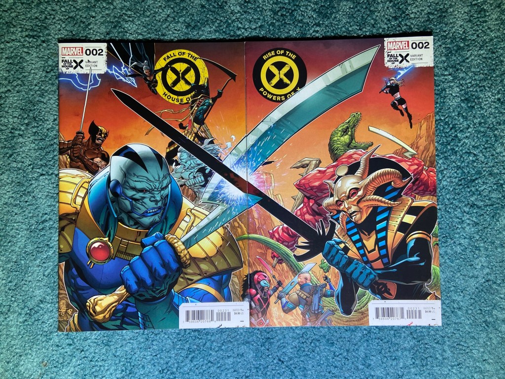
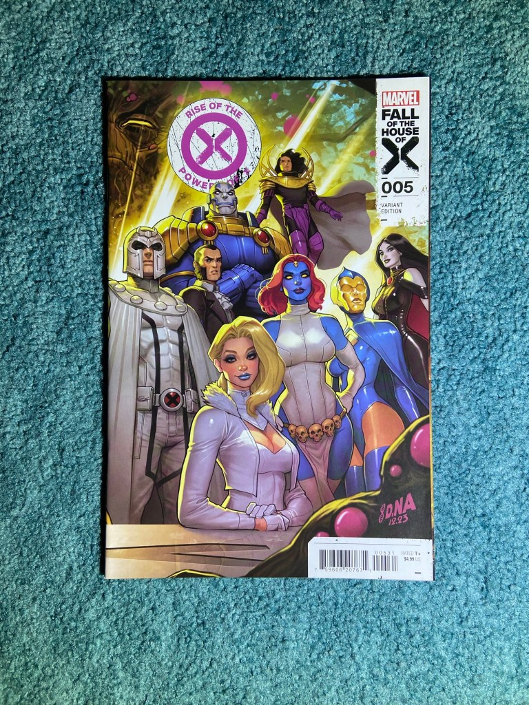
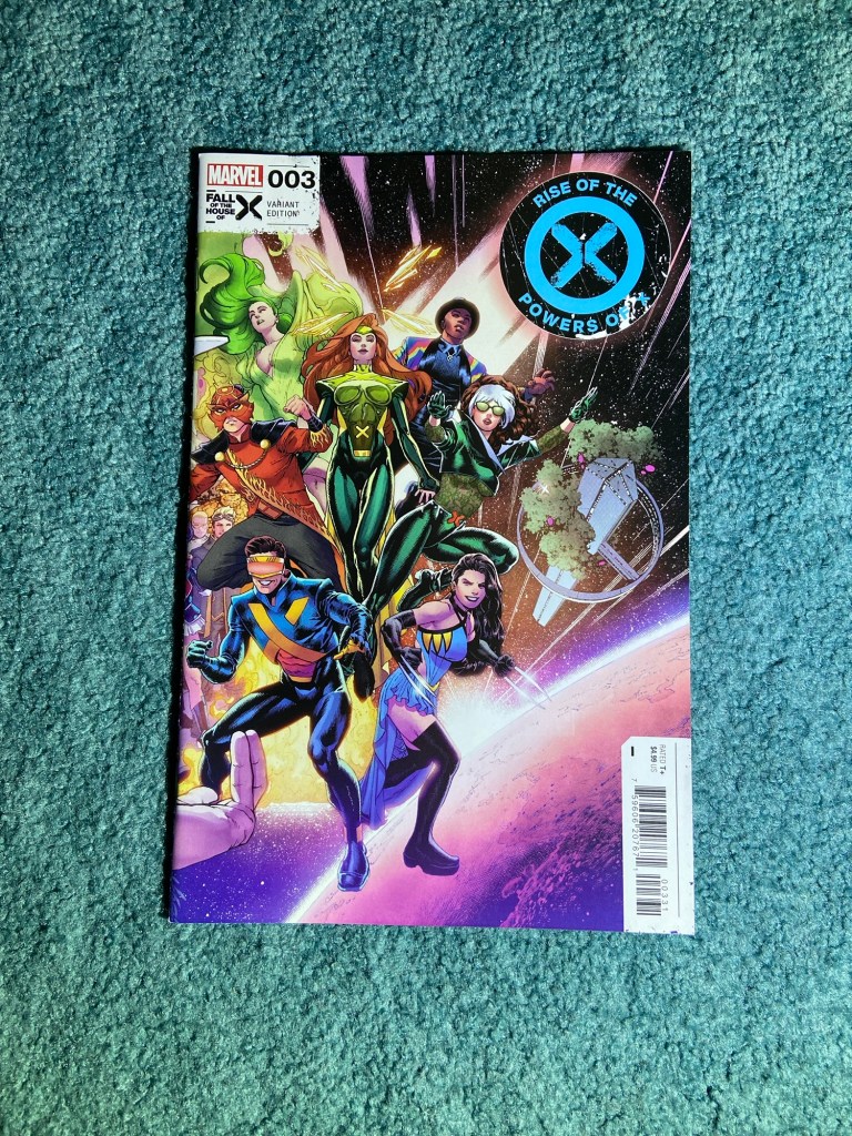
Here’s another Nakayama set during the Fall of X. I love these designs and the shot itself.
And unfortunately, it’s misaligned and a bit disproportioned with one of the covers. I lined it up as best as I could. Though the art is so good, I really don’t notice the flaw.
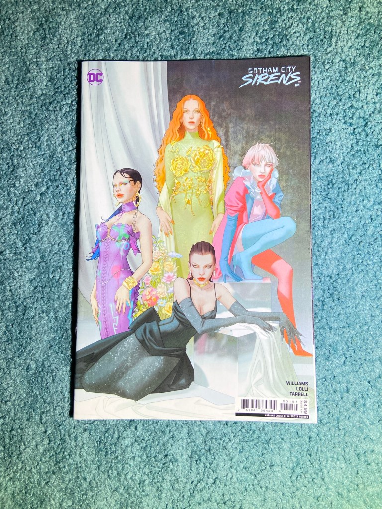
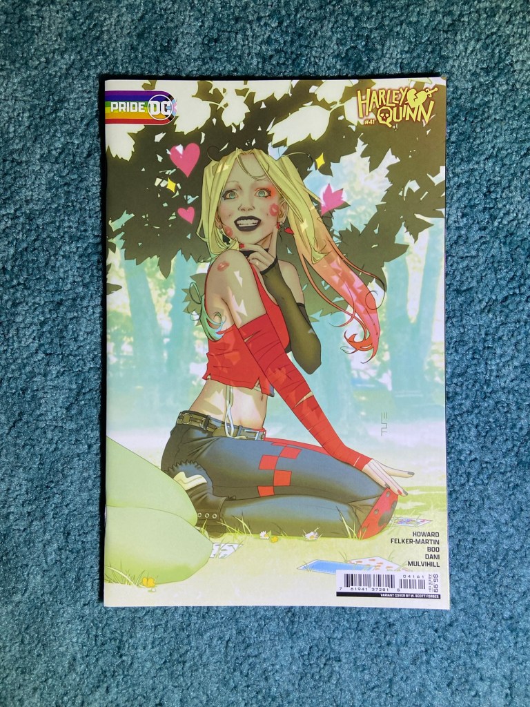
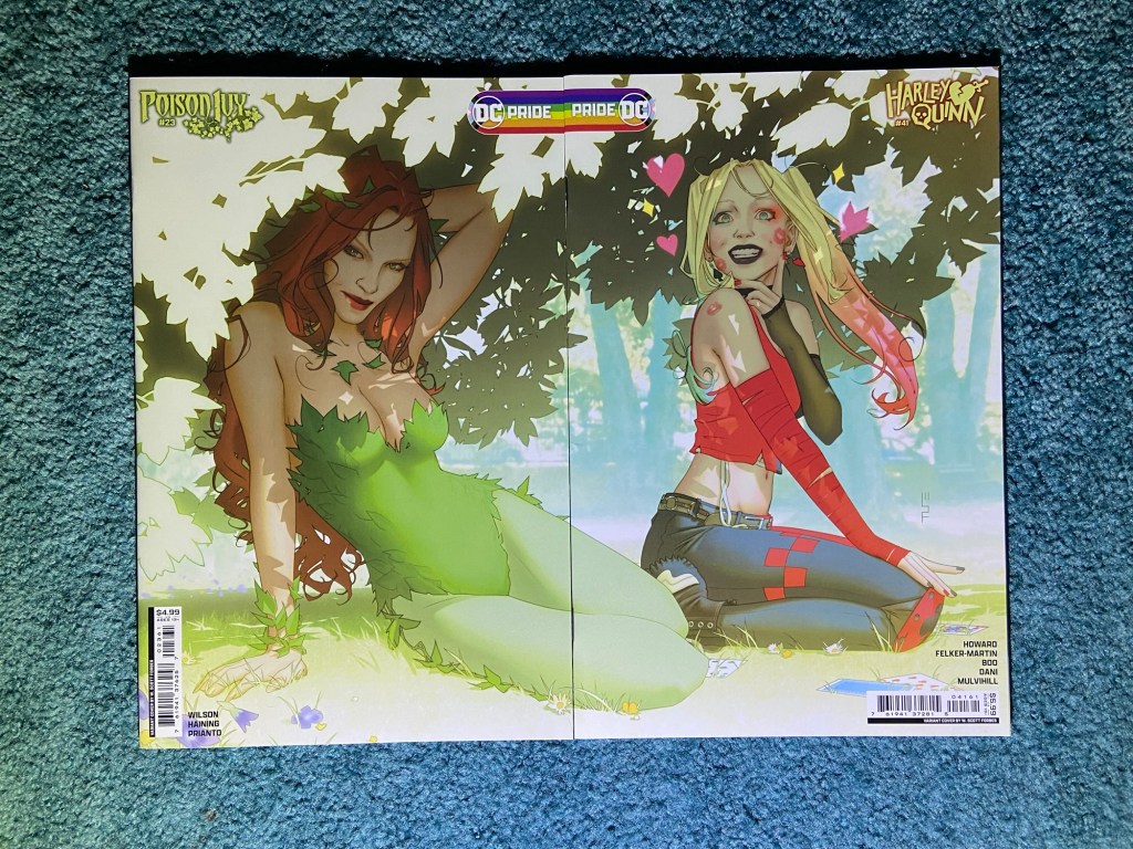
This is a nice set by W. Scott Forbes. I love the bright colors and the scene itself.
I think this was the only set that actually connected properly. So, woot!
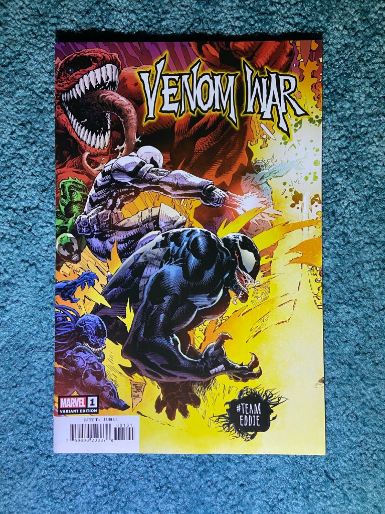
There were a lot of wars going on last year. This is another dynamic set.
This was another overlap, but at least it works when it’s overlapped and lines up.
This cover should be familiar because it’s been here before. Taurin Clarke is just so good!
This had an overlap and perhaps something missing? But they also did this design as a wraparound cover. So I’m fine with this having a flaw.
This is just a fun design even with the tone of the end of the Krakoan age happening.
These also overlapped.
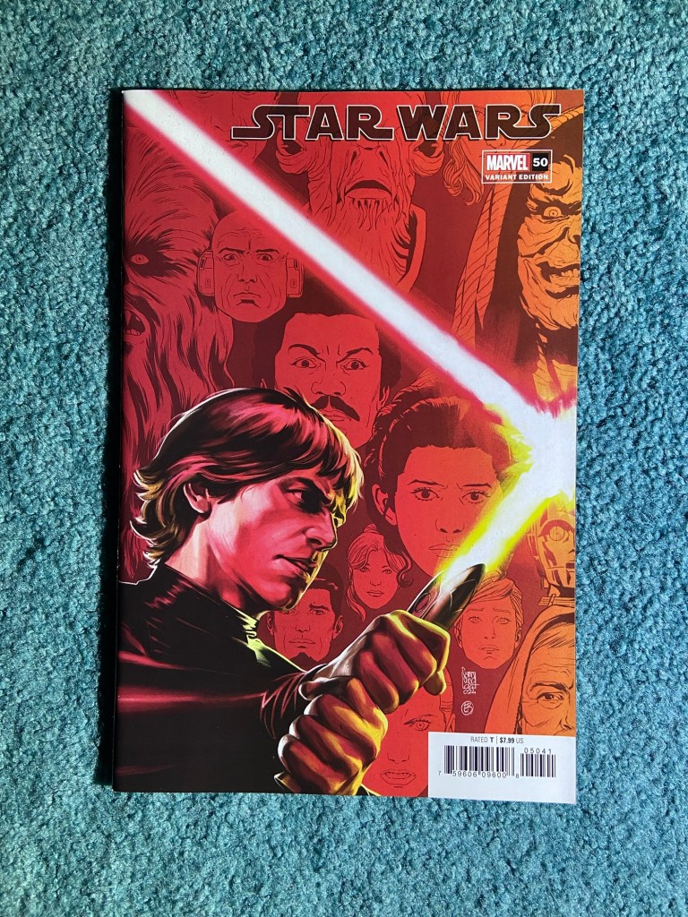
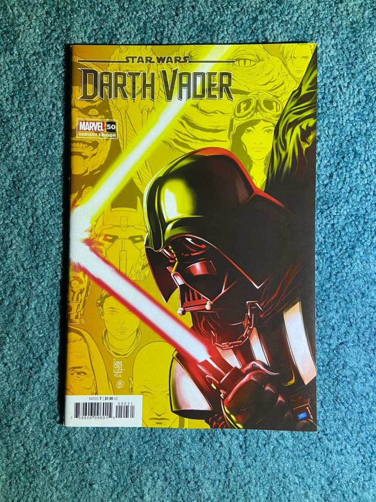
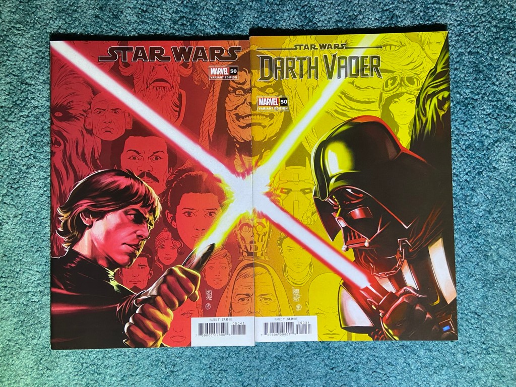
These designs were variants for each of these titles’ 50th issues. I like the characters from each title in the background of each cover.
This set was misaligned, but it still looks good.
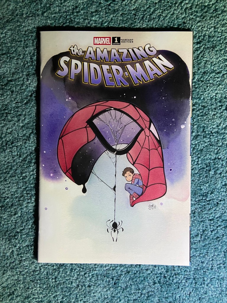
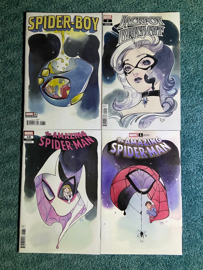
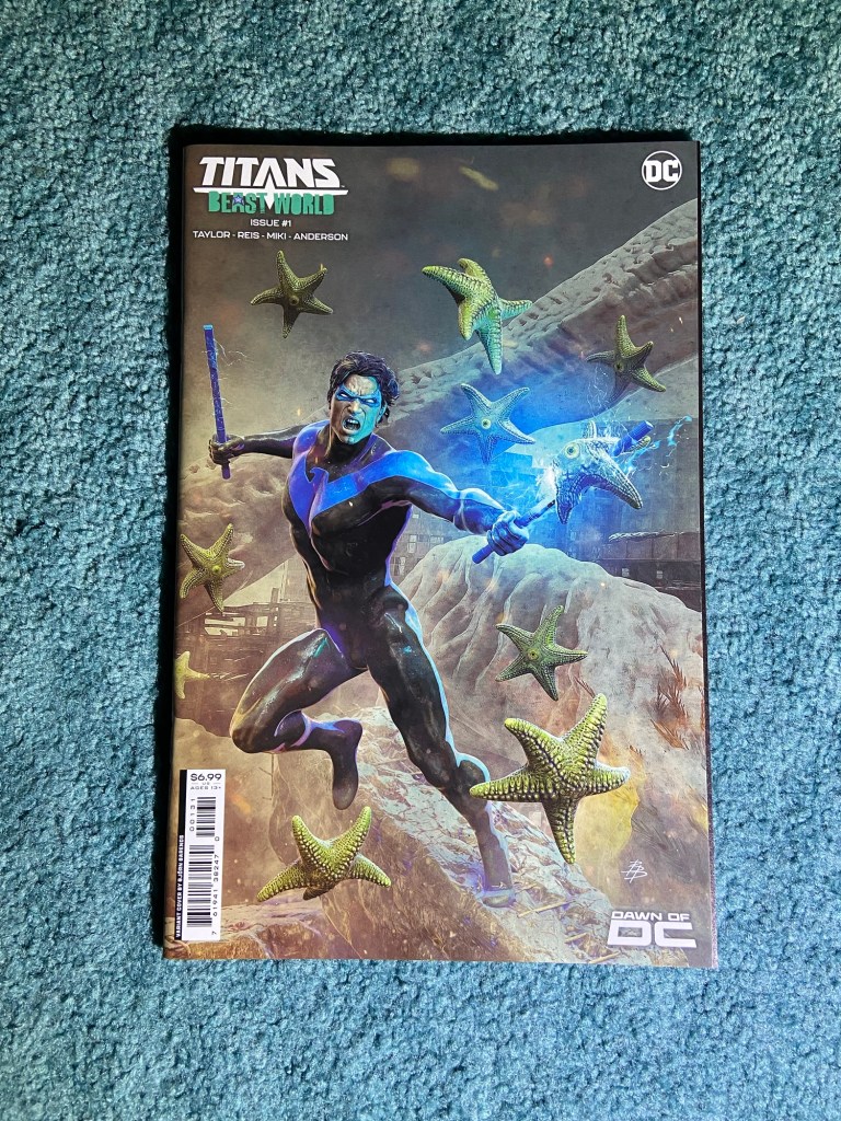
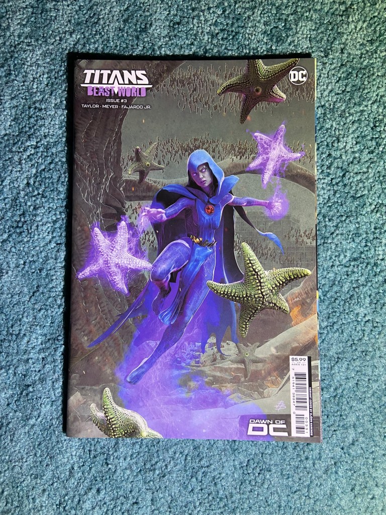
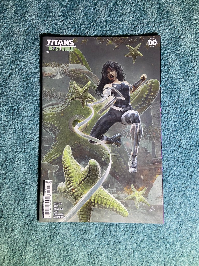
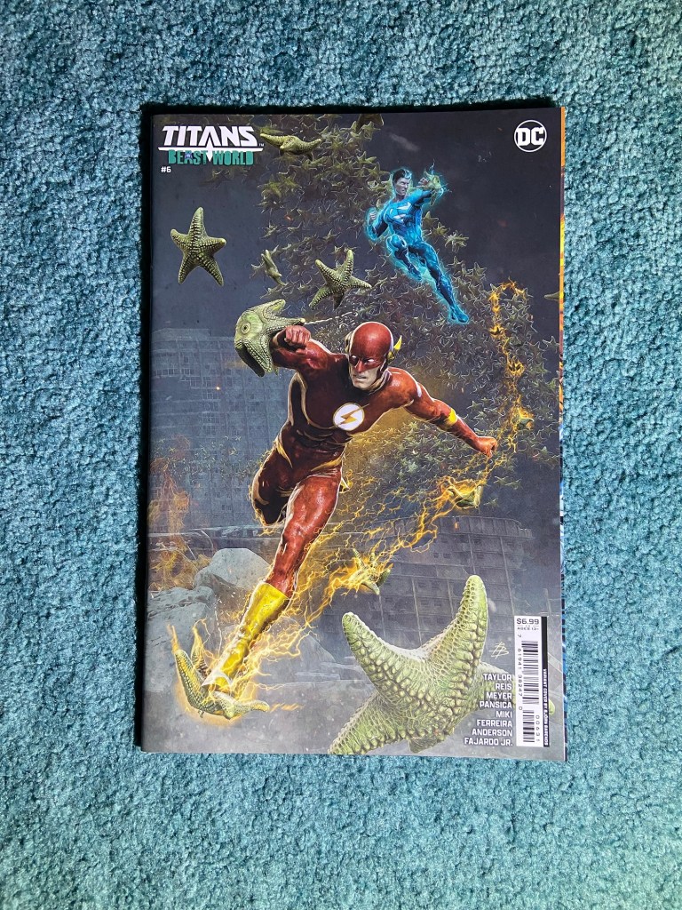
I’ve been waiting to have this set together. Björn Barends did such a great job with these!
I know you can’t zoom in on this, but they line up perfectly, but, it’s all overlap. That’s the problem with the covers that go for card material of the covers because the cover doesn’t fully wrap around the issue itself. So they just all overlap.