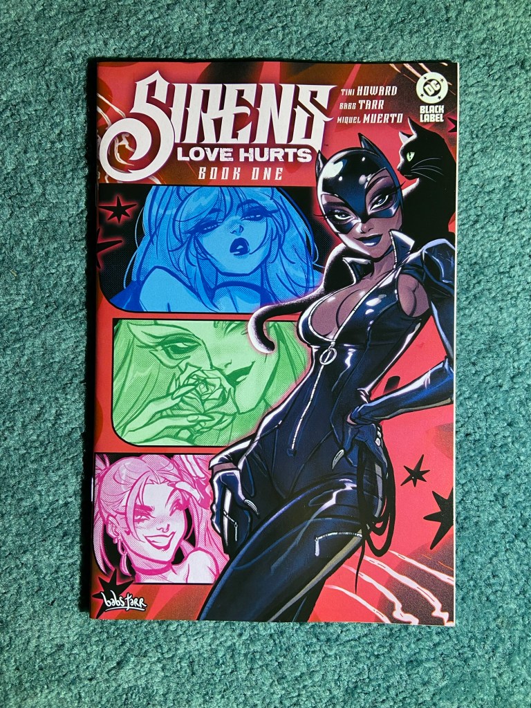
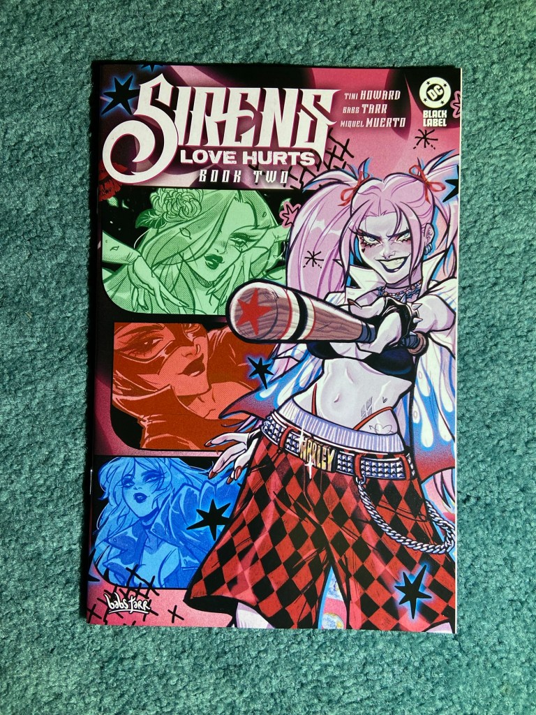
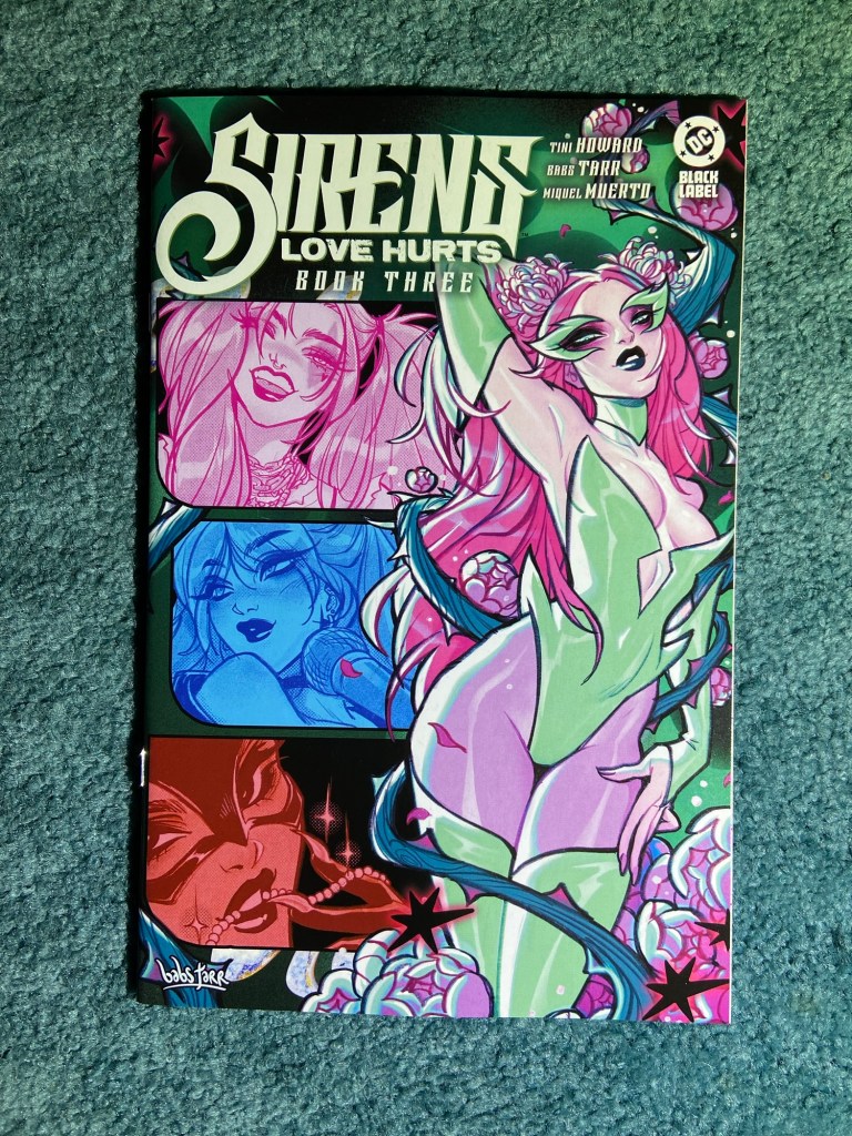
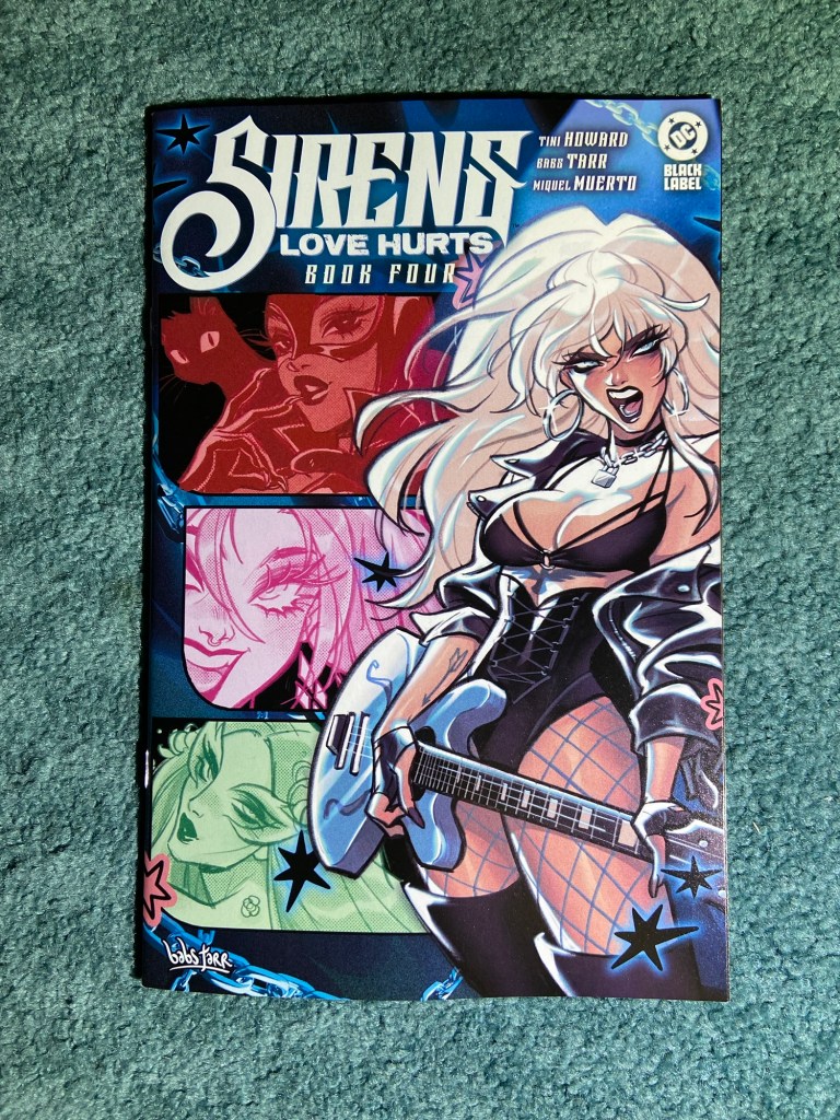
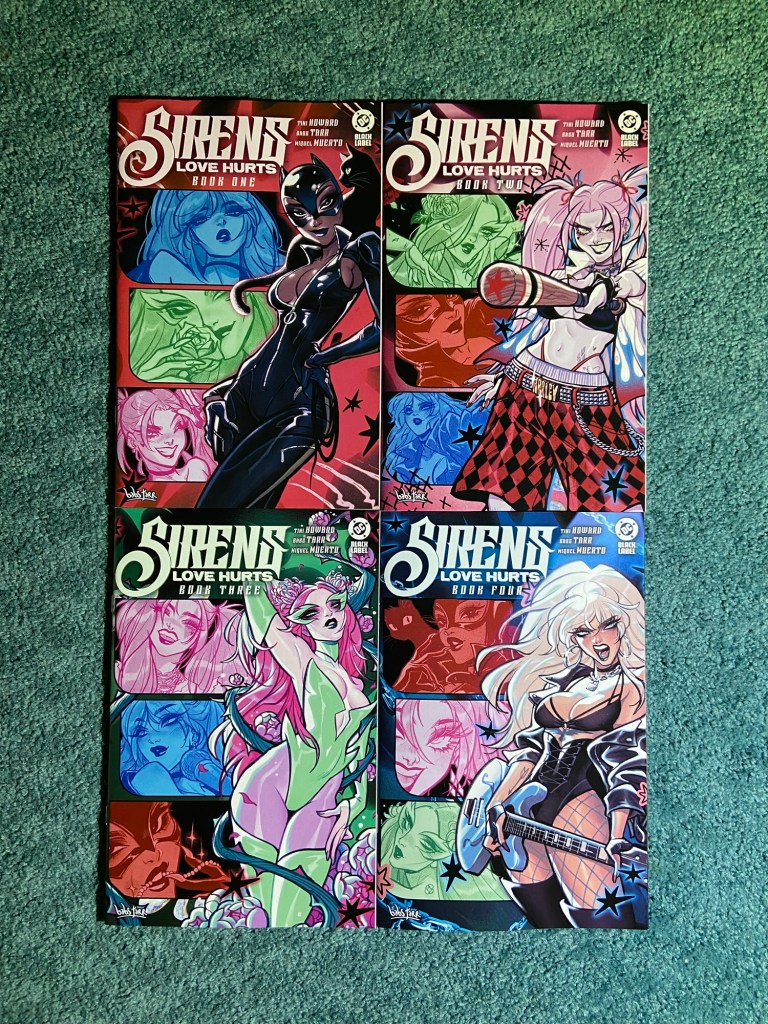
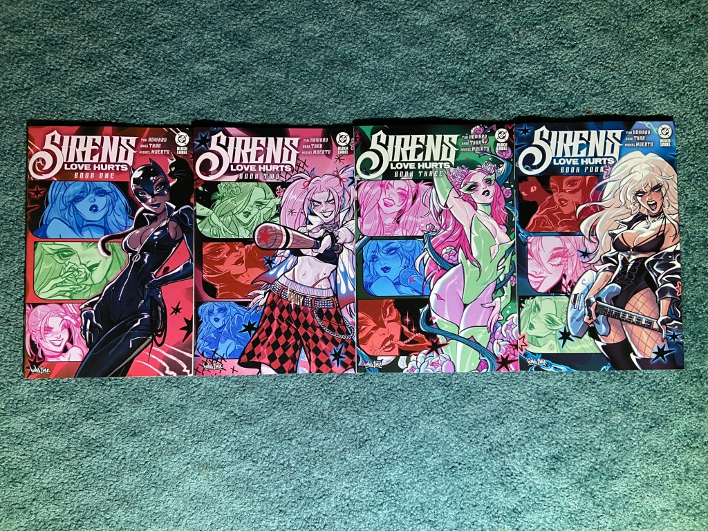
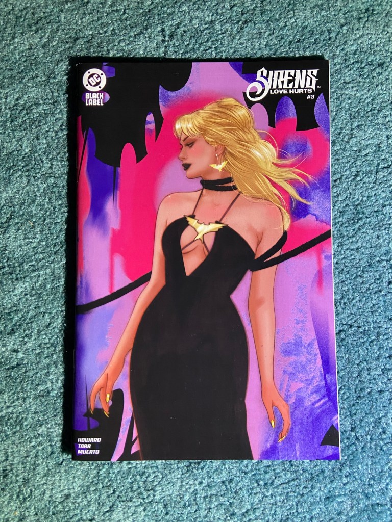
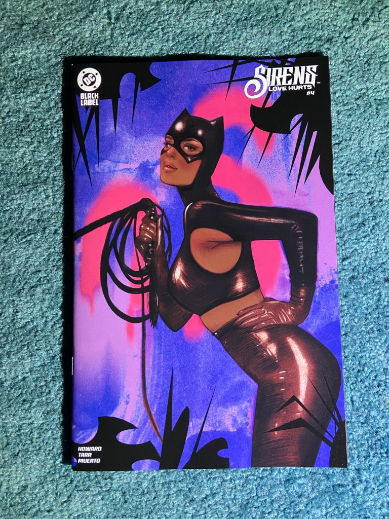
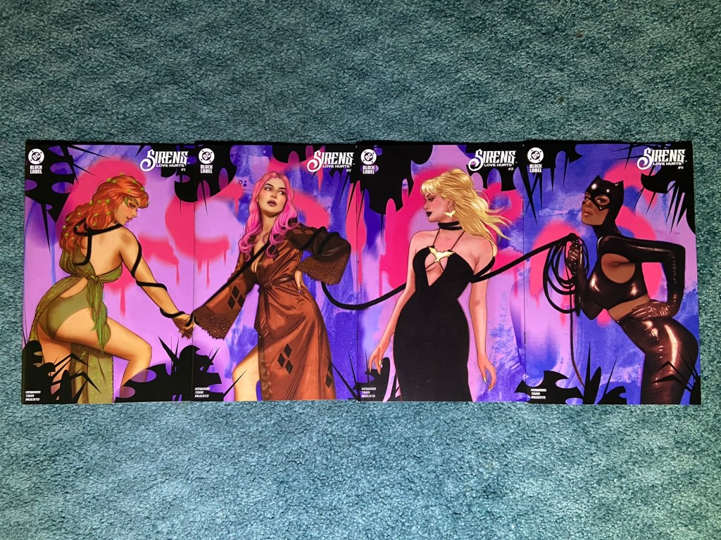
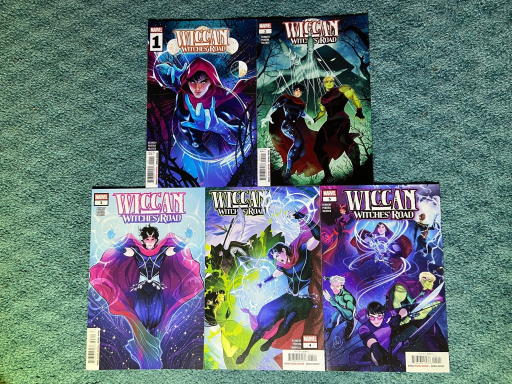
These are the Babs Tarr main covers! They look so great! It’s always nice when an artist is doing the main covers and the interior art. Though, it’s probably super stressful for them.
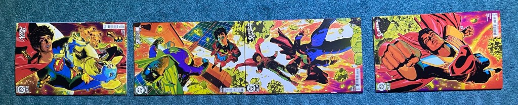
I wasn’t sure which configuration I liked best, stacked or lined up, so I did both.
I normally do connecting variant sets first but it just made sense to do this after the main cover set. These are by Tula Lotay.
There was slight overlap between all the issues and maybe a little misalignment, but at least they could be arranged as actually connecting for once!
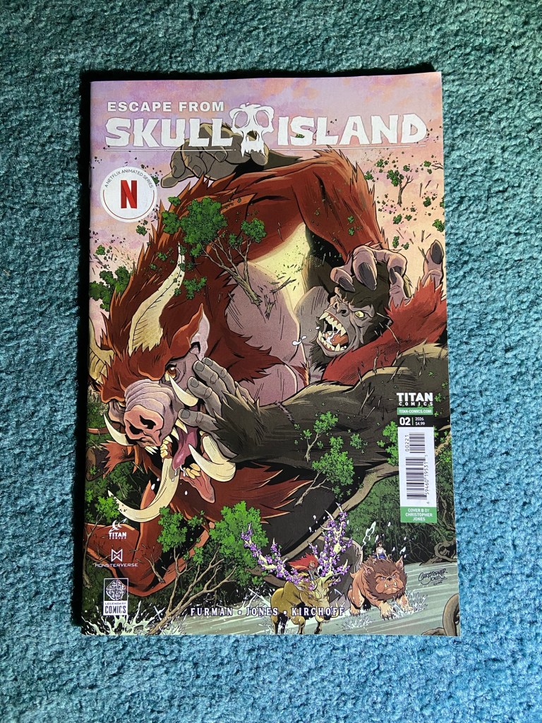
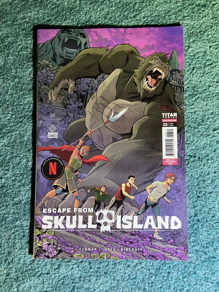
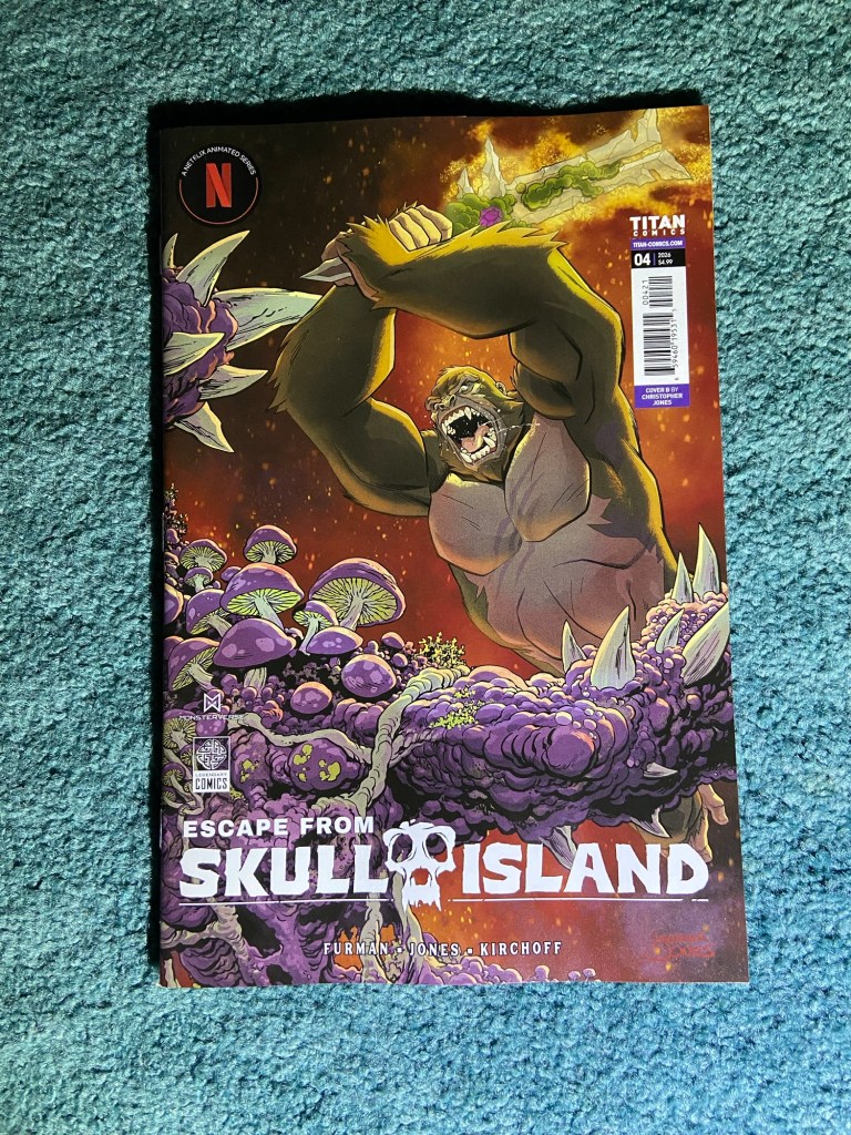
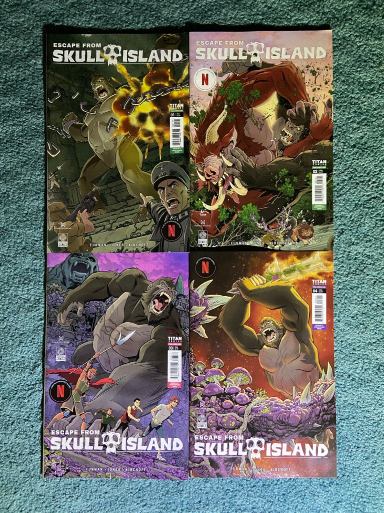
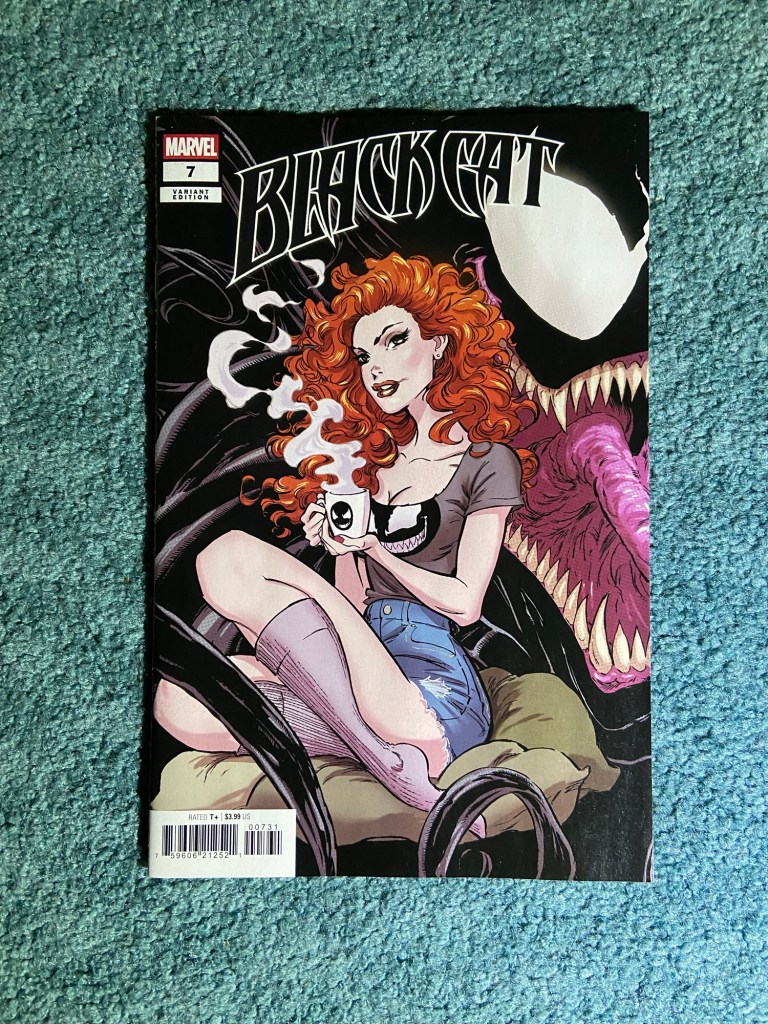
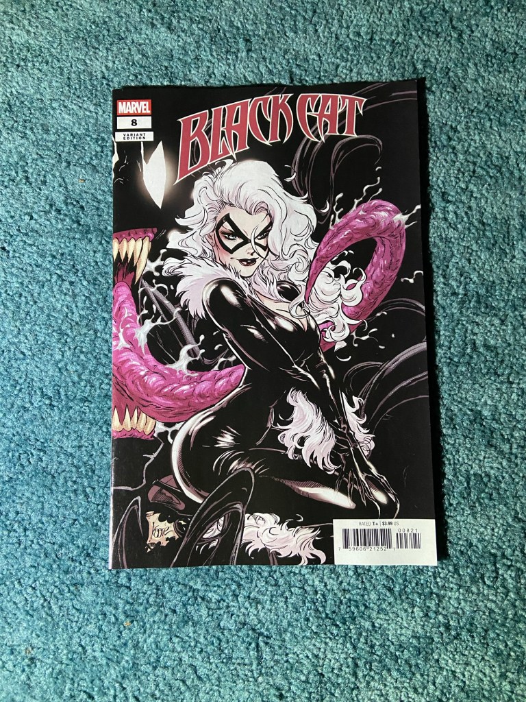
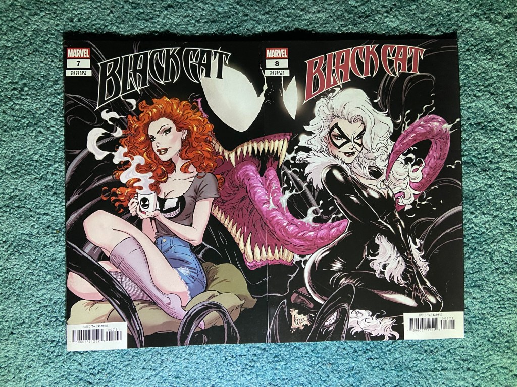
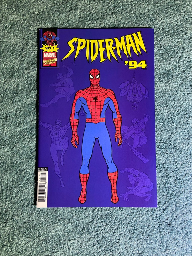
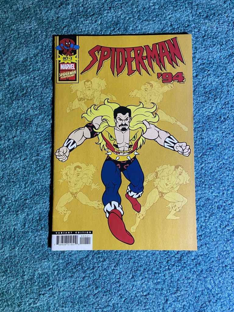
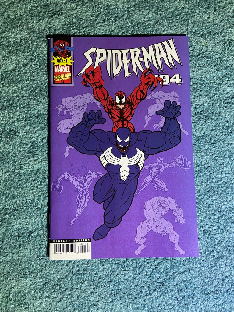
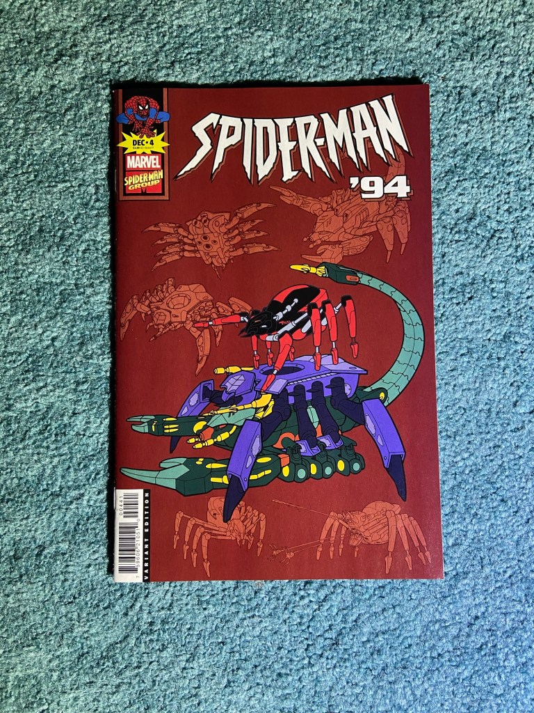
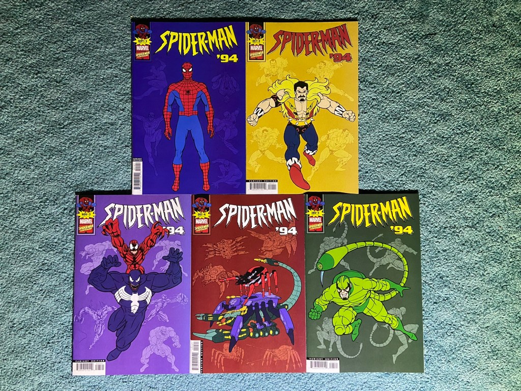
These are the animation variants by Chris Jones. I will have to get the other animation variants from the previous run. I think I only have the variant for the first issue.
These look good together.
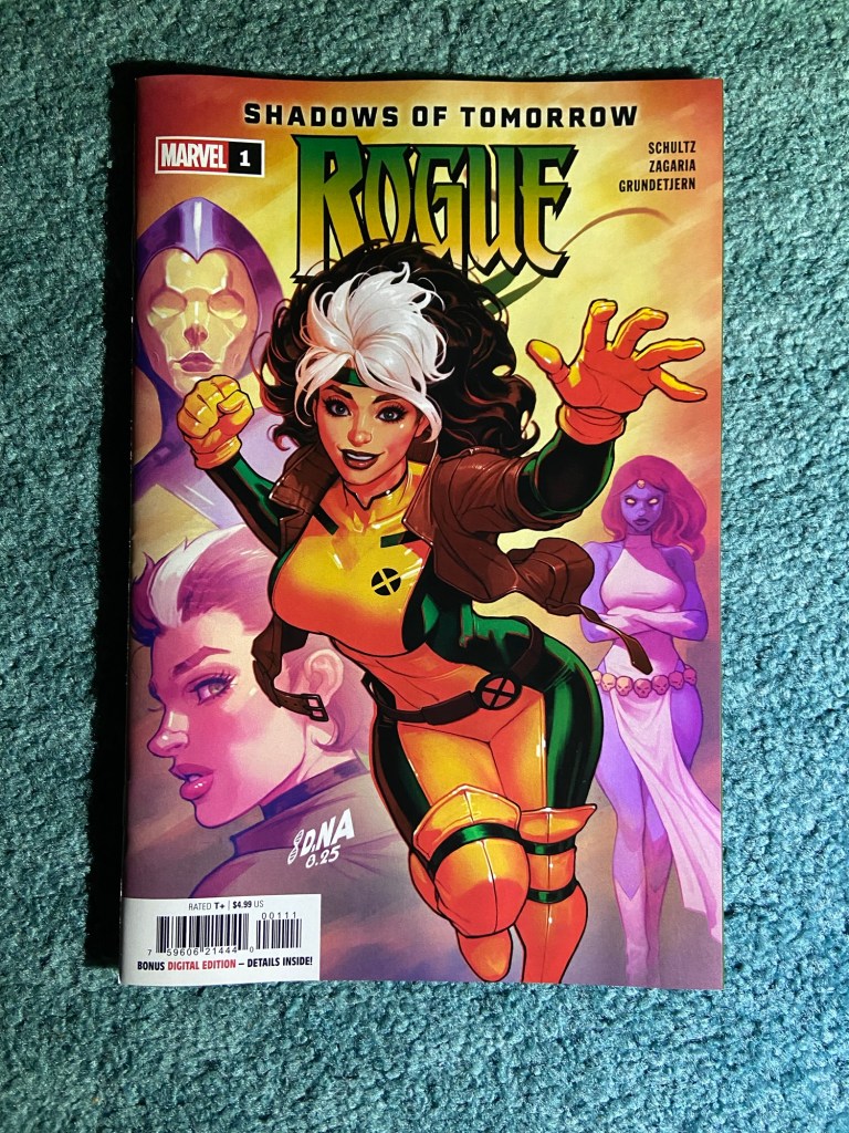
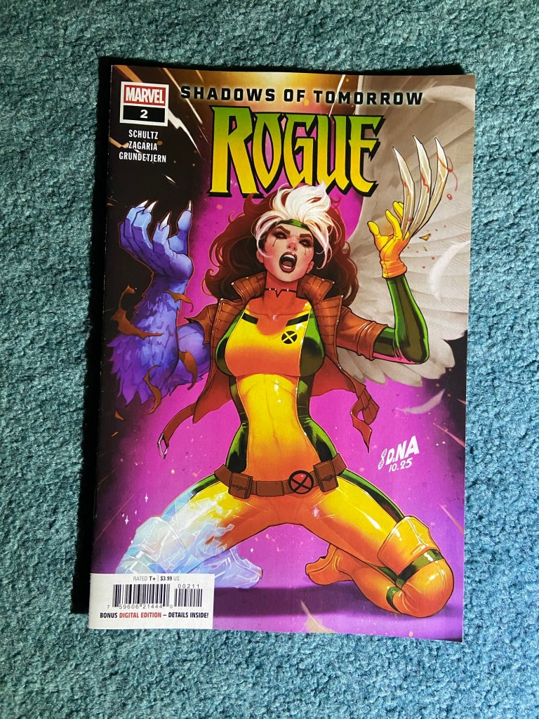
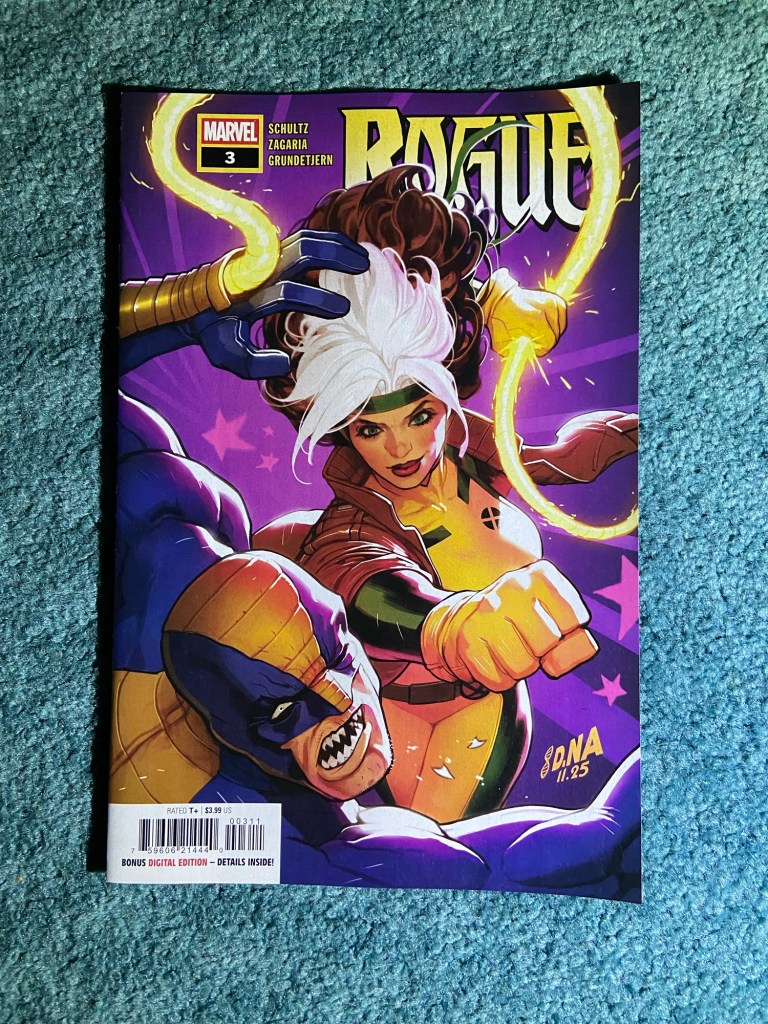
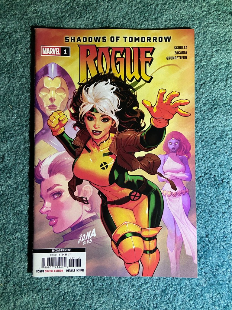
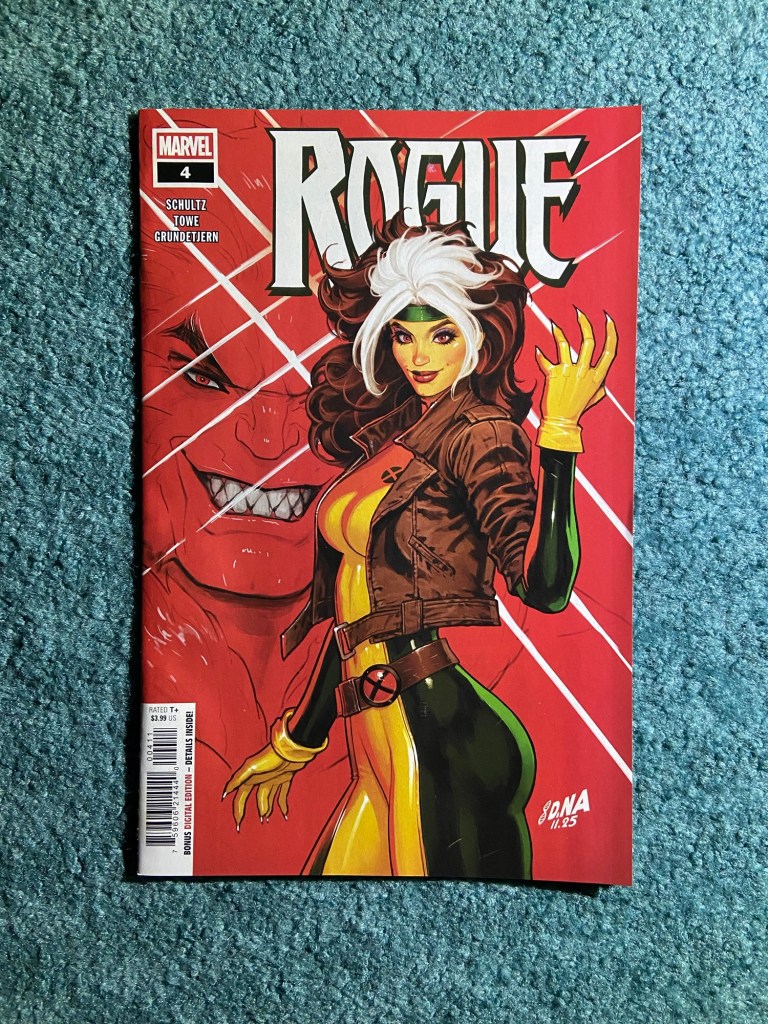
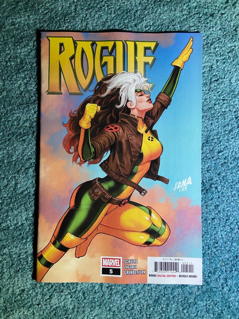
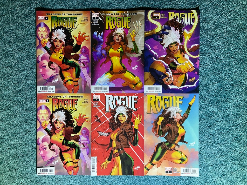
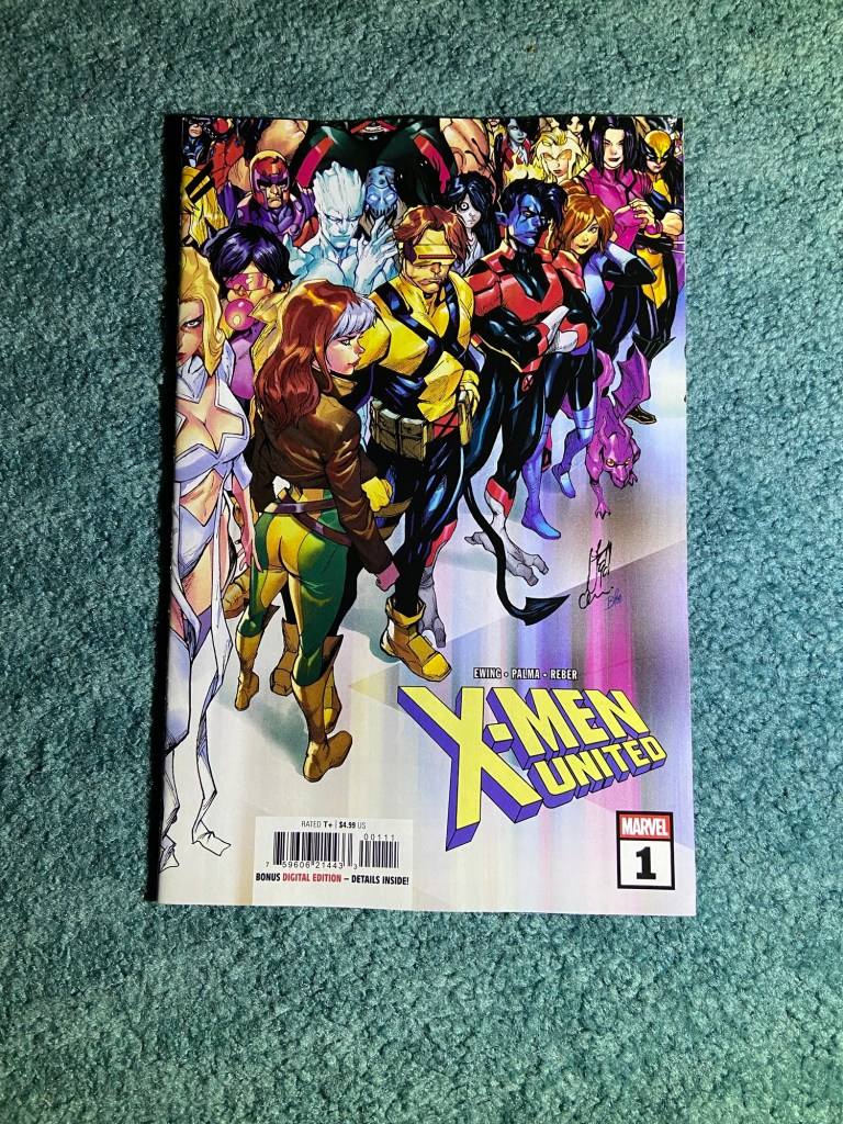
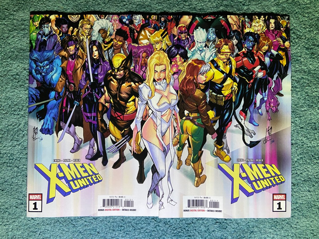
And these are of course the David Nakayama main covers for this most recent Rogue miniseries. This also has a second printing of the first issue!
These look so good together! Especially seeing the first and second printings together to spot the slight and obvious differences.
This is the Iban Coello connecting set! Each of them look great individually, and they do look good together.
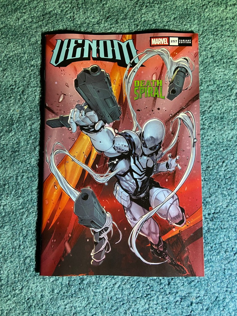
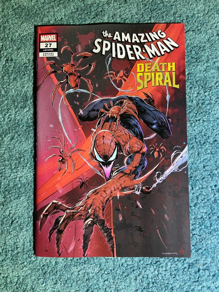
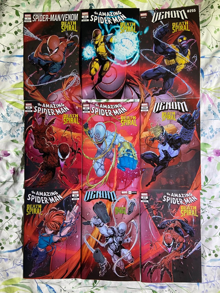
I did my best with connecting them, as usual, some connect vertically, some connect horizontally. There is a variant that has all the designs on it, but it costs $100. It’s still not a bad 9-cover connecting set compared to other sets.
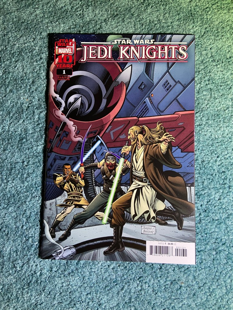
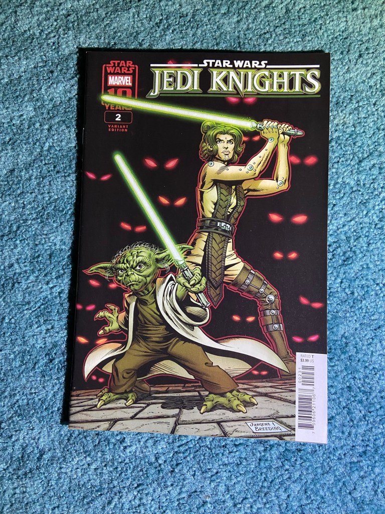
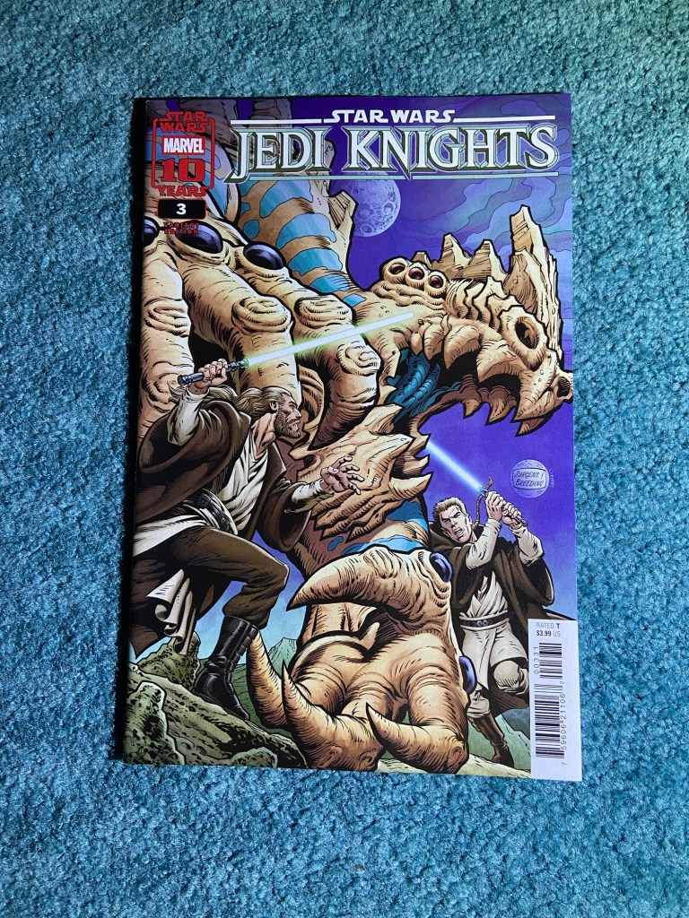
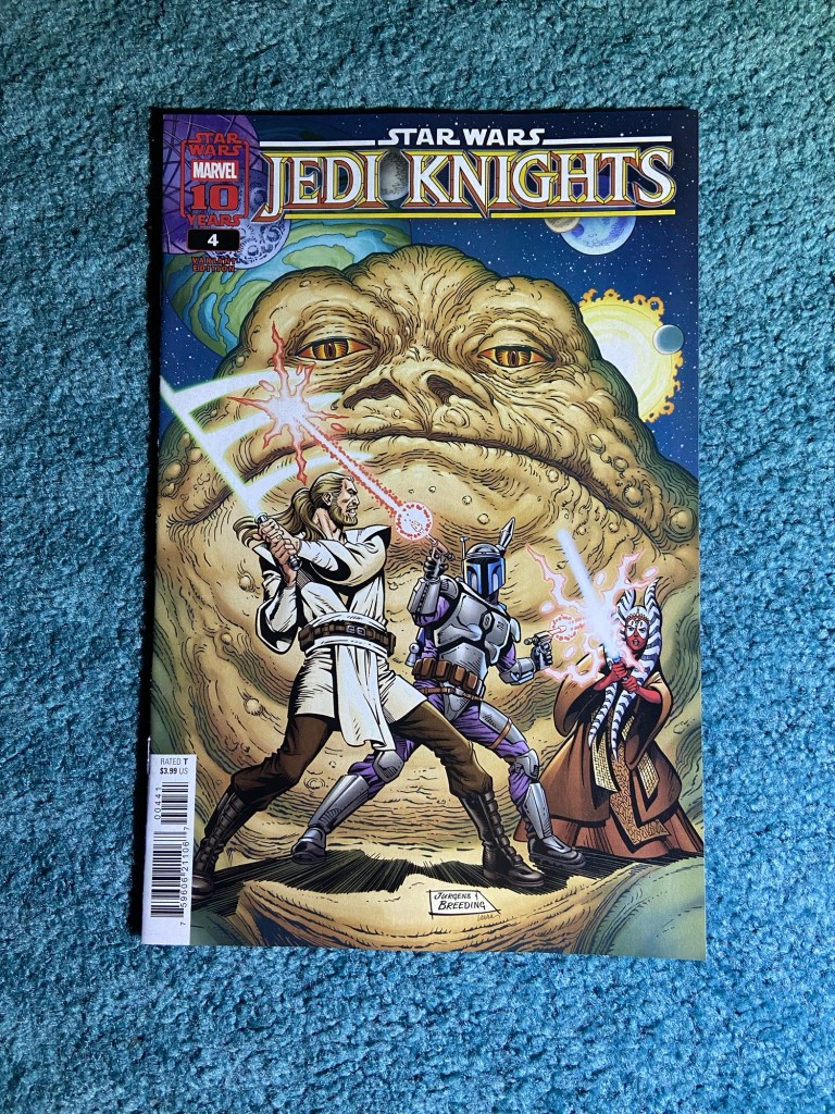
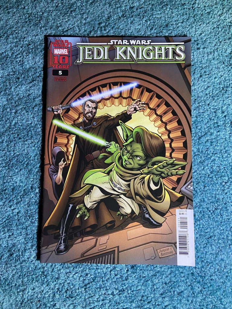
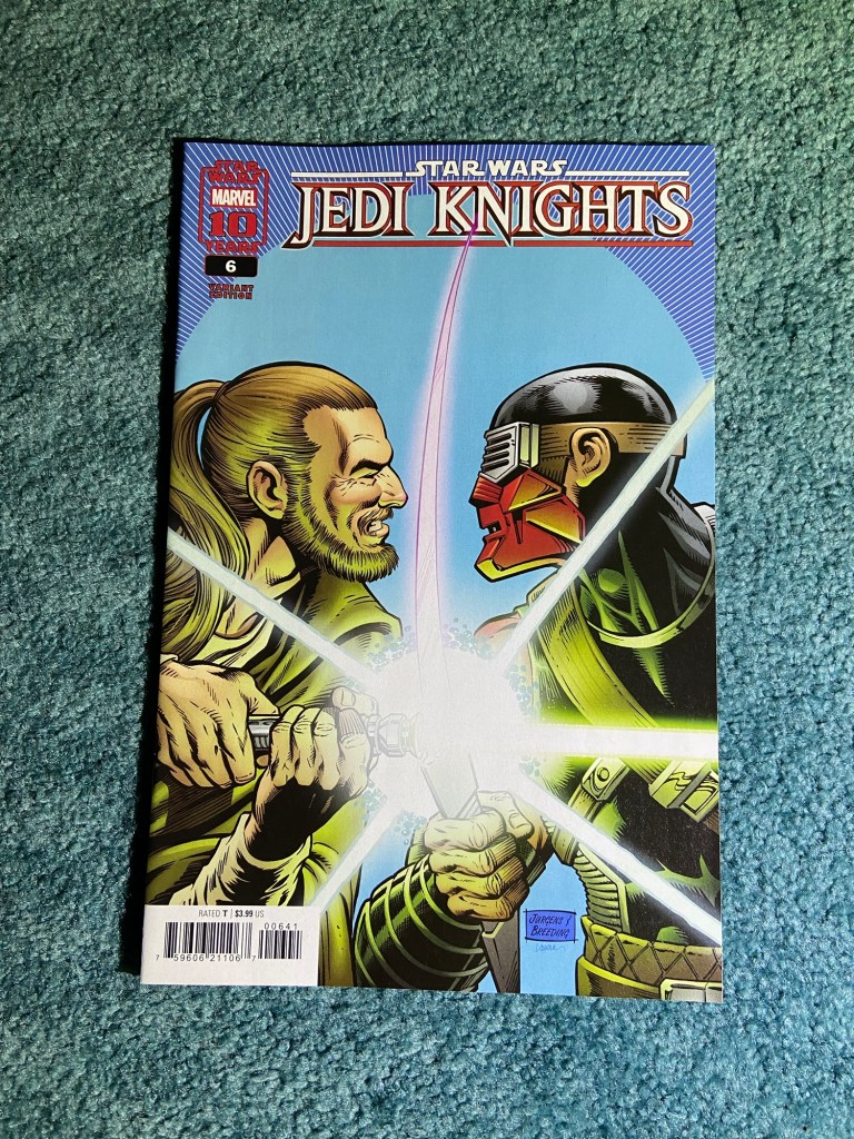
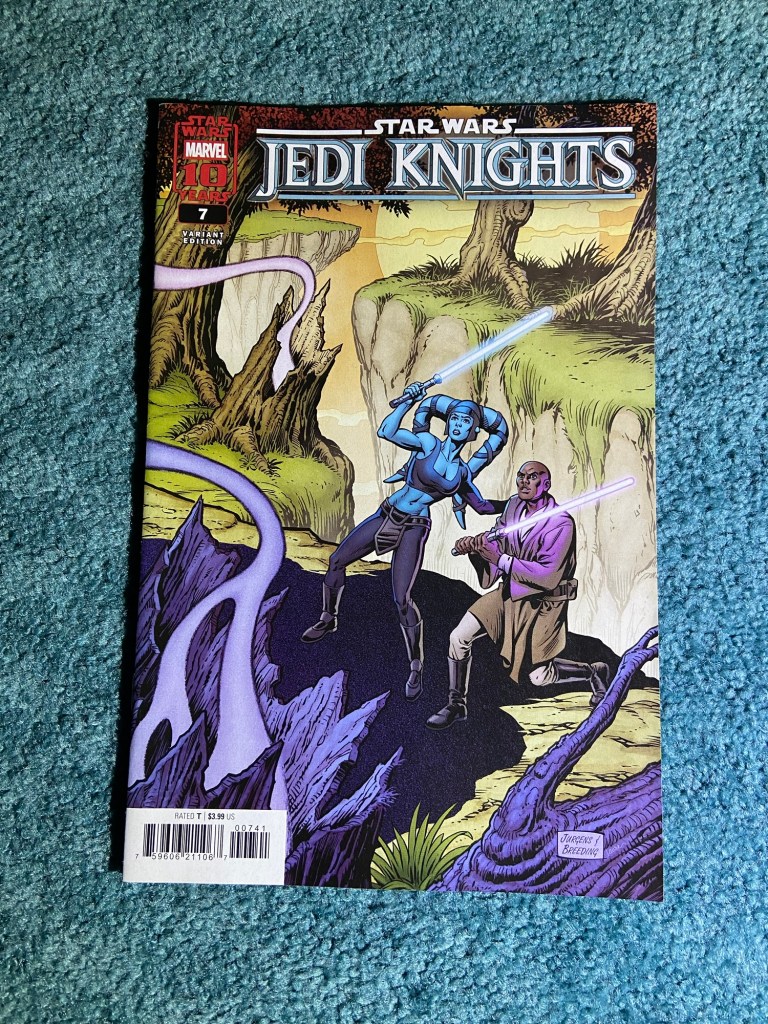
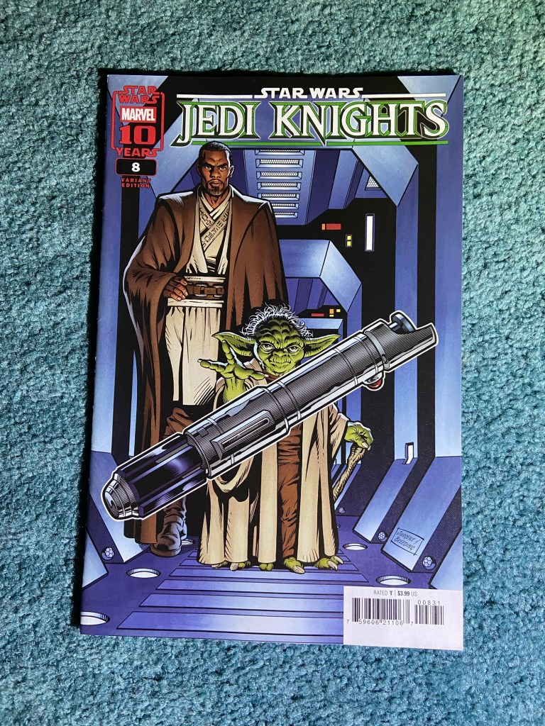
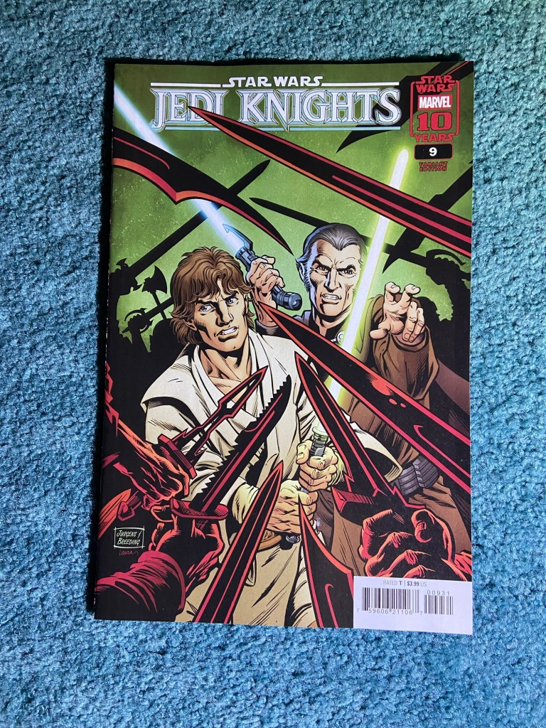
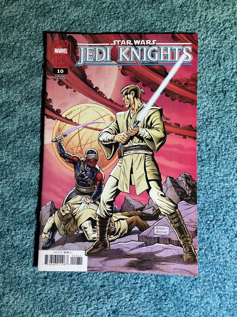
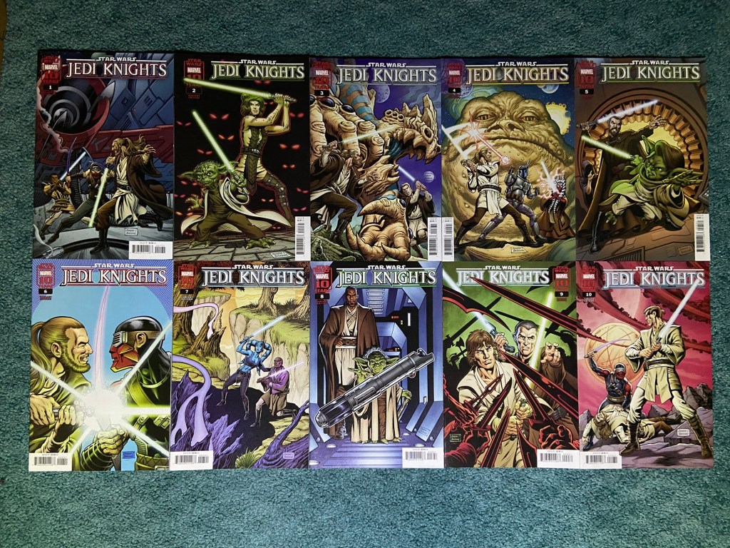
These are the Dan Jurgens and Brett Breeding variants for Jedi Knights.
As usual, they look great!
A nice connecting cover set by Guillem March that have a little overlap but almost connect properly.
Also slightly misaligned. But they do look nice together.
These are the ACO connecting set. They all look great!
But of course. The connecting aspect is horribly printed. I showed this design as a vertical image and a horizontal one since they both work. But yes. The first and last issues have a huge chunk of design missing between the next and precious issues respectively. And yet, the middle issues connect decently enough? So very strange.
Connecting variants first, as always. though, only one set is non-connecting covers.
Russell Dauterman just is amazing. These covers look fantastic! And yet, the connections are both misaligned and overlapping. It’s frustrating since it’s such a great design.
This looks just glorious, just don’t look too closely between the covers. I’d buy a poster of this.
Kaare Andrews did a great job on this design! This also is an overlap problem, but even when next to each other normally, it’s passable.
This design just looks so good.
Stefano Caselli deserved SO MUCH BETTER than what Marvel did to this design. But these covers are fantastic.
This was an overlap issue. And it just looks far too noticeable to have next to each other normally. But this design is great to look at. I can’t remember if I got the poster of this from the store, I think they just hung it up at the store.
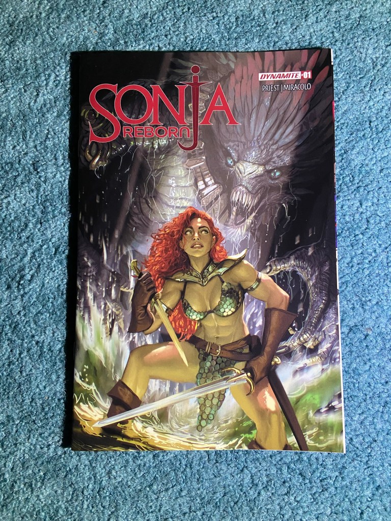
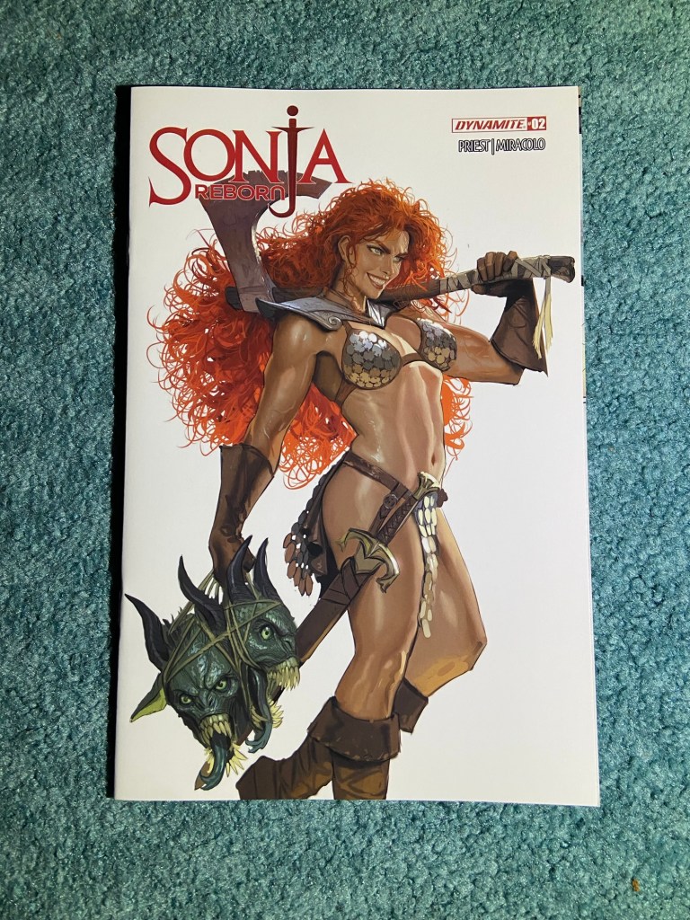
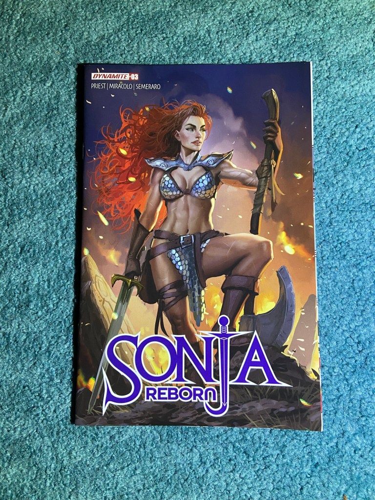
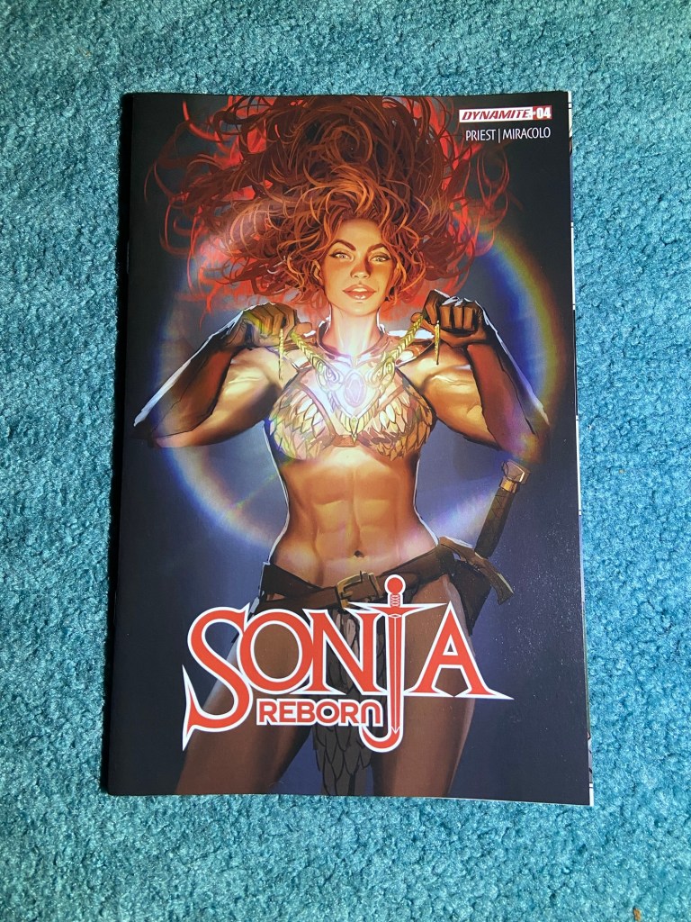
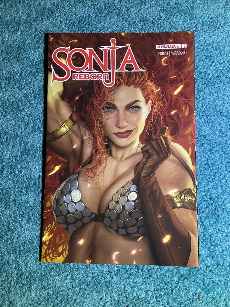
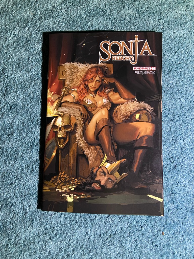
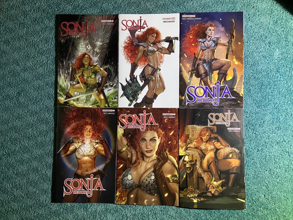
And these are all the covers by Stjepan Šejiić for Sonja Reborn.
I (unsurprisingly) love his art!!
Added just one new box, a Darkseid covers box. So, we’re at 113 boxes.
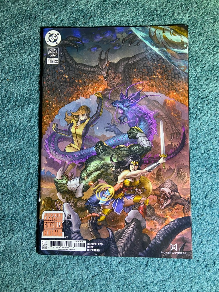
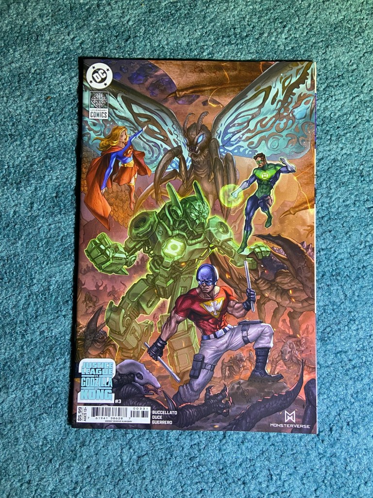
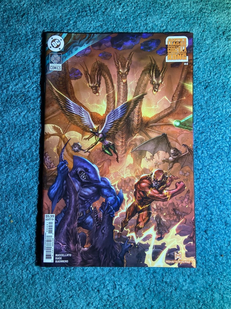
Alan Quah did such an amazing job with this design! And as usual, I’m sad that they don’t connect properly. These were all overlapped. But the designs are just so detailed! I love them!
The overlap wasn’t huge, but still frustrating. But they look good like this, mostly.
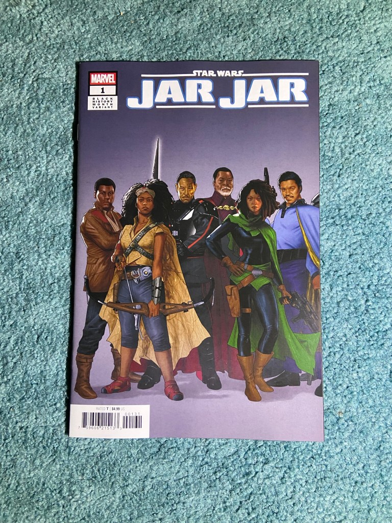
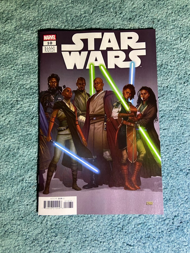
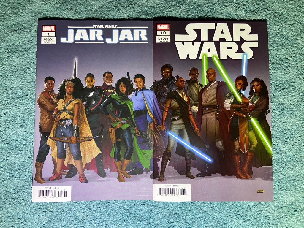
Taurin Clarke with the Black History Month set. Now, this, I don’t understand. Why on earth are the shades of colors different between issues? How is that not a QC problem? The images were drawn as one image, why would you allow this kind of color difference for mass production? I assume time is the reason and QC didn’t have much or any time.
I think there wasn’t much overlap, but the color difference was far too distracting. But they all look amazing next to each other!
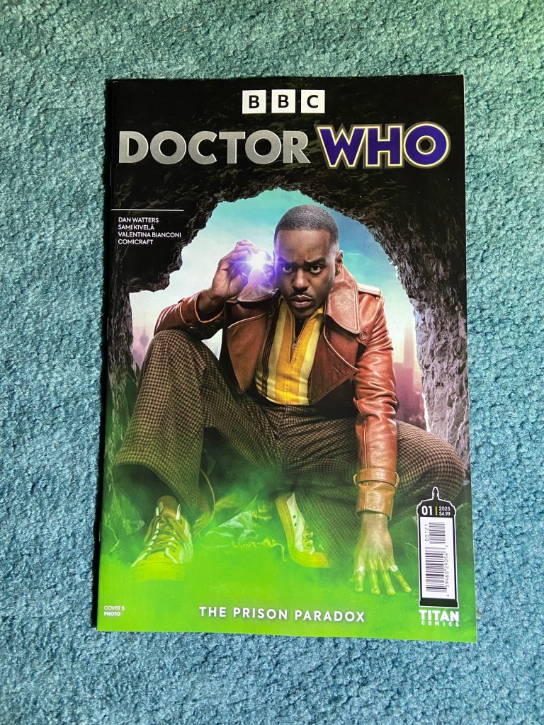
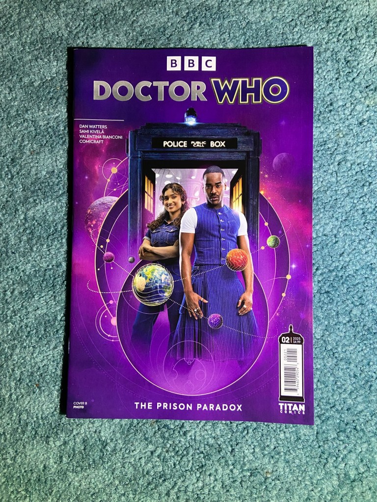
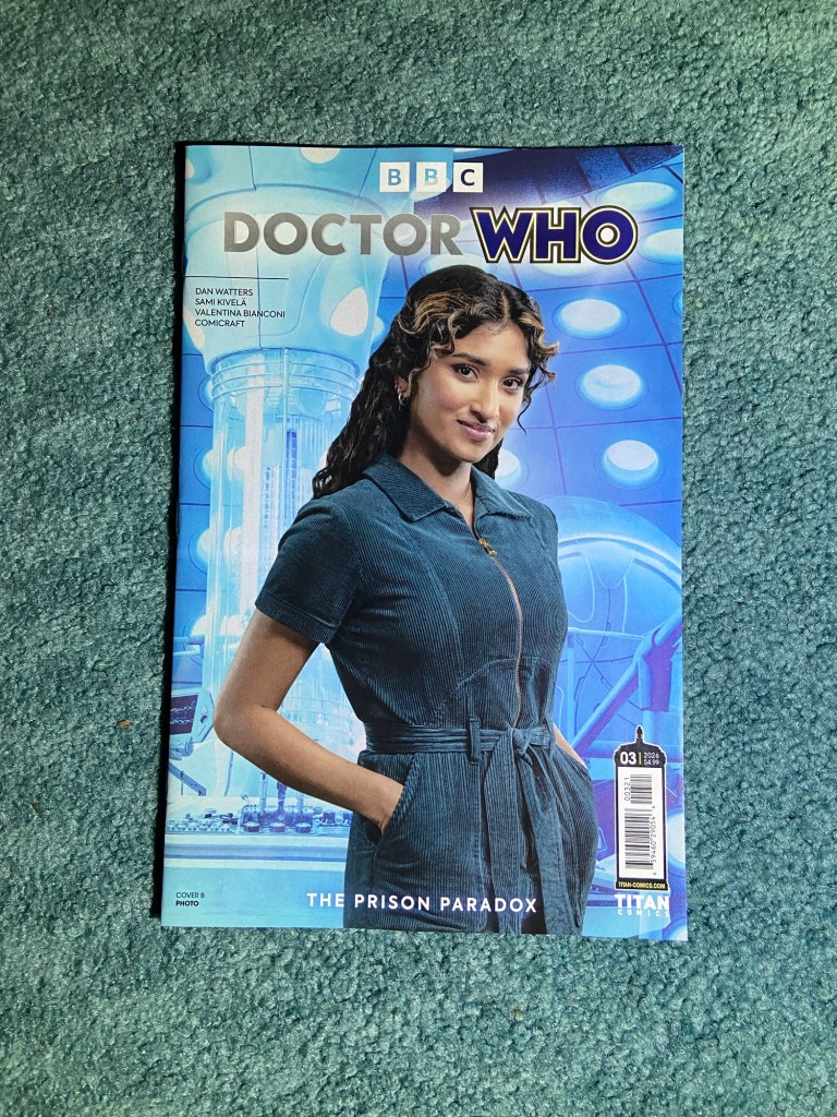
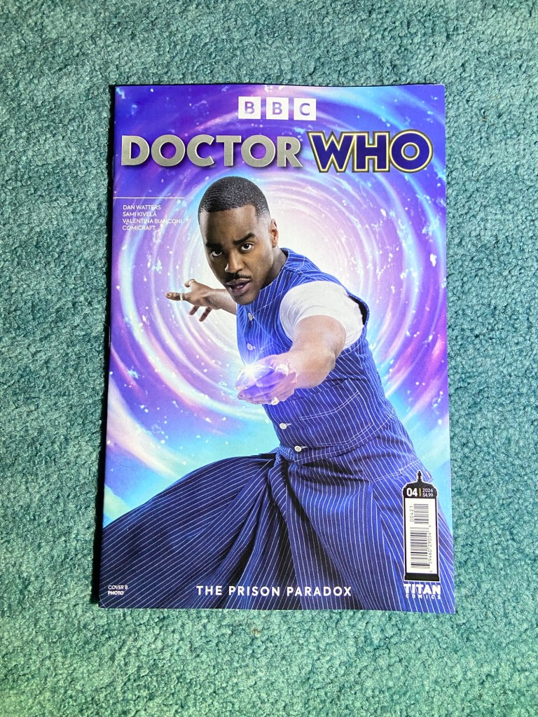
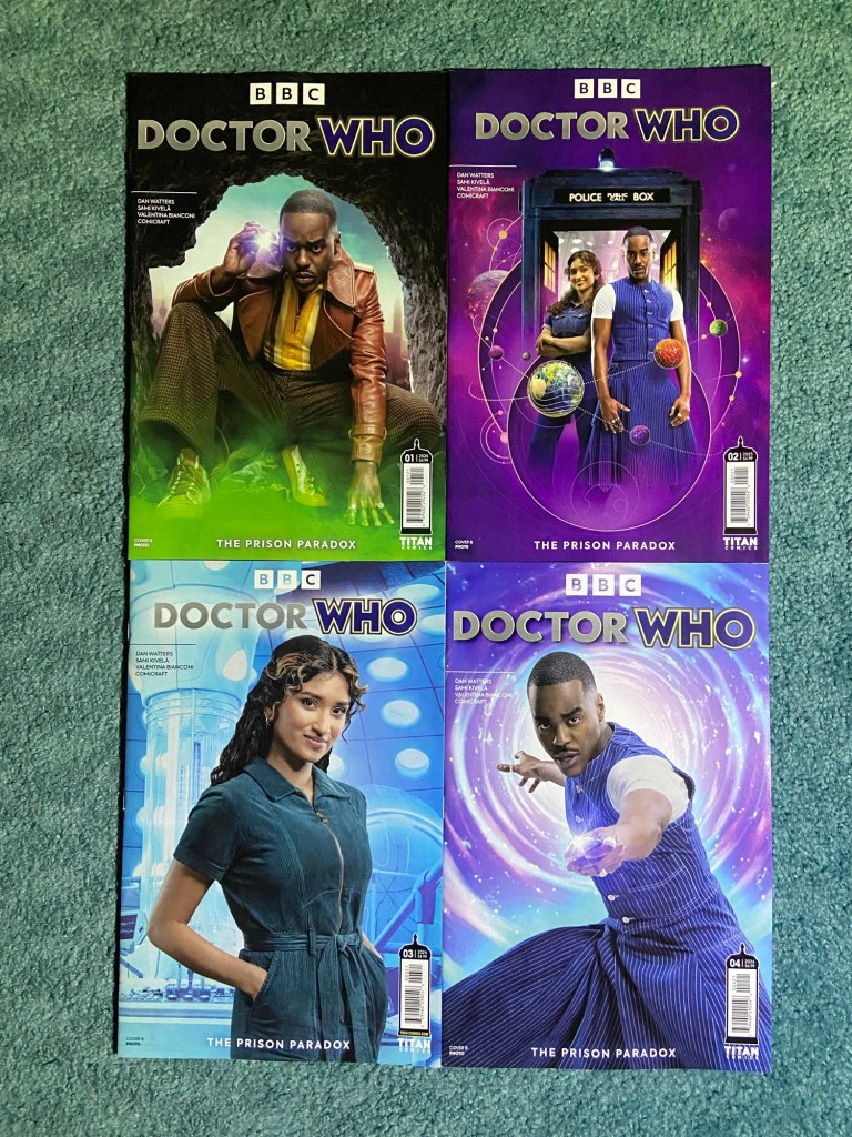
I do enjoy when Doctor Who does photo variants for its comics. It’s a nice way to get some promo photos!
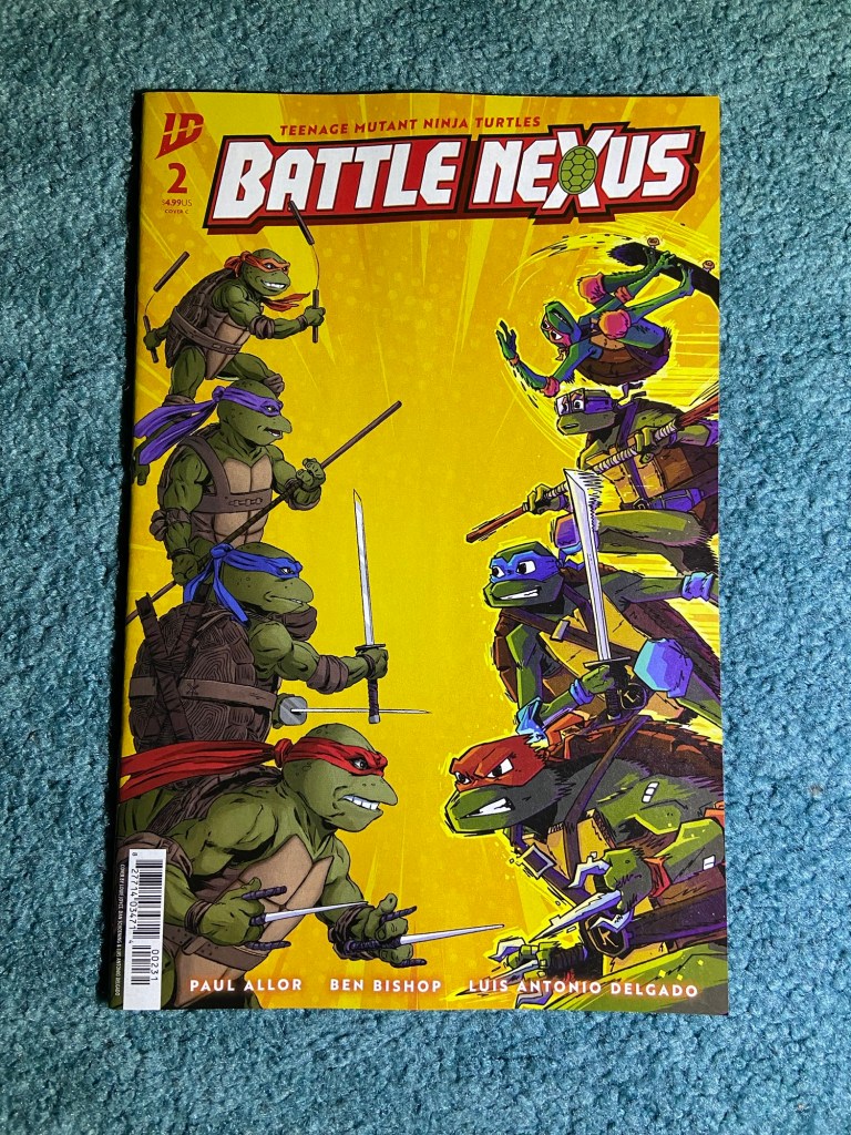
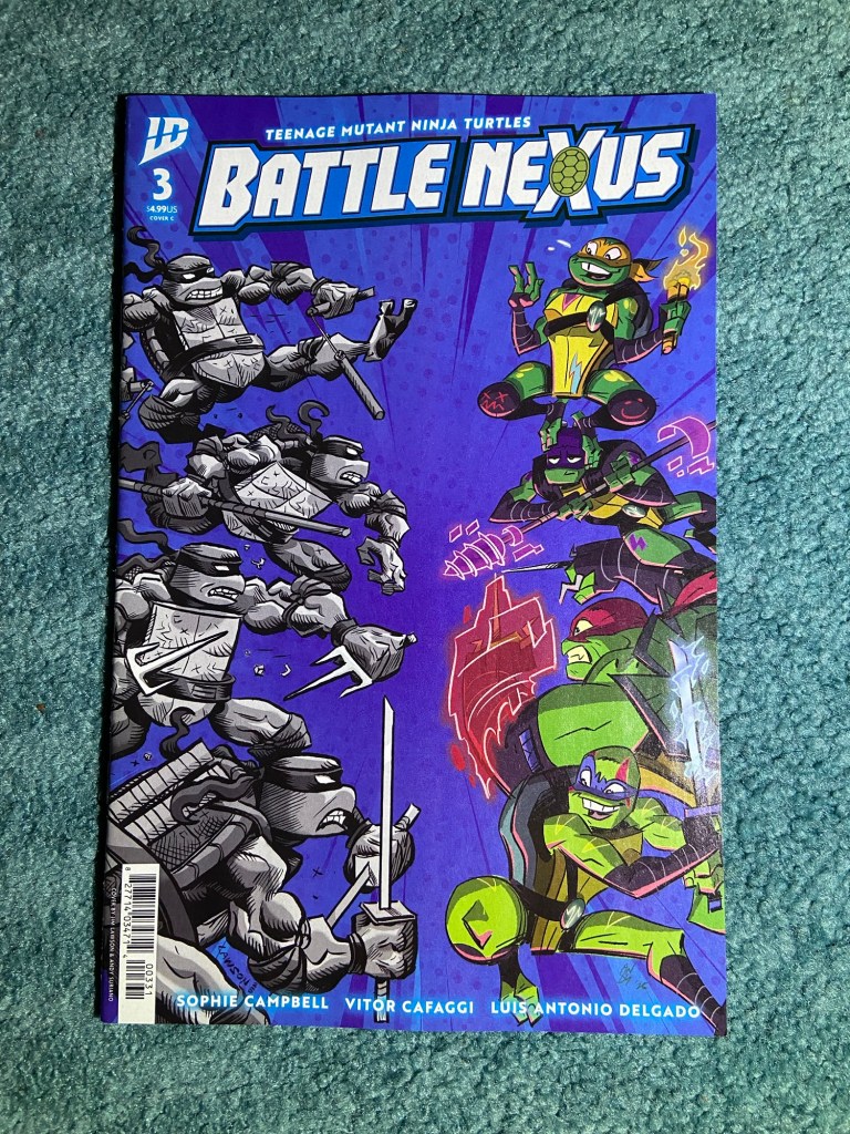
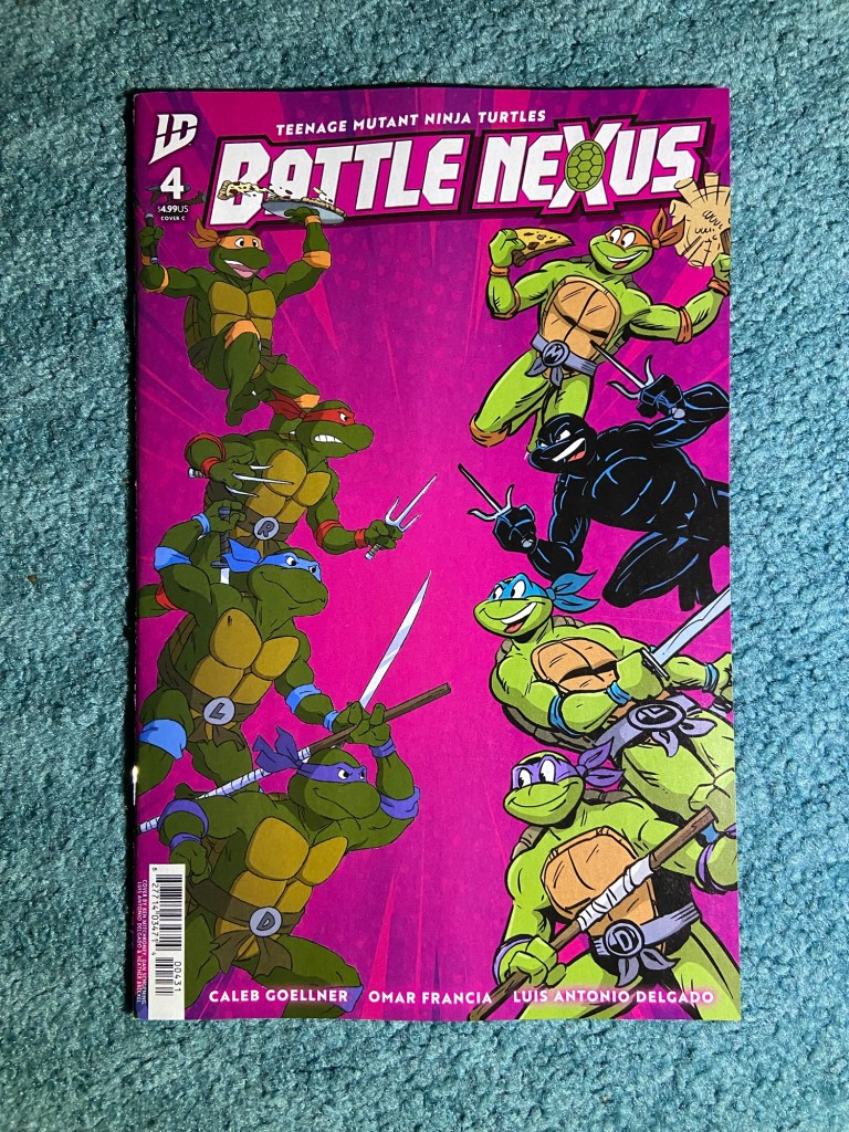
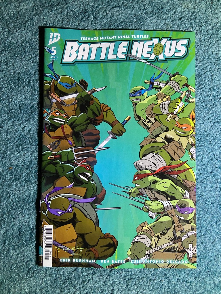
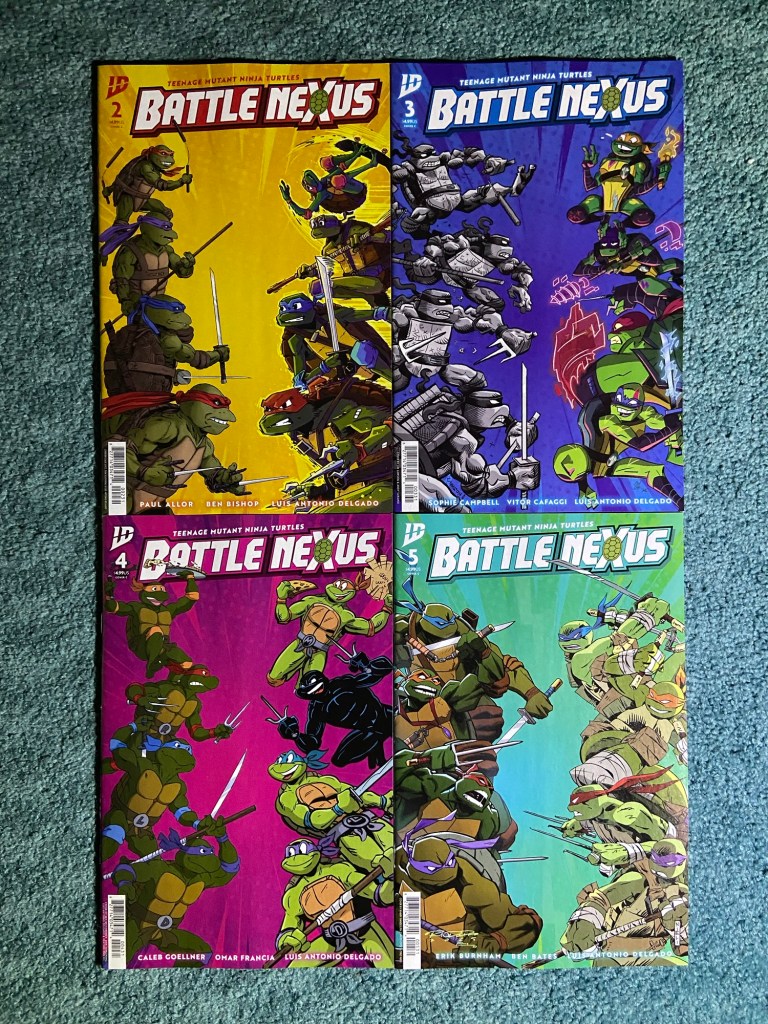
These covers were so wonderful to see! Even though apparently most of these battles don’t happen in the story, but they look so good on these covers! I watched the 80’s/90’s’s TMNT cartoon and then the 2003 one mainly. I’ve watched a bit of some of the other ones and the movies too. I haven’t read any of the classic comics though.
The first issue of this also had a similar team vs team design, but it was the villains of the story on the right, and I just wanted to see the turtle teams. The first cover here is by Dan Schoening and Louie Joyce showing the first live-action turtles vs the most recent Mutant Mayhem turtles. The next variant is by Andy Suriano and Jim Lawson showing turtles from the first comic run vs the Rise of the TMNT’s animated series. The next one is by Dan Schoening, Luis Antonio Delgado, Ken Mitchroney and Heather Breckel showing the 1987 cartoon turtles vs the Saturday morning adventures comic turtles. The final cover is by Ciro Nieli and Luis Antonio Delgado showing the 2003 animated series turtles vs the present day comic turtles.
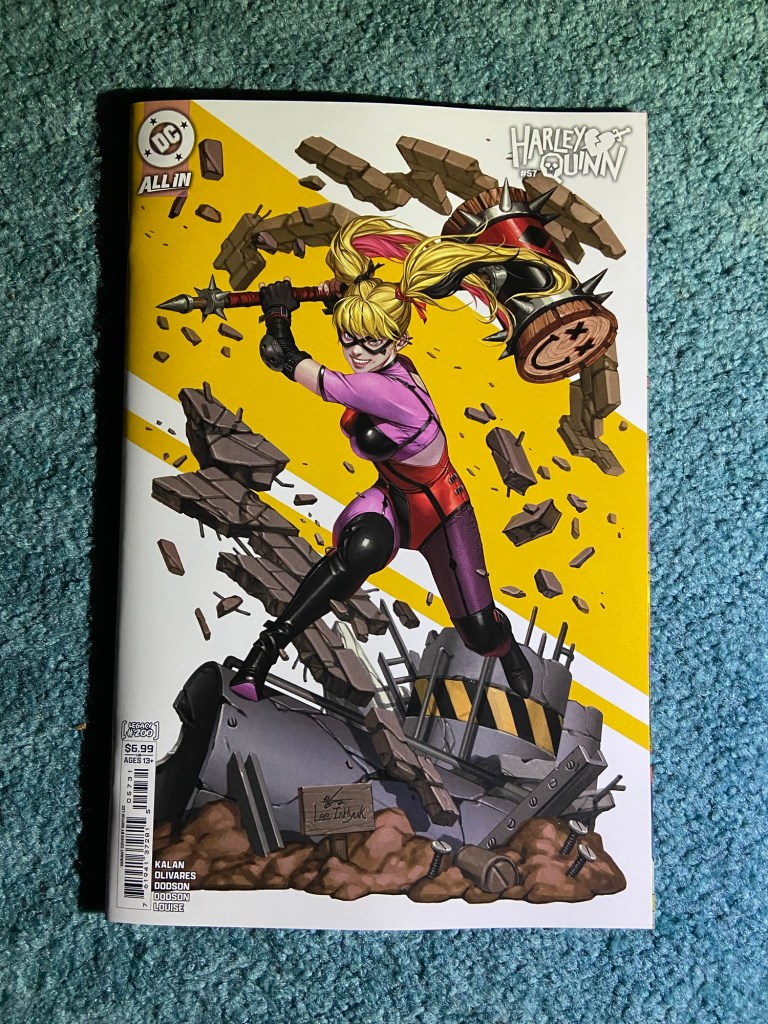
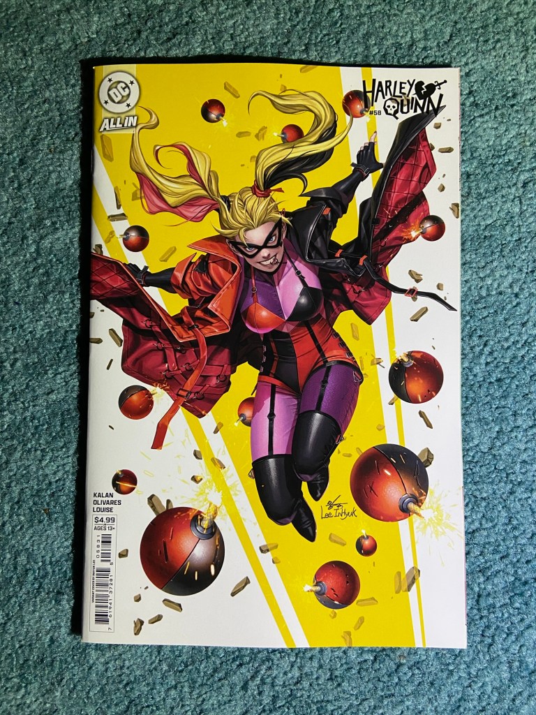
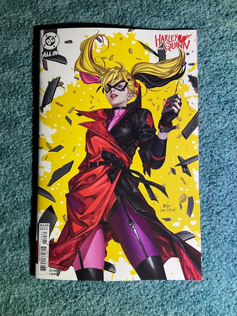
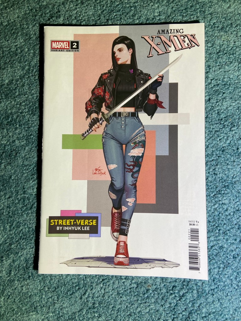
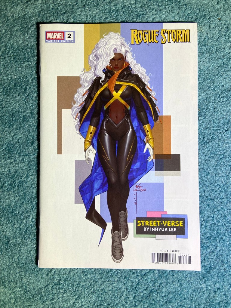
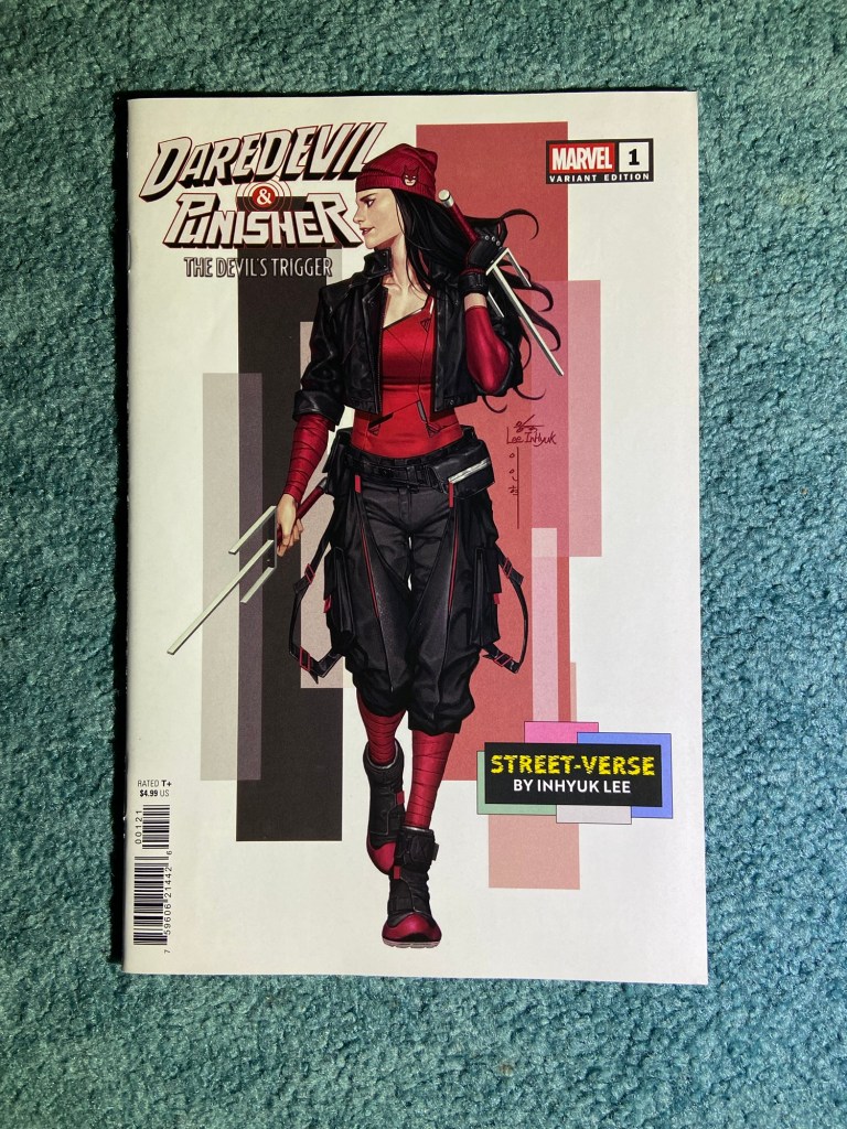
Love these Inhyuk Lee variants! I thought there were more of these covers but nope, just three.
I kind of wish that the yellow design in the background connected somehow. But they look great!
After this sorting, I added 3 boxes. So we’re at 112!
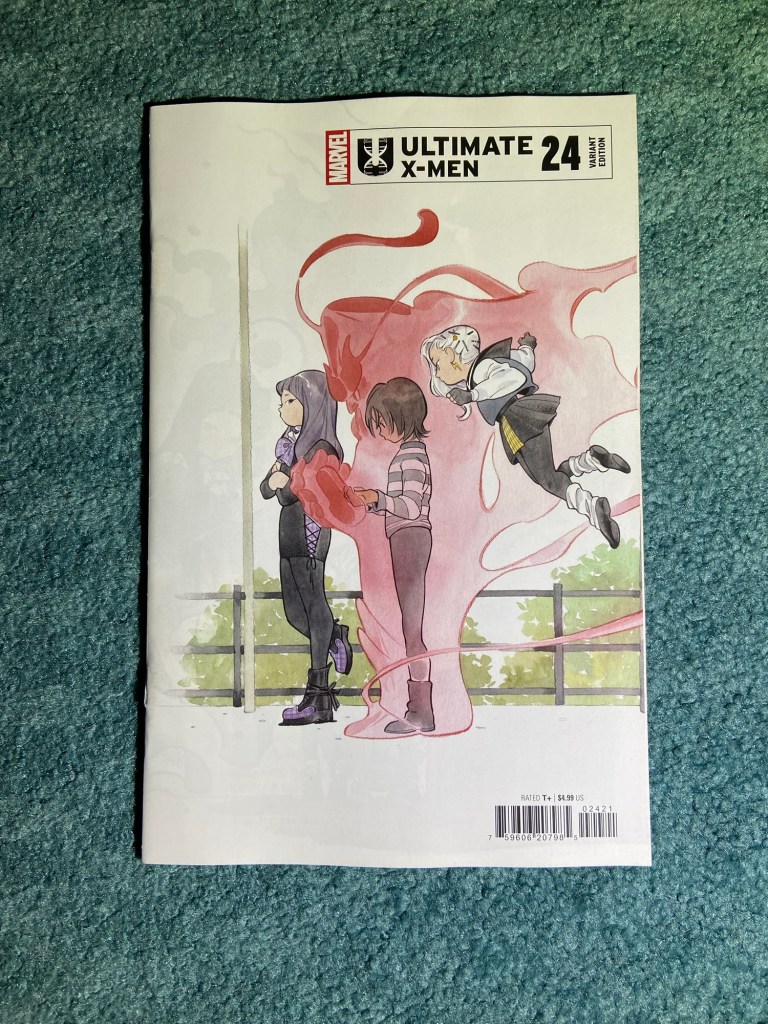
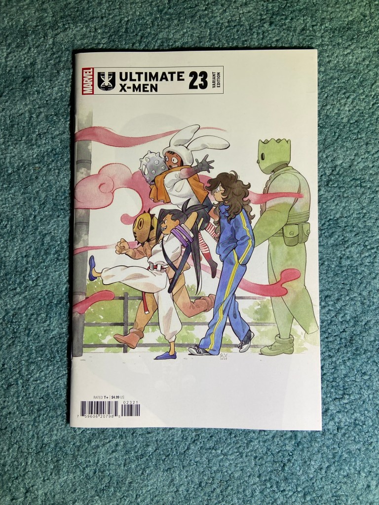
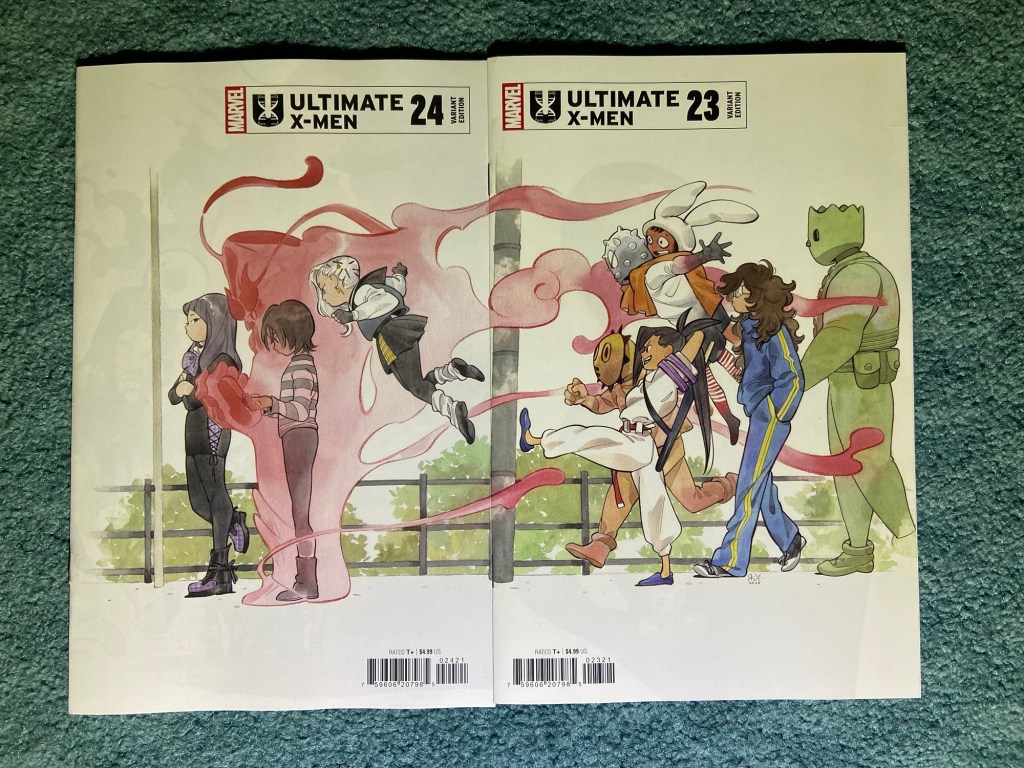
It’s one of those odd connecting variants which get release backwards. But these are great! Of course they’re by Peach Momoko. And of course they don’t connect properly. They both misalign and overlap. This could have been a great wraparound for the final issue!
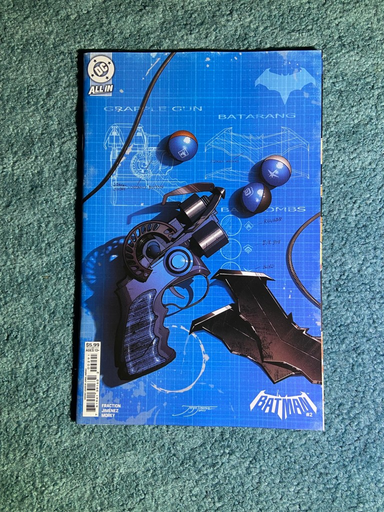
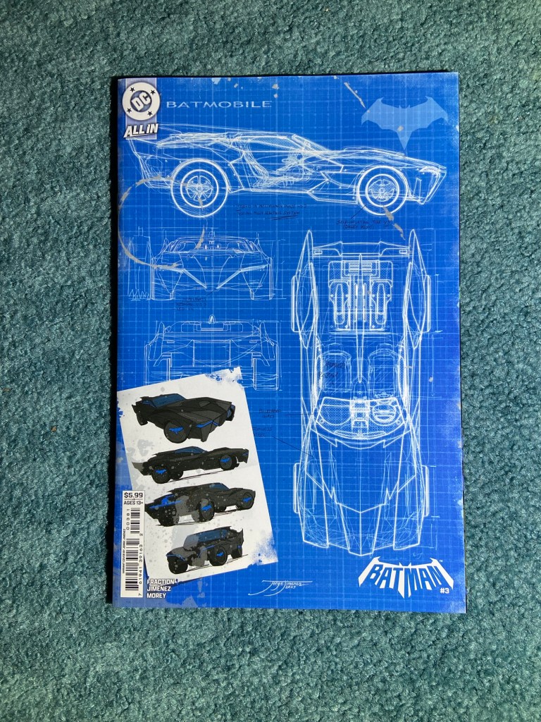
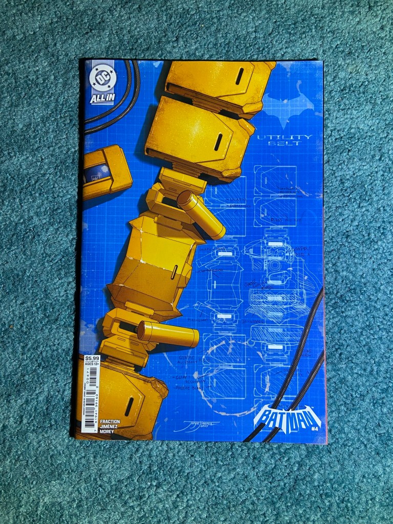
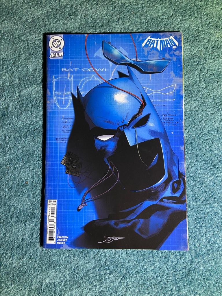
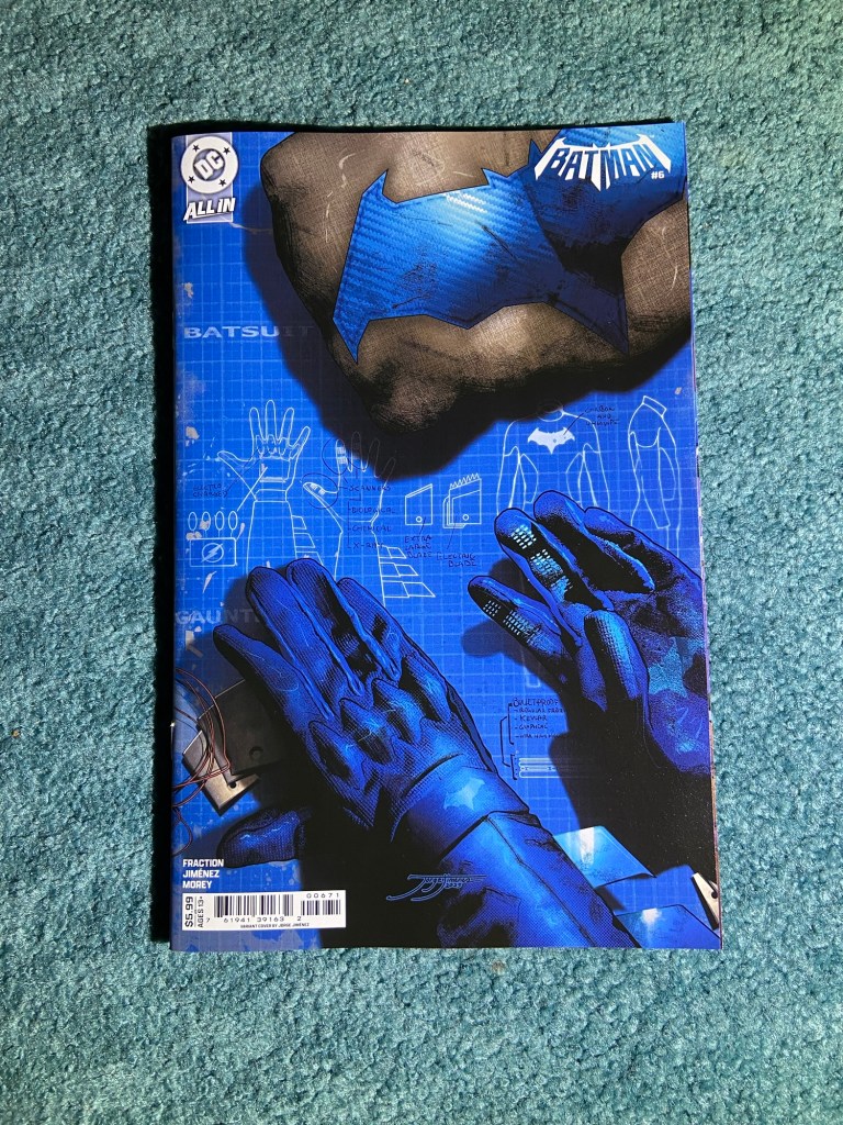
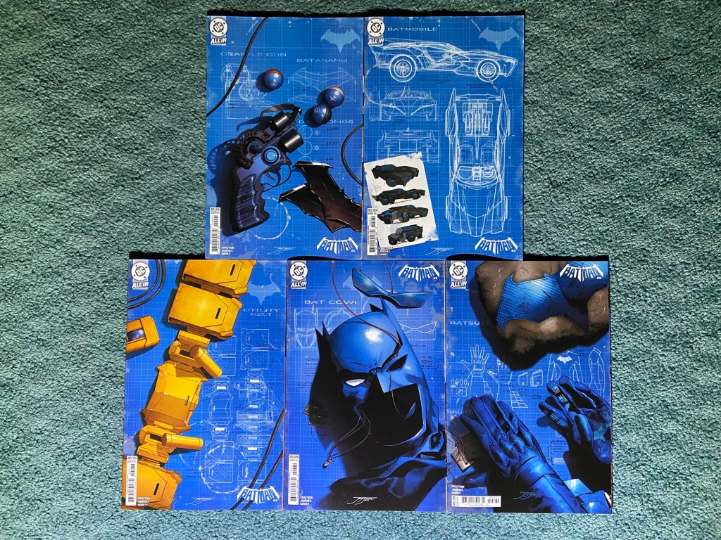
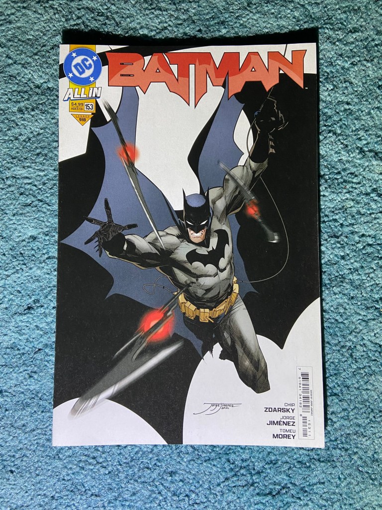
These are the Bat-Gadgets variants from Jorge Jiménes!
I kind of would have loved if all these connected but in a weird way so they looked like a pile of things all next to each other. But these all look so good!
Three of these collections have been ready for a bit, but for different reasons, I hadn’t gotten to them yet.
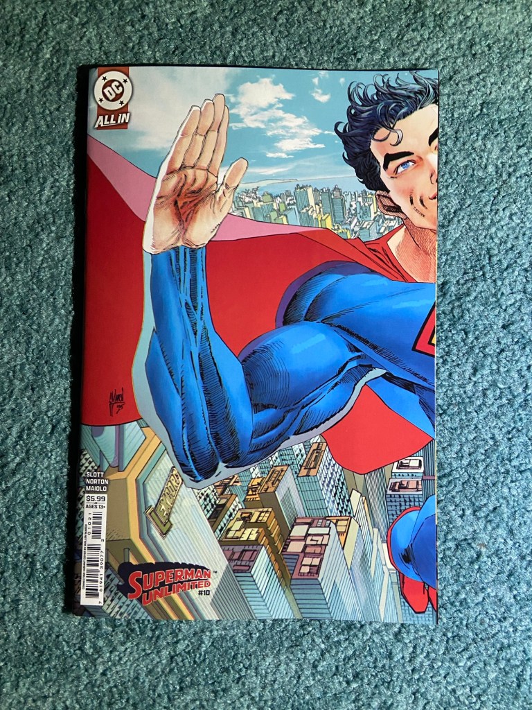
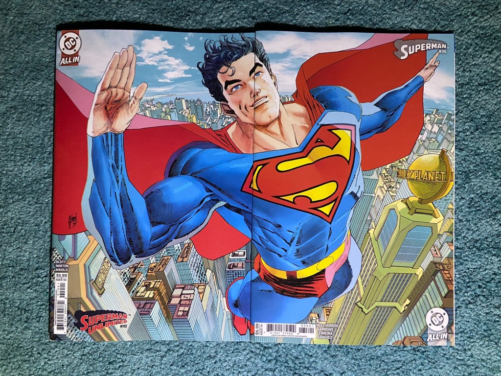
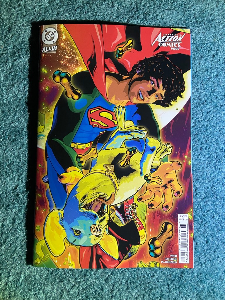
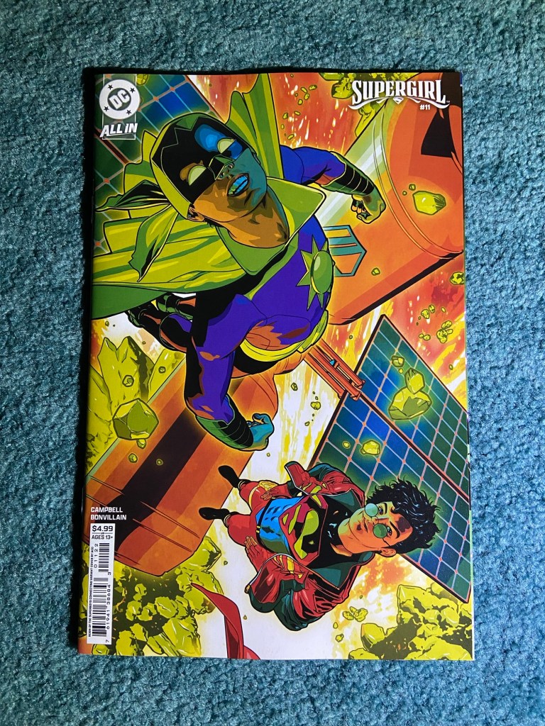
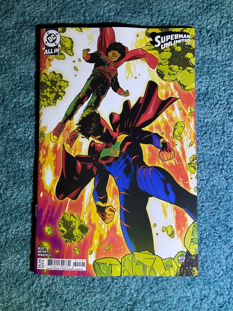
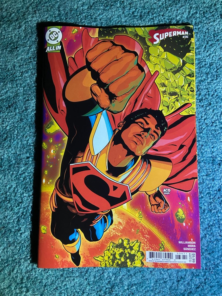
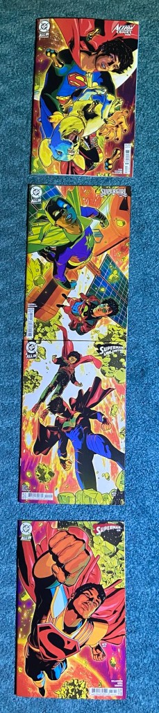
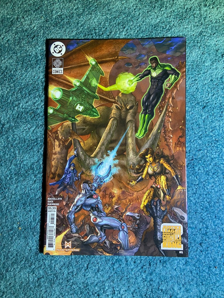
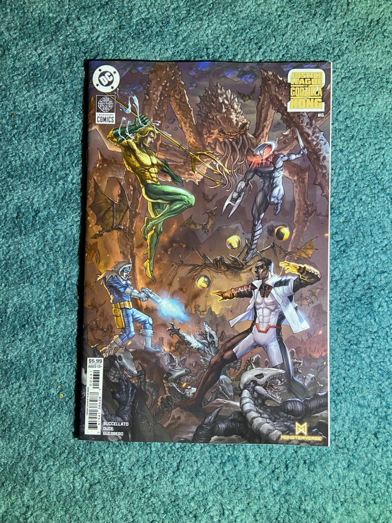
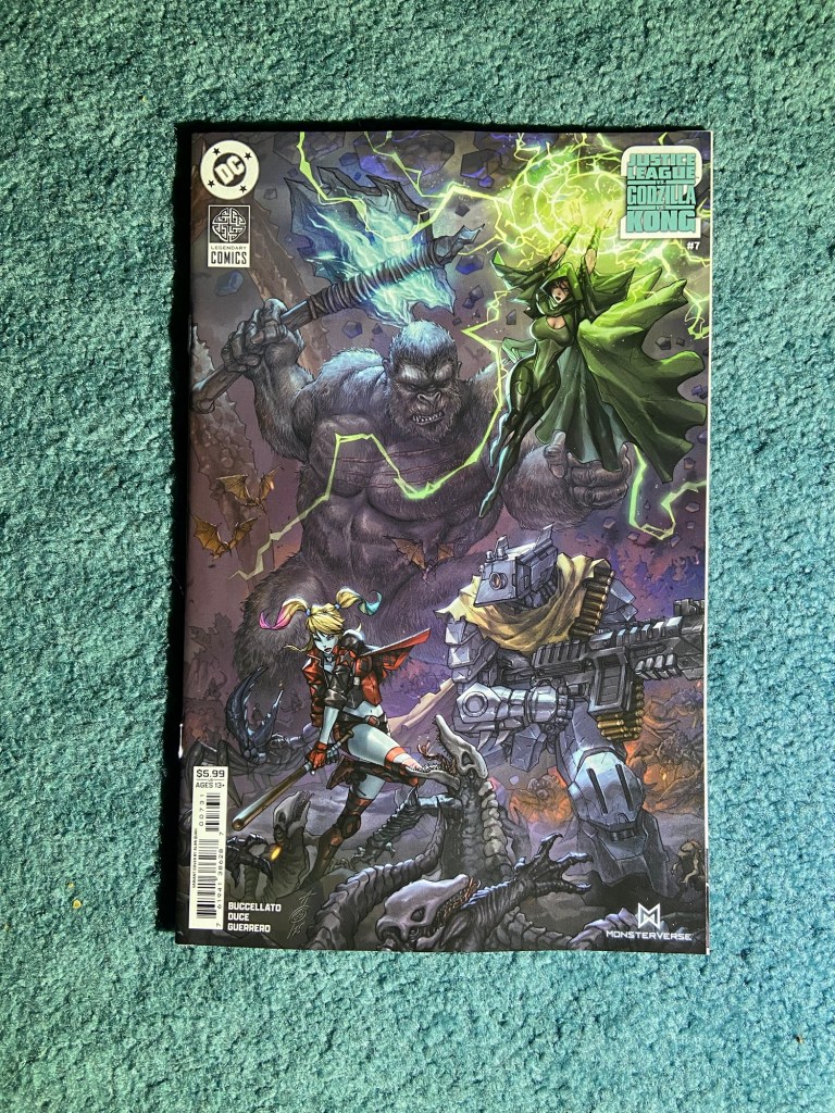
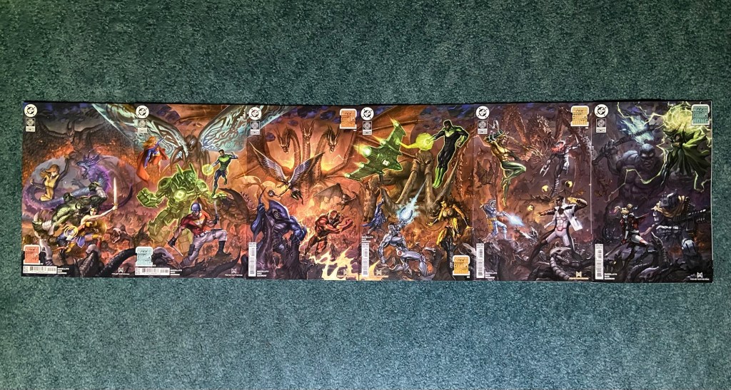
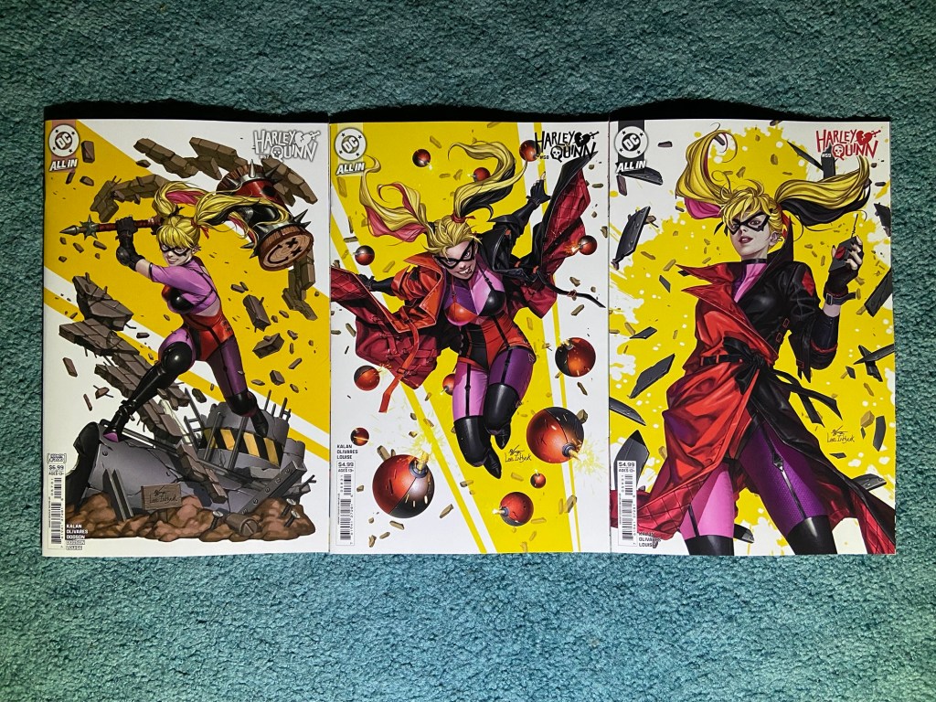
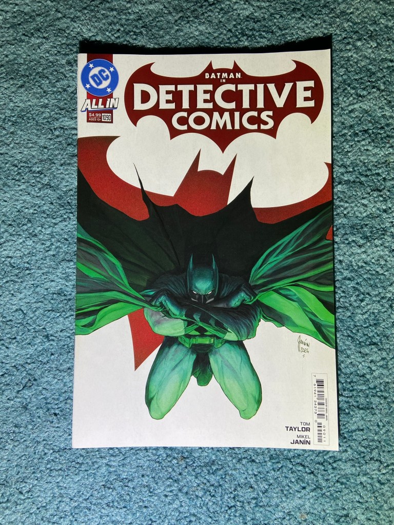
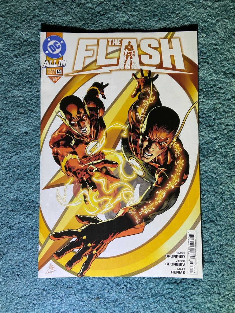
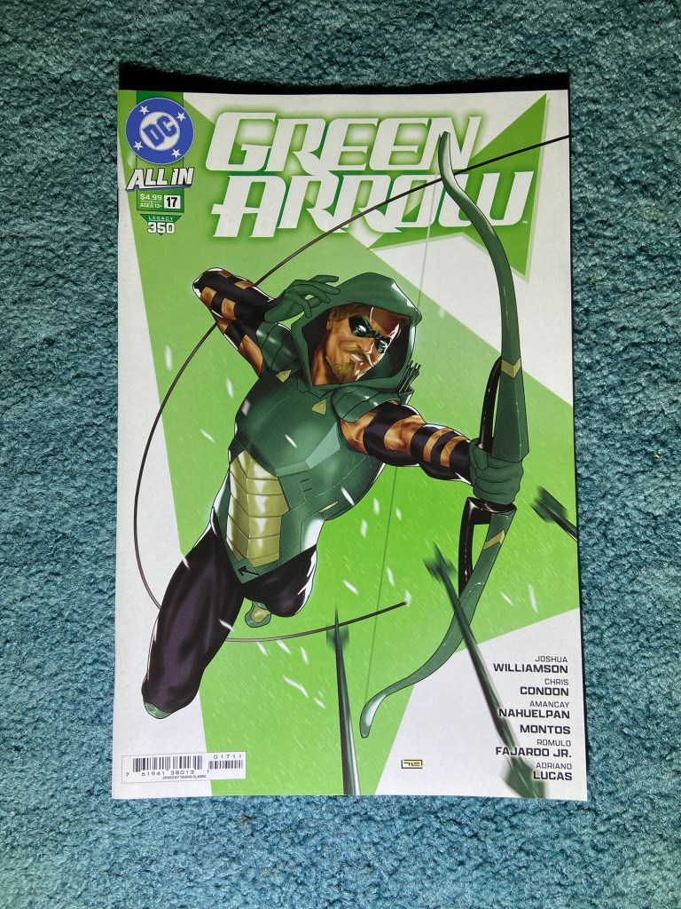
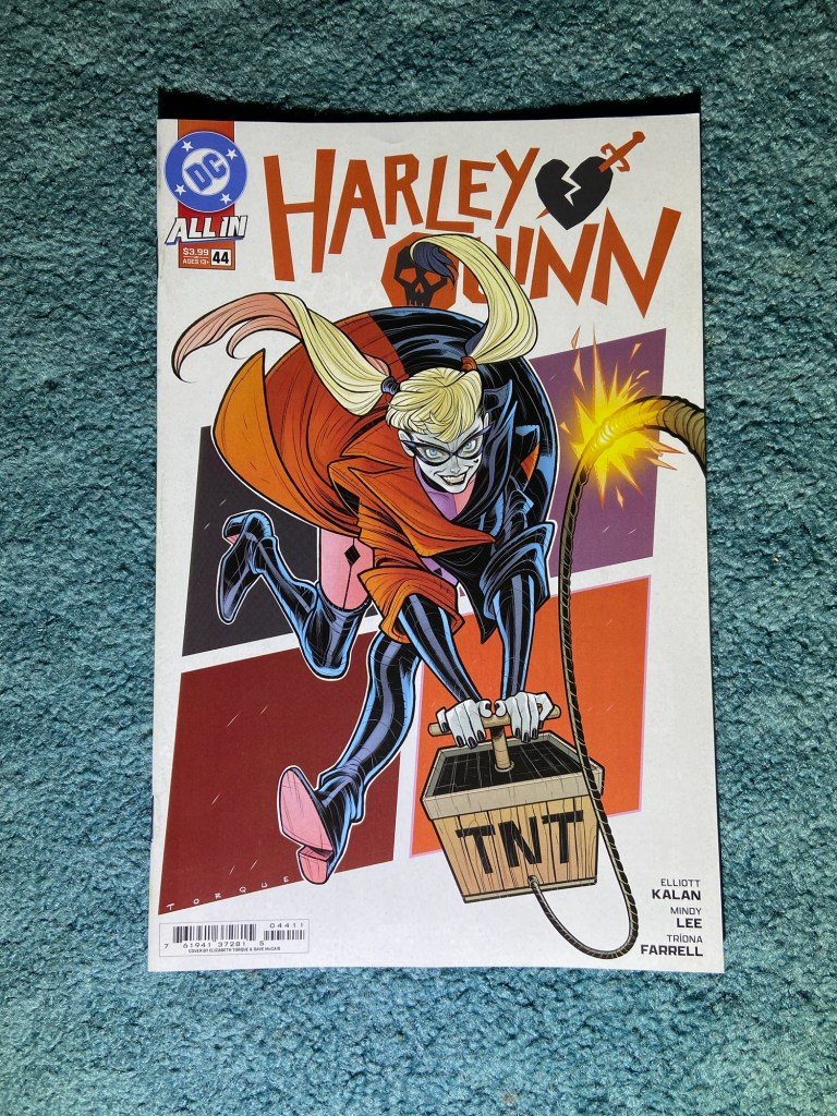
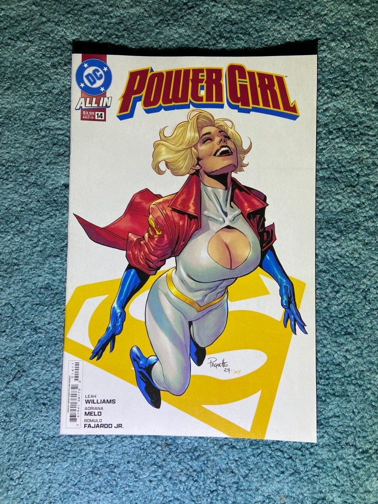
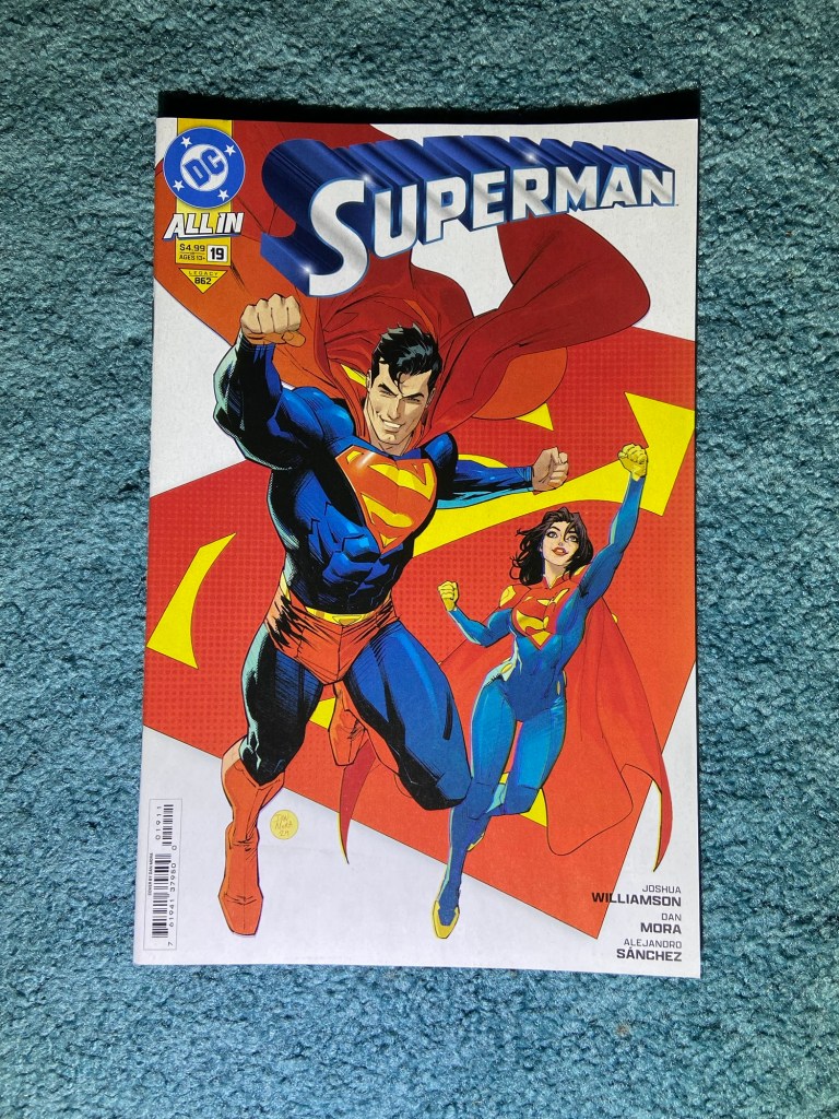
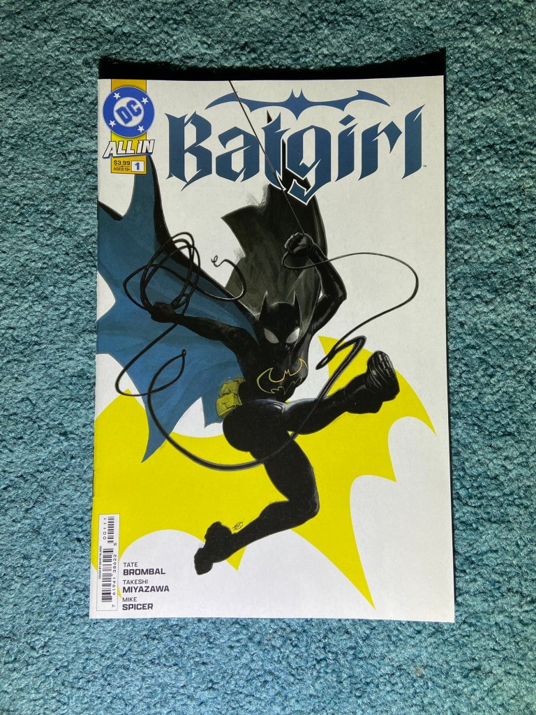
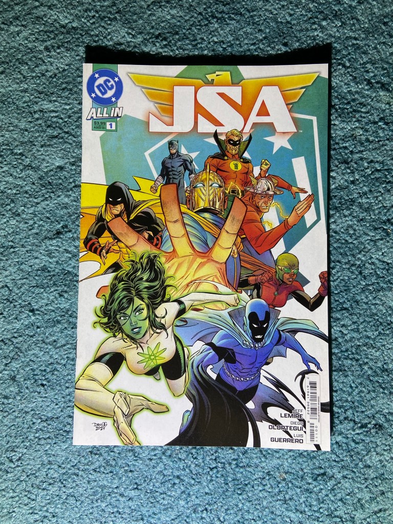
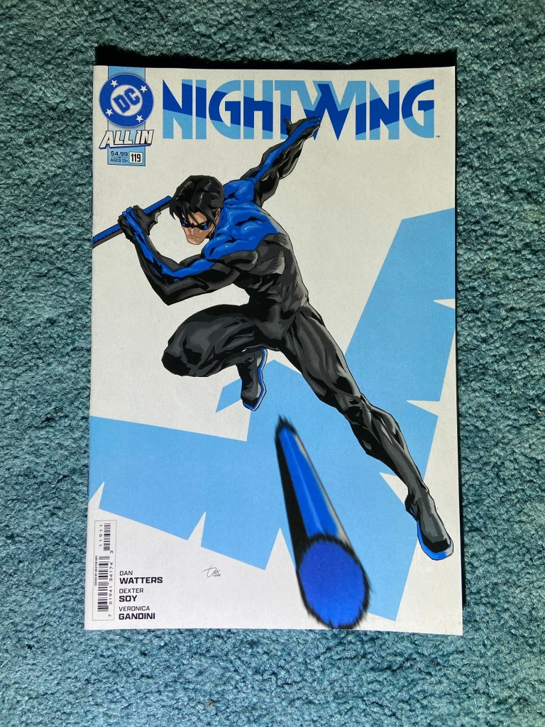
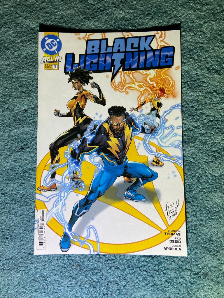
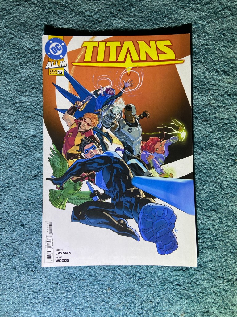
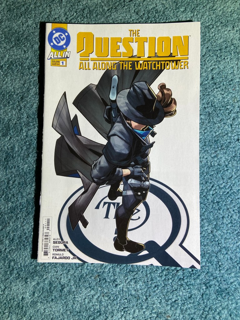
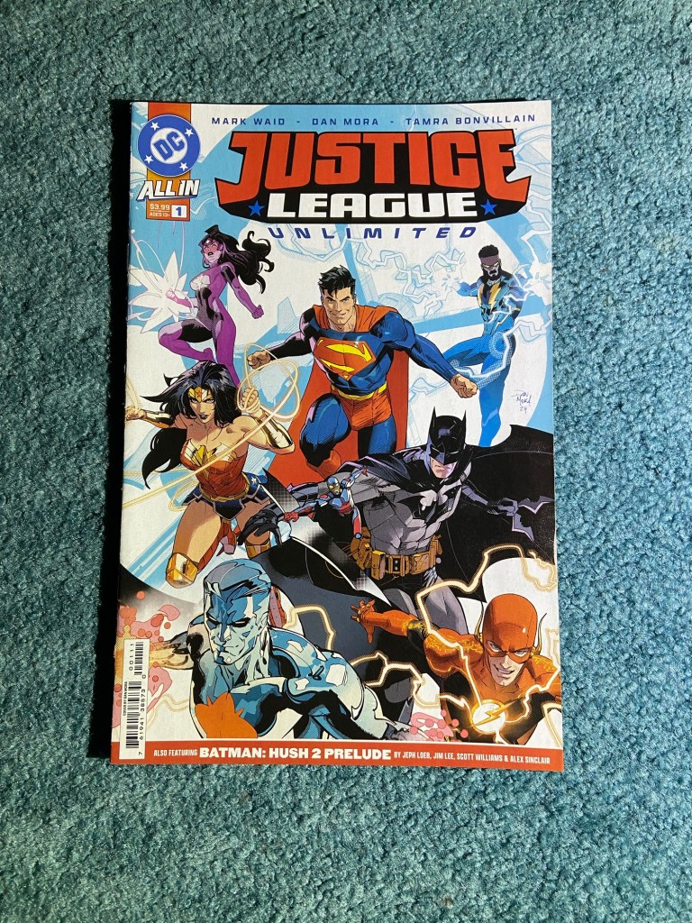
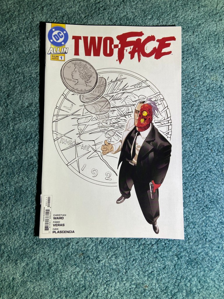
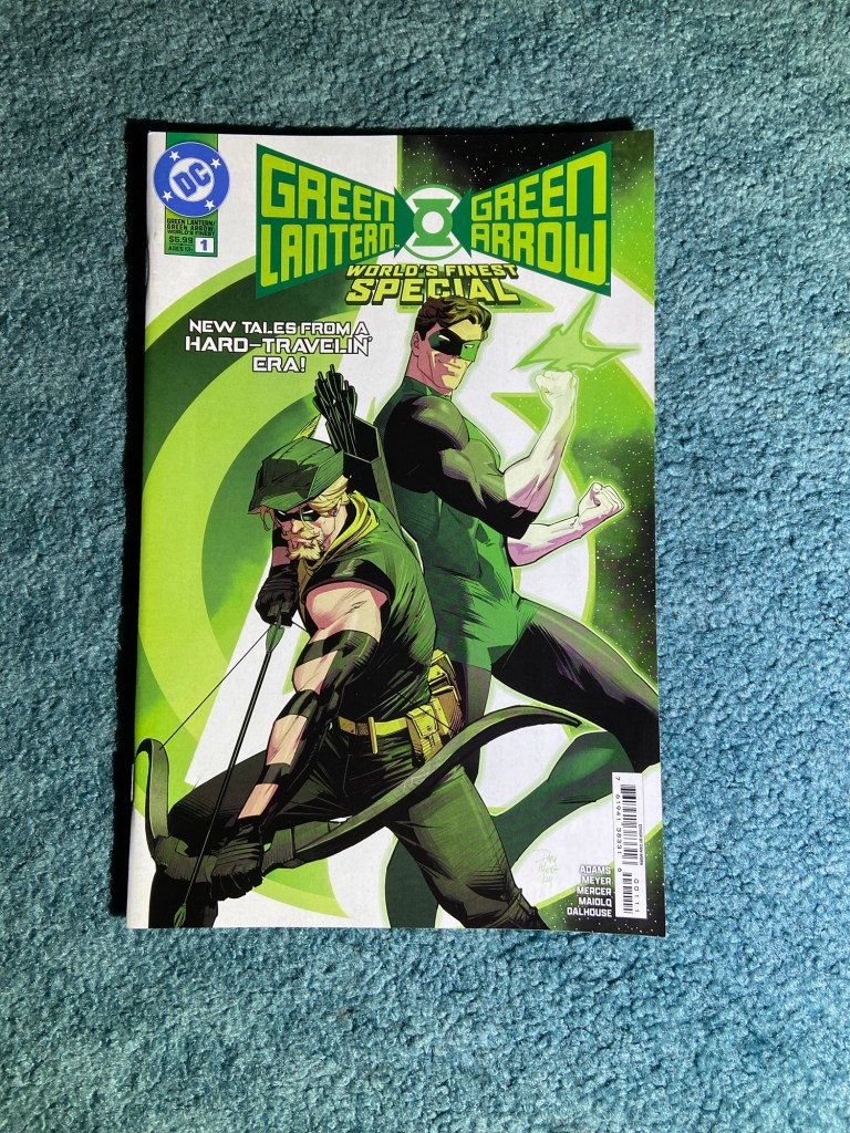
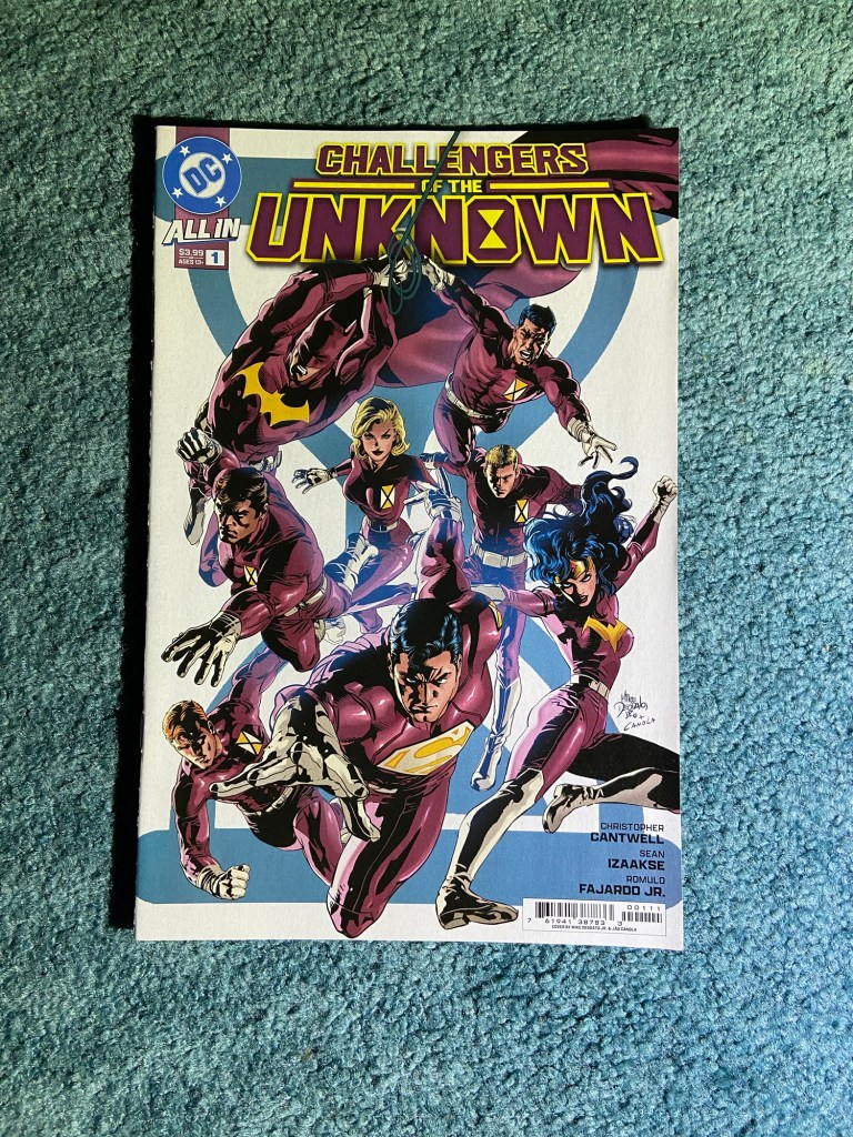
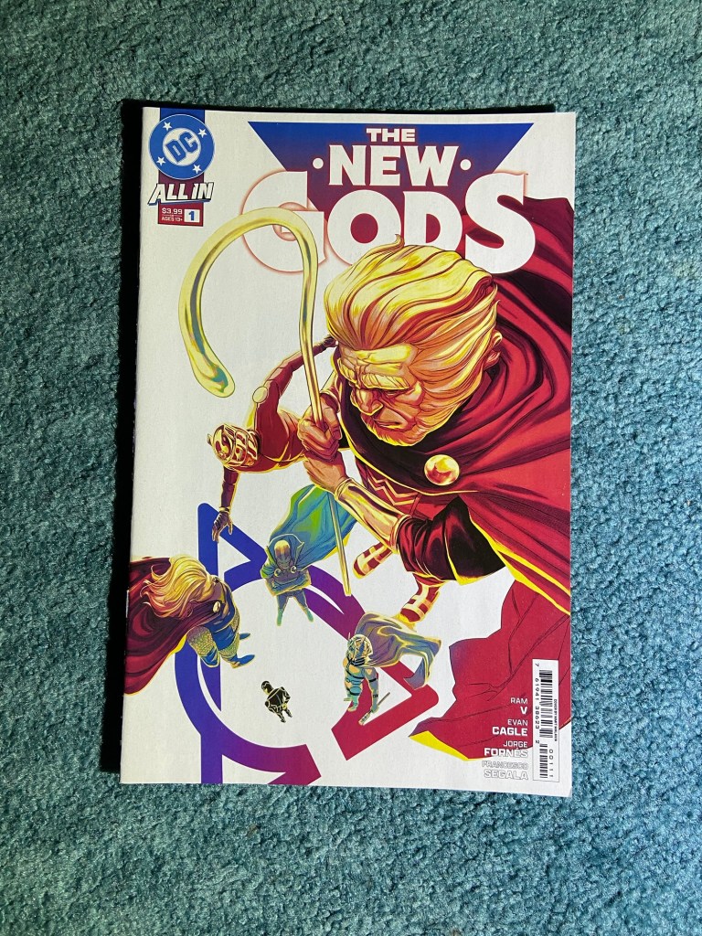
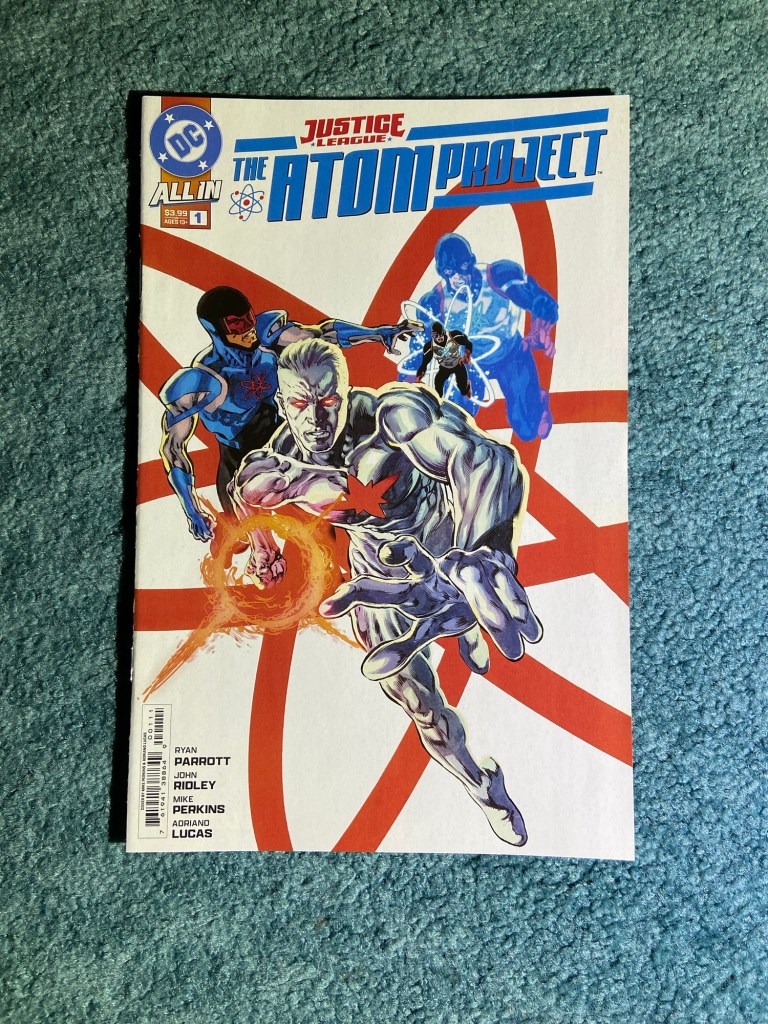
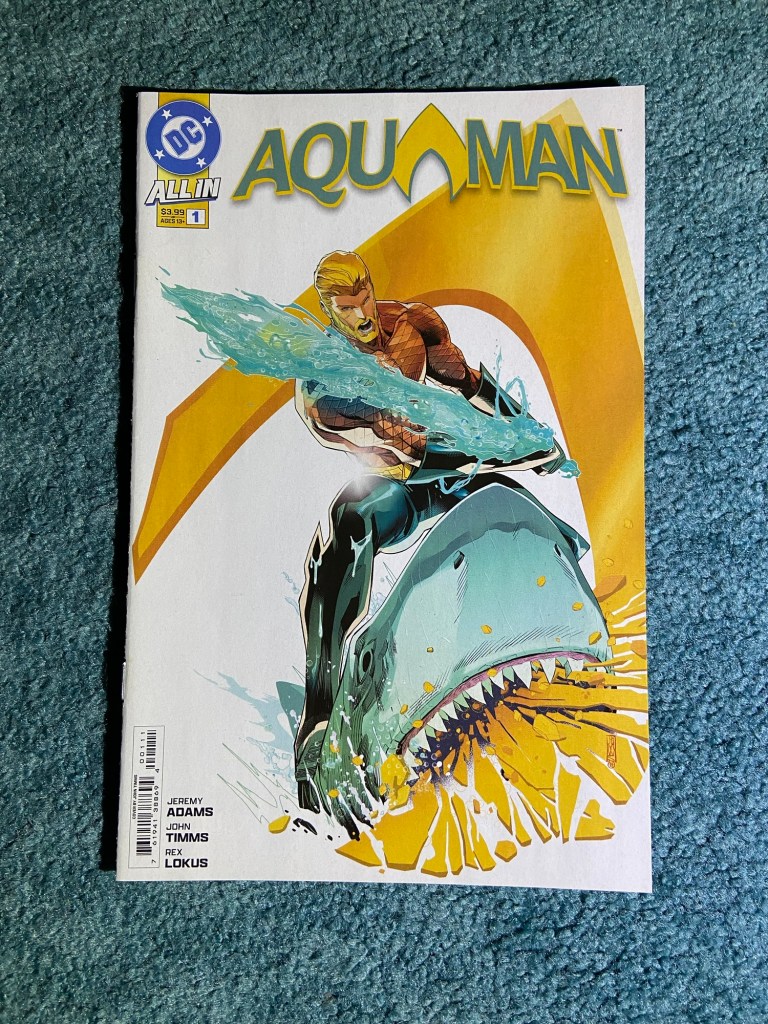
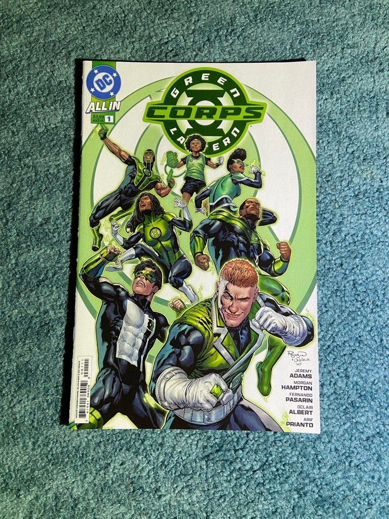
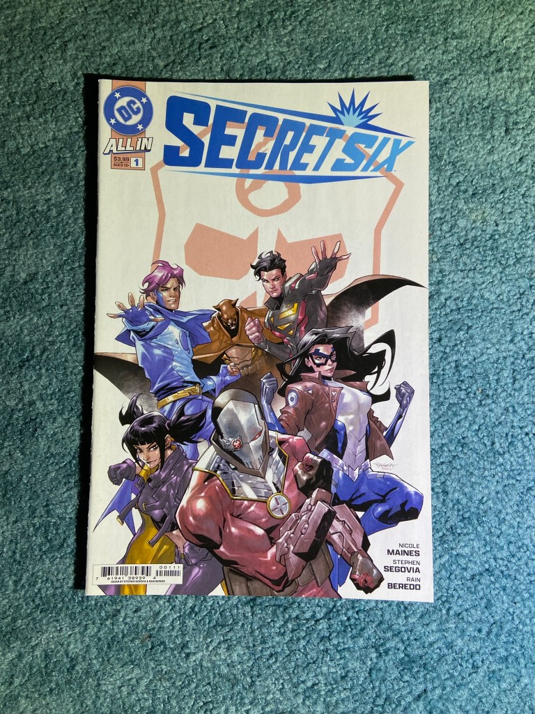
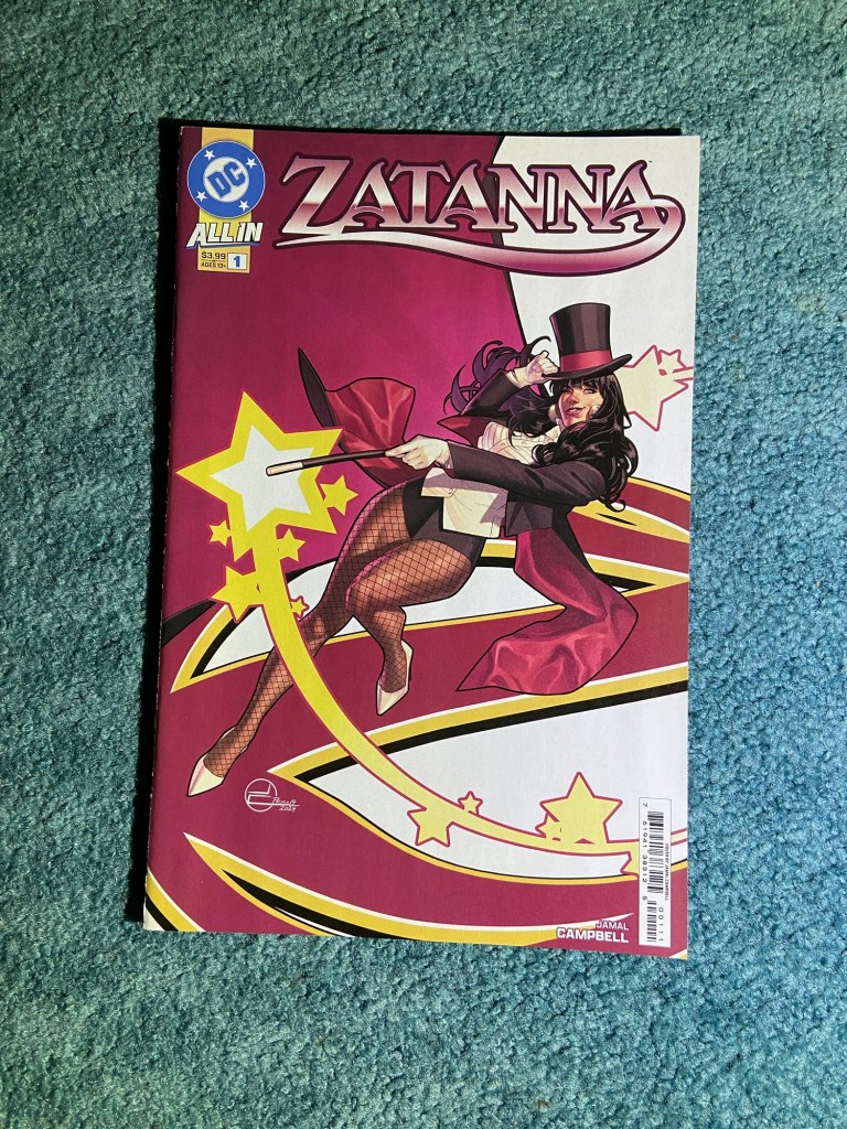
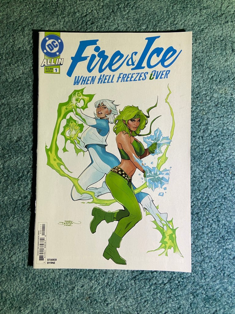
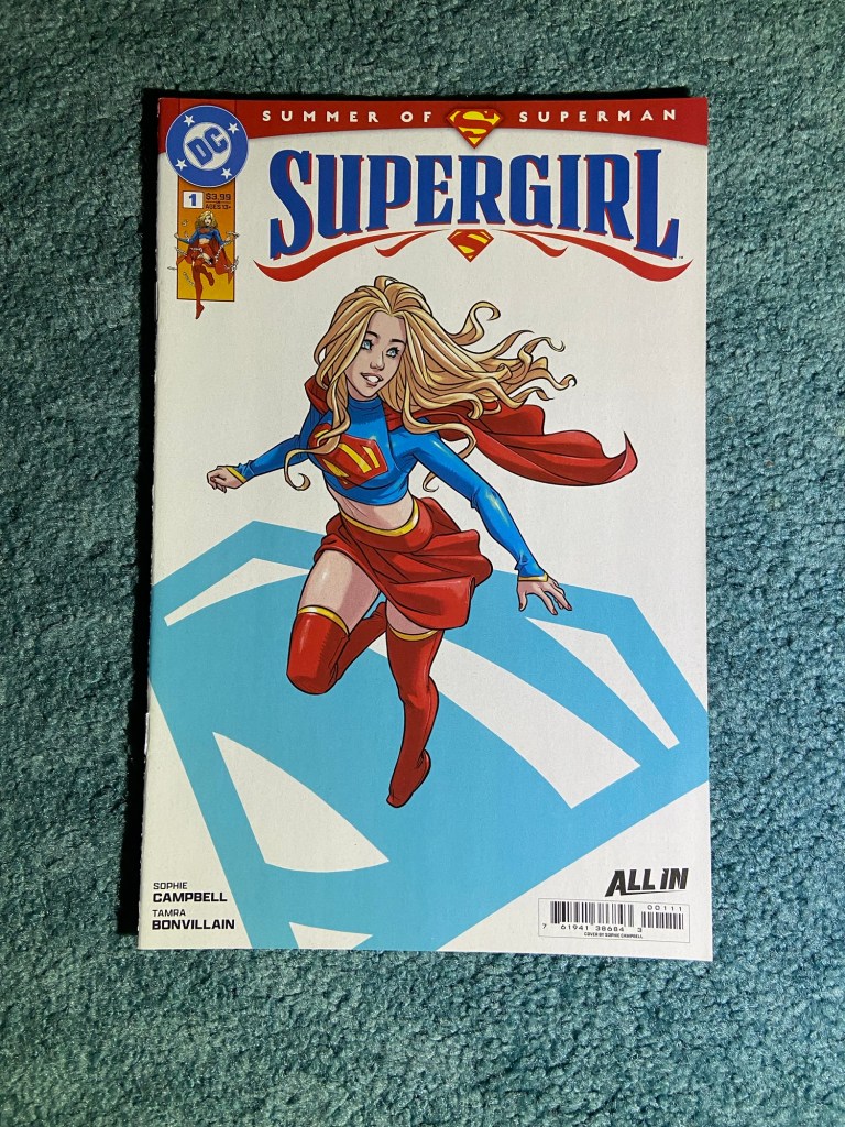
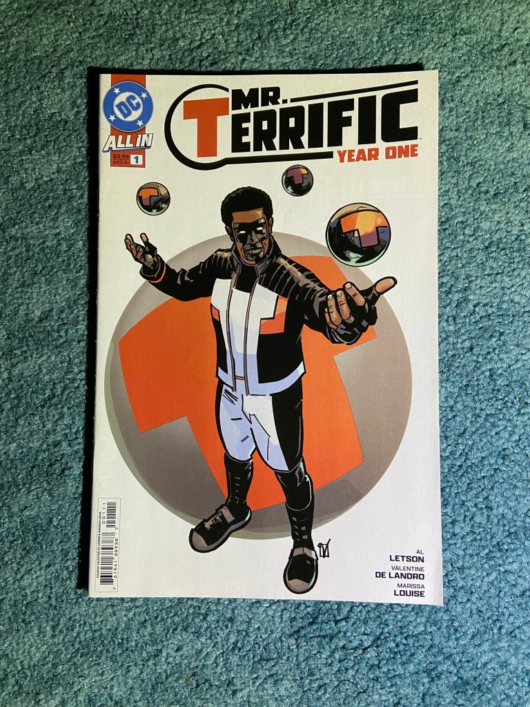
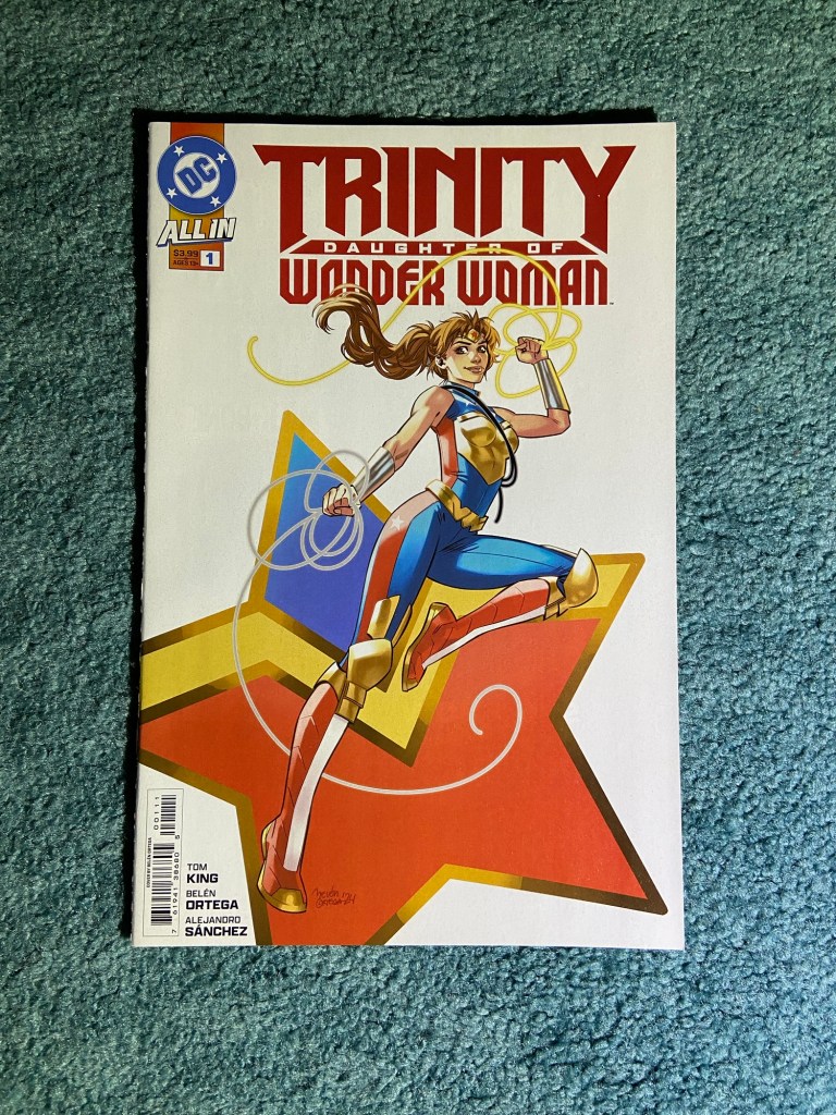
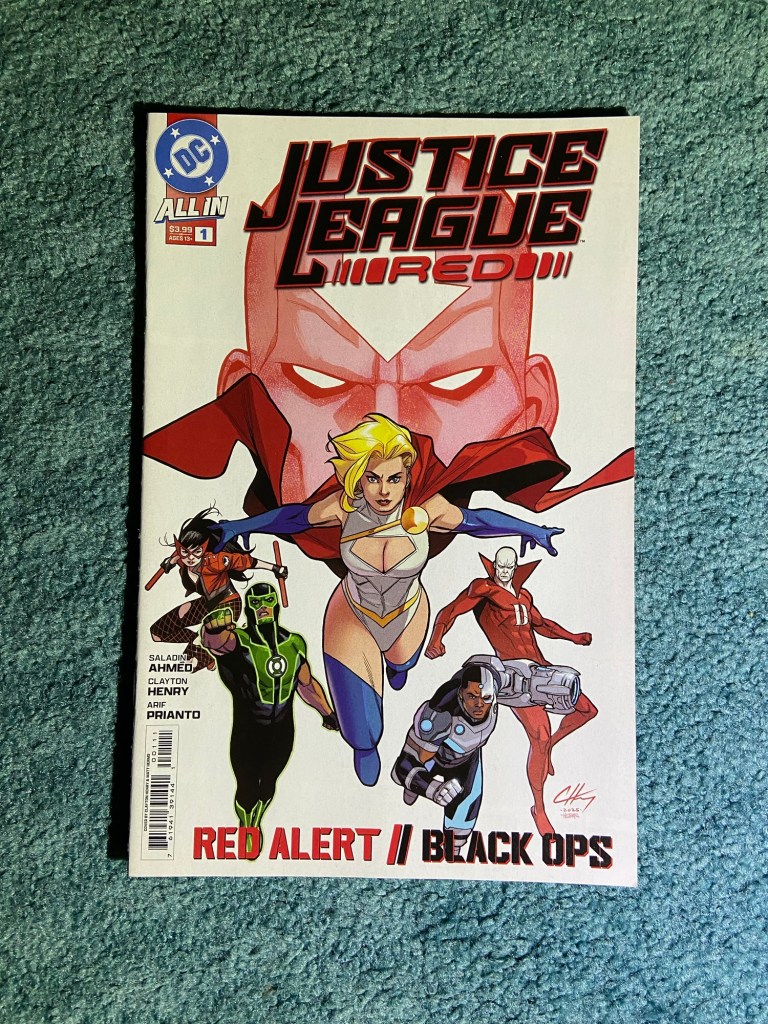
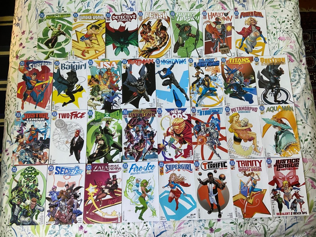
These are all the “All-In” covers for this current era of DC (a new era is coming soon). So many issues!
There have been new titles that came out after Justice League Red but they didn’t get main covers like these. So I’ve been waiting to see if there would be another one and there doesn’t seem to be one. They look great together! Man, can you imagine us getting tons of character posters like these for James Gunn’s DCU characters? Can’t wait!
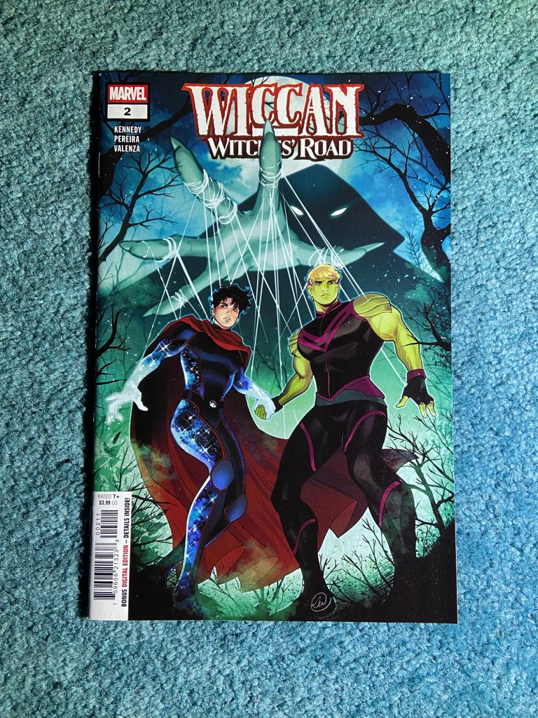
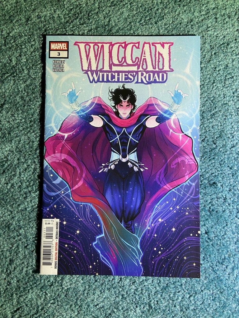
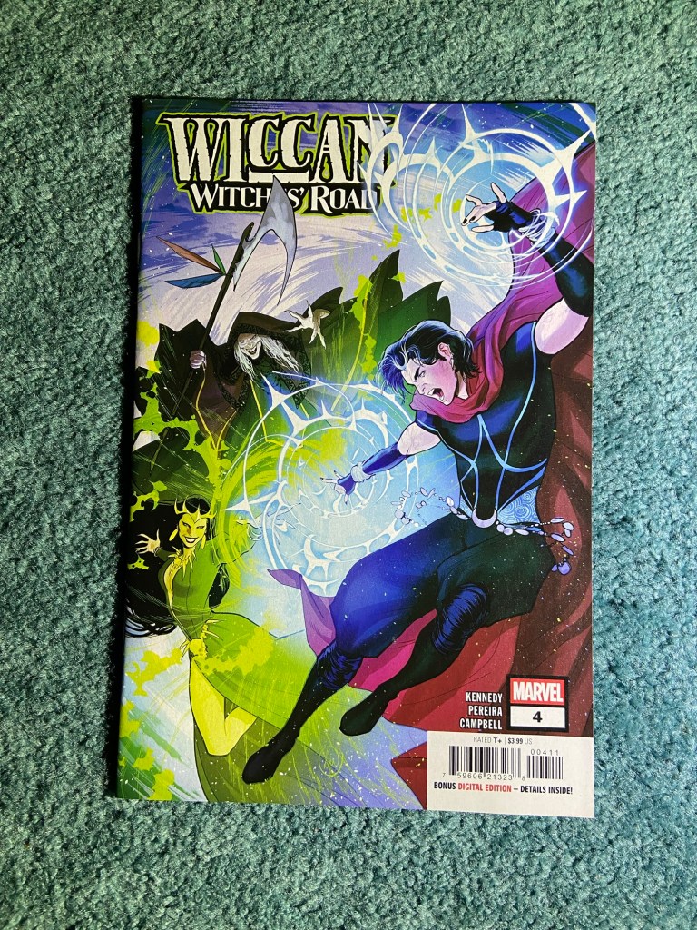
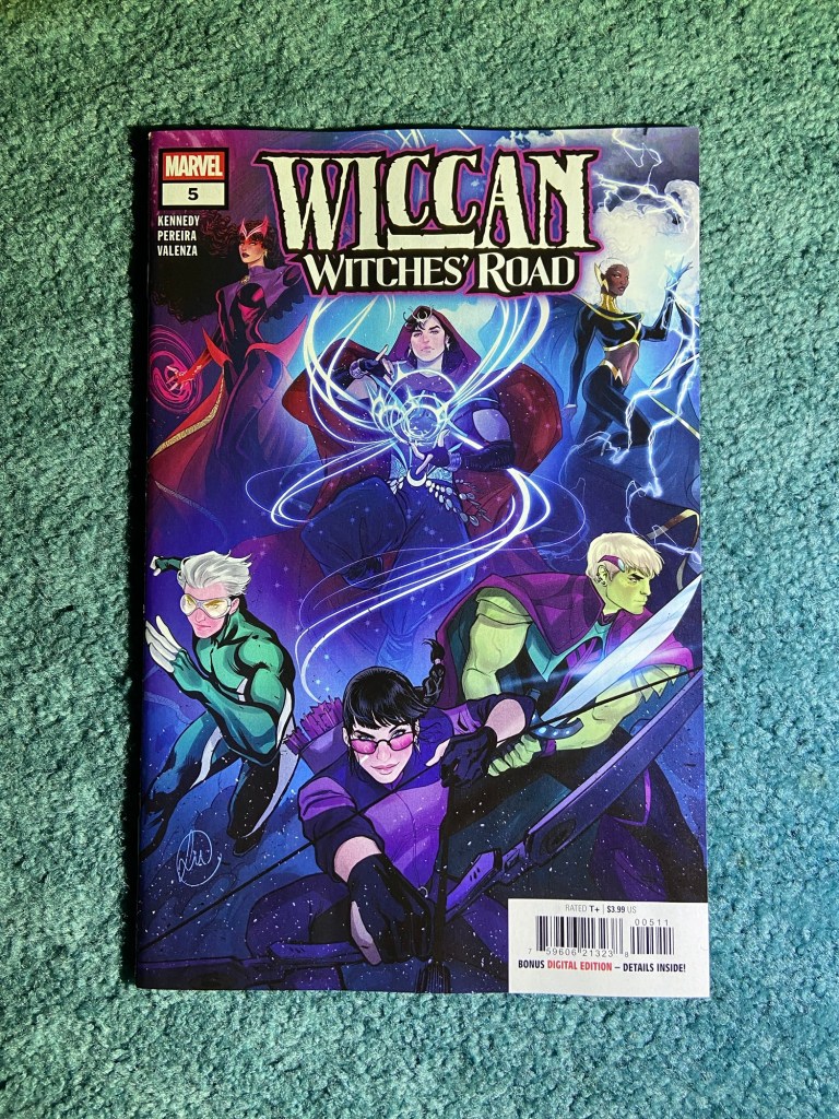
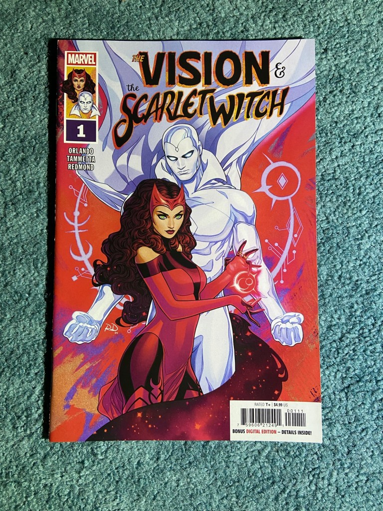
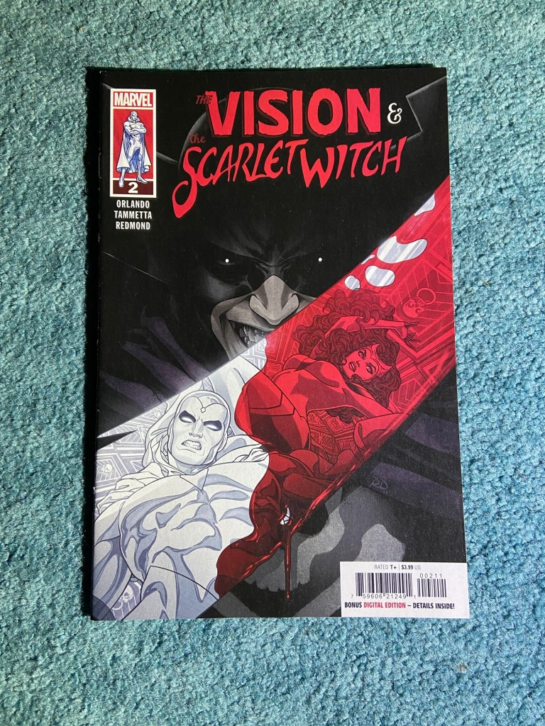
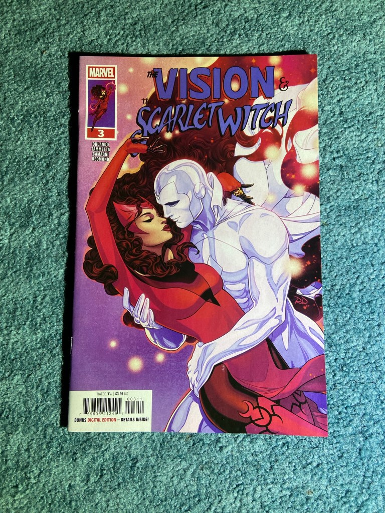
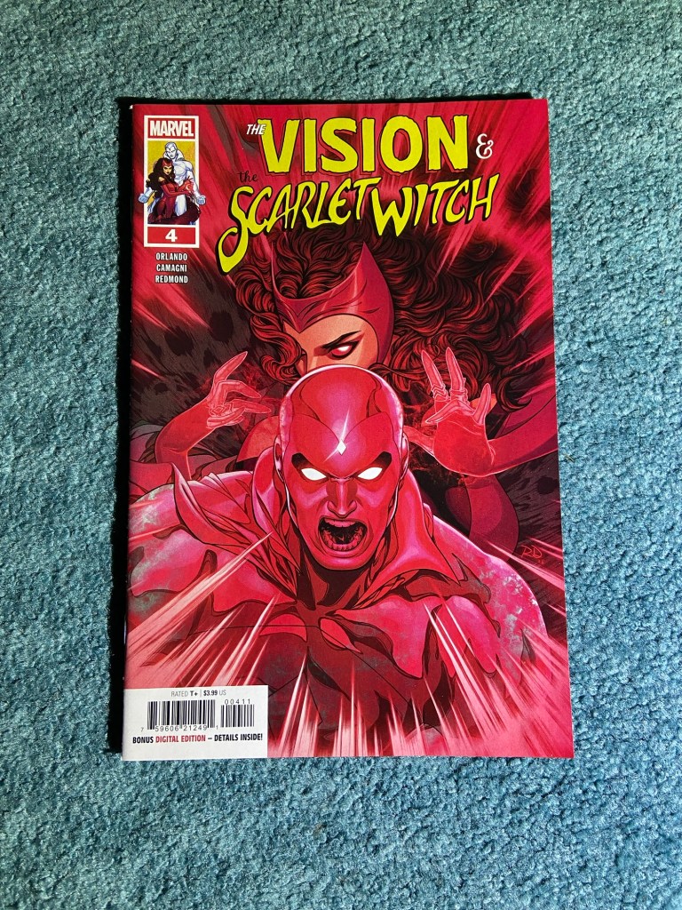
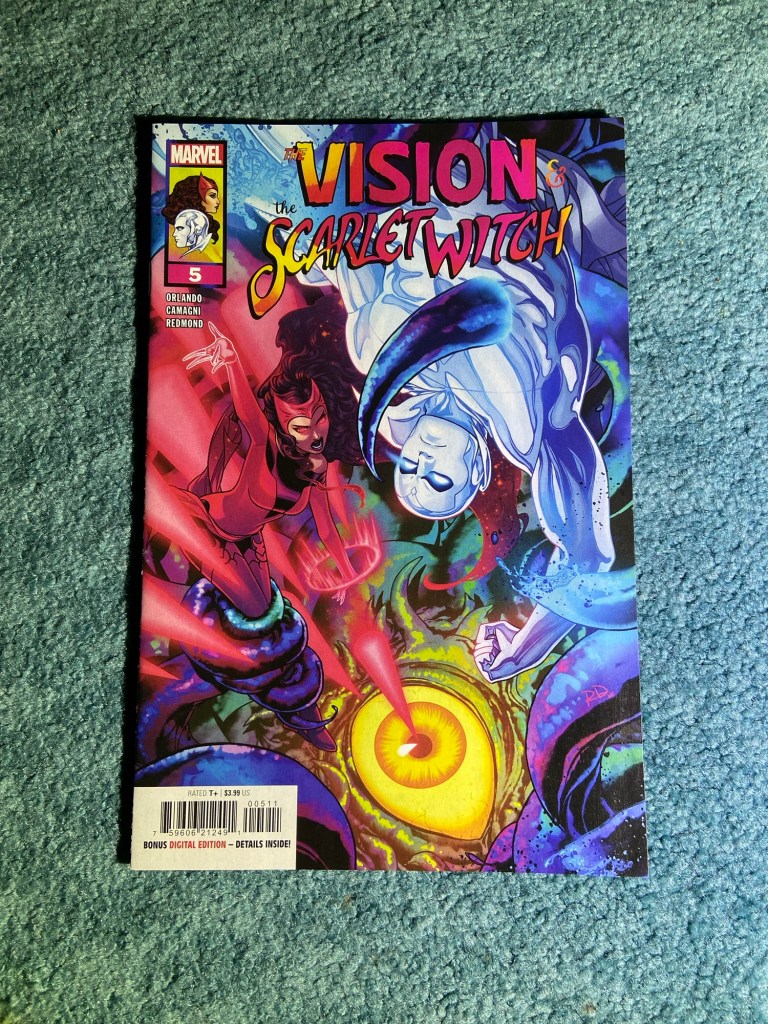
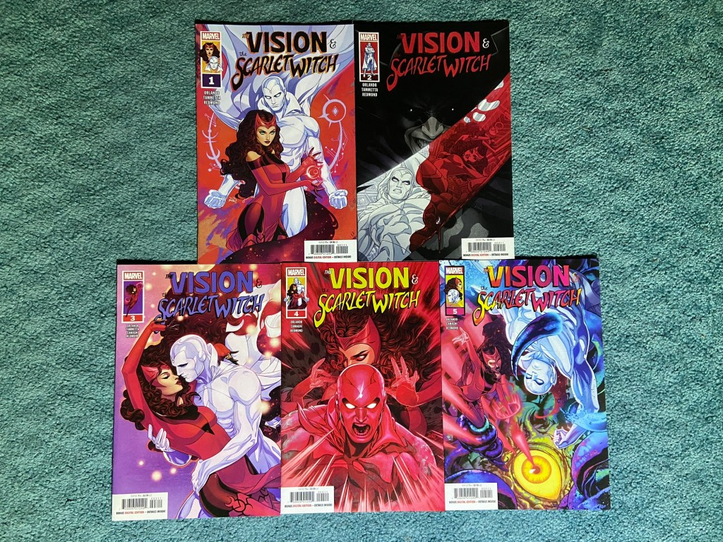
It’s always nice to have an artist I love doing main covers of characters I love! Russell Dauterman gave us some great covers for this Vision and Scarlet Witch.
Such a great story being told just from the covers!
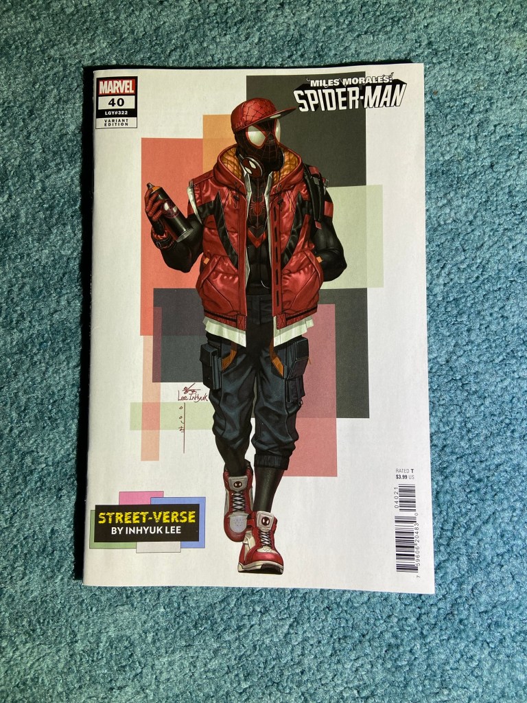
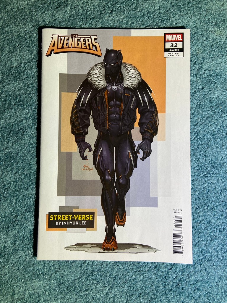
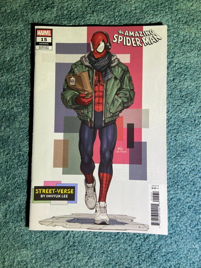
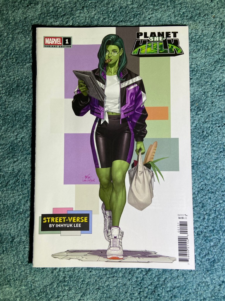
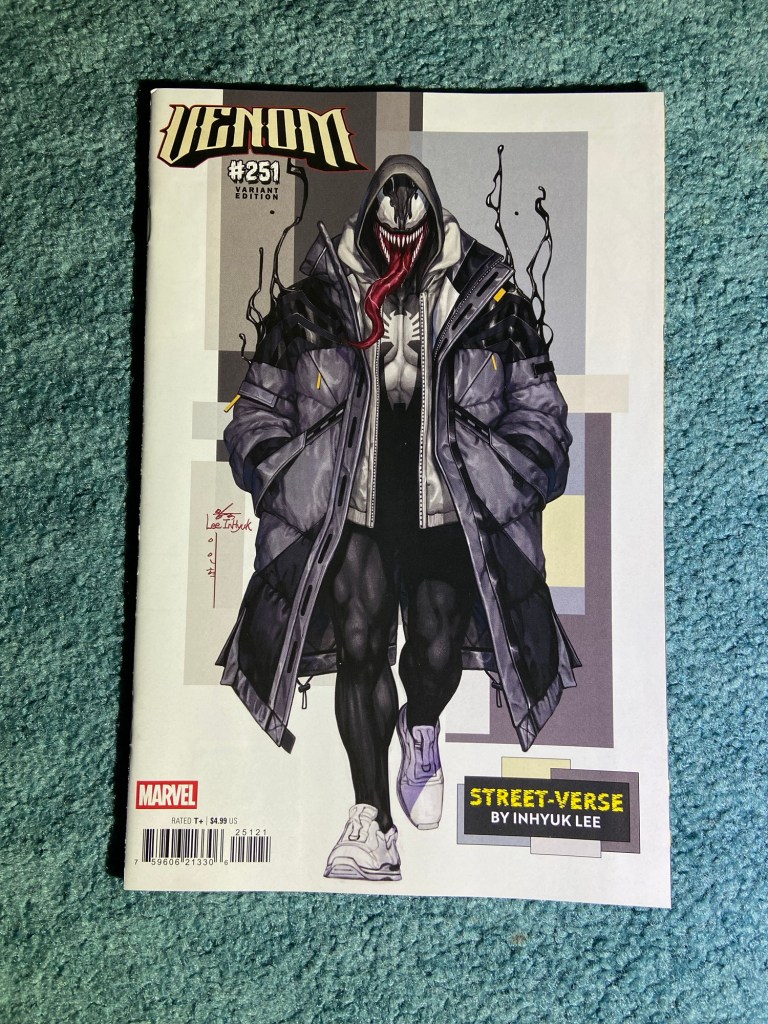
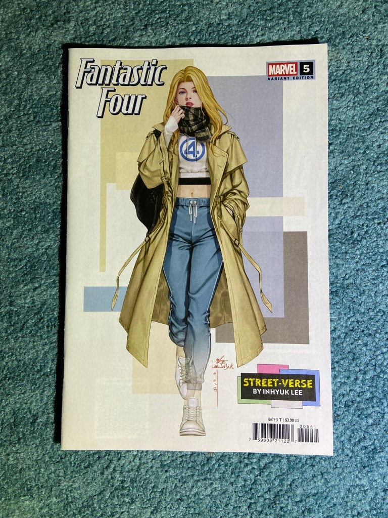
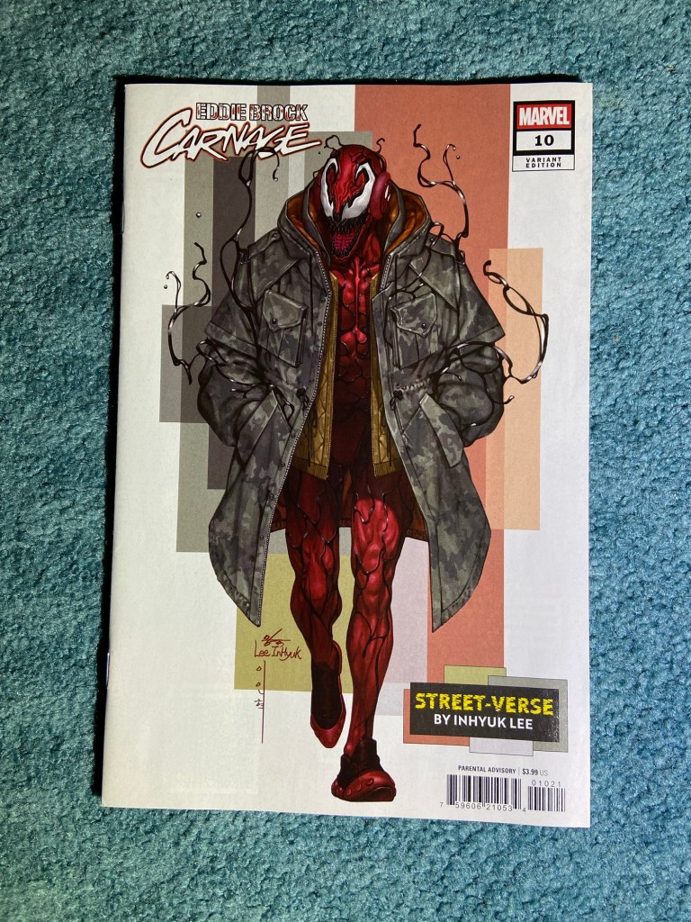
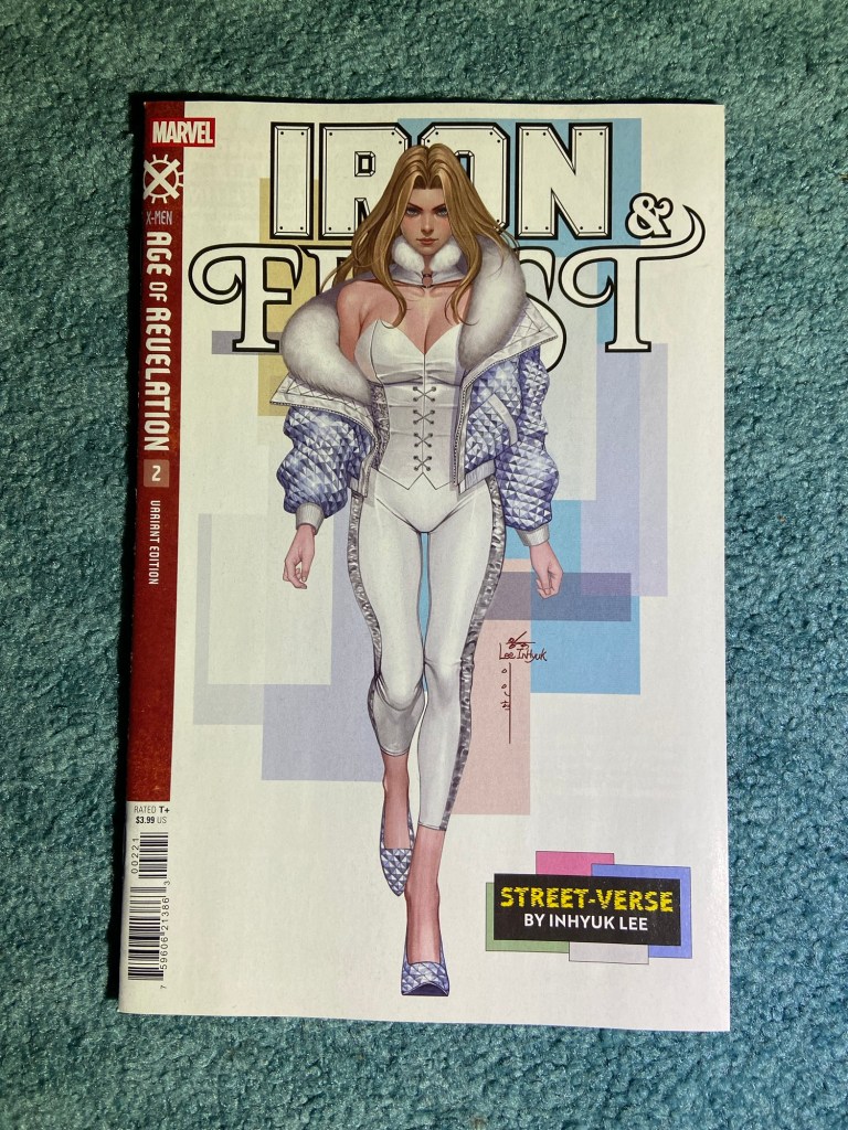
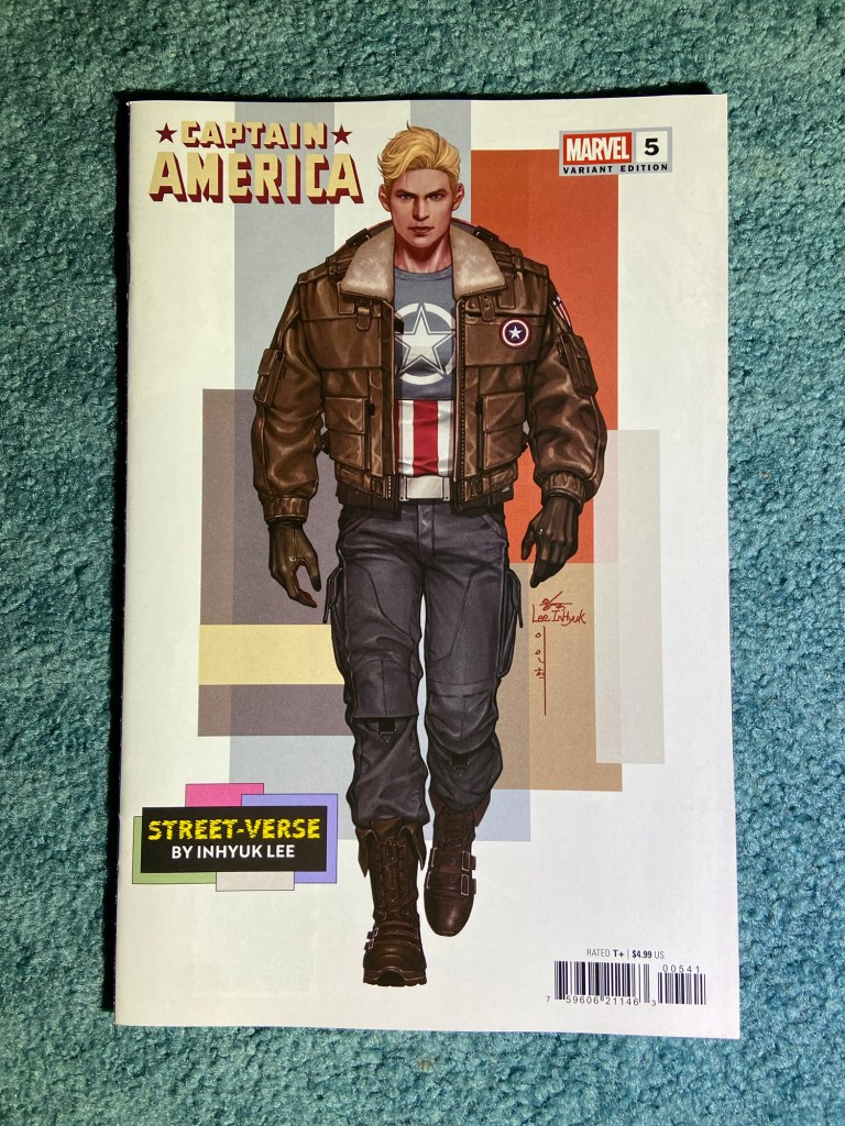
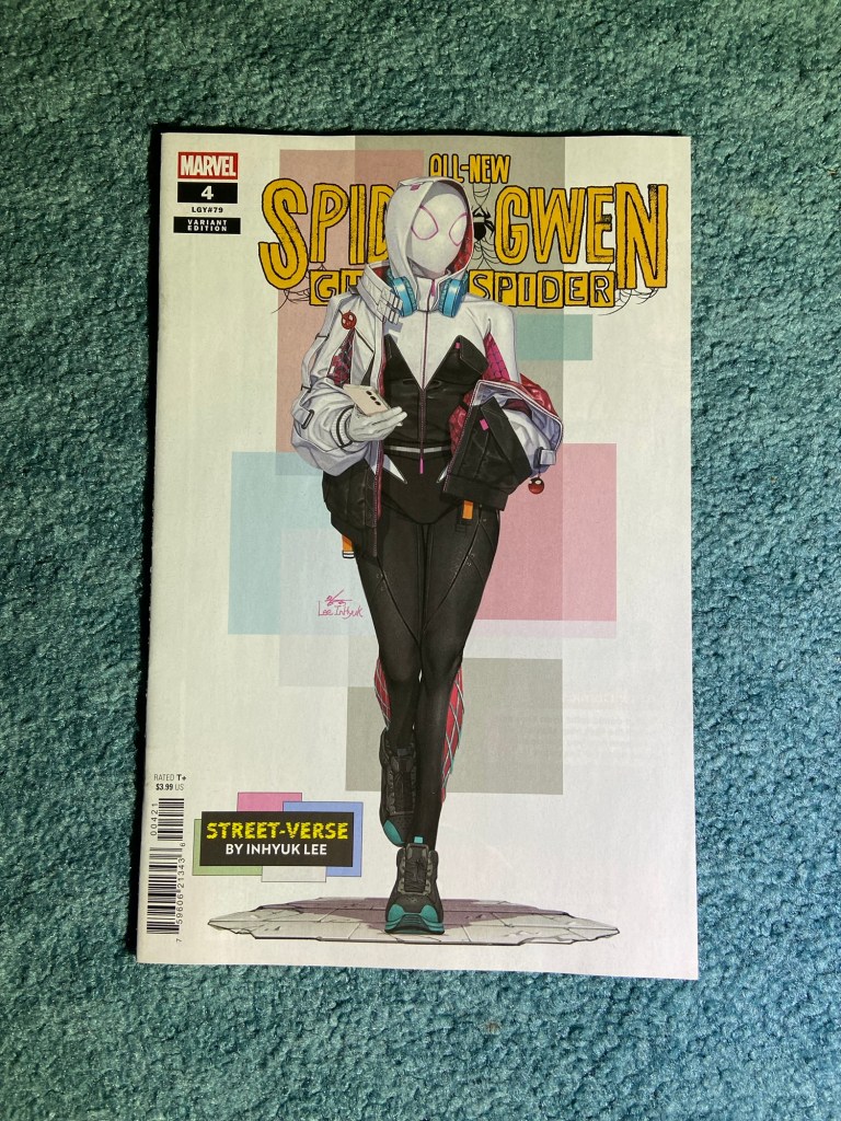
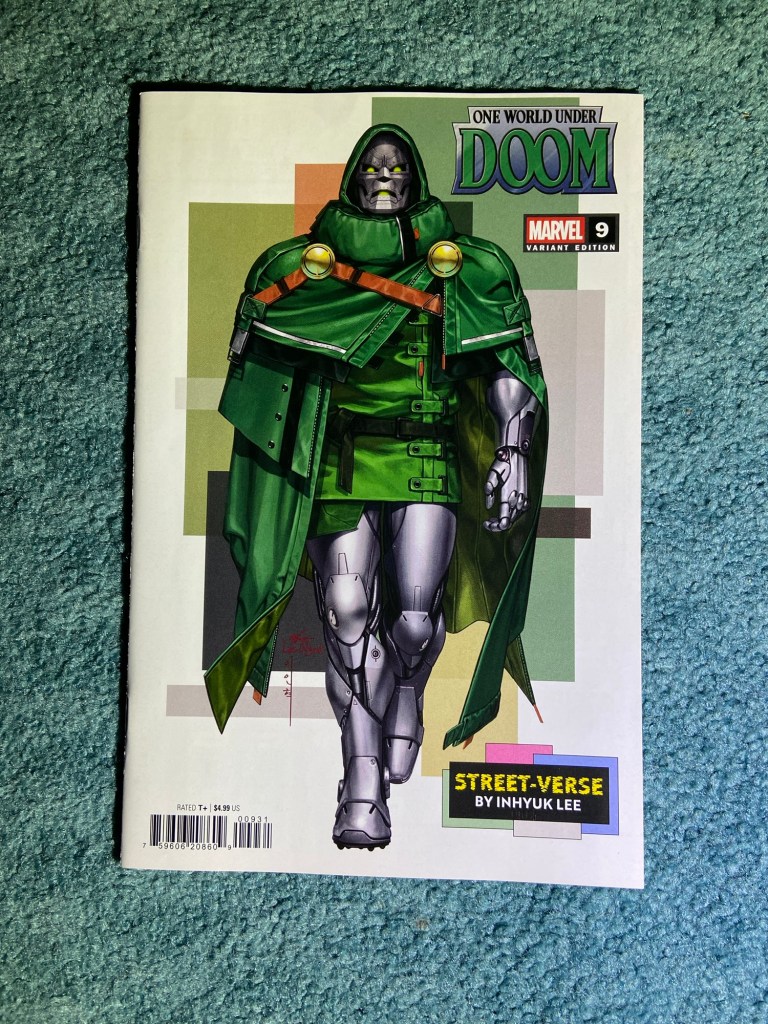
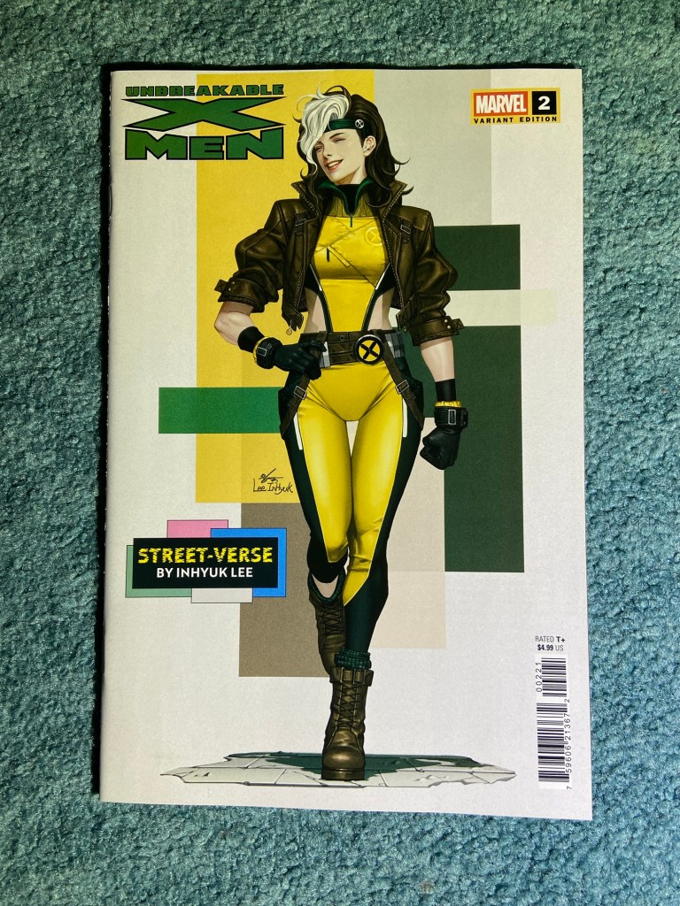
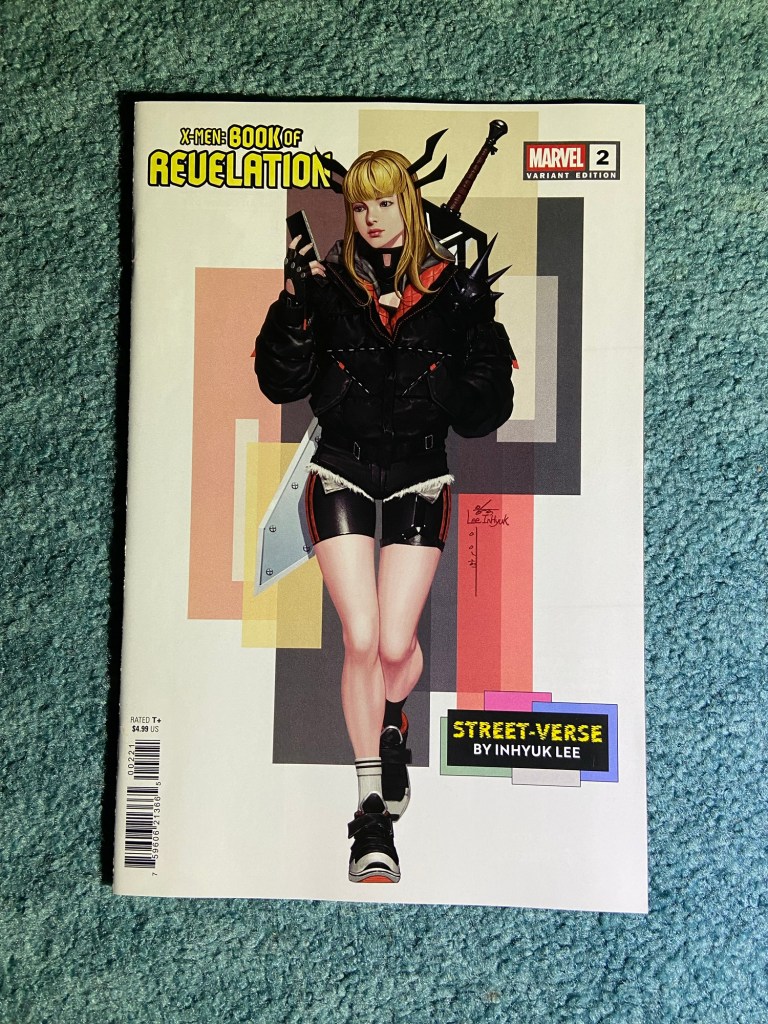
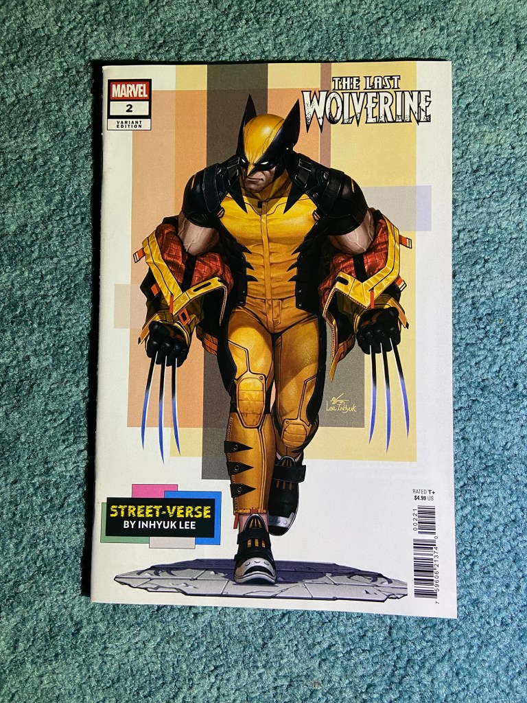
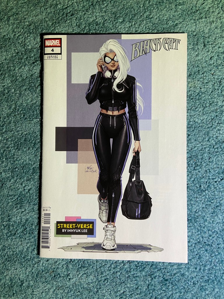
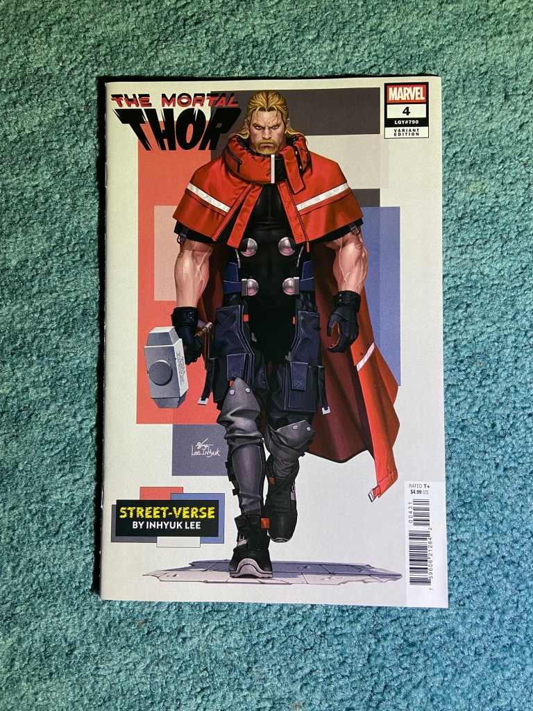
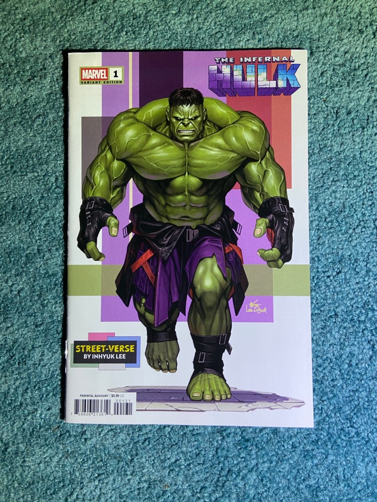
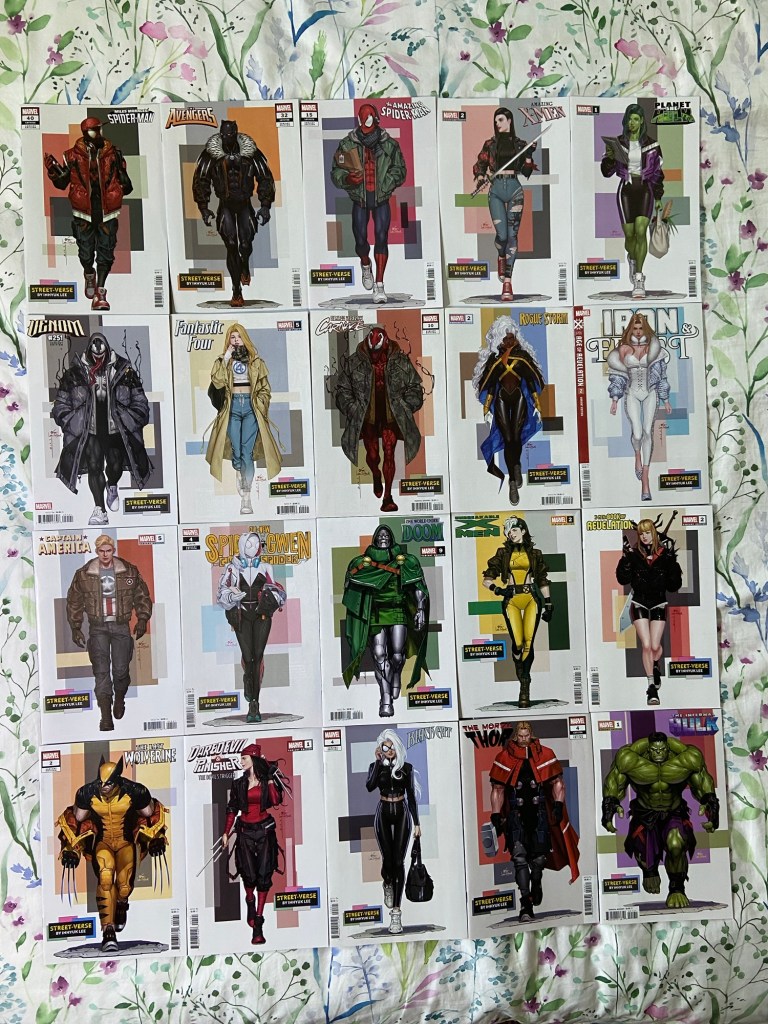
We’re back for more InHyuk Lee Streetwear covers! I’ve LOVED these designs since his first sets of them a few years ago. They’re on here. You could probably search Streetwear and InHyuk Lee and they’d show up. I would read a miniseries or watch an animated movie surrounding these versions of these characters.
I mean look how amazing these look together!!
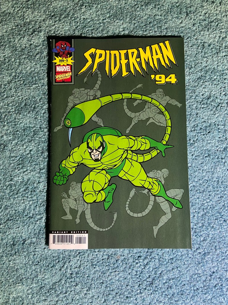
Even if only 5 issues, I loved having these animation variants! They always made me think about the original show.
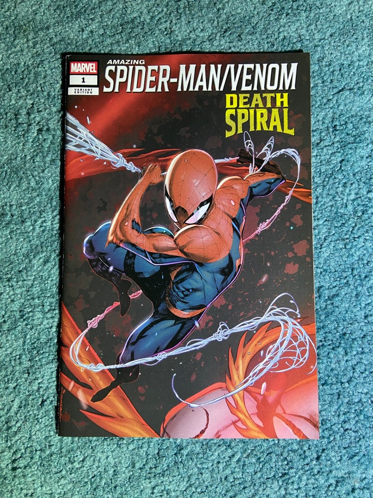
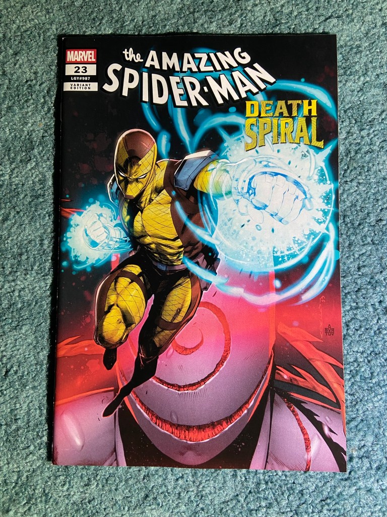
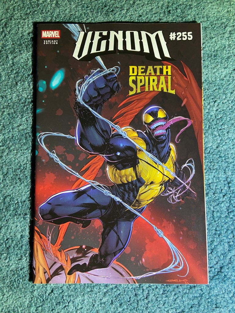
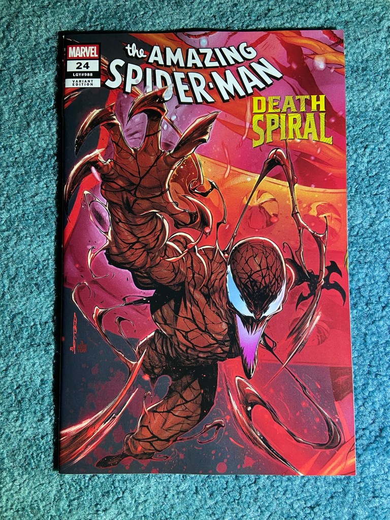
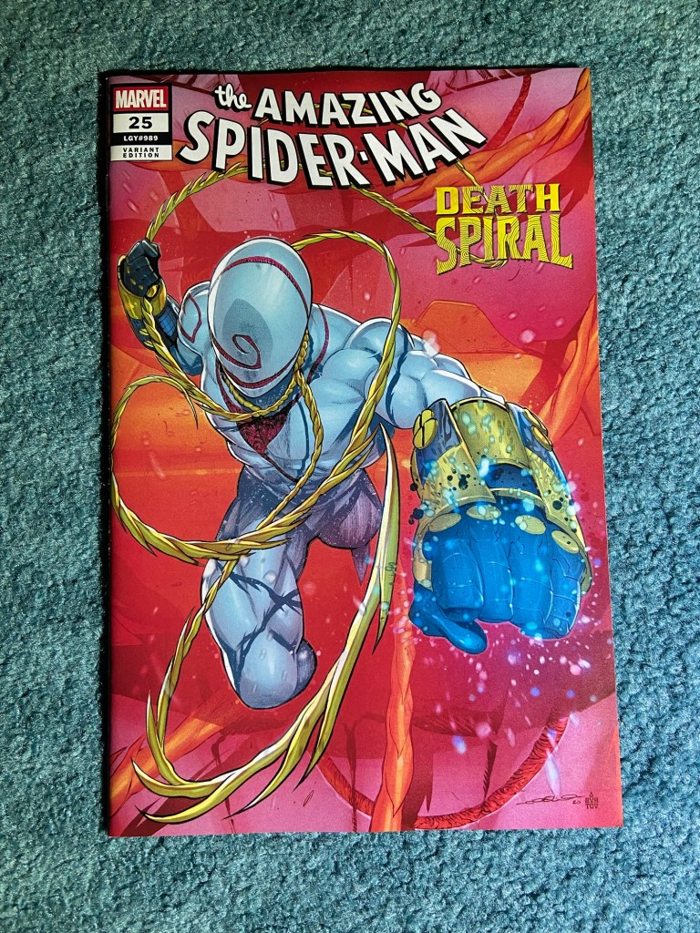
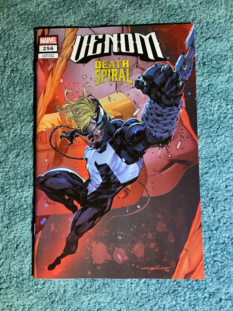
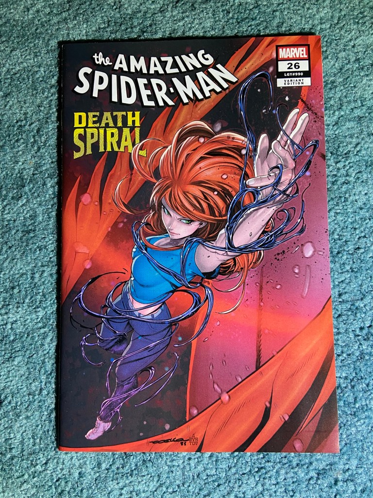
I do wonder if they intend to make another run of this since having covers with protagonists on them, besides Spidey, would be fun too.
Even after all these posts, there haven’t yet been any new boxes. So the number is still at 109 boxes. That may change this weekend.
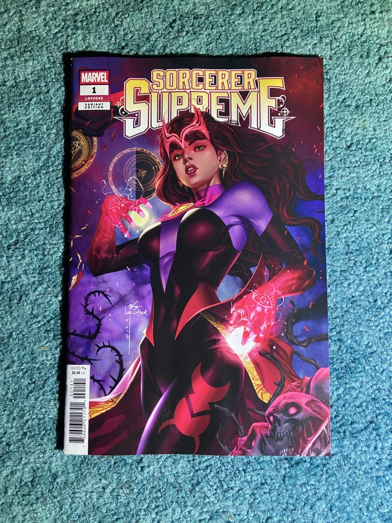
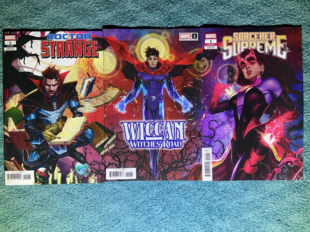
I almost forgot that the Wanda cover was part of this set! These all are amazing covers by InHyuk Lee.
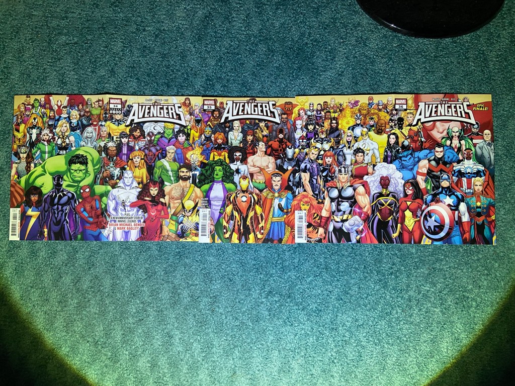
This set was so close to being properly connecting! The third issue was a millimeter ish of overlap with the second issue. And the first issue was overlap plus misaligned with the second. it really is a fantastic design though. I really wish they perfect this printing process or just pivot to wraparounds and gatefold variants.