
As usual, connecting variants first! And this will probably be 3 posts like last time but it may be more, I’m not sure yet.
These sets were similar to June’s sets, not as bad but still none that really connected as they should. Most of the faults were overlaps or misalignments.
There are a lot of these two-issue sets from Sean Galloway this time! I thought these would be all sets when they first appeared, but there are a lot that are on their own. So, I probably will have to make a post with all the ones I’ve not taken photos of and also have one like that for the Windowshades covers.


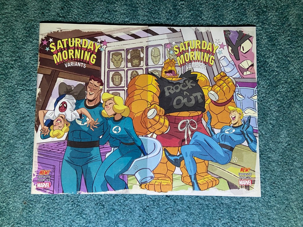
These are fun covers. There was a bit of misalignment and obviously the colors are not matched up at all. But I still like this image of Marvel’s First Family having fun while some villain is trying to get their attention.
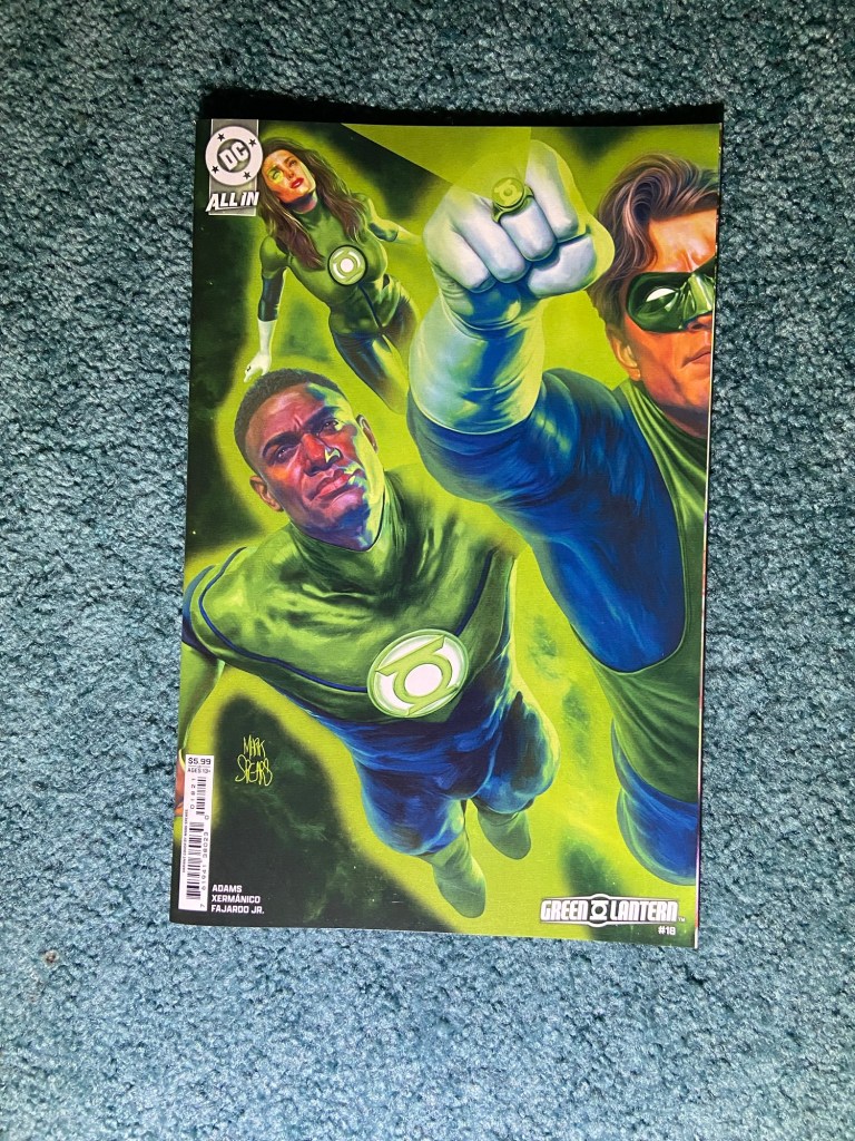
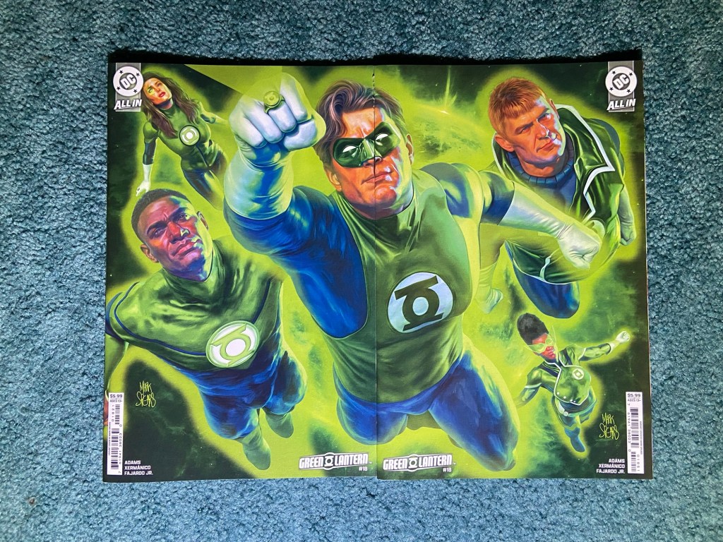
I love Mark Spears’ covers! Probably for similar reasons to why we all love Alex Ross’s art. The realism is so well-done! I would love something like this from him but with as many Lanterns on it as he could fit. Perhaps one set for each Lantern ring or one with all of them.

This one was I think a little bit of an overlap. Though only by a sliver of page. A lot of the overlaps were really just the card cover not reaching the edge of the rest of the book so there’s that sliver of pages on the right side. As I’ve said before, you’d think they would have figured out all these connecting cover problems by now, in 2025.
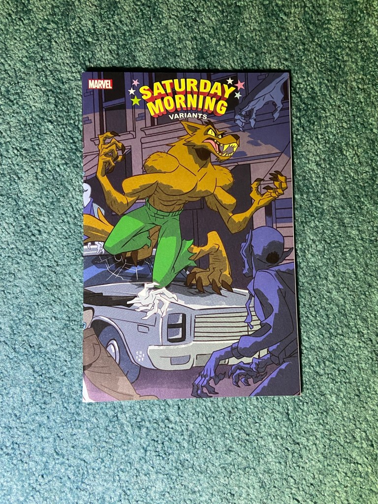
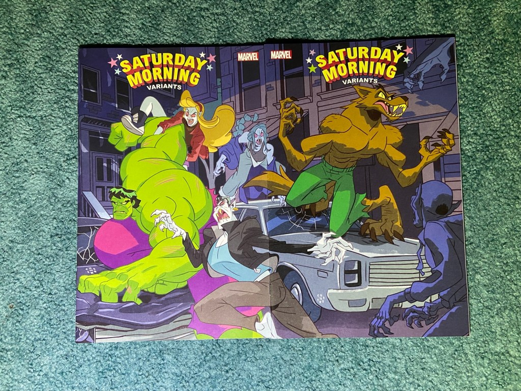
Here’s another Galloway set! this was during the Blood Hunt event.
This was both misaligned and overlapped. But still a fun and busy cover!
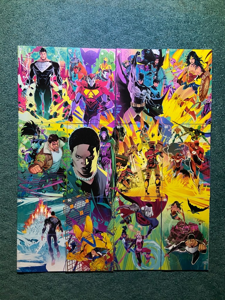
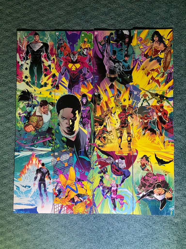
A 12-issue connecting cover grid!! This was an interesting set indeed. I do love the line-work and the colors! Bravo to John Timms!


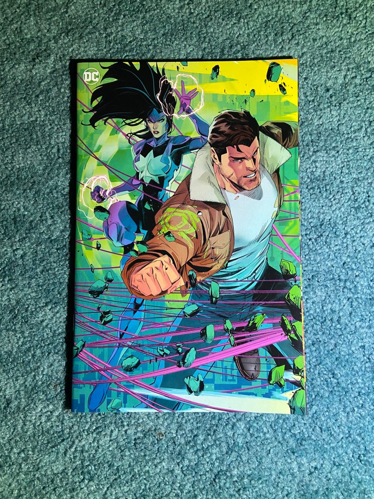
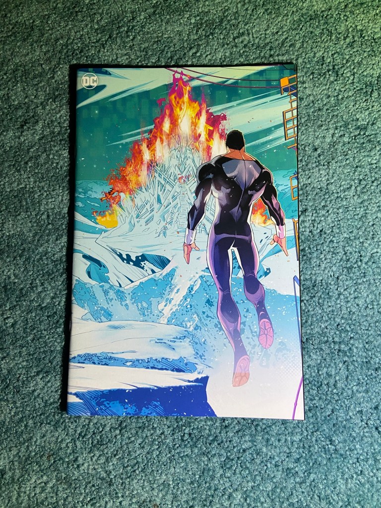
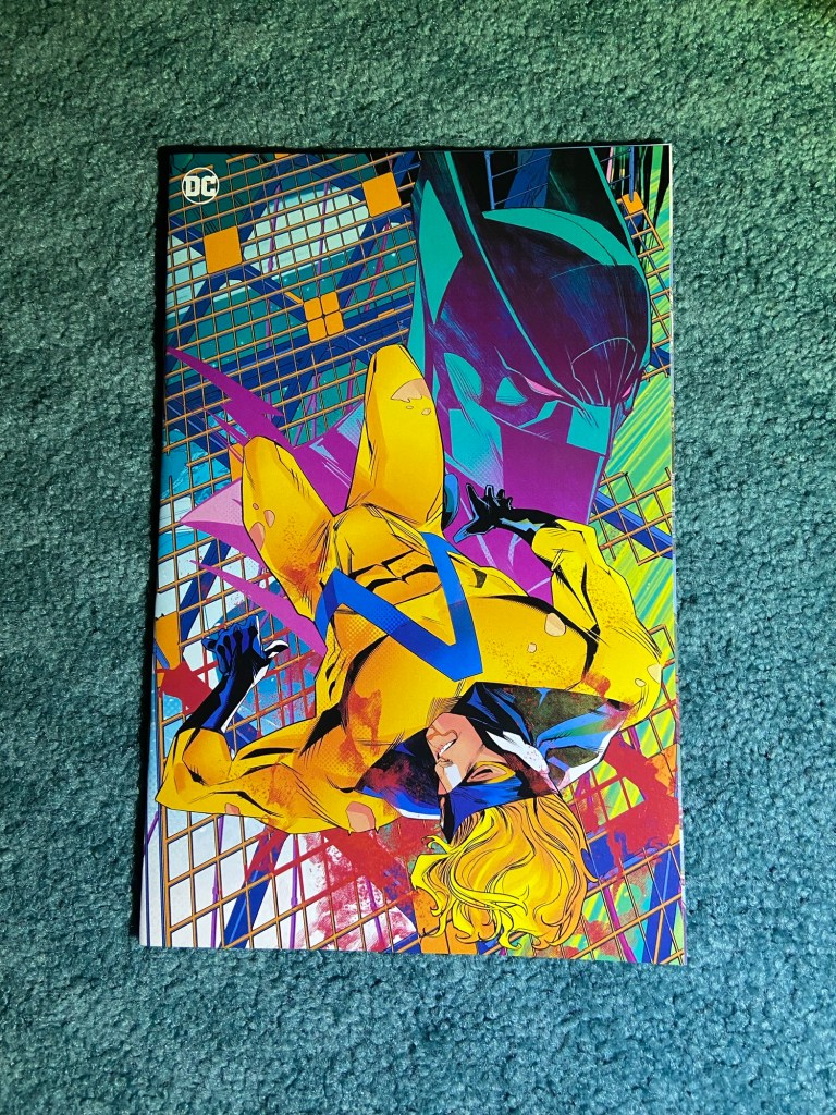

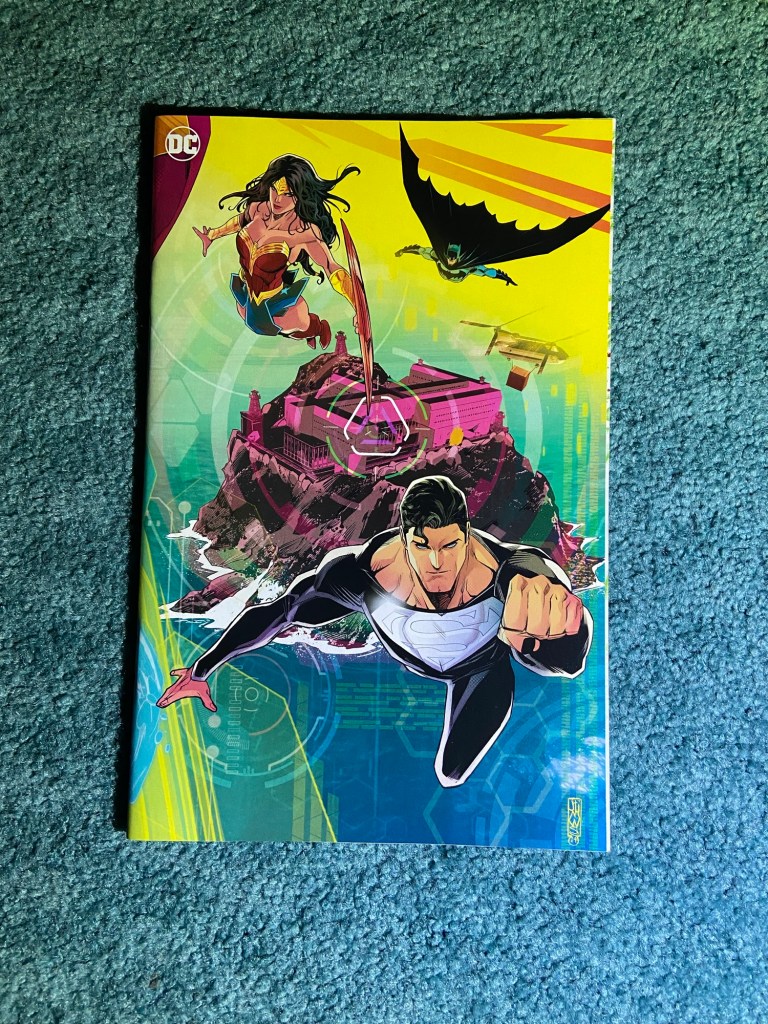
This set had some parts overlapping and other parts misaligned. So I did my best to make sure that the vertical connections worked. Now, I will say that for a connecting set, usually there’s one background connecting image and then the characters are mostly in the foreground, and this whole image seemed all over the place. When I first saw the set in the previews, I wasn’t 100% sure I was even looking at a connecting set.
Having said all that, I do love that this image feels like it’s storyboard for a big comicbook movie event! There’s so much going on that you want to look at every inch of it to find something you hadn’t noticed before. And as I said, the art itself is amazing! There are two photos because I wanted to get the light on both ends but with the angles I had to work with, I couldn’t make it work. Hence, after this, sets with 12 or more, had photos take elsewhere.
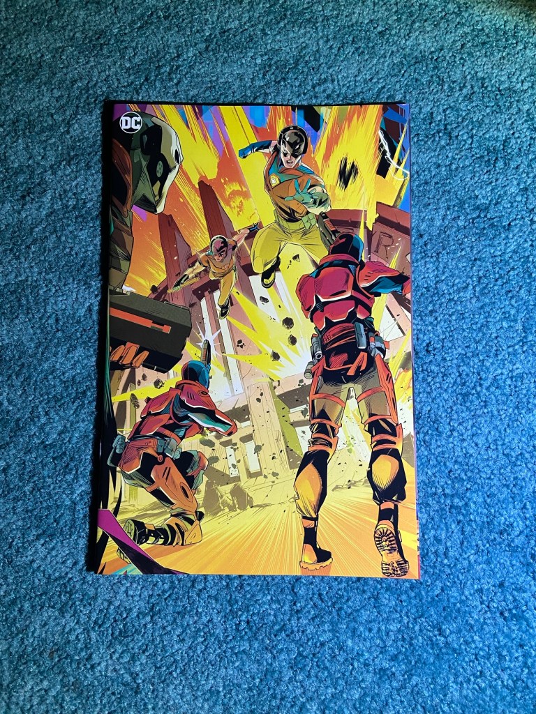
Here’s a Galloway set of 4!

Such a fun set! If only there wasn’t a gap between those first two issues, not the color matches between covers being non-existent, nor the overlap issues. But other than the problems, the image itself is so great! A lot going on and all the characters are front-and-center!
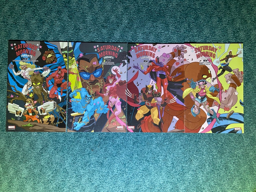
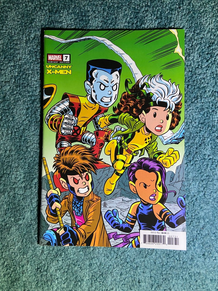
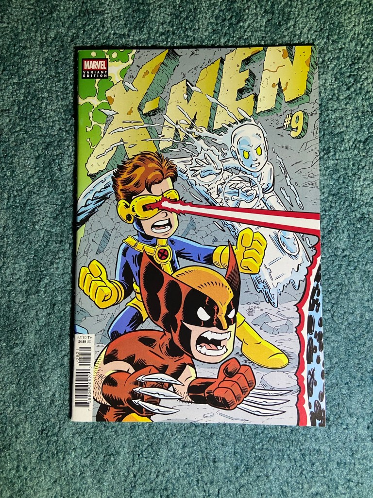
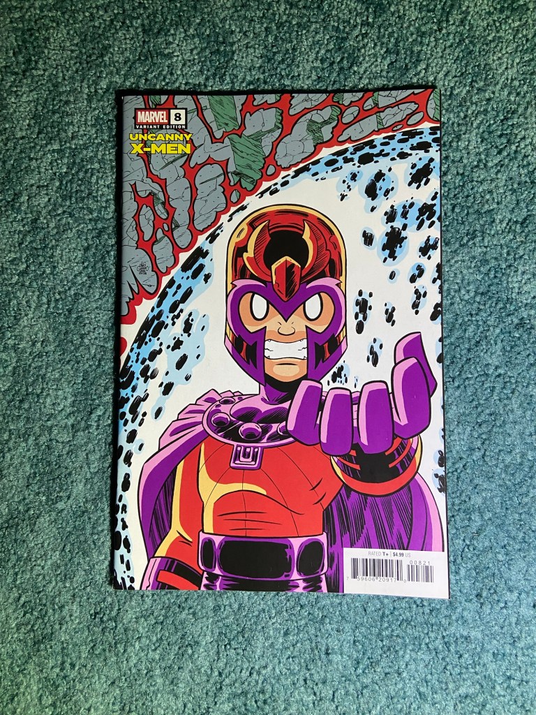
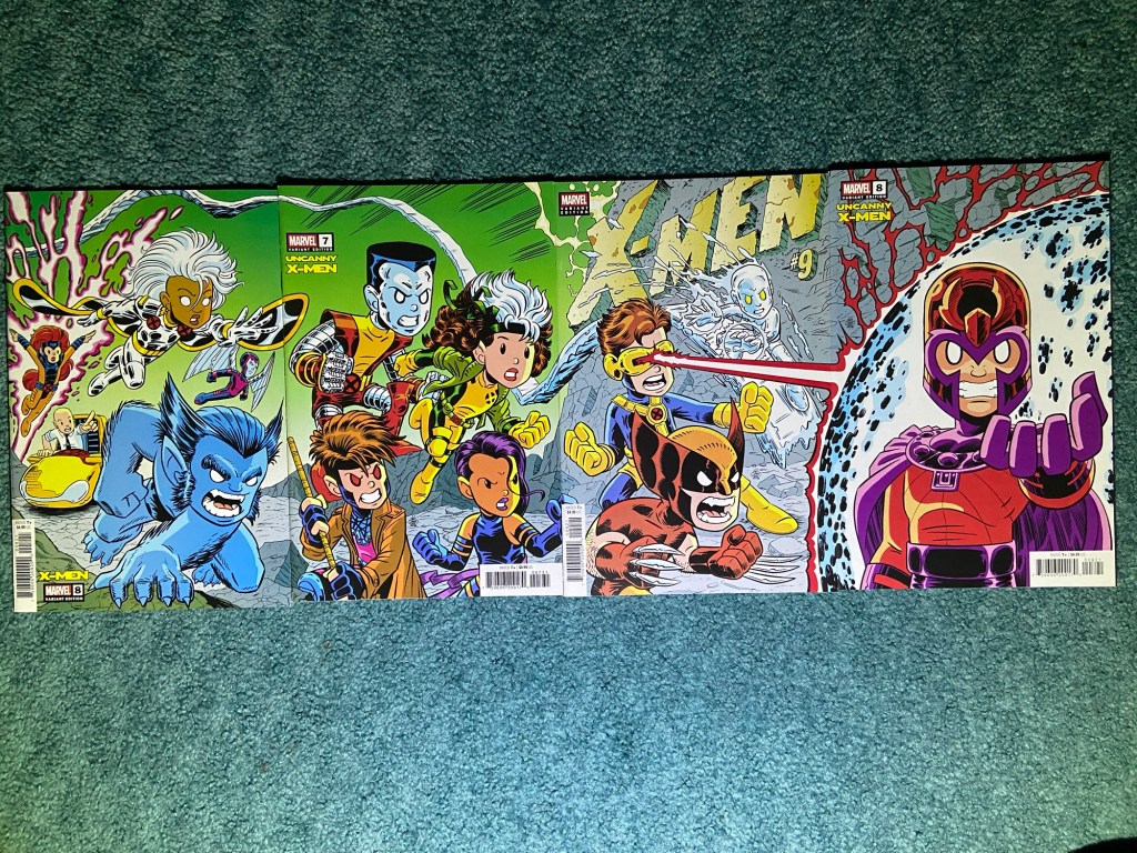
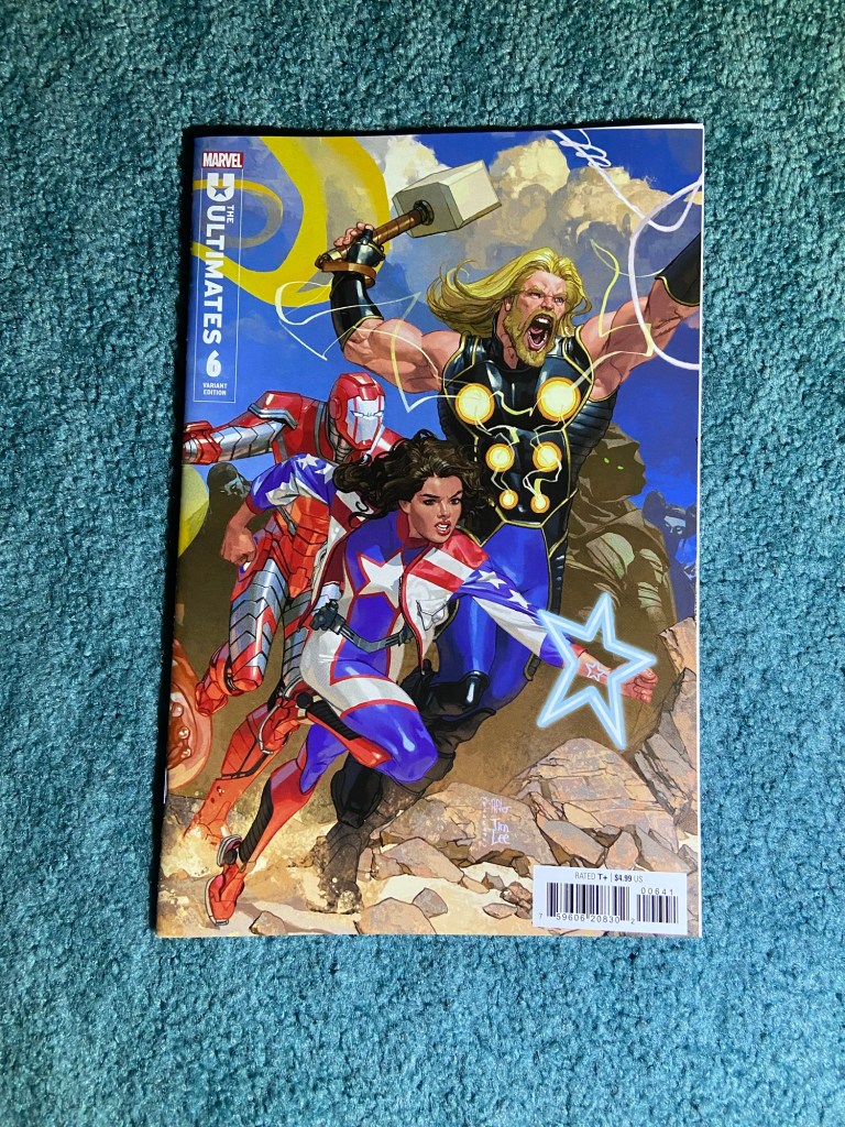
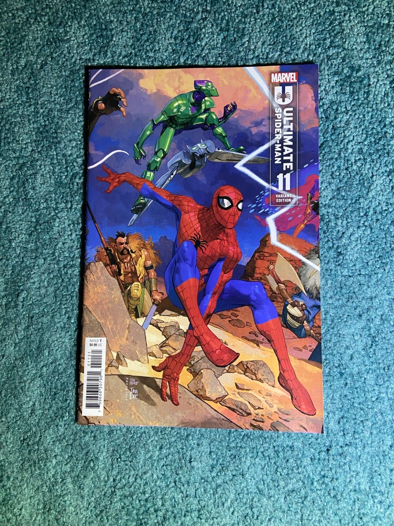
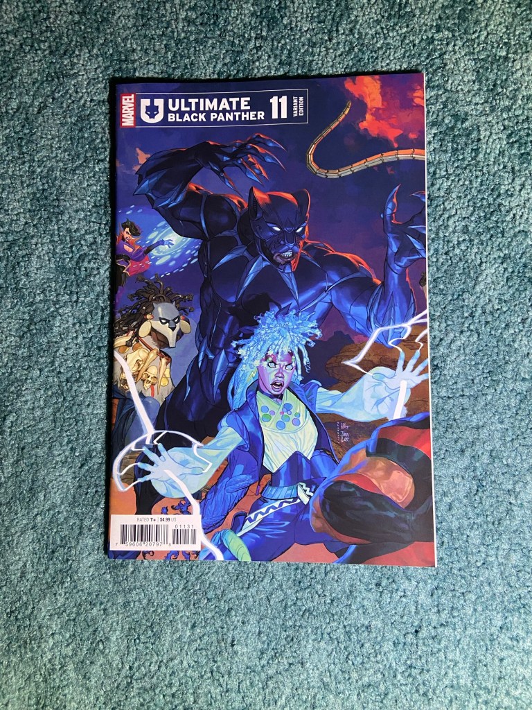
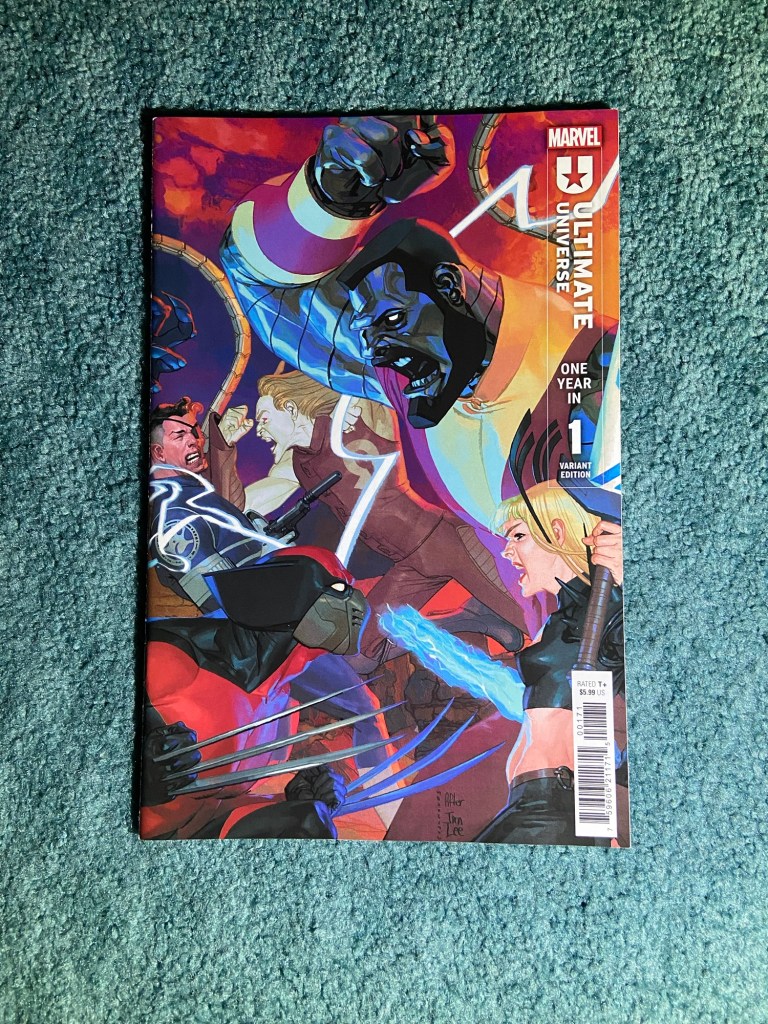
This artist is a name and art that I recognized from a recent connecting cover set. Chris Giarrusso did a great job with this homage set to that classic X-Men Jim Lee cover!

This is another set that I really wanted to connect well! This one was both misalignments and overlaps. Though those last two issues look really good next to each other. It’s still such a fantastic image!
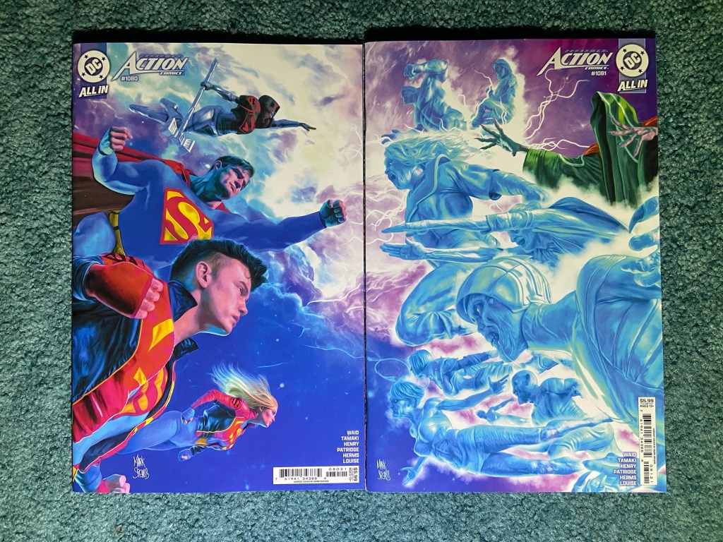
More Mark Spears! This time with the Super-Family!

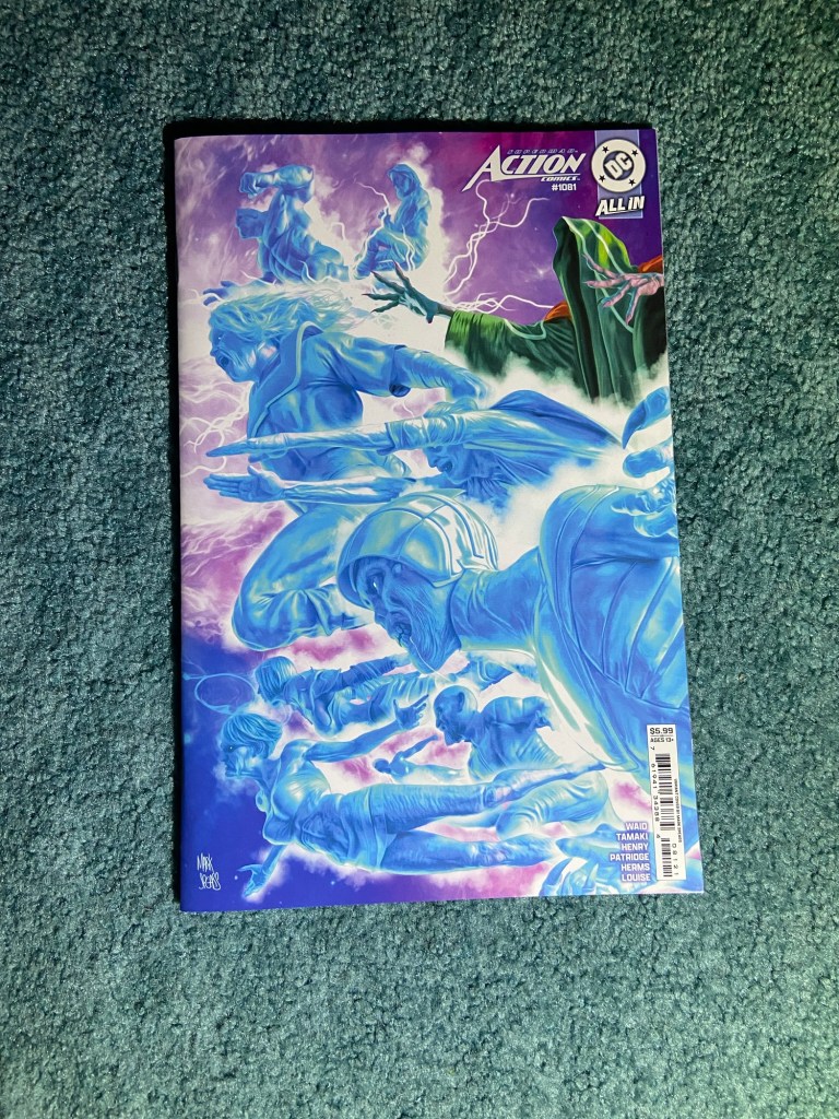
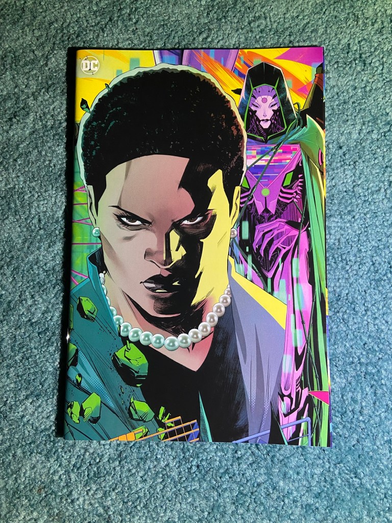
Such a great image! This one was an overlap. I’ll have to think about where to put these within my set boxes. The family looks great! And the villains look great too!
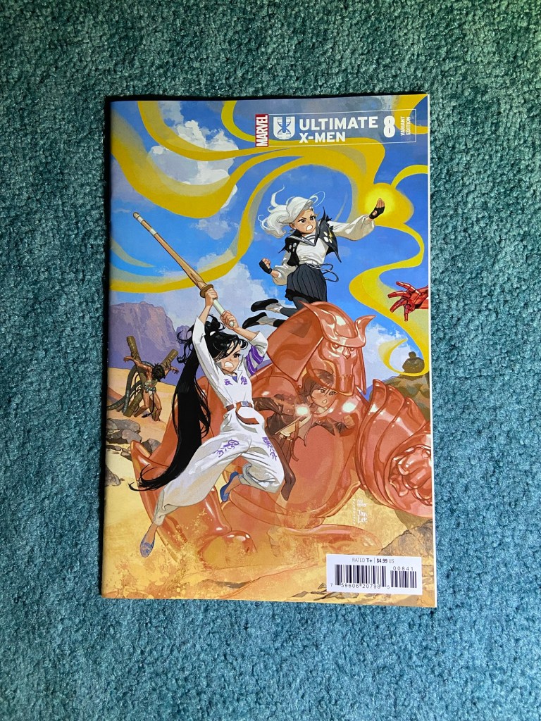
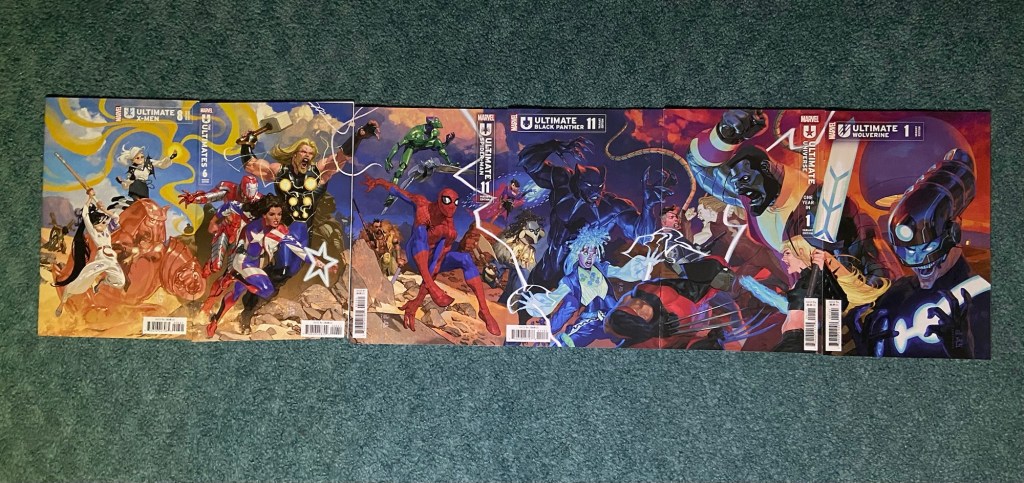
This next set is by Josemaria Casanovas. Since Peach Momoko’s Ultimate X-Men run started, I’ve been wondering what those characters would look like in normal Ultimates art styles, since Momoko’s style is so unique. Seeing all these characters in one image was great!
The first and third through sixth issues all had the overlap problem. But the second issue somehow was printed and cut at a slight angle? Very odd indeed. But the whole image does look pretty great.
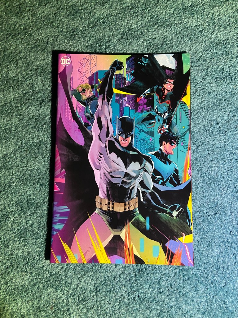
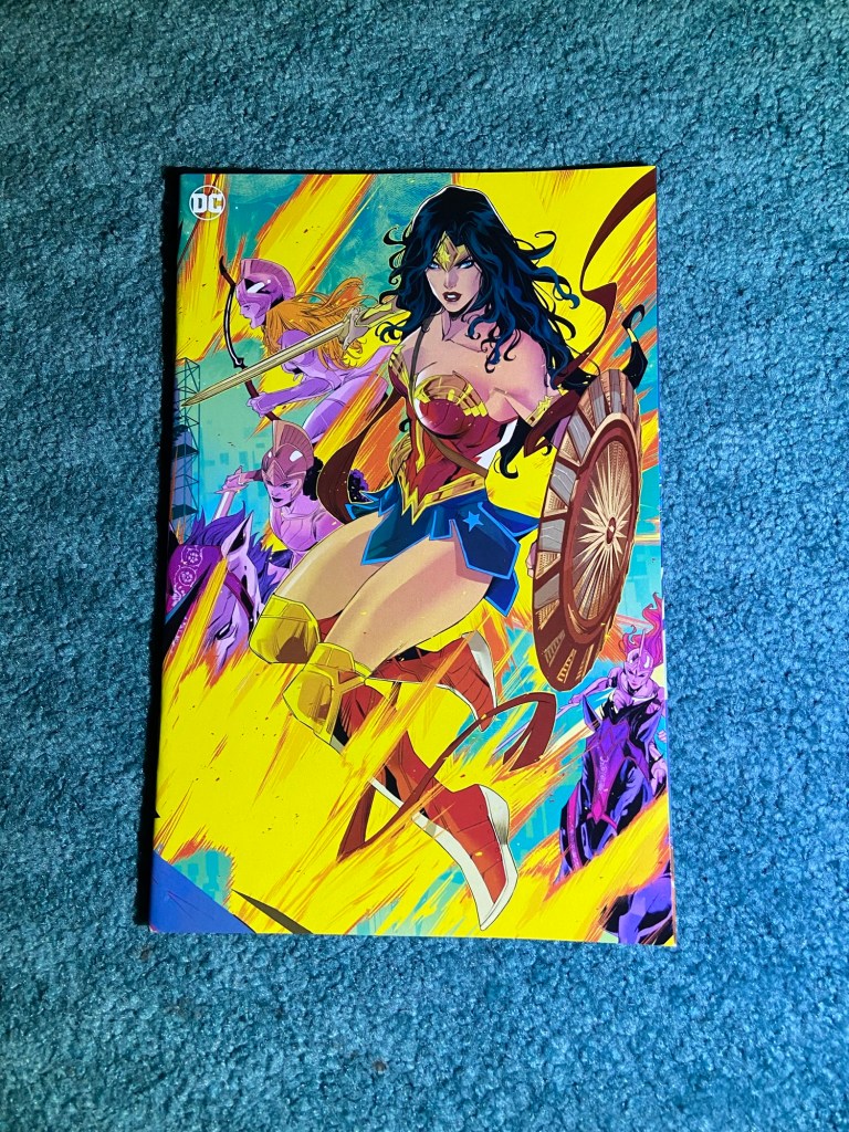
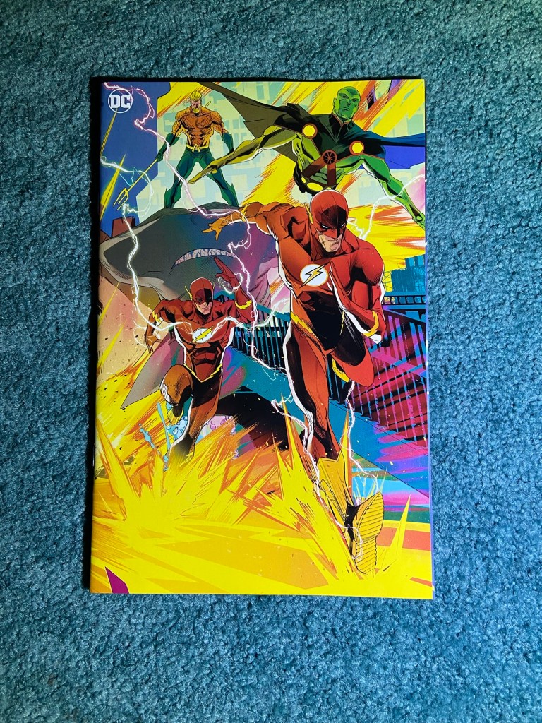
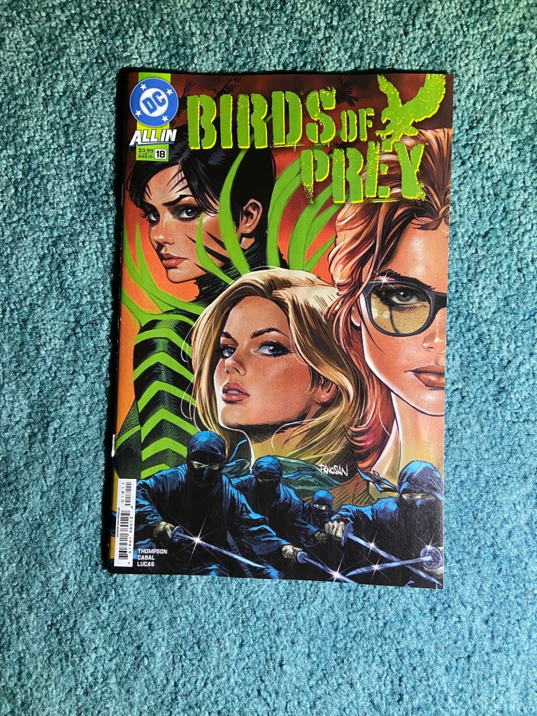
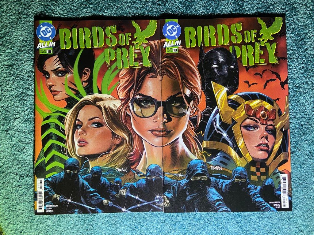
These are both the main covers for these issues by Dan Panosian. I really like this image!
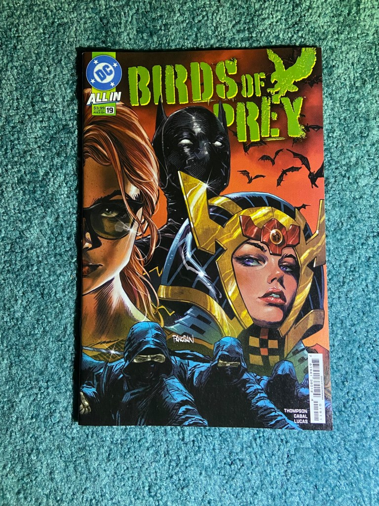
This was an overlap via the sliver of page. But other than that, everything else looks great!
And that’s the end of the connecting covers for this sorting. Well, I will have a couple more in the next couple parts of the complete sets posts, but I felt they better suited those posts, or also, I’d already covered them.
