
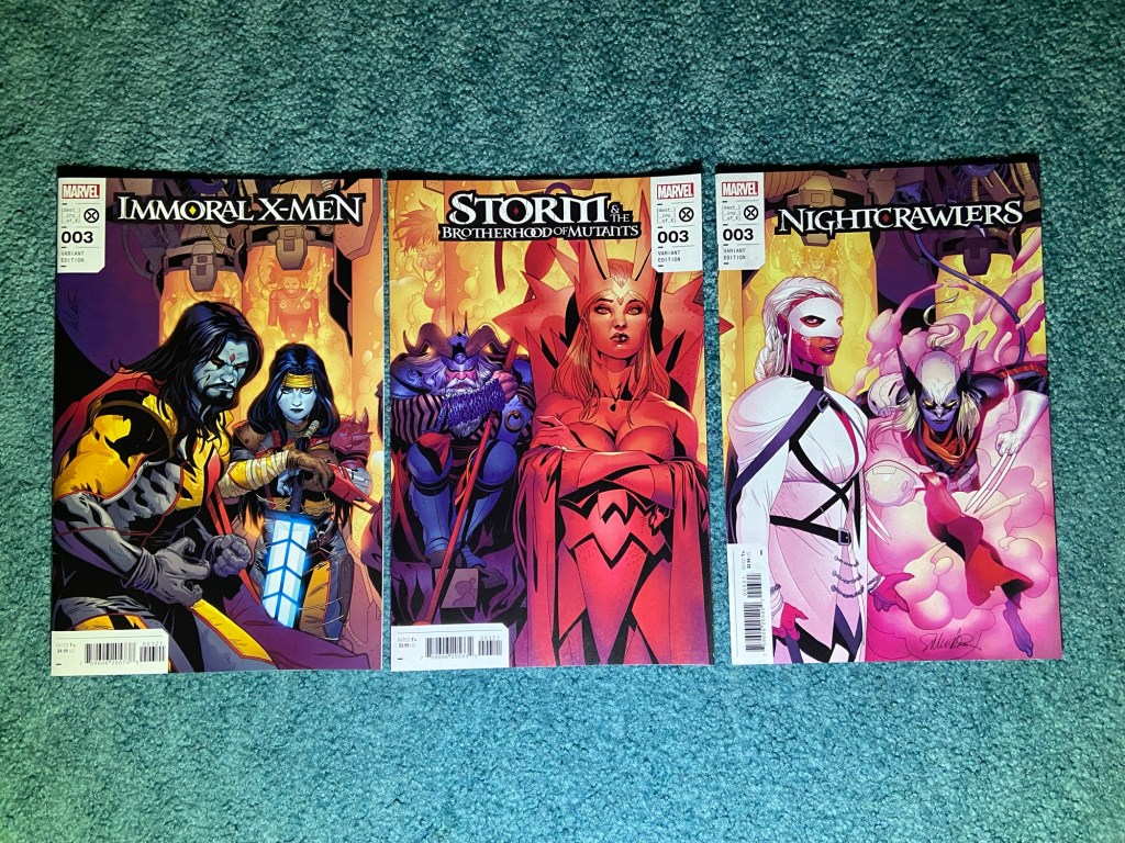
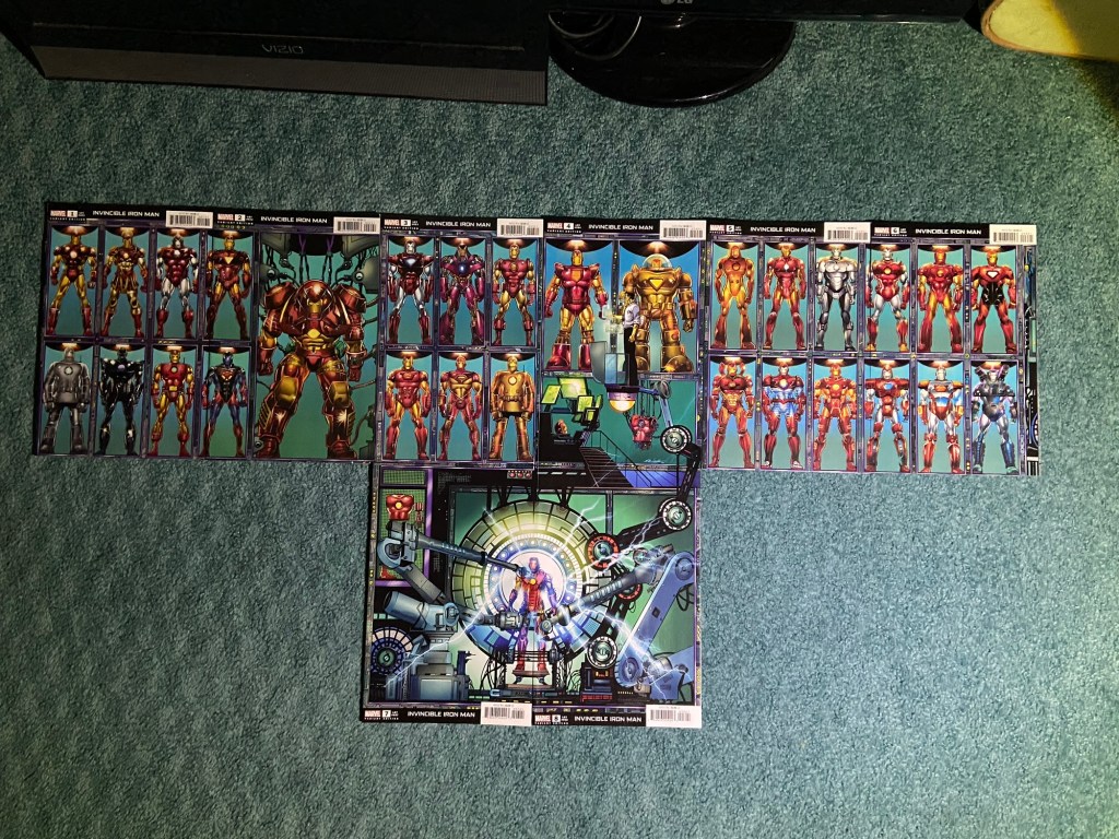
This will be a post of only connecting covers. I’m glad I did the photos of these first, because this was extremely frustrating to do. Why, you ask?
Because I forgot how many problems there are with connecting covers. I guess it’s just been so long since I last sorted these that I didn’t remember what to expect, and also, it was vastly more comics I was taking photos of than previously. There are, as far as I know, 6 problems with connecting covers, and I don’t really understand how it’s possible to get connecting covers wrong when DC and Marvel comic books have existed for over 90 years, you’d think they’d have figured it out by now.
Now, since I’ll be posting the collection images as images and not in a gallery form, as I always do, it may be difficult to see some of the 6 problems, and for some it’ll be very obvious. I will save the worse for second or third from last so I don’t end on a very frustrating paragraph of text.
I also feel so badly for all the amazing artists whose art have been done wrong by the printing process. And I hate that other than I think 2-3 sets of allll these connecting cover sets, none of them can really be displayed together since they aren’t all connecting the images correctly. I had been planning on framing all these connecting cover sets so they could be beheld in their full image, but I won’t be able to.
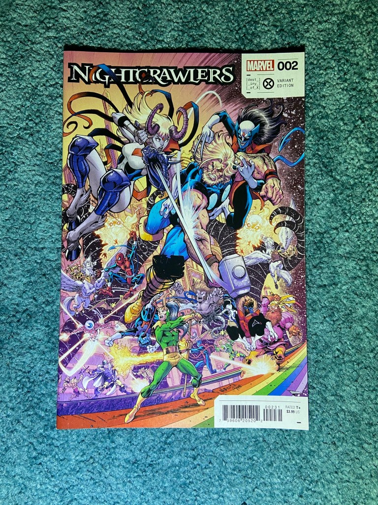
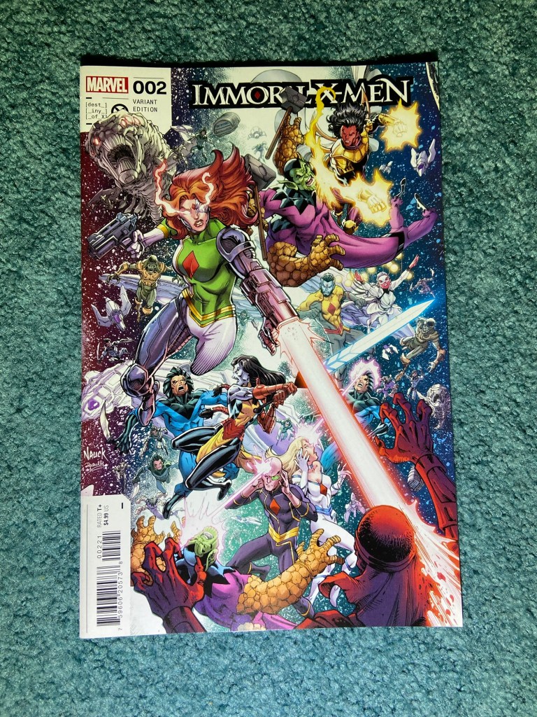
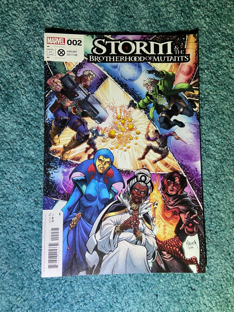
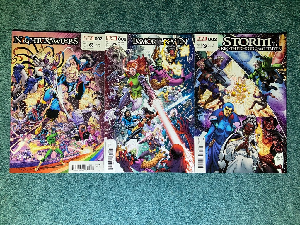
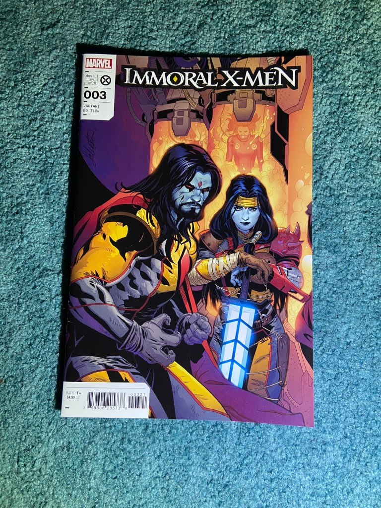
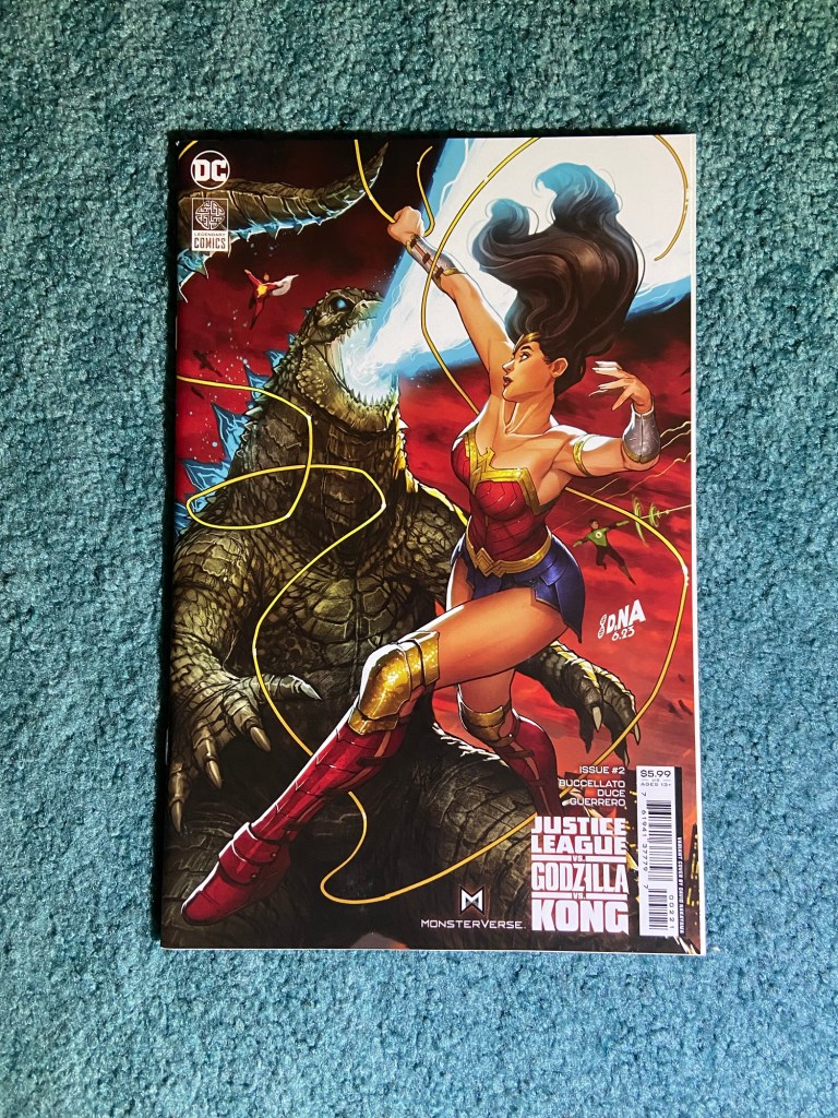
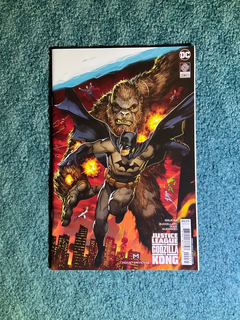
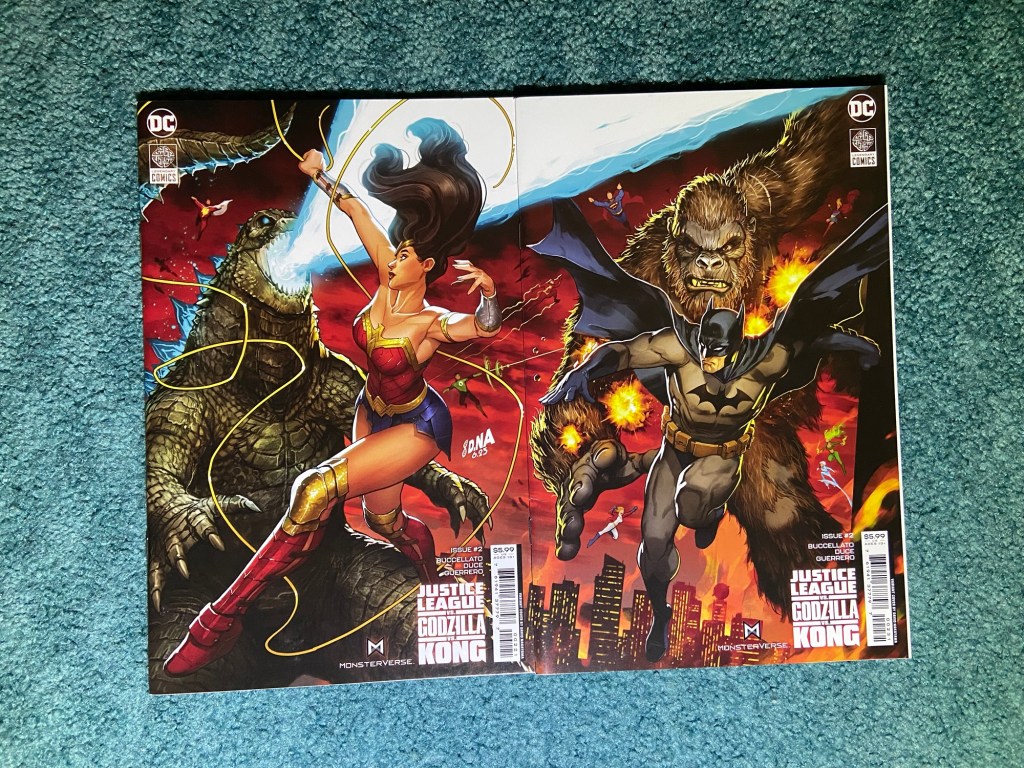
The first set was a bit odd because it took me a while to figure out if this was, in-fact, a connecting set at all. The only things that actually connect are a couple of small items between the second and third issues and then generally the literal background of outer space. I, of course, still enjoy Todd Nauck’s art in the set, I just was left confused. But on the plus side, everything that did connect, actually connected between the covers!
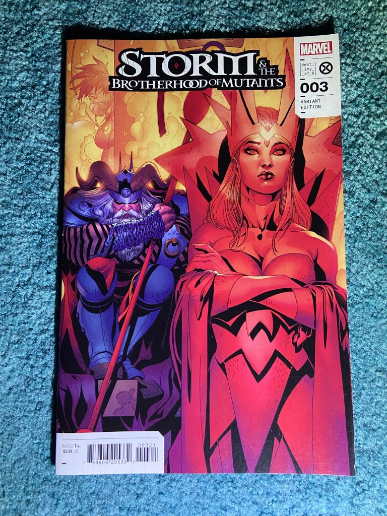
The next set is during the same time, and is a Suns of Sinister set. This was by Salvador Larroca. I enjoy the art and the characters and the design (I will probably repeat myself on this for all of these sets) in general. One of the 6 problems appears here in the form of thin gaps between the covers where art is missing. And therefore, the covers don’t actually connect because of a couple centimeters of space. I tried my best (with this set and with other sets which had the same problem) to make the image work as best as it could with where it should be lined up.
I do love the poses and such of these covers a lot.
Next had the same problem, the gap between the cover art. This one, even though it’s a collage, it still noticeable because of Galactus missing have of his face and body (among other characters bodies below him sharing the same fate).
This design was in celebration of every character who’s been in an FF comic, I assume. I love seeing so many characters on these covers! So many I know and so many I don’t know.
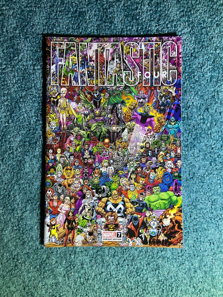
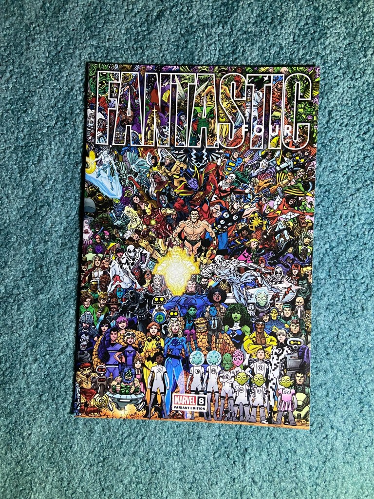
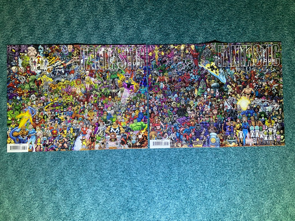
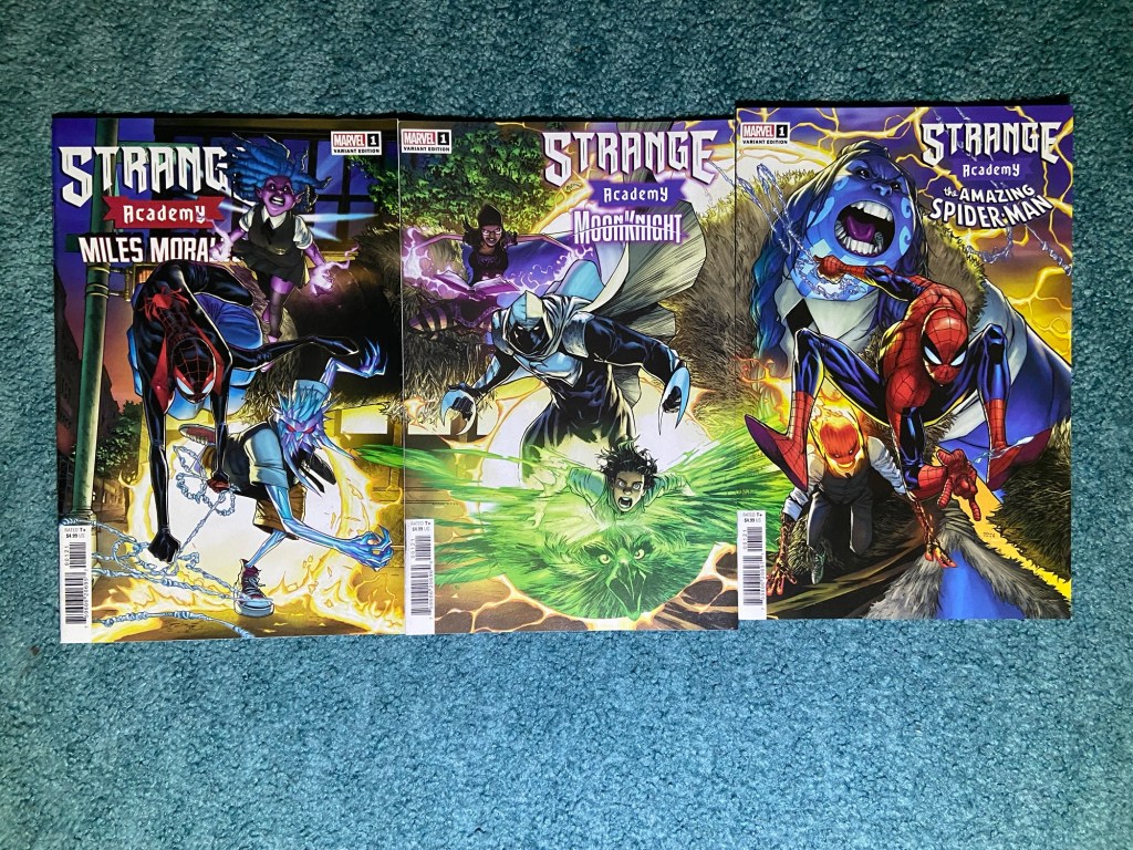
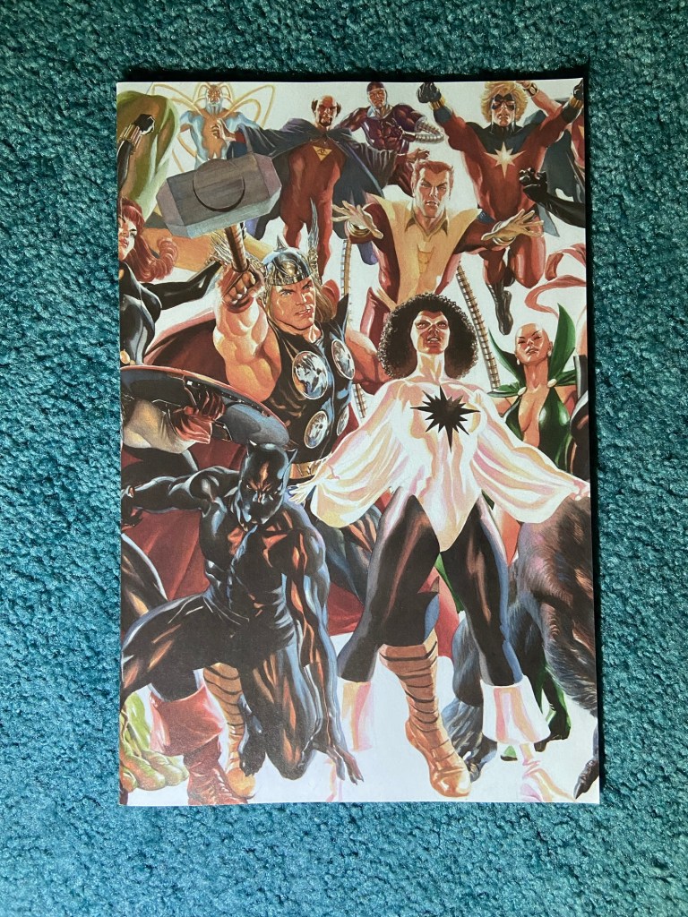
This next set showed a different problem, and one that I’m not sure if it’s a product of the times or it’s just continued bad luck with how they print these covers. The problem being that the image itself is made up of layers, and most artists drawn digitally now, and the way things don’t line up here make me think that each layer of the whole image lines up with itself on each cover but not all the layers lining up with each other. But again, how does something like that happen when the original image is all drawn as one?? It’s frustrating. And again, I tried my best to line of the most prominent layers so the image works as best as it can.
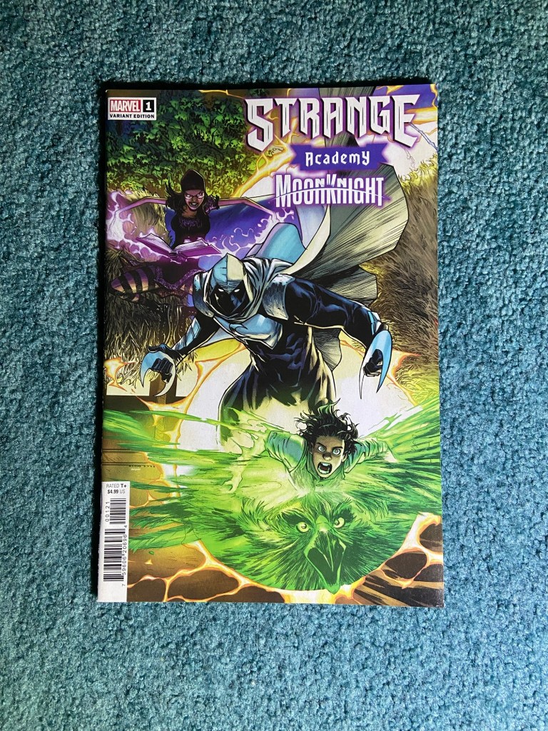

The art is by Humberto Ramos. I loved seeing his work on these covers since he did the original run of this title when it was a full title and not just a tie-in for an event or crossover. His art is so fun and dynamic.
The next set simply wasn’t lined up properly, so the only way to make the image work was to have the issues unaligned for the photo. This is again, something that works for a photo, but not for a display.
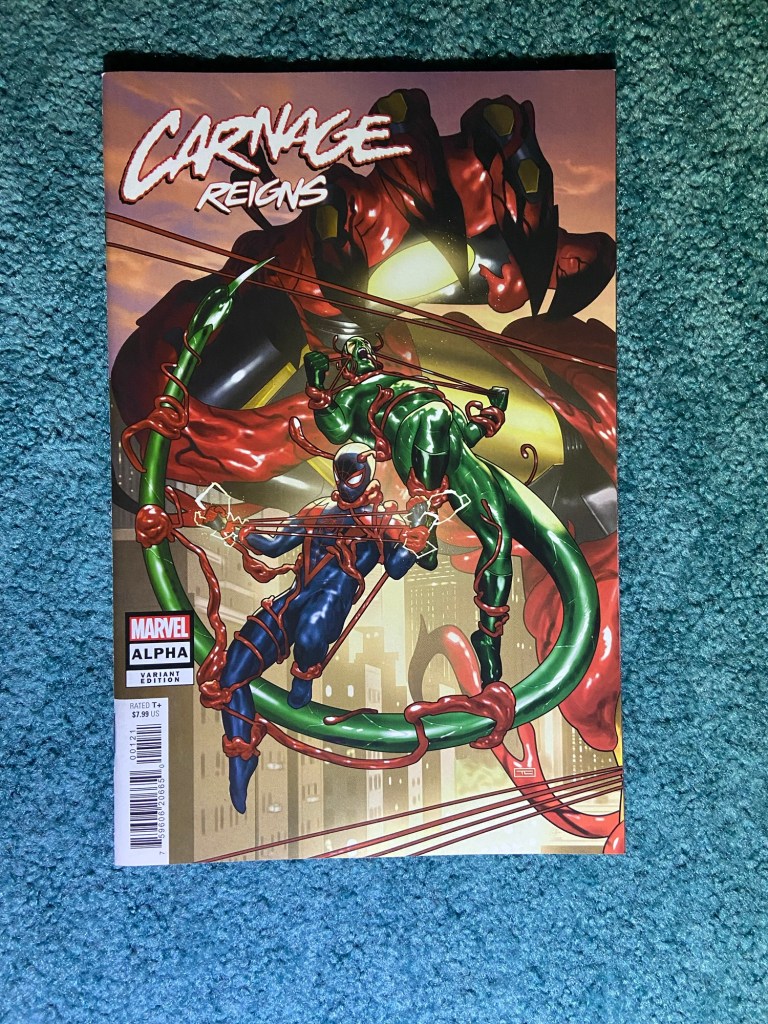
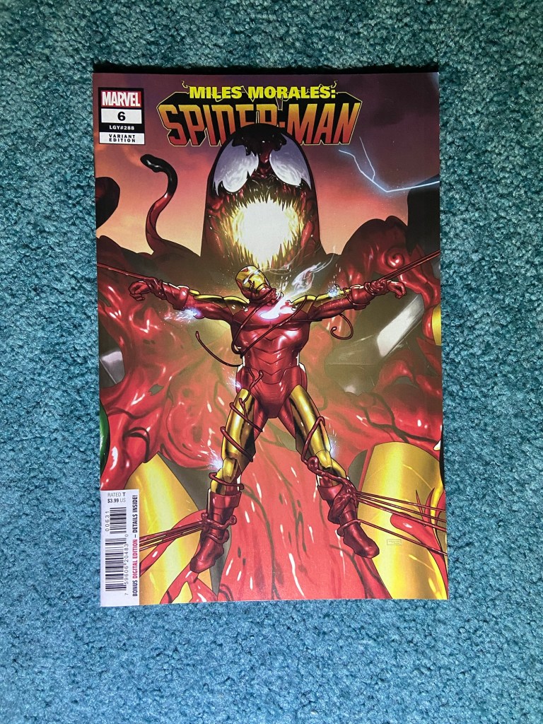
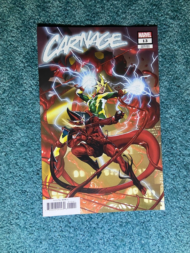
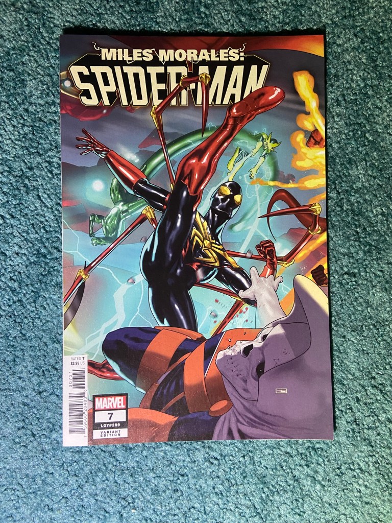
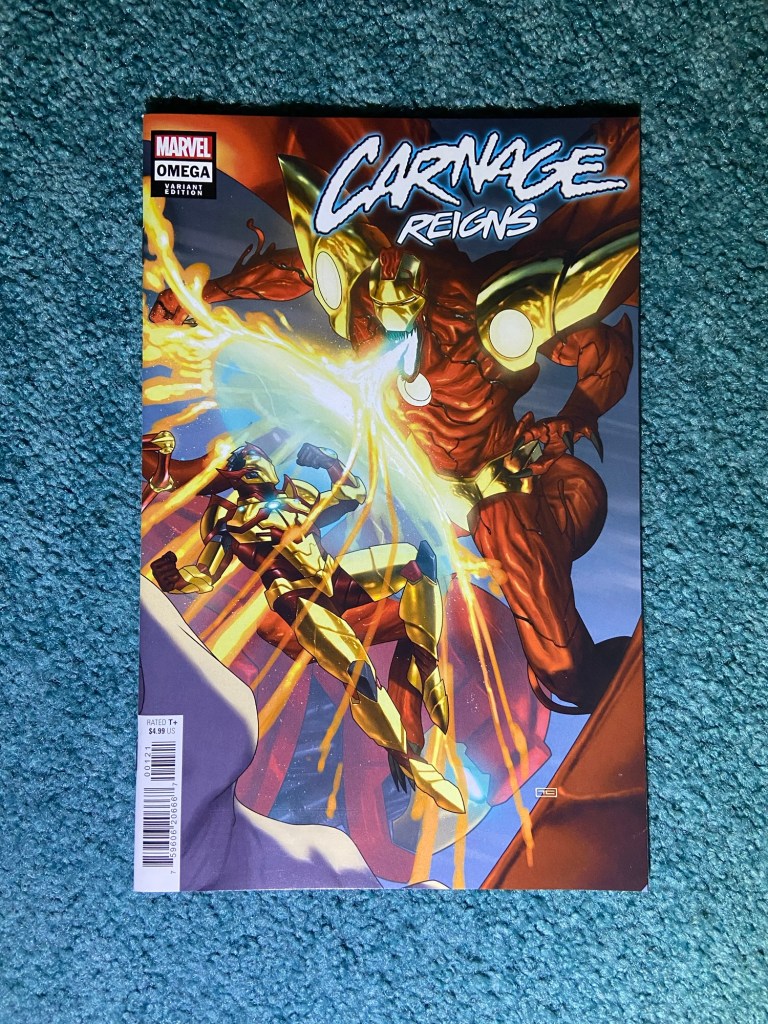
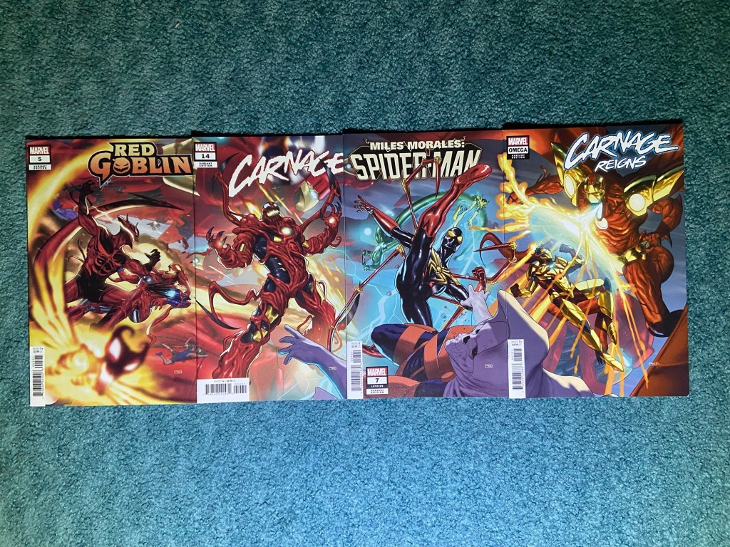
This art is by the amazing Taurin Clarke of course! The red looks great and the shiny look of his art are amazing. It just sucks that the images aren’t aligned. This was during the Carnage Reigns event, as is the next set. which is also by the same artist.
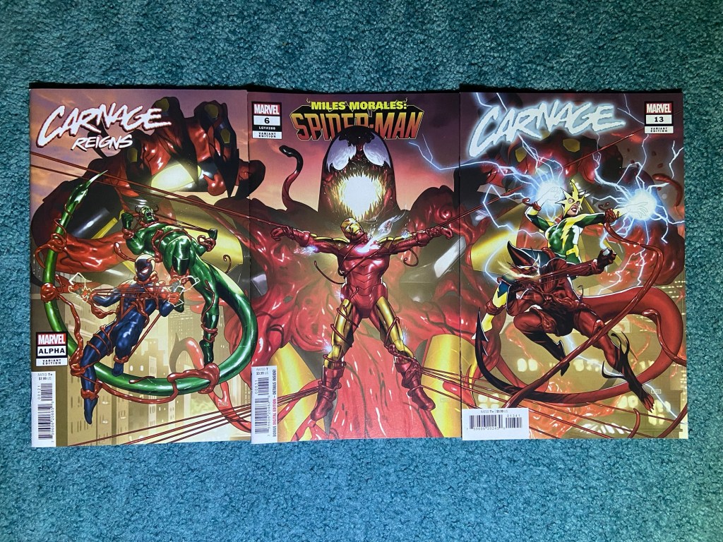
Another great art piece that for messed up. but again, I love the details and colors he used so much!
This set had the layers problem and an overlap problem. Now, for a photo, I don’t mind the overlap problem too much since at least it still shows the whole image. But, for display, it will be tricky. if I can find a way to hold the comics in place so that the images work, then perhaps I will be able to display them, we’ll see. I think between the second and third issue, the overlap was larger than others.
The next set is so amazing that it really is disappointing that the art doesn’t match up. It’s the Alex Ross homage connecting cover paying homage to Jim Lee’s X-Men 1 triple gatefold and connecting cover art from the 90’s. The art is of course amazing as ever. Though in this case, the details in the art make it even more obvious that the images don’t line-up.

I mean from afar, that looks amazing!! Up close, the errors were I think some small overlap, and misalignment.
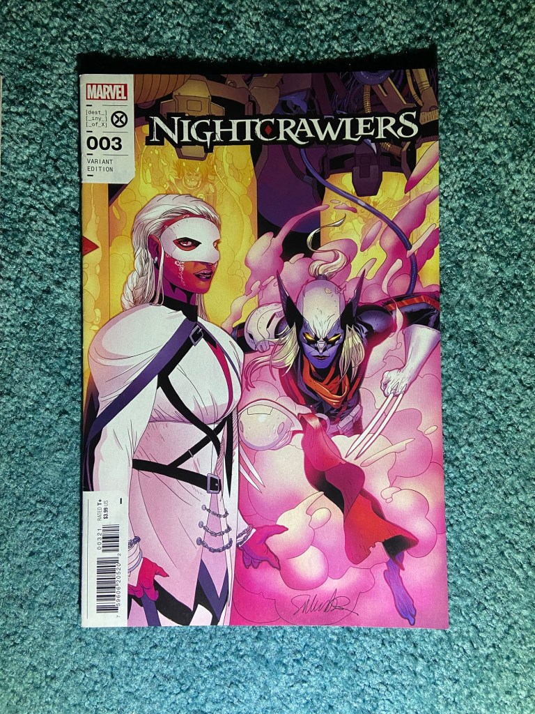
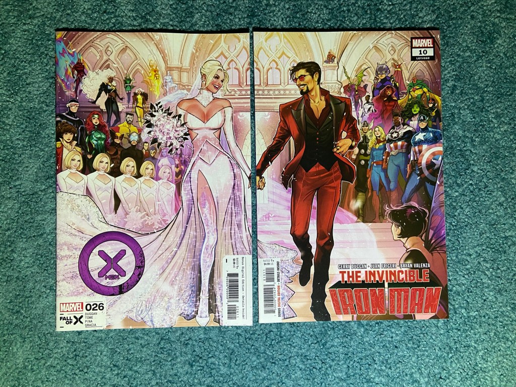
The next one has that same missing line of art similarly to those first sets I posted. and it’s only between two issues, not a bunch of covers.

This one is more noticeable because of the coloring I guess. But there are part of their hands missing and bits of the architecture of the church is missing. This are is by the amazing Lucas Werneck! He always does such a great job whether it’s with multiple characters on a cover or singular characters.
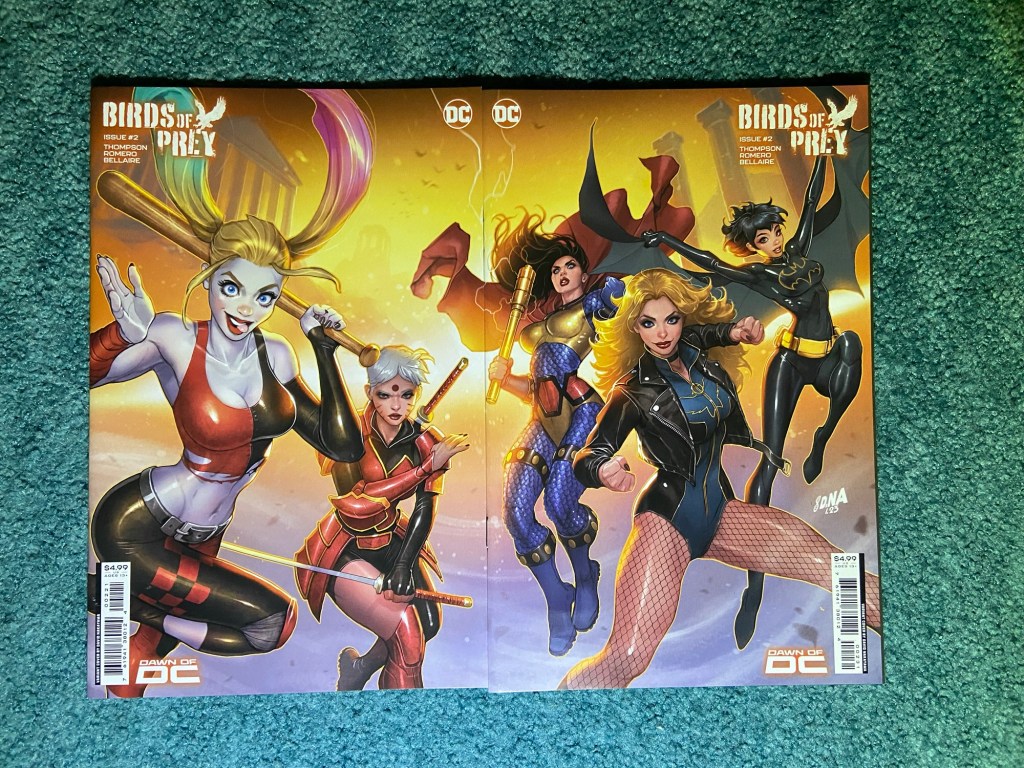
The next one is a Nakayama set for Birds of Prey. This one is just a misaligned set. Though, this also was released as a wraparound cover, so I can just display that.
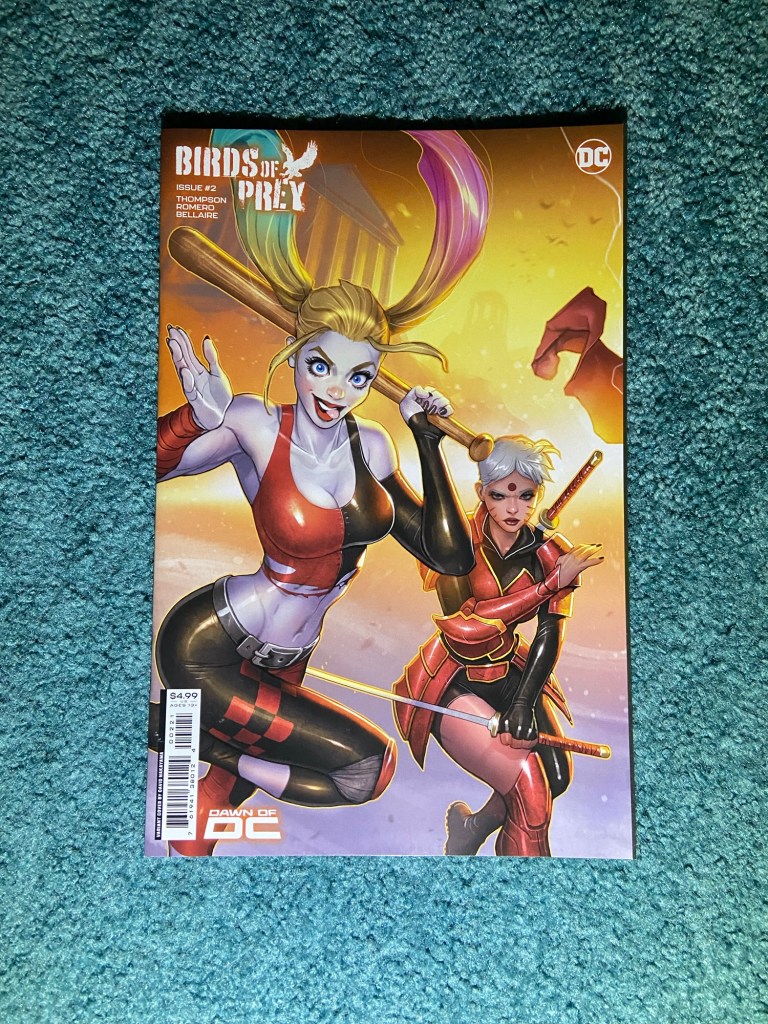
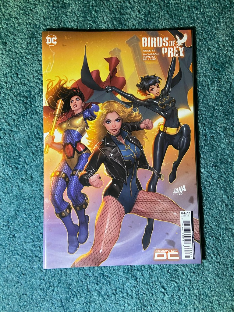
Love this! they all look great!
The next set is another Nakayama one!
This was a slight misalignment. But I still enjoy the depth and colors on these!
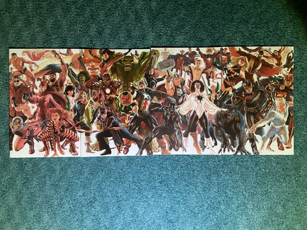
The next set is another Alex Ross one!

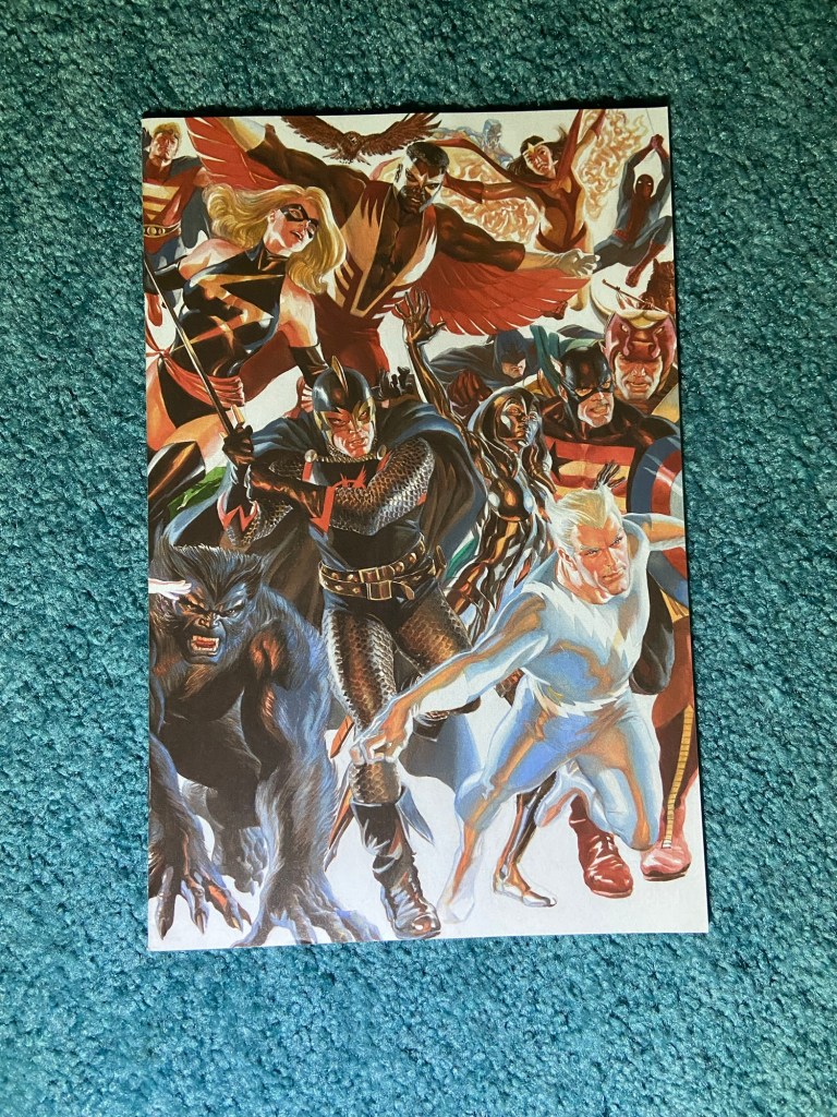
It looks so good from afar!! I love his art so much! Before the days where we had comic book characters in movies and shows, Ross’s work was the only way people saw what these characters could look like if they ever existed in the real world.
The problems here were misalignment and overlapping. It’s most noticeable between the first two covers. I lined up the images via Hawkeye’s bow and you can see above that area, there isn’t alignment.
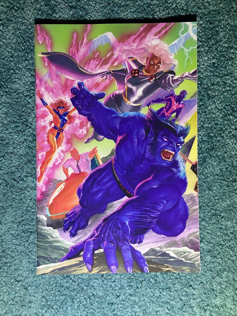
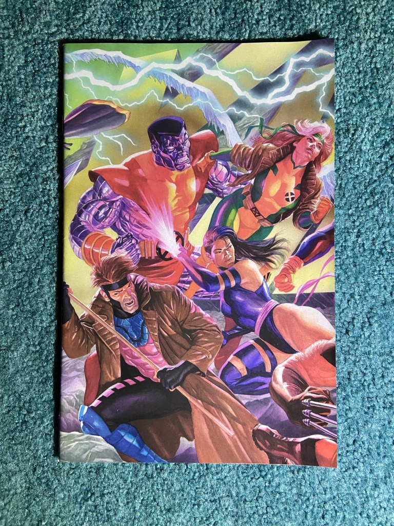
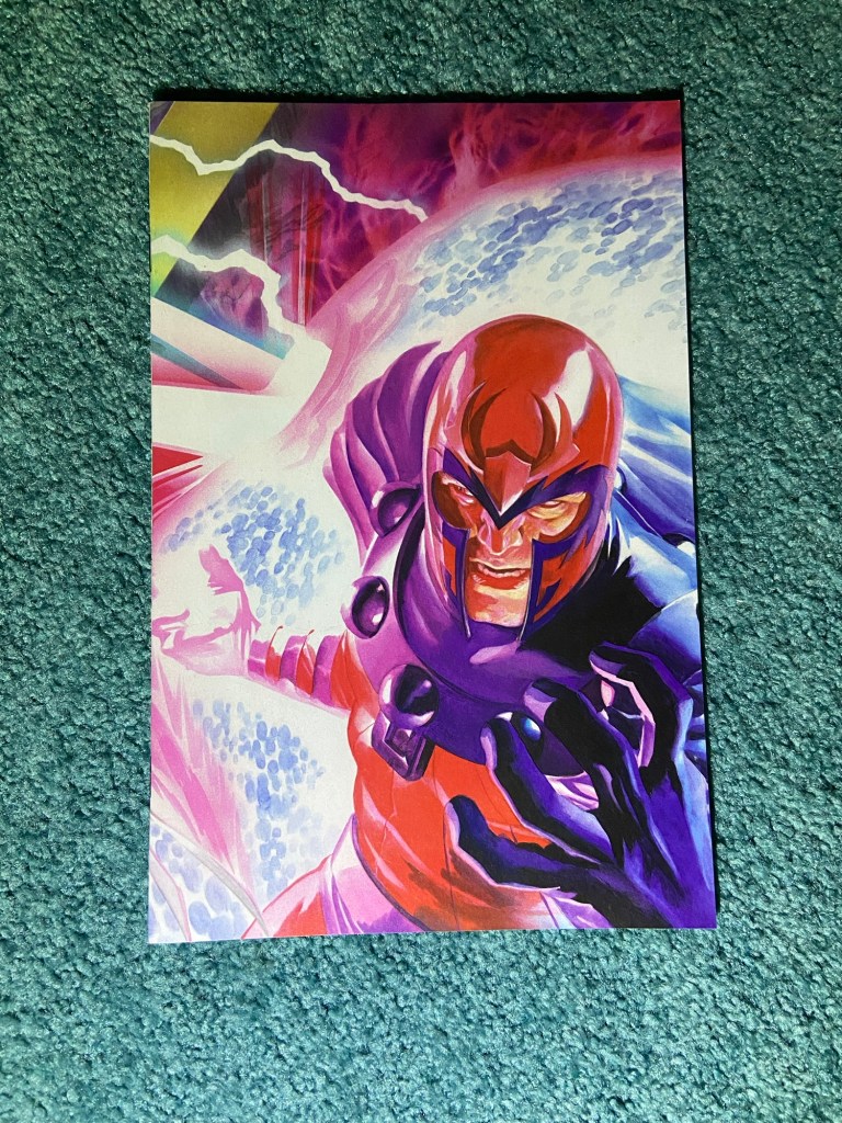
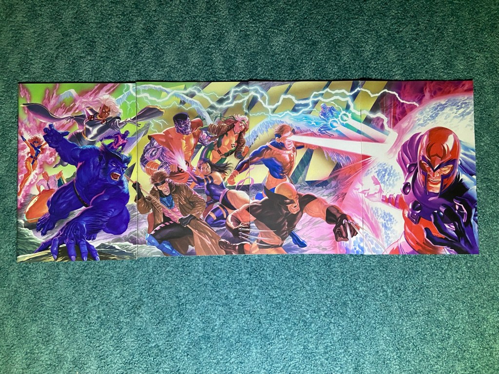
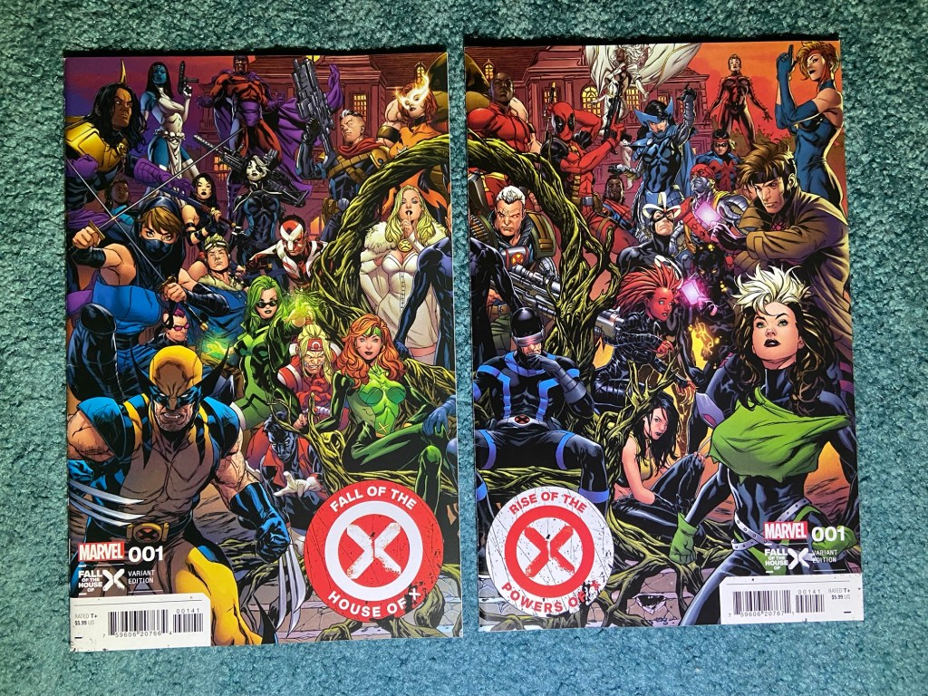
The next set of two has the same problem as the first set but this gap in the art is far more noticeable because Xavier is missing 70% of his face!
This wonderful art is by Mark Brooks. It all looks amazing! If only the centerpiece of the image was present!
Alright. Before I post the best three sets, I am going to post the absolute worst printing of a connecting cover set I’ve ever seen. The other problems seem like simple printing errors or cutting errors or something, but this? This is, I don’t even comprehend how a connecting image can be printed SO badly, and then how it can then be approved for mass production.
But before I get to that, I will also say that this was a 7 part crossover between two titles and for some reason, the last issue wasn’t included in the connecting cover set and it’s the same artist too. It’s just an odd choice. I still included it in the photos because I feel like it deserved to be part of the set.
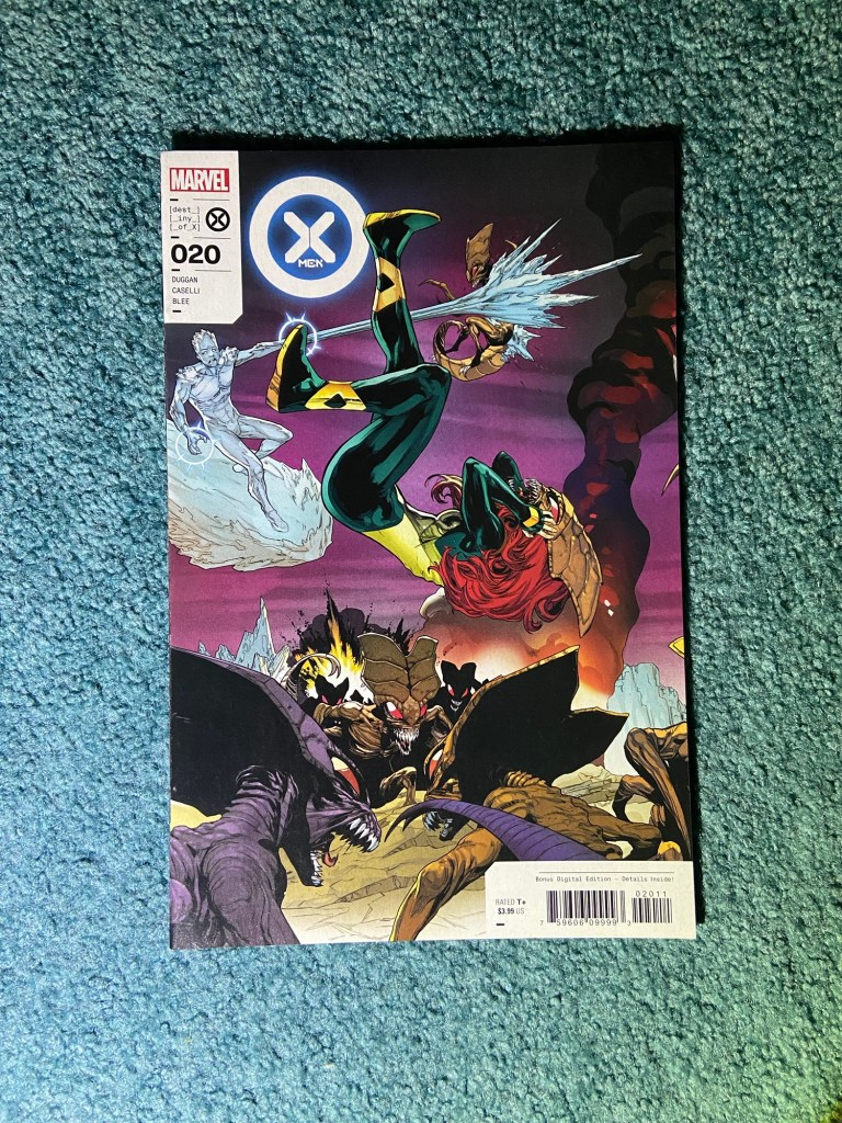
The line art is by Juan Frigeri. I loved the sequential aspect of this connecting set! I was excited to see it all together, and I’m very sorry to Juan that his art got absolutely butchered.
Between the third and sixth issues there was the missing art gap problem. I think between the first two issues was either an overlap, or it was fine. But between the second and third issues was the huge problem that I can’t comprehend.
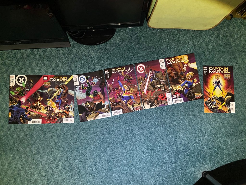
At first I had them side-by-side and was like oh, maybe Bobby’s ice bridge is just bending down? But no, because it doesn’t look right like that. And, when I do that, part of that Brood at the bottom doesn’t line up correctly. Once I realized how the line-work lined up, I was flabbergasted. How does a piece of art drawn in a straight line, so-to-speak, get printed in such a way that part of the art is diagonal??
Okay, now that that traumatic viewing is over I will move to the best three sets.
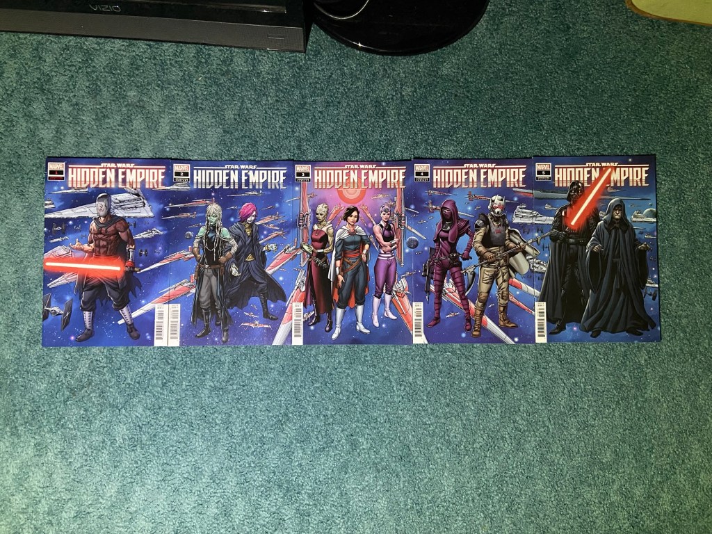
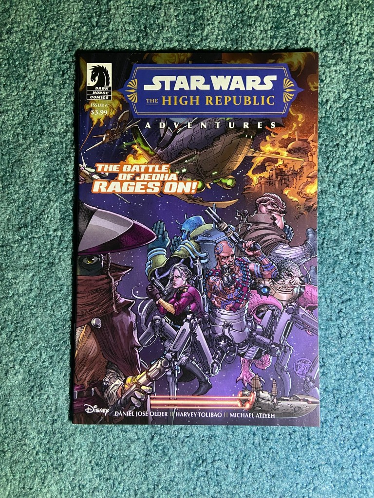
This five-part set is soooo close to being correct! The problem is just misalignment. The art is by Steven Cummings and was made for the Hidden Empire event in Star Wars comics that continued after the Crimson Reign event. It’s such a great set!

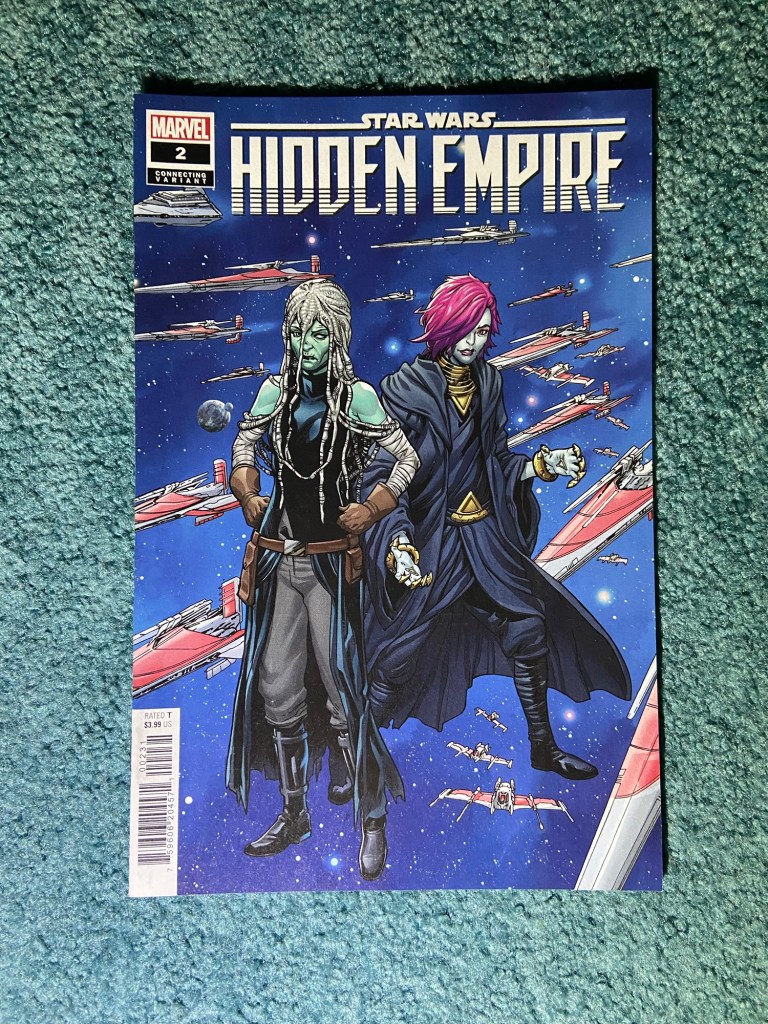
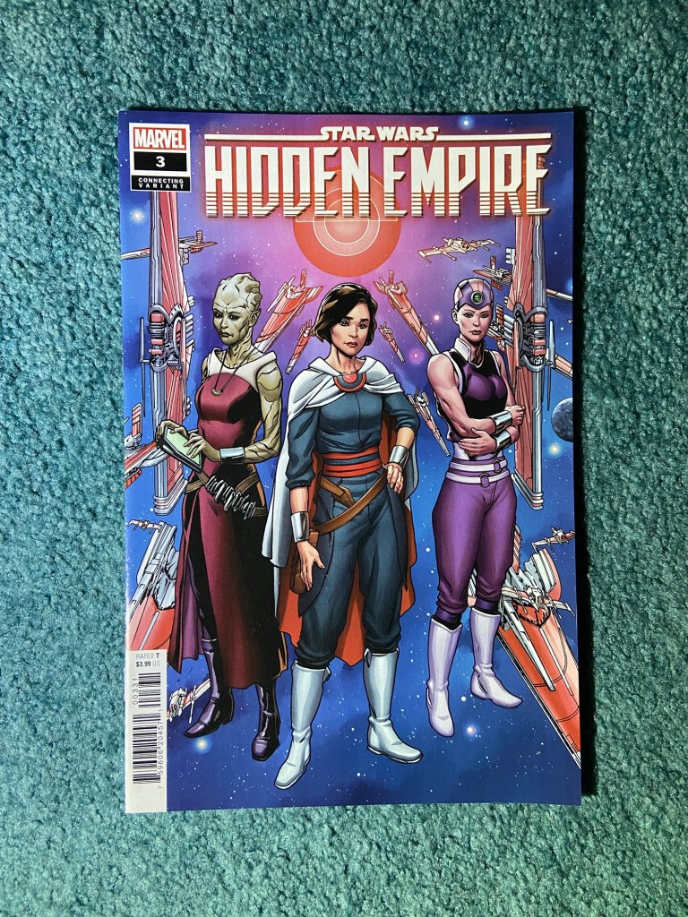
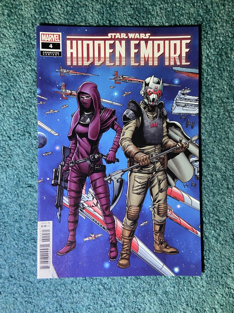
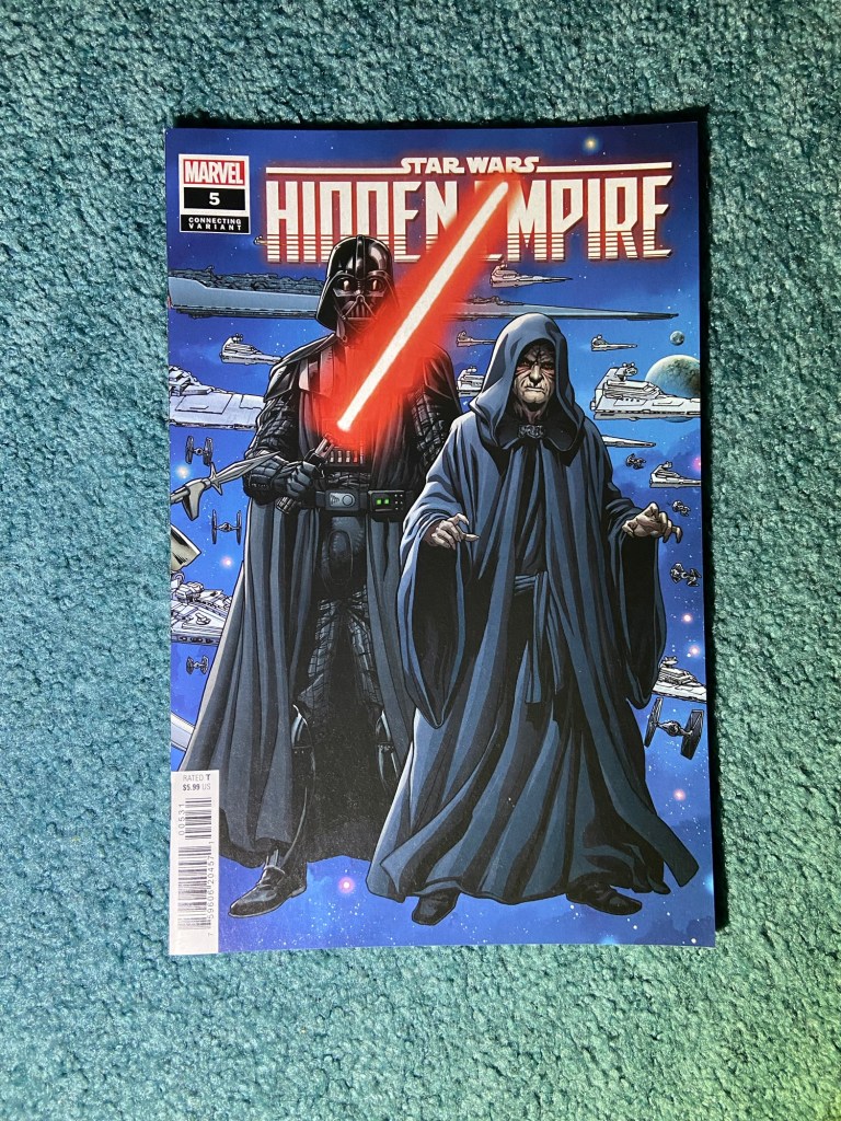
A couple of the ships aren’t lined up in the background. Even with the slight misalignment I think I may still get these framed.
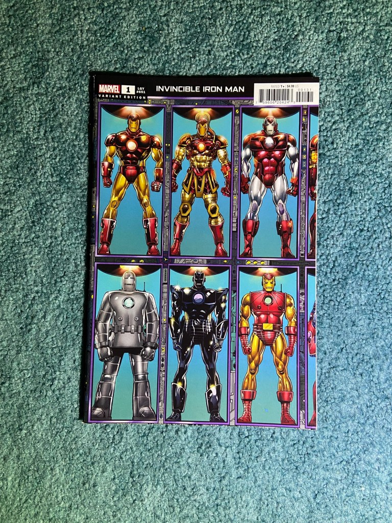
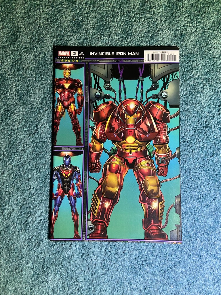
This set of two is one of the ones that works almost perfectly too. The only detail that’s odd is the shading, but I think that may just be the art being brighter because of the explosion creating light on the center character. I think this is all lined up. This art is by Harvey and Kevin Tolibao

The last set of these connecting covers is one I was so happy to finish finally! And it looks amazing!! This masterpiece is drawn by Bob Layton.

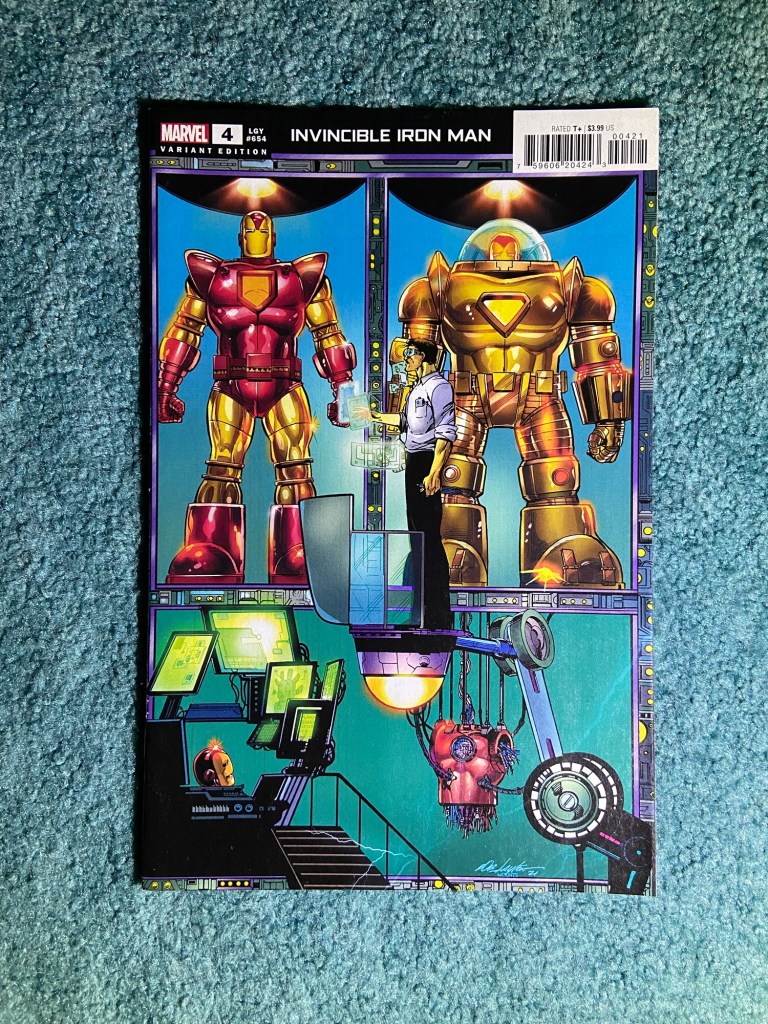
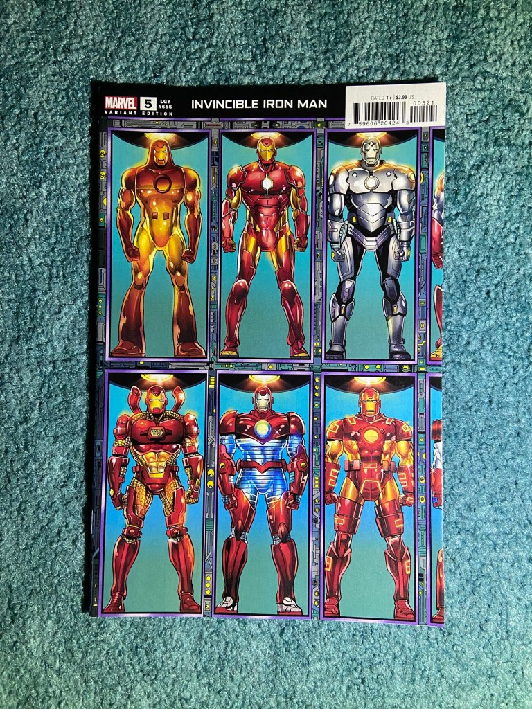
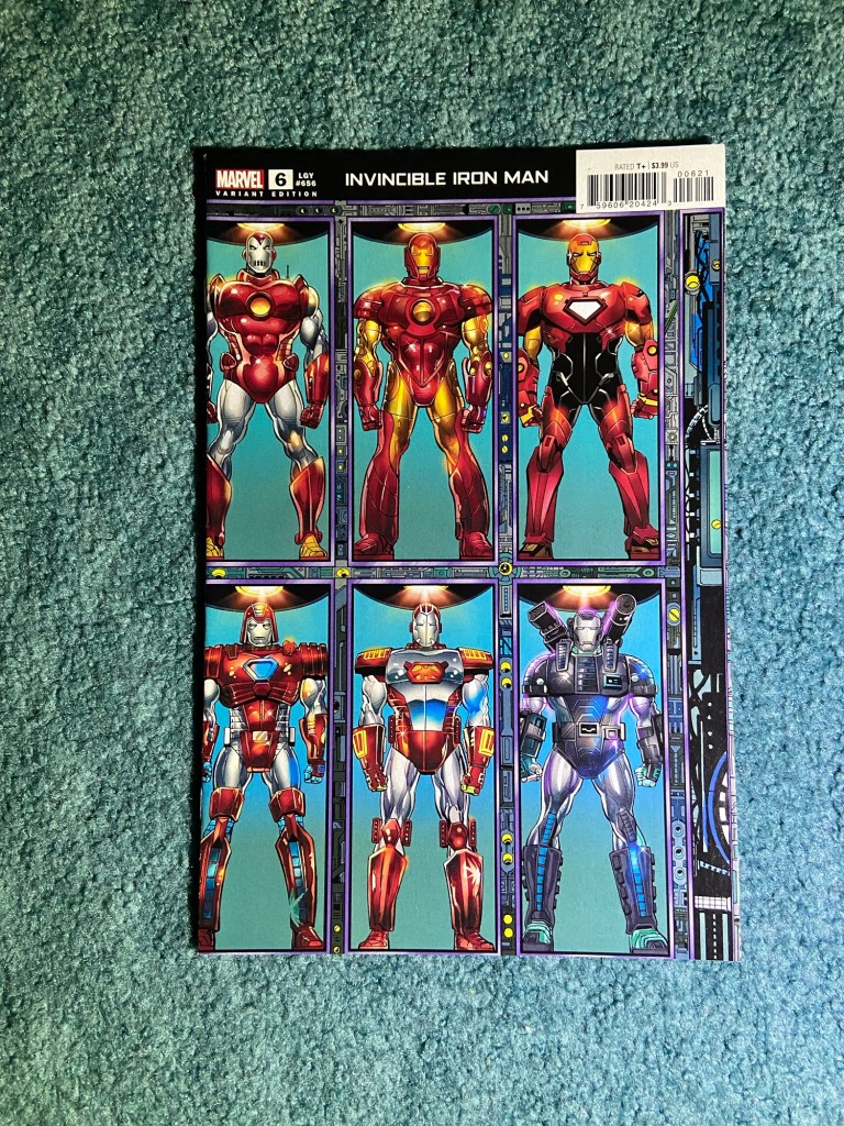
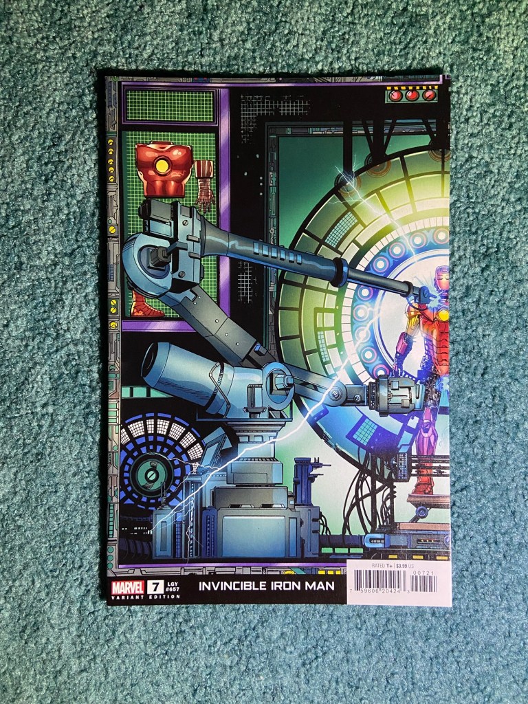

It just such a great use for a connecting cover art piece! I had forgotten that it connected in this T shape when I was putting them together. I was fearful that something wasn’t aligning, but nope, it was all good. If I can figure out a way to frame these, I probably will do so. so, thank you Bob Layton for drawing this all and thank you Paul Mounts for coloring it!
Alright, that’s the connecting variants post done! Hopefully, the normal completed collection posts don’t take as long to type up as this did!
